


The Toggle Block is a versatile block within the aBlocks website builder. It is designed to enable users to easily switch between two states, such as on/off, active/inactive, or true/false. This block is ideal for creating interactive and dynamic user experiences, allowing seamless toggling of anything. It is also beneficial for showcasing different types of pricing, such as monthly vs. annual plans or tiered pricing options.
This documentation will guide you through its usage, customization options, and integration into your website.
Add Toggle Block
Access your WordPress dashboard and open the page or post you want to edit. Locate the section where you’d like to insert the toggle block, or create a new page or post to add it seamlessly.
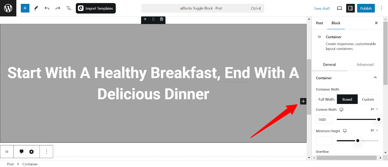
Click the plus (+) icon to add a new block.
Search for “Toggle” in the search option and select the aBlocks toggle block. The toggle will appear on your page.

Customize Toggle Block
When the toggle block appears on your page, you customize it to the right-side panel under Block > General. Here, you will see five different options to customize the toggle:
- Toggle
- Toggle Label
- Toggle Control
- Toggle Bar
- Advanced
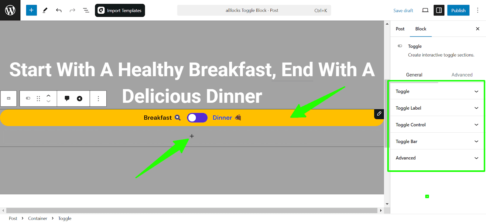
To add your toggle elements, simply click on the plus icon under the toggle bar and add the elements as per your needs. I have created a pricing table to show you.
Also, you can import pre-made Toggle designs from aBlocks template library with just a single click.
Let’s describe the toggle customization options one by one.
Toggle
Controls the alignment, layout (horizontal or vertical), spacing, and gaps between elements for a well-structured toggle design.
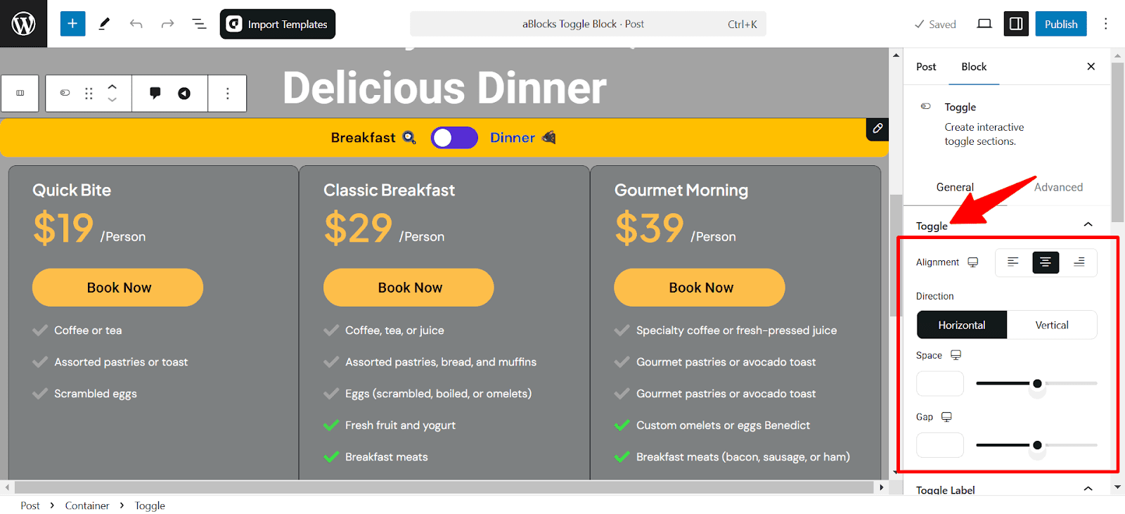
- Alignment: Adjusts the horizontal positioning of the toggle block.
- Direction: Choose between a horizontal or vertical layout.
- Space: Sets the padding around the toggle for better spacing.
- Gap: Controls the distance between toggle elements.
Padding settings come with responsive controls, letting you fine-tune spacing separately for desktop, tablet, and mobile views.
Toggle Label
The Toggle Label section allows you to customize the left and right labels and style them to match your design preferences, ensuring a clean and user-friendly interface.
Toggle Label Content
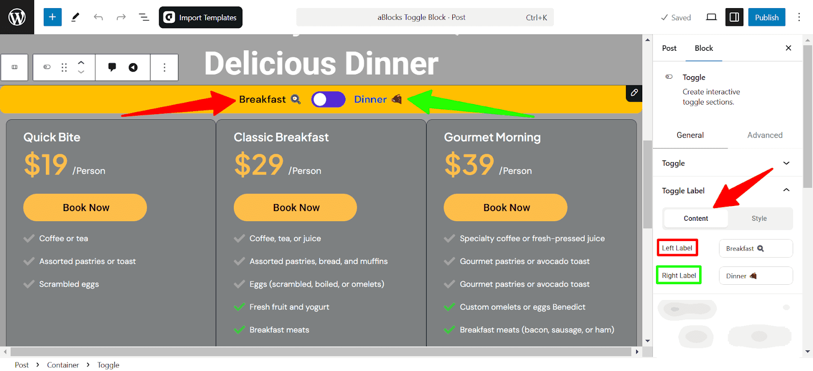
- Left Label: Defines the text and icon for the left side of the toggle switch.
- Right Label: Sets the text and icon for the right side.
Toggle Label Style
This section customizes the label’s appearance when the toggle is active. You can: Switch Between Normal & Active States to adjust styling separately for each state.
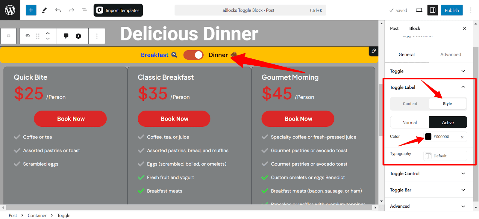
- Color: Set the text color of the active label. For detailed customization, refer to the ablocks Advanced Color Settings Documentation
- Typography: Modify the font style, size, weight, and more for better readability. For detailed customization, refer to the ablocks Typography Settings Documentation
Toggle Control
The Toggle Control settings allow you to configure the appearance and behavior of the toggle switch. It includes options for both Content and Style, ensuring flexibility in design customization.
Content
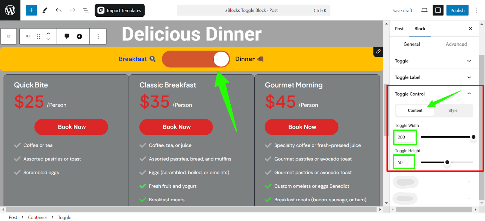
Toggle Width: Adjust the width of the toggle switch using sliders or putting a value on the box.
Toggle Height: Adjust the height of the toggle switch using sliders or by putting a value on the box.
Style
This section controls the visual style of the toggle switch.
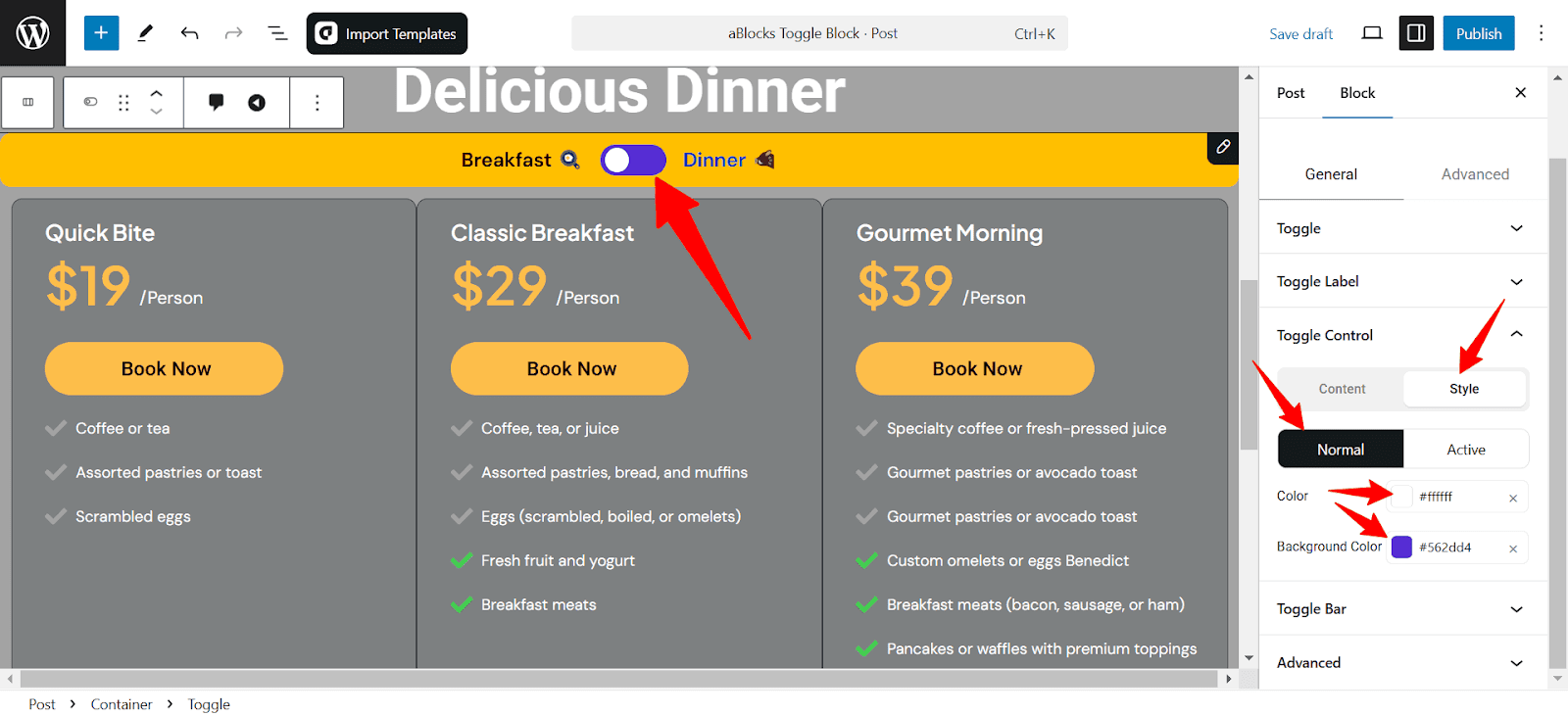
- Color: Change the switch’s color
- Background Color: Set the background color to highlight the state.
Toggle Bar
The Toggle Bar settings control the container that houses the toggle switch and labels.
Background Color: Change the toggle bar’s background to match your design.
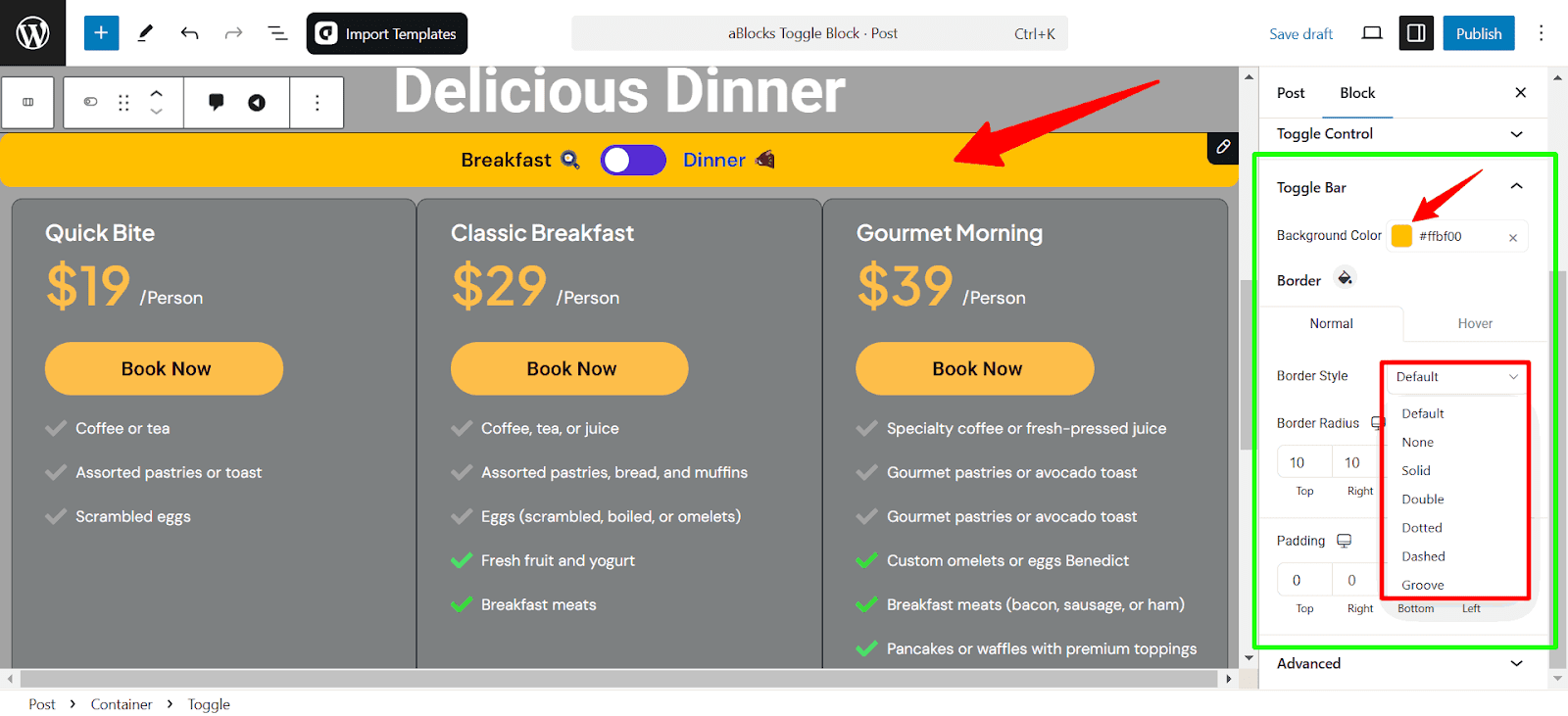
Border
There are two options on the border: Normal and Hover. You can set individual styles for both.
- Border Style: Offers a dropdown to choose the border type. Options include:
- Default
- None
- Double
- Dashed
- Groove
- Border Radius: This setting controls the roundness of the border corners. Input fields for Top, Right, Bottom, and Left allow individual customization. Click the link icon from the right to customize independently for each side.
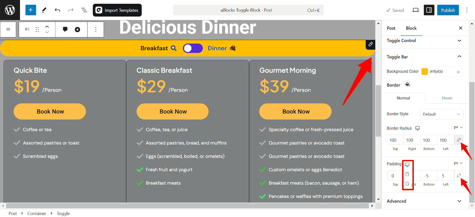
- Padding: Padding controls the space inside the toggle bar. Input fields allow adjustments for the Top, Right, Bottom, and Left paddings separately. Click the link icon from the right to customize independently for each side.
Border Radius and Padding settings come with responsive controls, letting you customize separately for desktop, tablet, and mobile views.
Consultation
This guide covers everything you need to customize the aBlocks Toggle Block. If you need any help, create a support ticket—our team is ready to assist you!