


The aBlocks Carousel Block allows you to create stunning carousels effortlessly. Showcase multiple images, Posts, Products, and others in a dynamic, interactive slider with customizable settings to enhance your design.
Add aBlocks Carousel block
Open your WordPress dashboard and click to edit a page or post. Navigate to the section where you want to add the aBlocks Carousel Block. You can also add it to a new page or post.
Click the plus (+) icon to add a new block.
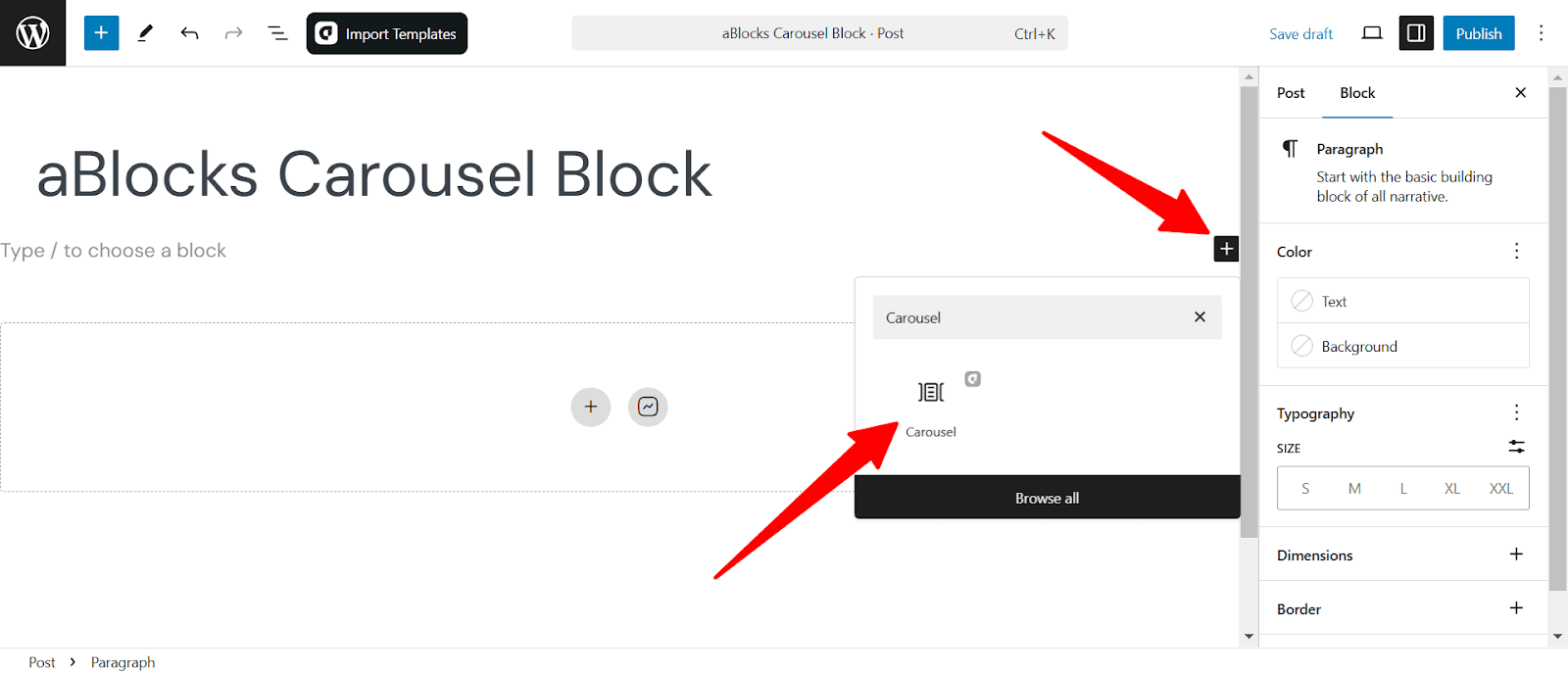
Search for “Carousel” in the search option and select the aBlocks Carousel Block. The block will appear on your page, ready for customization.
Save time and get started instantly! With the aBlocks Demo Importer, you can add a fully designed Carousel Block in just one click!
Add Carousel Chield Elements
When you add the carousel you will see the plus icon to add elements called chield. Simply add the elements that you need.
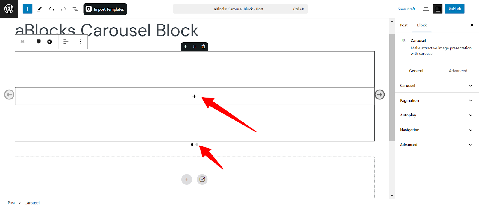
At the bottom you you see two child. Add child elements one by one that you want to show on the carousel.
I have added some child elements which are products with all the elements like: Product name, image, description, price, and rating to show you the carousel block customization.
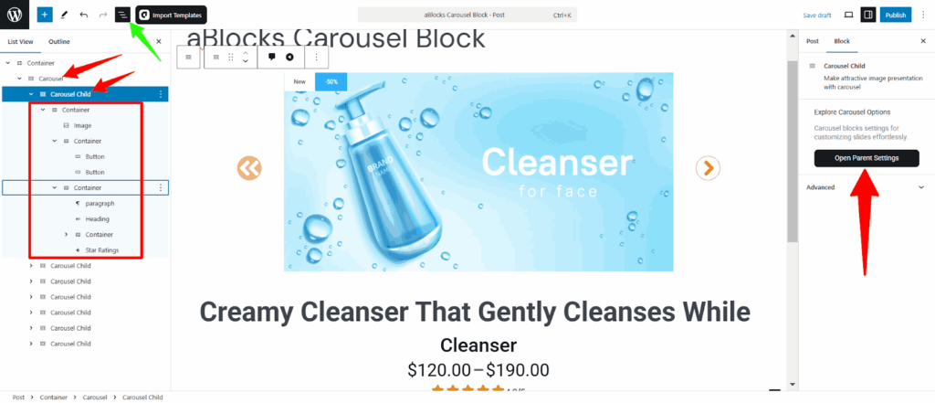
Click the “ Open Parrent Settings” to see the customization options.
Customize Carousel Block
Note: Some features will only be visible on the frontend. Adjust the settings, save your changes, and preview your page to see the final effect.
First, select the carousel by clicking on the carousel block. Then go to the right-side panel under Block > General. Here, you will see all the customization options of aBlocks carousel block. Let’s describe one by one:
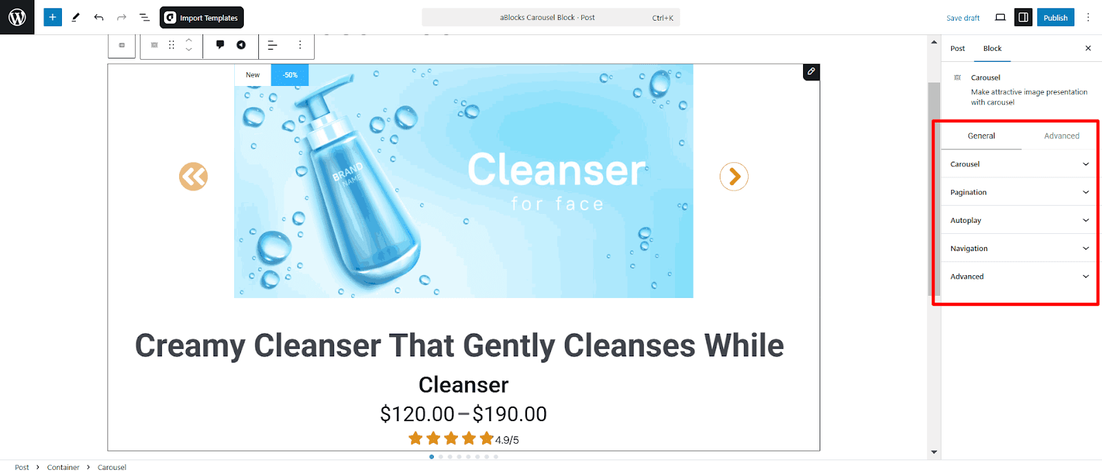
Carousel
The Carousel Settings allow you to customize the behavior and appearance of the Carousel. Adjust effects, speed, looping, and more to create a smooth, interactive slider.
Carousel Content
- Choose Effect: Select a transition effect for the carousel.
Available Effects:
- Slide
- Fade
- Cube
- Flip
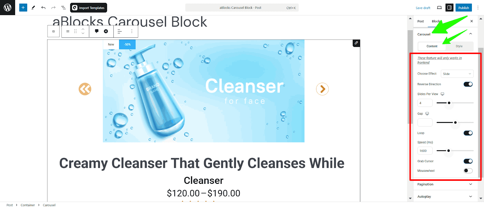
- Reverse Direction: Enable this to reverse the scrolling direction of the carousel.
- Sliders Per view: Select how many sliders are shown on a page
- Gap: Set the gap between two sliders.
- Loop: Toggle this option to make the carousel loop infinitely.
- Speed (ms): Adjust the transition speed of the carousel in milliseconds.
- Grab Cursor: Enable this to show a grab cursor when hovering over the carousel.
- Mousewheel: Turn this on to allow carousel navigation using the mouse scroll wheel.
Carousel Style
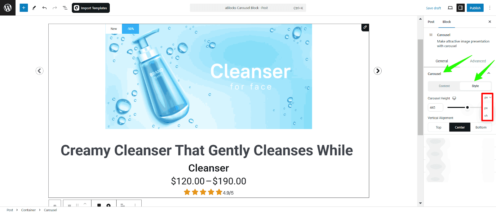
- Carousel Height: Adjust the height of the carousel elements using sliders or putting a value on the box.
- Vertical Alignment: Set the vertical alignment of the carousel.
Pagination
The Pagination Settings let you control how users navigate through the carousel. Customize pagination style and visibility for a seamless browsing experience.
Pagination Content
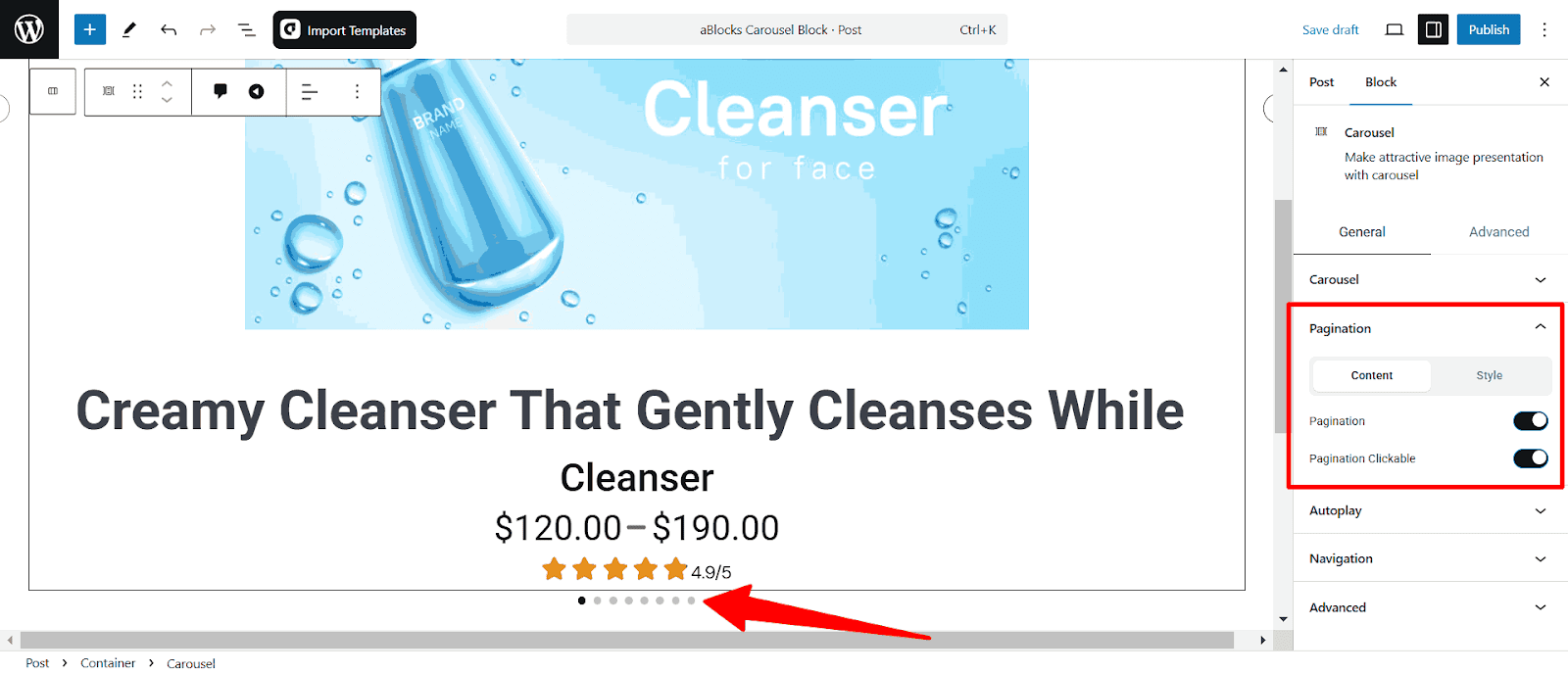
Pagination: Enable the toggle to turn on the pagination of your carousel elements.
pagination Clickable: Enable the toggle to make the pagination clickable.
Pagination Style
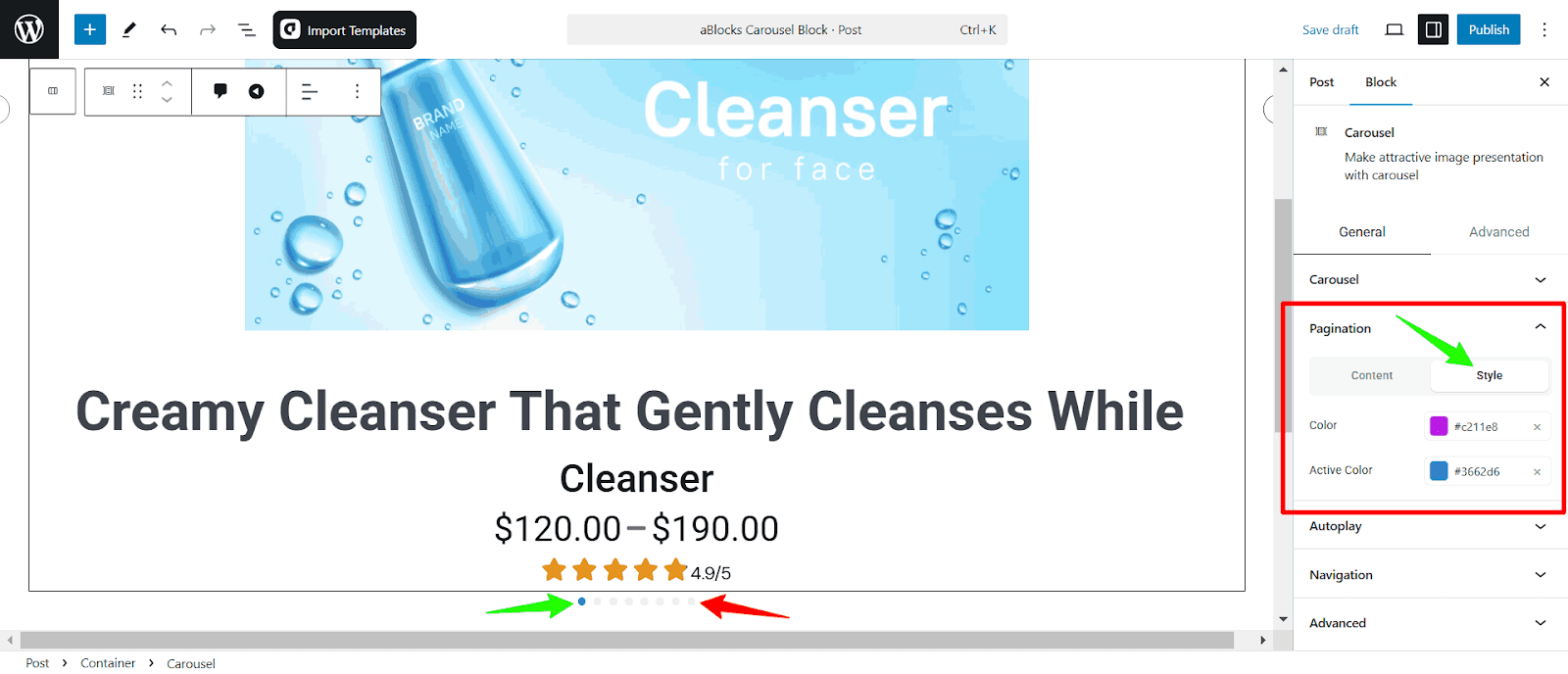
Color: Set the color of the pagination icon.
Active Color: Set the active color of the pagination icon.
Autoplay
The Autoplay Settings allow your carousel slide to transition automatically without user interaction. You can enable autoplay, adjust the delay time, reverse the autoplay direction, and pause autoplay when users hover over the carousel.
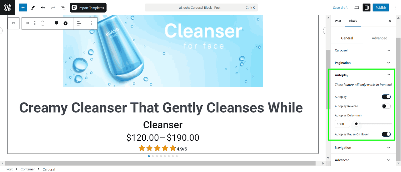
- Autoplay: Enable this option to make the carousel slide transition automatically.
- Autoplay Reverse: Activate this setting to make the carousel slide move in the opposite direction.
- Autoplay Delay (ms): Adjust the delay time (in milliseconds) between each slide transition.
- Autoplay Pause on Hover: Enable this option to pause autoplay when users hover over the carousel.
Navigation
The Navigation Settings allow users to control the carousel slide using navigation arrows, enhancing user interaction and accessibility.
Navigation Content
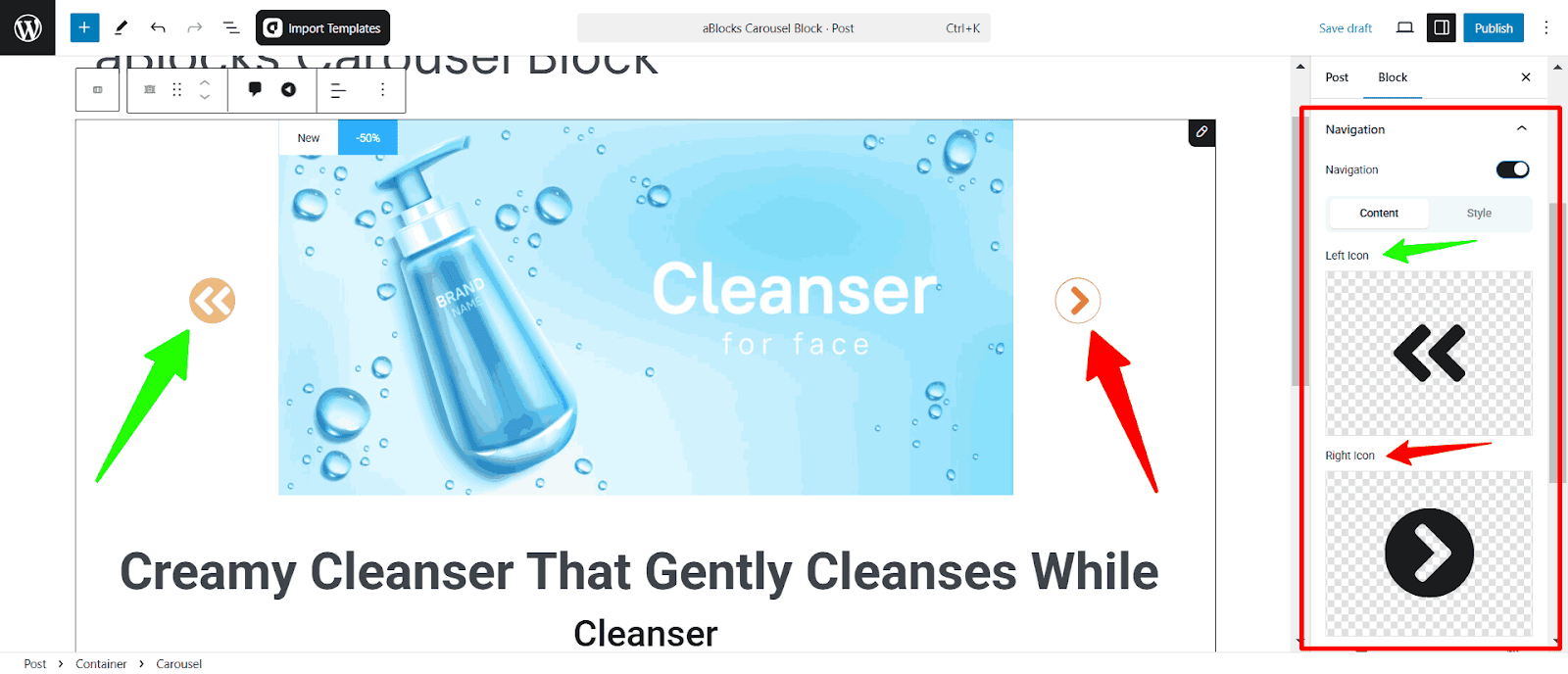
- Navigation Toggle: Enable or disable navigation arrows for the carousel slide.
- Left Icon: Customize the icon for the left navigation arrow.
- Right Icon: Choose the icon for the right navigation arrow.
- Size: Adjust the size of the navigation icons in pixels. You can measure it with PX, REM, and EM
- Position Y: Adjusts the vertical position of the navigation icons within the carousel.
- Nav Next X: Controls the horizontal position of the next (right) navigation icon.
- Nav Prev X: Sets the horizontal position of the previous (left) navigation icon.
You can measure all the positions with PX and %.
Navigation Style
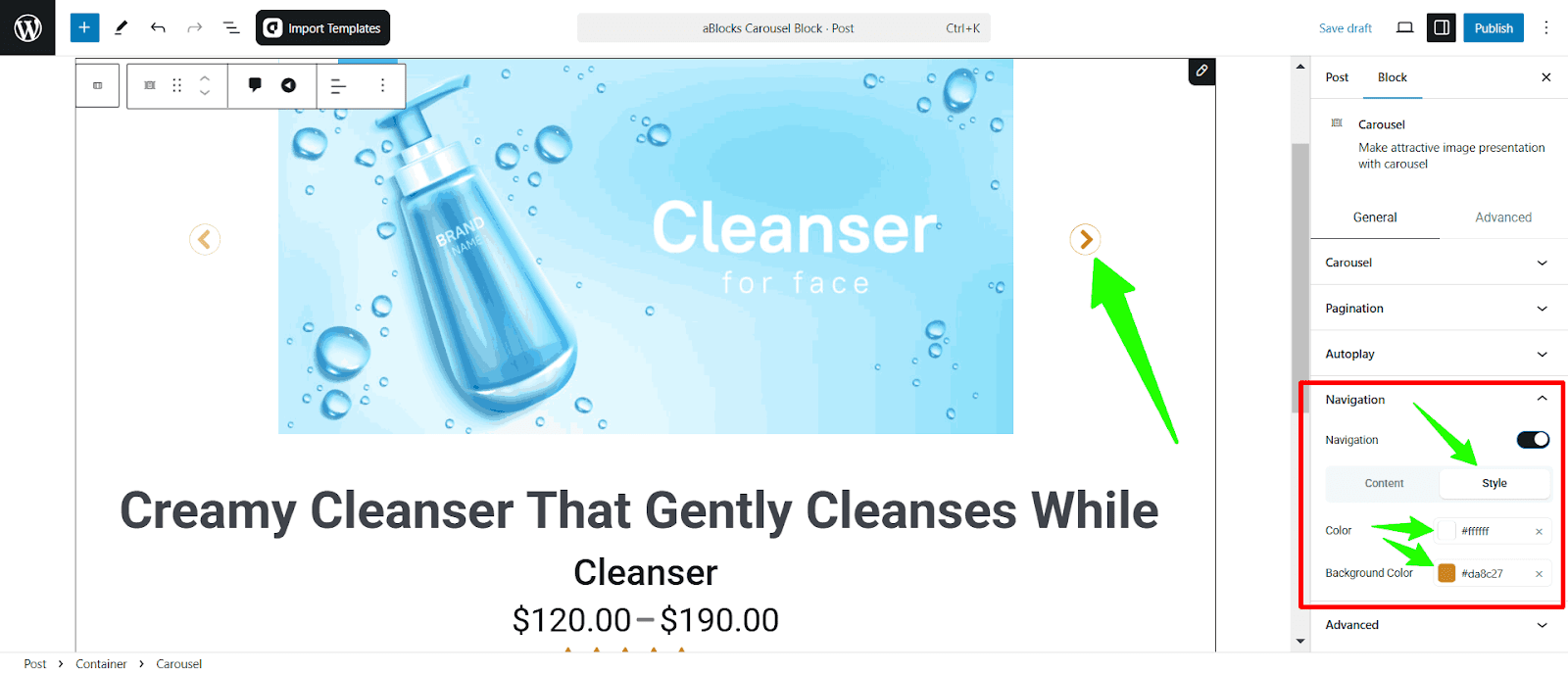
- Color: Sets the color of the navigation icons.
- Background Color: Sets the background color of the navigation buttons.
Conclusion
Everything you need to know about the aBlocks Image Comparison Block! Easily add and customize a stunning image comparison slider with aBlocks.If you need any assistance, our dedicated support team is always ready to help—reach out anytime, and we’ll resolve any issues for you!