


The Advance Lists Block in aBlocks lets you create styled, icon-based, or multi-column lists easily within the Gutenberg editor. Follow these steps to set up and customize your list.
Add the Advance Lists Block
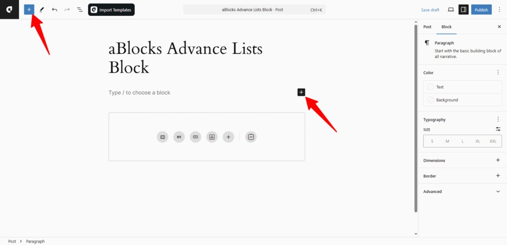
Open the page or post in the WordPress editor.
Click the (+) icon to open the block selection panel.
You’ll see all the aBlocks blocks. Scroll to find the Advance Lists block, or type Advance Lists in the search bar to find it quickly.
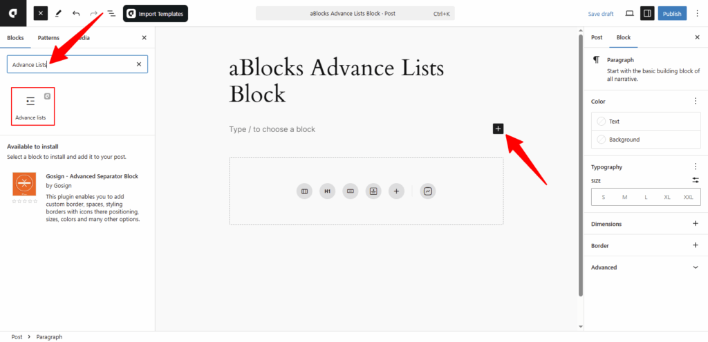
Click the aBlocks Advance Lists block to add it to your page. Then, update the text and adjust the styles to fit your design.
Customize the aBlocks Advance Lists Block
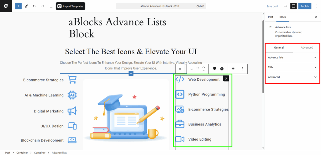
We will guide you step-by-step on how to use and customize the aBlocks Advance Lists block. First, go to the right sidebar and click Block > General. There, you will find two main sections:
- Advance lists
- Title
Let’s explore these options in detail.
Advance lists
In this section, you’ll find several options to customize the look and feel of your list.
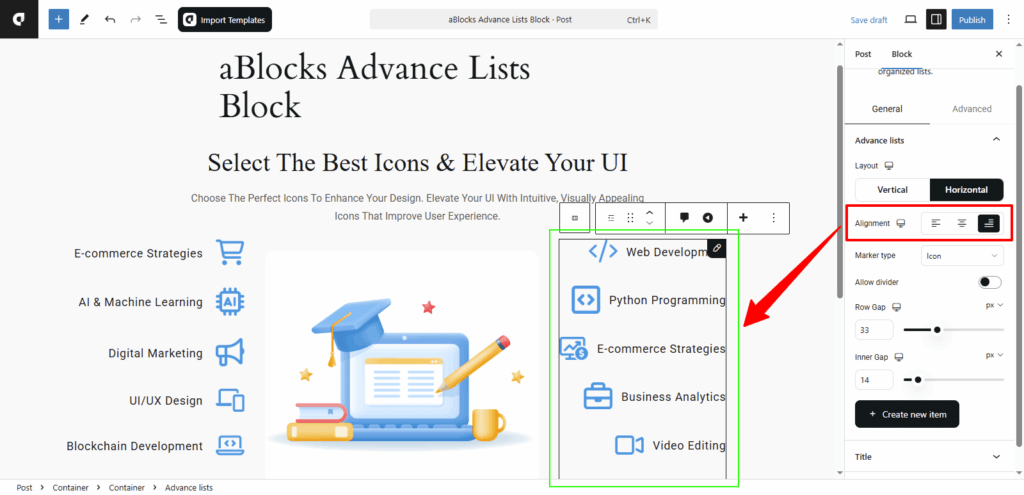
Layout: You can set the list layout to Vertical or Horizontal, depending on how you want the items to appear.
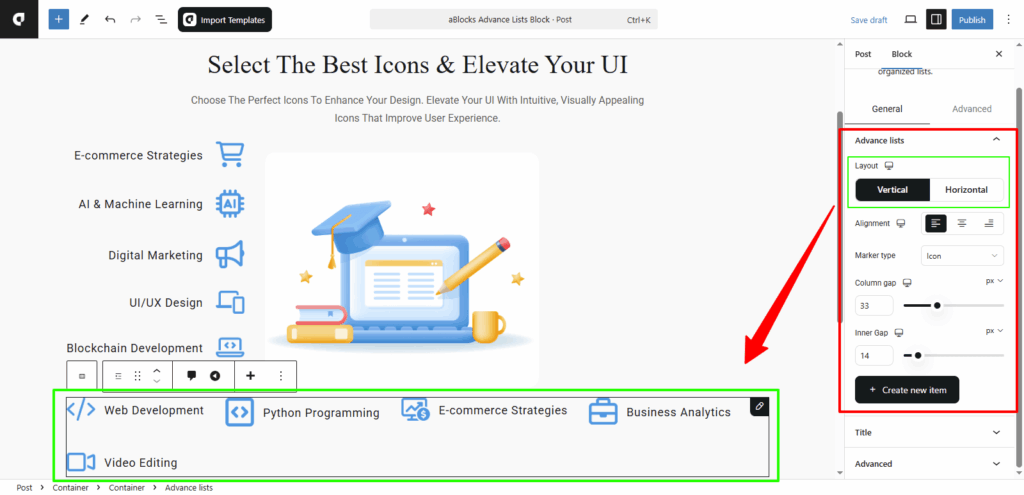
Alignment: Control how the list items align. Choose from flex-start, center, or flex-end to position the list to the left, center, or right.
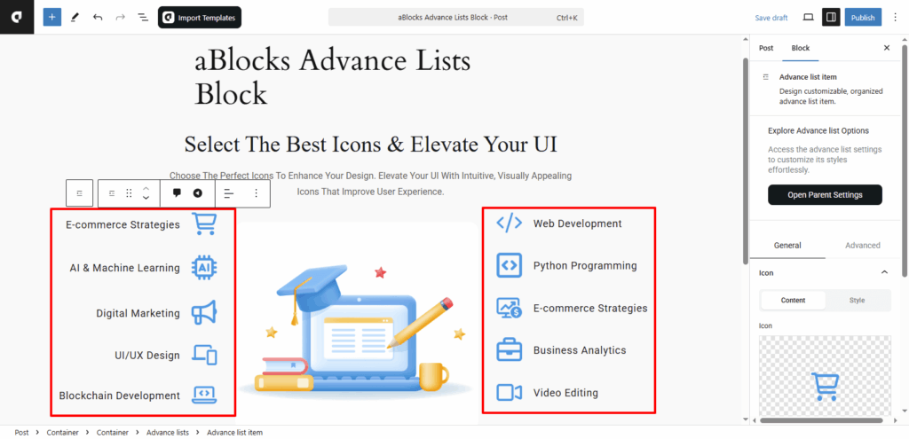
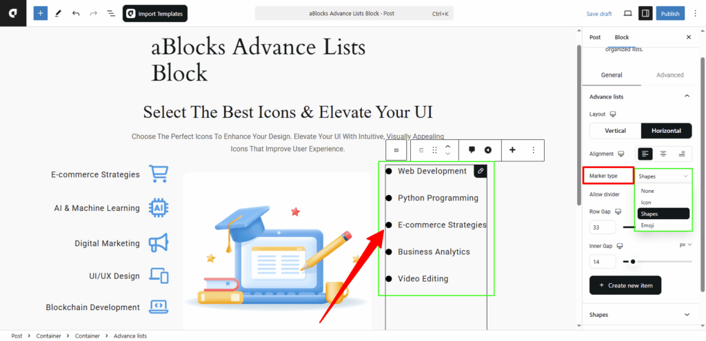
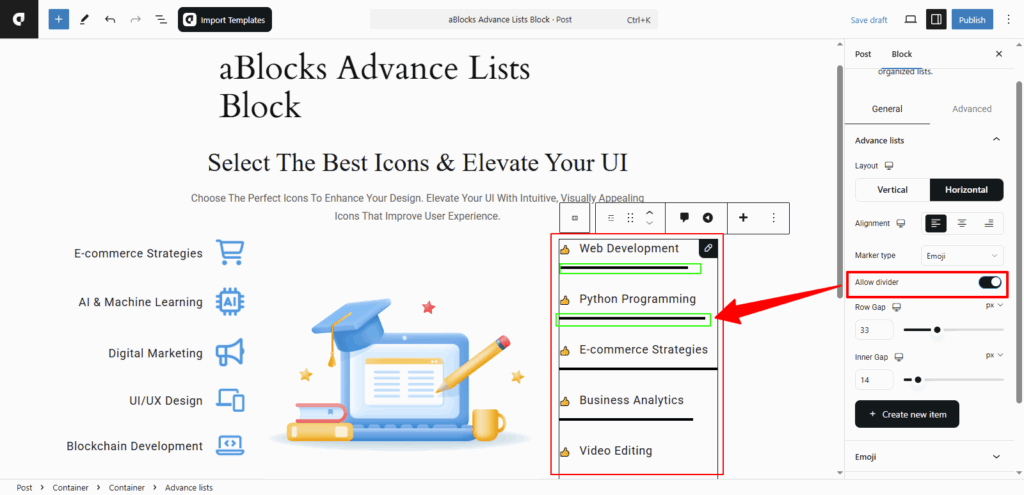
Marker Type: Decide how each list item is marked. You can choose from Icons, Shapes, or Emojis.
Allow Divider: Toggle this option to show or hide a divider line between each list item. Once enabled, a Divider section will appear below. From there, you can click on any single list item and customize its individual divider style as needed.
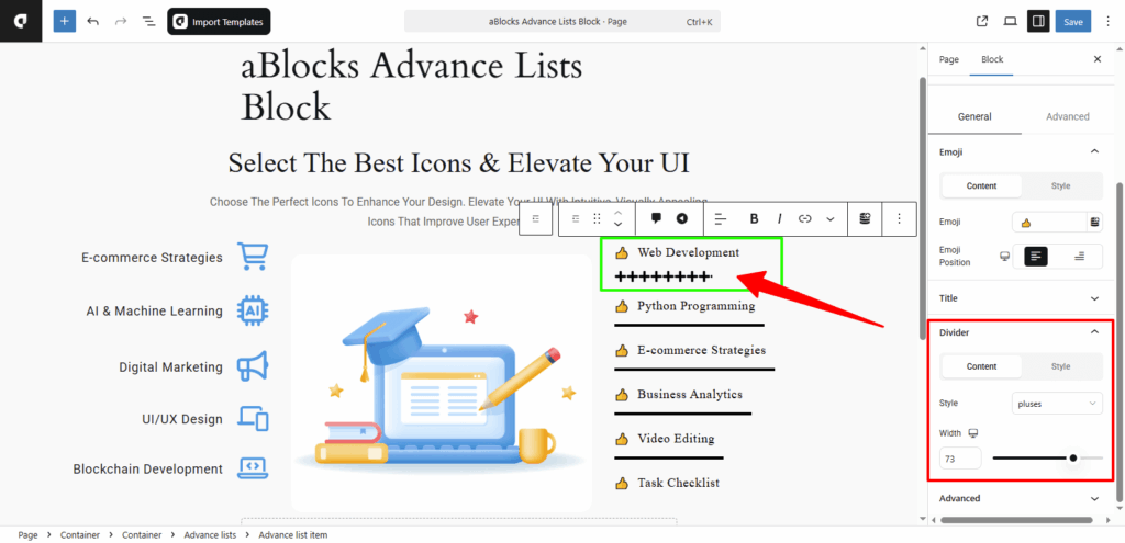
Divider
In this section, you’ll find two main tabs: Content and Style. Let’s go through the Content options first.
Style: Choose the look of your divider from various styles like Dashed, Square, Slashes, Arrows, Pluses, Dots, Solid, FirTree, HalfRound, Leaves, Stripes, Trees, Tribal, and X.
Width: Use this option to increase or decrease the thickness of the divider.
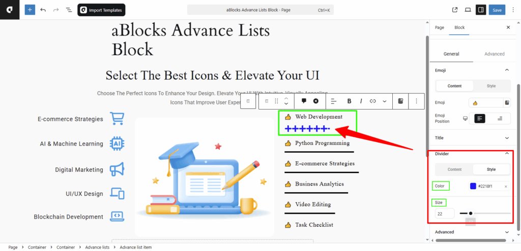
Style
Color: Change the color of the divider to match your design.
Weight: Adjust the weight (thickness) of the divider line using this option.
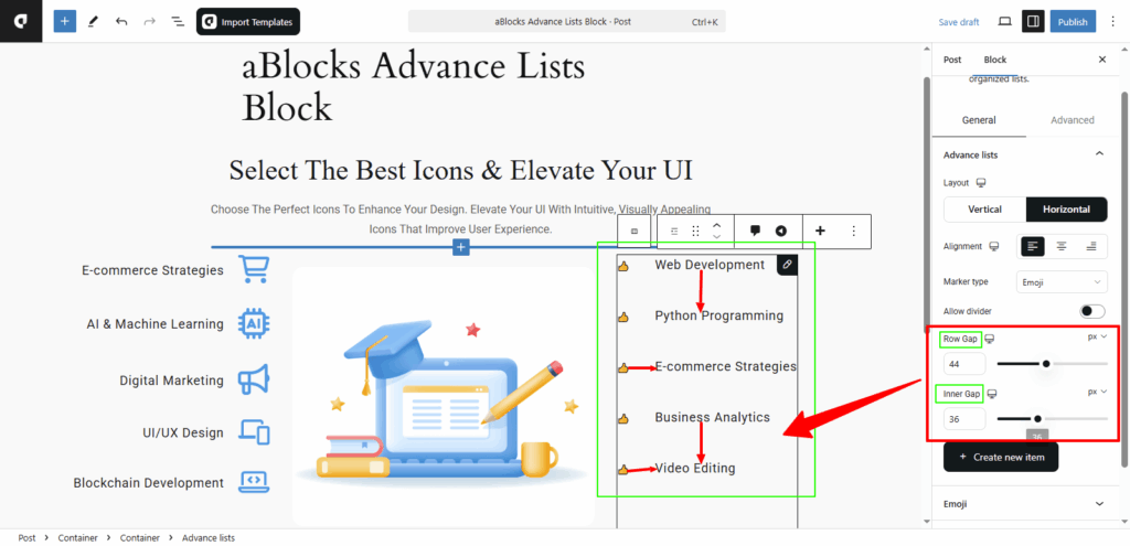
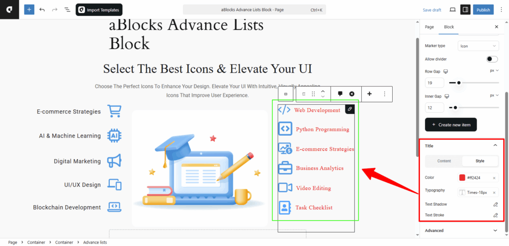
Row Gap: Adjust the spacing between the rows in your list. Increase or decrease the row gap to make the list more compact or more spaced out.
Inner Gap: This controls the space between the marker (icon, shape, emoji) and the text inside each list item. You can fine-tune it to improve readability and design balance.
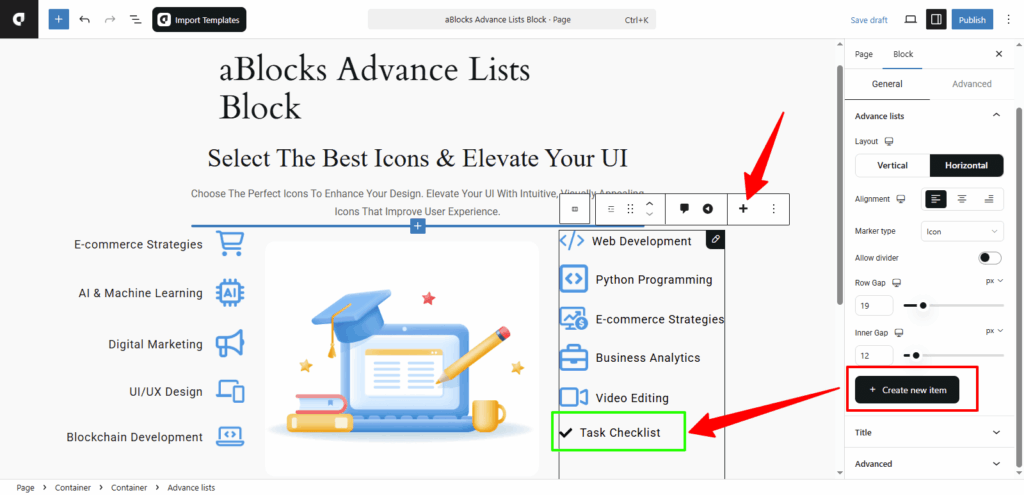
+Create new item
This option lets you add new list items. Just click the +Create New Item button, and a new item will be added to your list. You can also click the + icon from the toolbar to add a new item.
The new item will follow the Marker Type you selected—whether it’s Icon, Shape, or Emoji. Based on your chosen type, different customization fields will appear below.
For example, if you select Icon as your marker type, you’ll see an Icon field for your new item. From there, you can edit and style the item as needed.
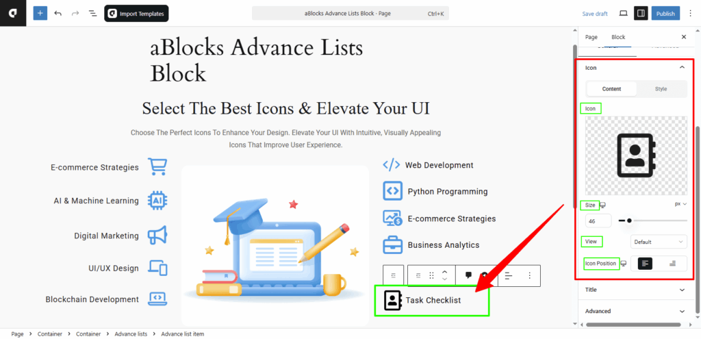
Icon
In the Icon section, you’ll find two main tabs: Content and Style. Each comes with several customization options. Under the Content tab, you can manage the icon settings for your list items.
Content
Icon: You can remove the current icon and add a new one using this option. To explore more about icons and how they work, check the aBlocks Icon Block documentation.
Size: Adjust the icon size to make it larger or smaller as needed.
View: Choose how the icon appears—Stacked or Framed—depending on your design preference.
Icon Position: Set the icon to appear on the left or right side of the text.
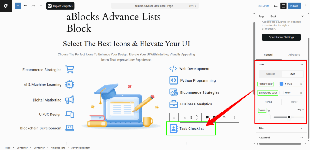
Style
In this section, you can adjust the color settings of your icon to match your design.
Primary Color: Change the main color of the icon from here.
Background Color: Set or change the background color of the icon using this option.
You’ll also see Normal and Hover tabs to set different styles for each state. Below that, you’ll find a Rotate option, which lets you manually rotate the icon to your preferred angle.
Note: Just like you customize new list items using this Icon section, you can also click on any existing list item and apply the same icon settings. Each list item supports the same customization options for full control.
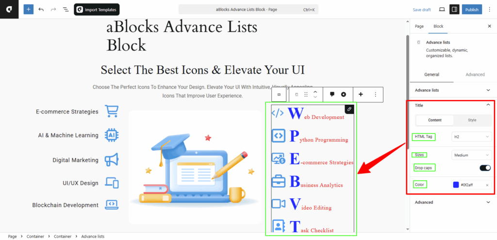
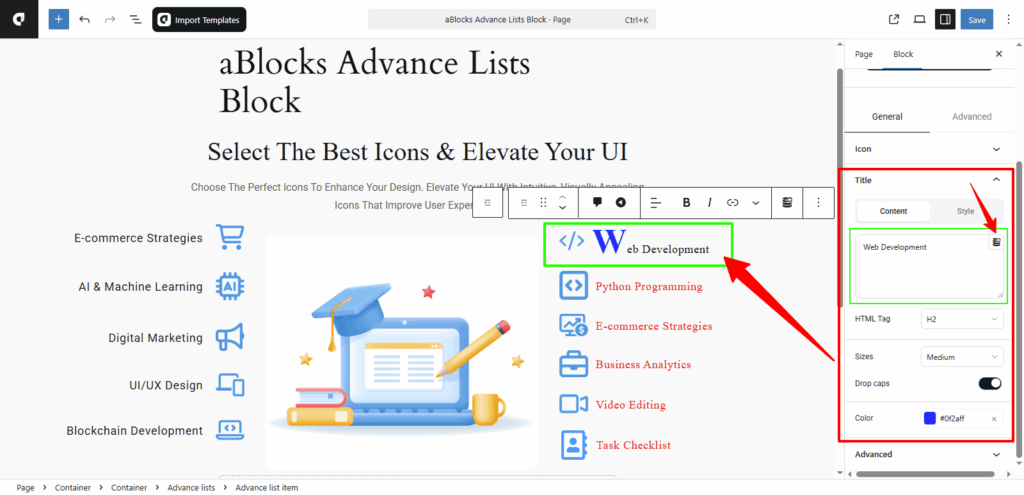
Title
In the Title section, you’ll find two tabs: Content and Style. Each offers different customization options. Under the Content tab, you can control how the text of your list item looks and behaves.
HTML Tag: You can choose the HTML tag for the text, such as H2, H3, H4, H5, H6, DIV, SPAN, or P, based on your design and SEO needs.
Sizes: Select the text size from options like Small, Medium, Large, or Extra Large to match your layout.
Drop Caps: Turn on the Drop Caps toggle to make the first letter of your text larger and styled like a drop cap. After enabling it, a Color option will appear—allowing you to change the color of the first letter. Turn it off to keep the text normal.
Style
Under the Style tab, you can customize the appearance of the list item text.
Color: Change the color of your title text to match your design.
Typography: This section lets you control the text style—like font size, weight, line height, and more. For full details, see the aBlocks Typography Settings documentation.
Text Shadow: You’ll get four options here to add shadow effects to your text. For step-by-step help, check the aBlocks Text Stroke and Text Shadow documentation.
Text Stroke: This section offers two settings to outline your text and adjust the stroke effect. For complete instructions, visit the aBlocks Text Stroke and Text Shadow documentation.
Single List Title Customization:
Just like you customized the main title section, you can customize each list item’s title in the same way. When you click on a single list item’s title, you’ll see the same set of options as shown in the main title settings.
In addition, a Title box will appear where you can directly edit the text. You’ll also see a Dynamic Content icon inside the title box. To learn how to use it, check the aBlocks Dynamic Content documentation. Using this, you can pull in dynamic content for the list title and customize everything just like the main title section.
Conclusion
The aBlocks Advance Lists Block makes it easy to build custom-styled lists in Gutenberg. Whether you want a simple vertical layout or a more complex icon-based list, this block gives you full control. You can adjust layout, spacing, icons, dividers, and even individual list items—without touching any code. Each section is built to be flexible, so your list fits any design need.
If you need help or run into any issues, feel free to contact the aBlocks support team. They’re ready to assist you anytime.