


You can make your website more appealing using images. This guide walks you through how to add and customize the aBlocks Image Block step by step.
aBlocks image block use and customization: Step-By-Step Guide
Open your website’s admin dashboard and create a new page or post.
Then, click the (+) icon to open the block options.

Now you can see all the blocks of aBlocks. Select the aBlocks Image Block from the list.

Upload an Image
You can upload an image using one of three options:
- Upload: Select an image from your computer.
- Media Library: Choose an image from your media library.
- Insert from URL: Paste an image URL to upload directly from the web.

Once you’ve uploaded your image, you’ll see some customization options on the right side, like Alt Text, Title, Caption, Description, and File URL. These settings are great for SEO and future navigation.
Customizing aBlocks Image Block
Let’s see the complete usage and customization settings of aBlocks Image Block step by step.
General and Advanced
As soon as you take a picture of aBlocks image block, you will see two sections on the right side General and Advanced by which you can easily customize your image.
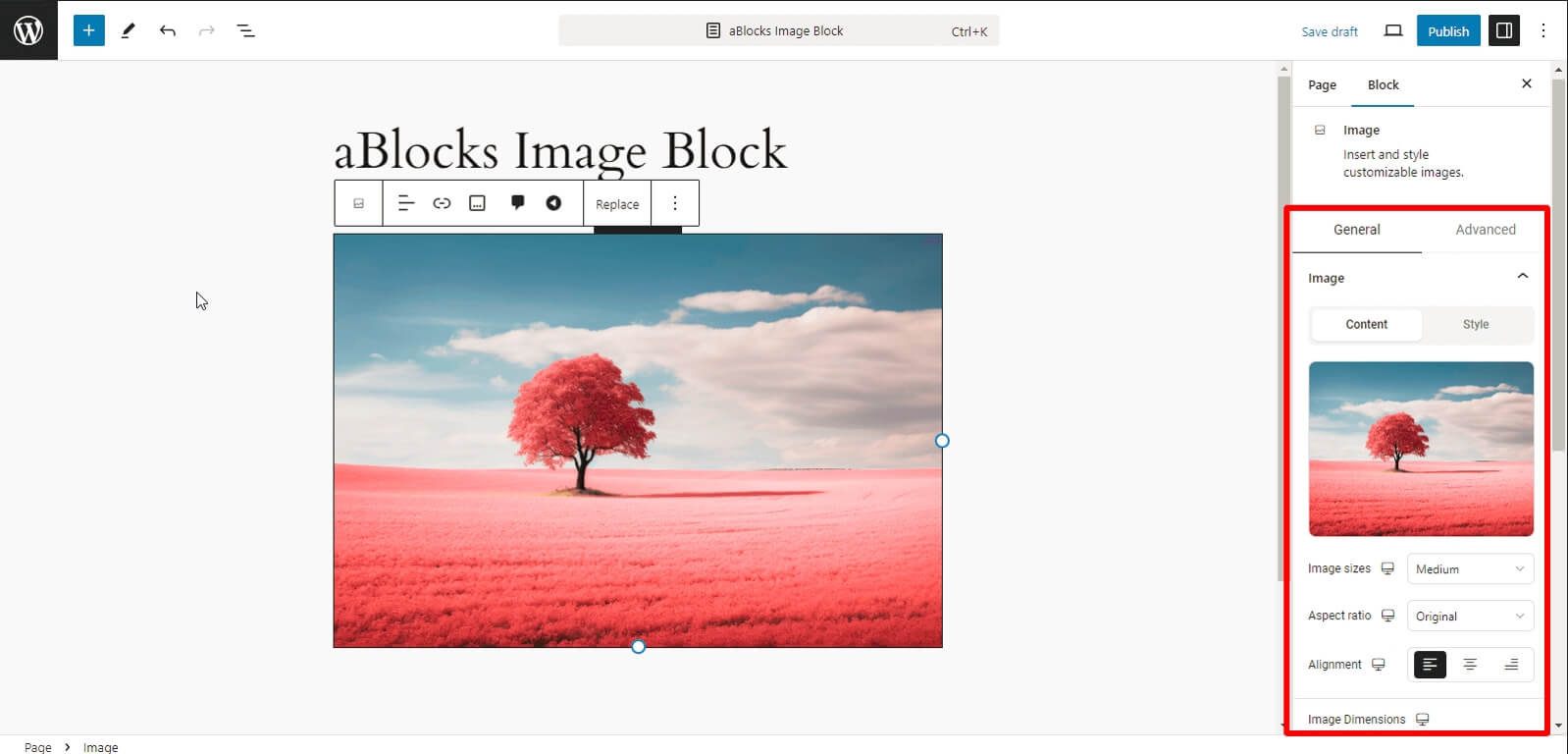
General
This section is split into two parts:
- Content
- Style
Content
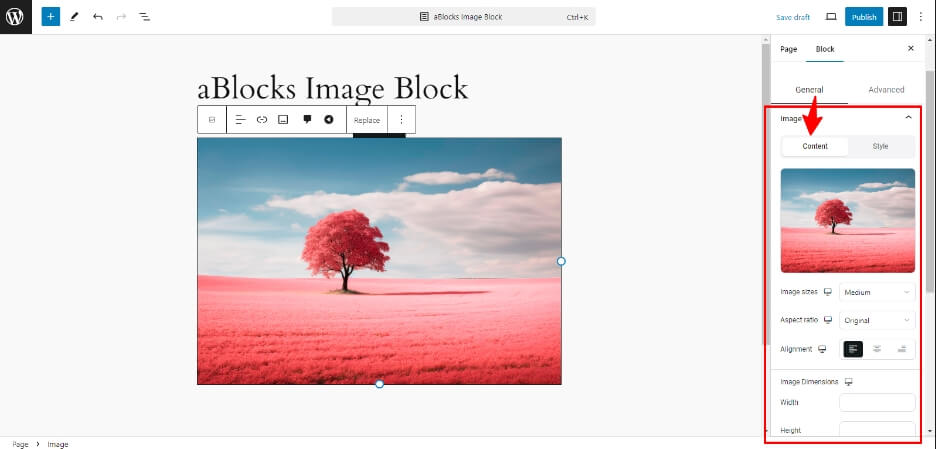
The content section has many customized options.
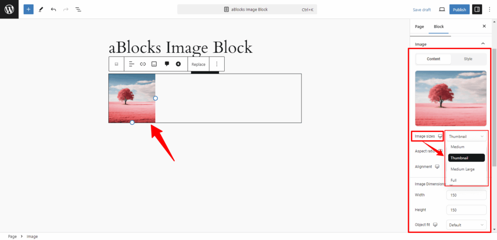
Image sizes: You can change your image size, to Medium, Thumbnail, Medium Large, or Full.
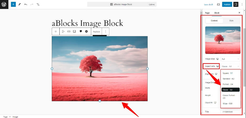
Aspect Ratio: You can easily change your image Aspect Ratio to Square, Portrait, Classic, or Wide from here.
Alignment: You can change your image position to the left, Center, or Right sides.
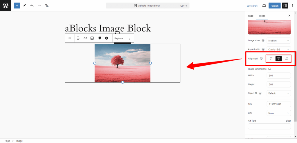
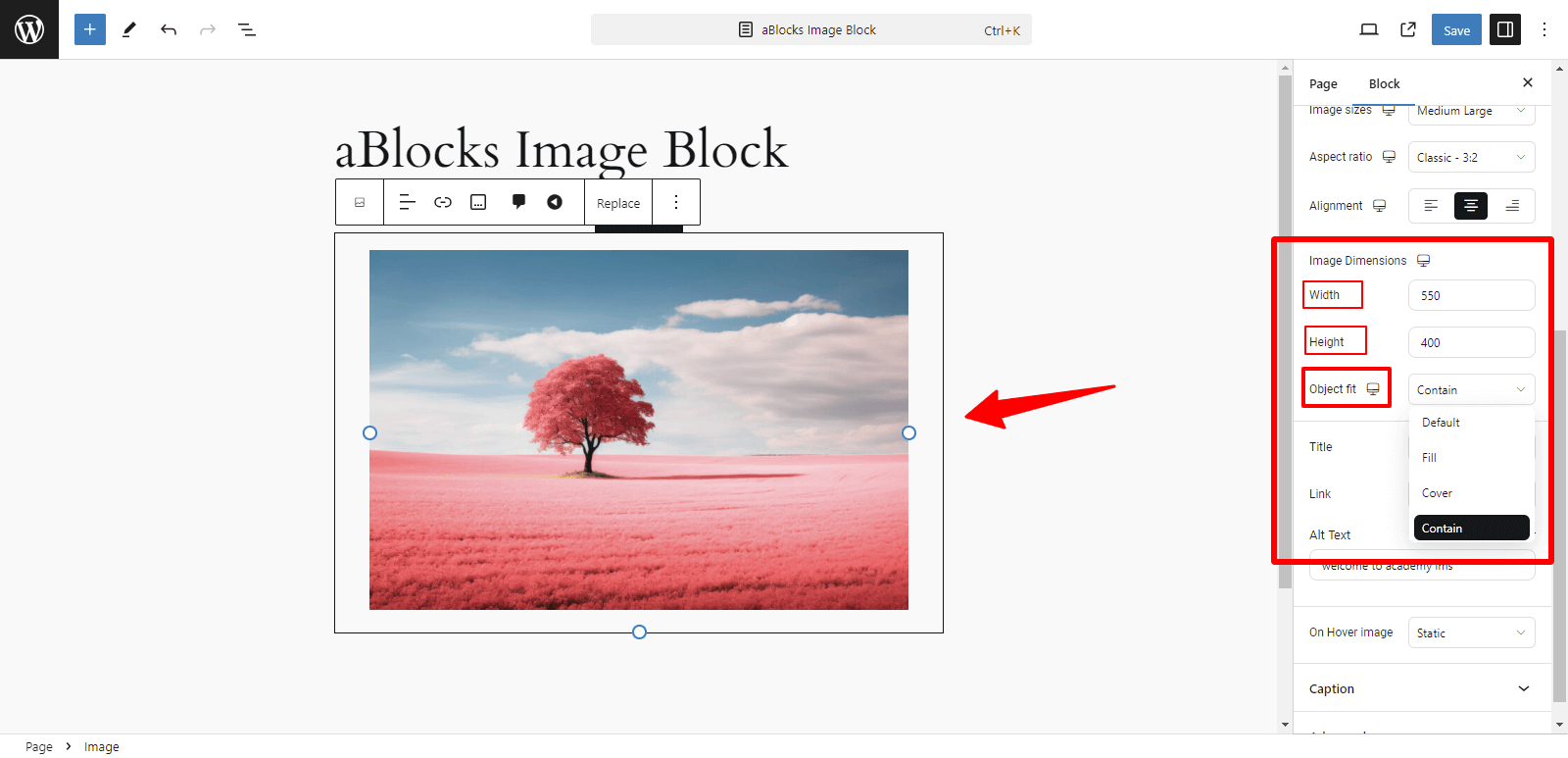
Image Dimensions: Adjust the Width, Height, and Object Fit settings to resize and crop your image.
Width: As you increase or decrease the width of your image, the size of your image will change.
Height: Height will change in the same way as width change.
Object fit: you can easily change your image Object fit, like Default, Fill, Cover, or Contain from here.
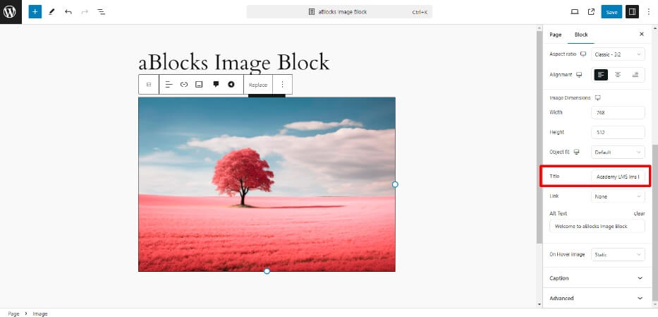
Title: A great system of aBlocks is that you can easily add and change titles as you wish.
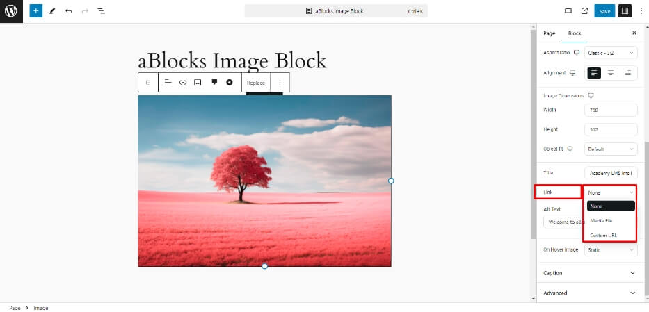
Link: aBlocks image block link section has two options, it’s Media File and Custom URL. You can easily add and change Media File and Custom URl as your wish from here.
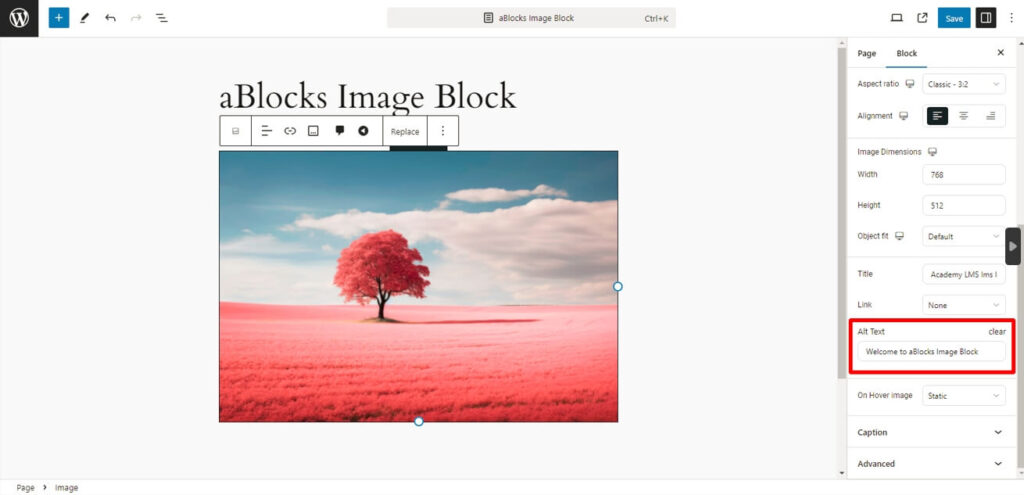
Alt Text: Add descriptive Alt text for SEO and accessibility.
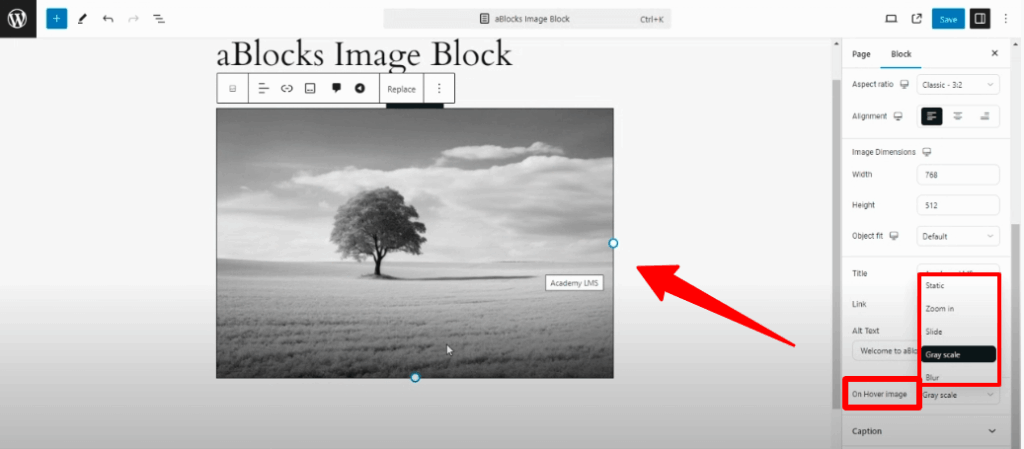
On Hover image: There are 5 style options in this section, as follows
- Static
- Zoom In
- Slide
- Gray scale
- Blur
You can style your image according to your choice using the above styles.
Caption
The caption section has two settings.
- Content
- Style
Caption content
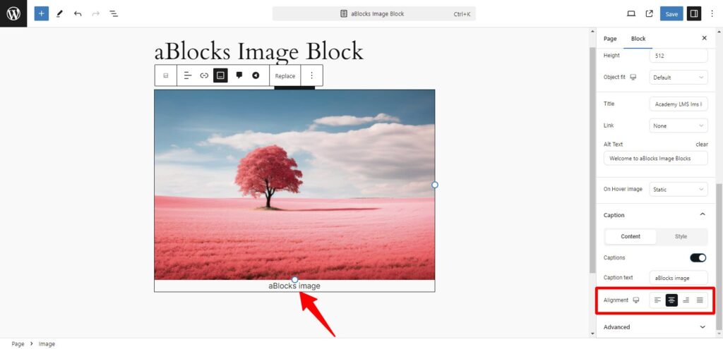
Content: If you go to the content, you will see the toggle button for captions, which will give you Caption Text and Alignment settings.
Caption Text: In the Caption Text box type the text you want to display as the caption. Then you can see this text under the image.
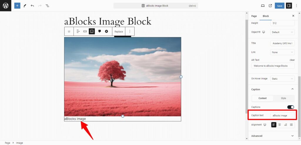
Alignment: Whatever you write in the Caption Text, you can do it Right, Left, Justify, in the Center, and at the end through the Alignment setting.
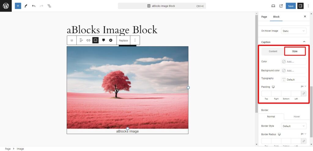
Caption Style
Style: The Style section has 4 style options, like
- Color
- Background Color
- Typography
- Padding
Now discuss the style section options: step-by-step
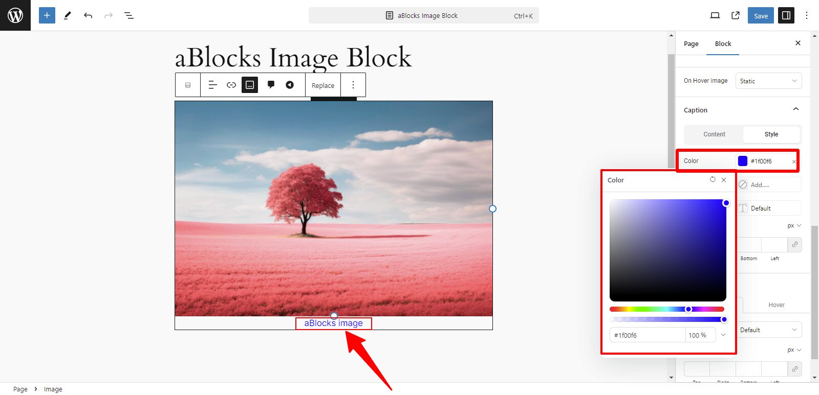
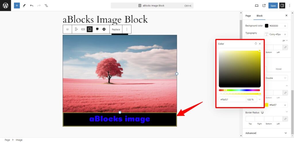
Color: You can change the color of the text you write in the caption box as you wish from the Color section. For detailed explanations, refer to the aBlocks advanced color settings.
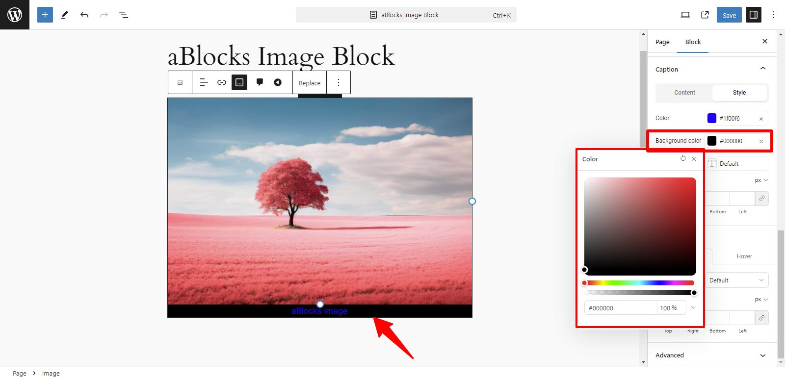
Background Color: In the Background Color options, you can easily change the caption box text background color.
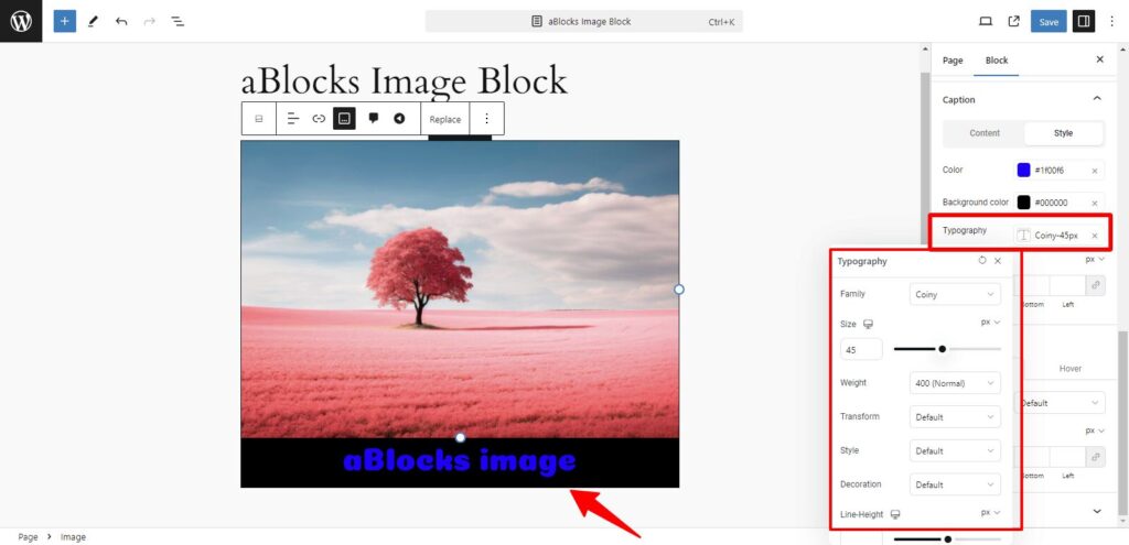
Typography: The Typography section has many advanced setting options, like
- Family
- Size
- Weight
- Transform
- Style
- Line-Weight
- Letter Spacing
- Word Spacing
With these typography options, you can fully customize the text overlay on your image blocks, ensuring that your website’s look is cohesive, modern, and visually striking. For further customization tips, you can explore the advanced settings within each typography option. For detailed explanations, refer to the aBlocks typography settings.
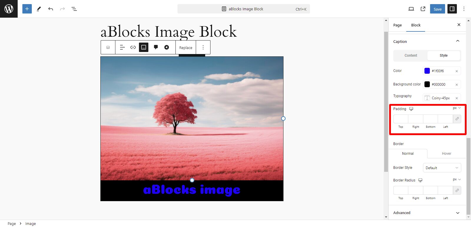
Padding: There are typically multiple padding control options, which give you the flexibility to adjust padding for different sides of the block:
- Top Padding: Controls the space above the image.
- Bottom Padding: Controls the space below the image.
- Left Padding: Adds space to the left side of the image.
- Right Padding: Adds space to the right side of the image.
This guide helps you step-by-step through the padding settings, ensuring your images are well-positioned and look great within your design.
Border
Border: The border section has two options, Normal and Hover. The Border options in the Image Block allow you to customize the look of the image’s border in just a few clicks.
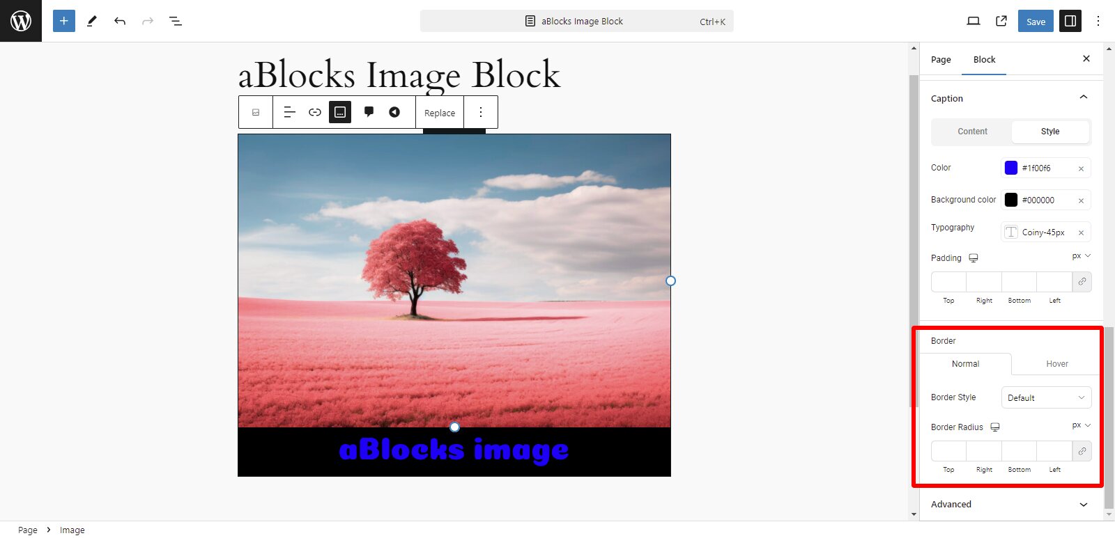
Normal
Border style: The visual style of the border section, like
- Solid: A single continuous line.
- Dashed: A series of dashes.
- Dotted: A series of dots.
- Double: Two solid lines with space in between.
- Groove: A single solid line.
If you choose any option you can see changes around the image.
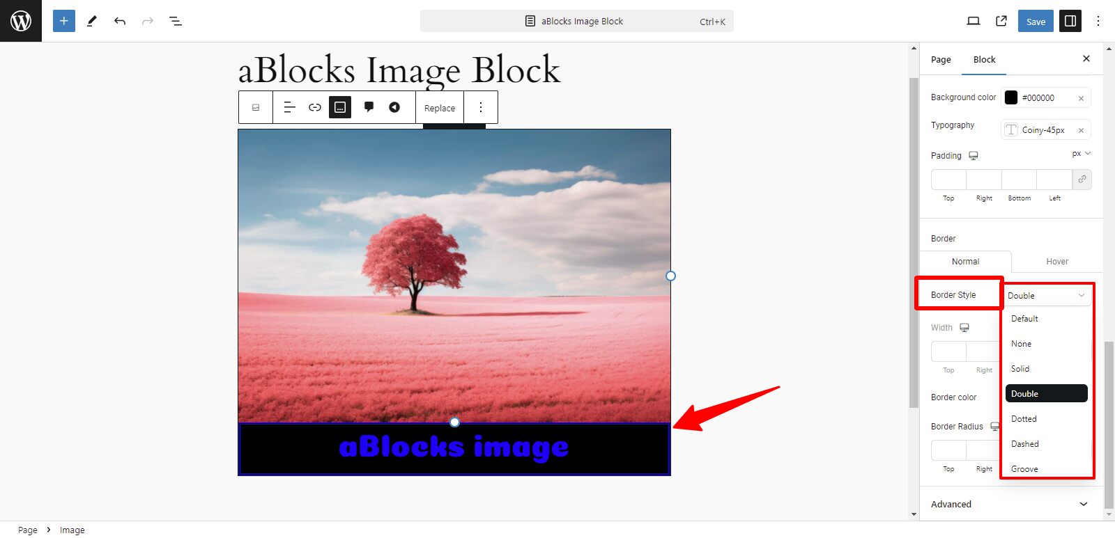
Border Width: In the Border weight option, you can customize the style of your content text weight here.
Border Color: Click on the color picker to select your desired border color. For precision, you can either select a color from the palette or enter a specific hex code.
Border Radius: Use a slider or enter a value (in pixels) to round the corners. The higher the value, the more rounded the corners will be.
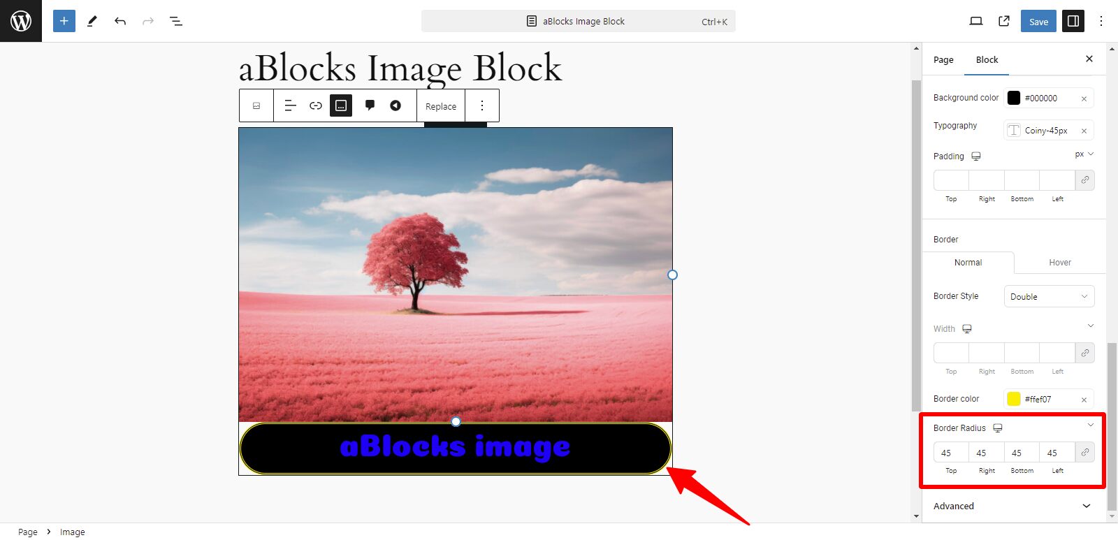
By adjusting these four settings (Border Width, Style, Color, and Radius) you can fully customize the border around your image block to fit your design perfectly.
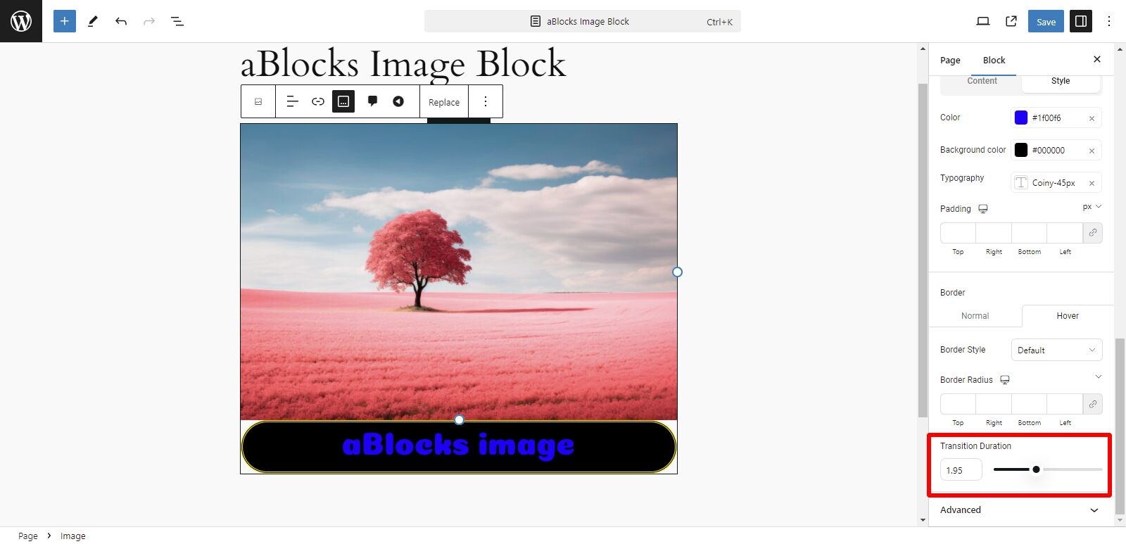
Hover
Transition Duration: Look for the Transition Duration setting. Set the duration using the slider or enter a value in milliseconds.
Style
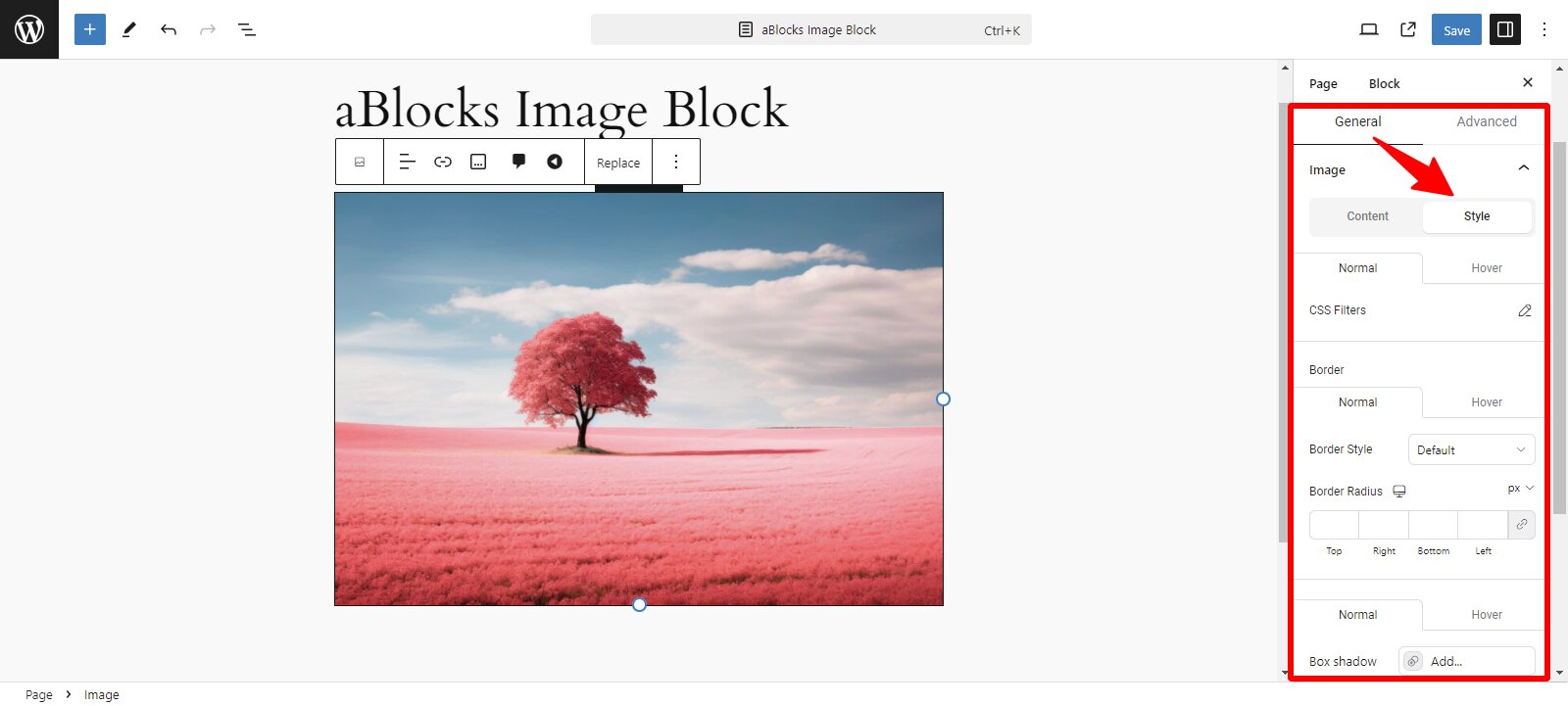
In the General section, the second option is Style. The Style section has many customized settings. Now discuss the image section step by step.
Firstly you can see the Style section has two options, like
- Normal
- Hover
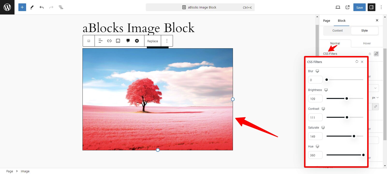
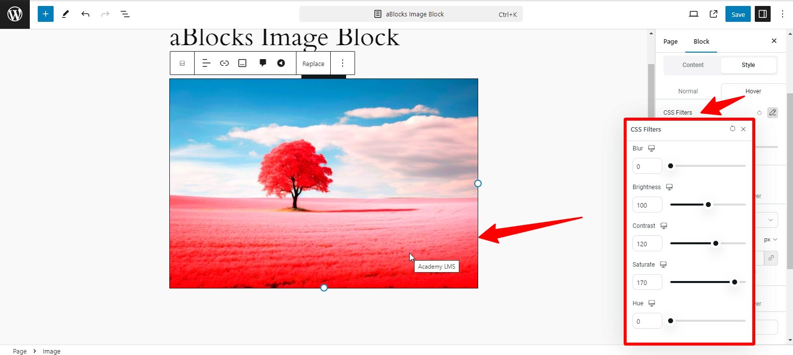
Normal: In the normal option, we can see CSS Filters. CSS Filters has many customized options, like
- Blur: Adjust the blur level to soften the edges of your icon, creating a subtle or pronounced blur effect.
- Brightness: Modify the brightness to make the icon appear lighter or darker, helping it blend or stand out.
- Contrast: Control the contrast to adjust the difference between the dark and light areas of the icon, giving it more depth.
- Saturate: Increase or decrease the saturation to make the icon colors more vivid or muted.
- Hue: Adjust the hue to change the overall color tone of the icon, giving you flexibility in matching your website’s theme.
You can easily edit and customize your image as you wish using these.
Hover: In the hover section, you will see the CSS Filter again. Hover section options are the same as Normal section options. In the same way, their edit and customize system is also the same, only in the normal section can you see your image customized very easily and if you want to see the change of the hover, you have to click the mouse button on the image, then the change of the image can be seen
Border
Border: The border section has two options, like
- Normal
- Hover
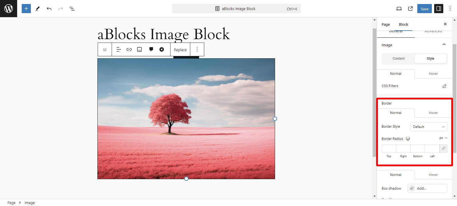
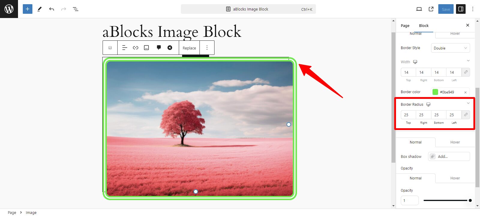
Normal: The normal section has two customized options: Border Style and Border Radius.
Border Style: The Border tab lets you style the borders of your image for a polished look. Select the type of border (Solid, Dashed, Dotted, Double, and Groove). Open the border style dropdown. Choose the desired style. Adjust the size of your image border style by specifying width in pixels or percentages. Click on the “Width” input box. Then type the value you want or use the slider (if available) to adjust.
Border Color: Then you can see the Border Color. Pick a color for the border. Click on the color picker box. Select a color or input a hex code. Now you can easily change your border color from here.
Border Radius: You can change the border radius corners of your image from here. Now find the border radius option. Adjust the corner roundness by entering a value or using the slider.
Now you can see Normal and Hover.
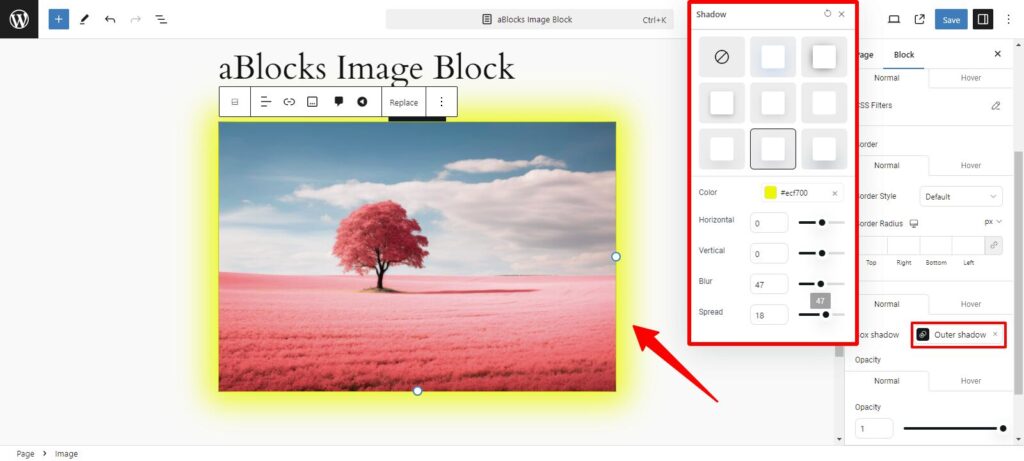
Normal: You can see Box shadow options from here. The Box shadow section has some customized options, like
- Shadow Types: Shadow Types have two types: Outer Shadow and Inner Shadow.
- Color: Click on the Color Picker to choose the shadow color. You can select any color or enter a custom hex code to match your design.
- Horizontal: Adjust this to move the shadow left or right. Positive values move the shadow to the right, while negative values move it to the left.
- Vertical: This setting controls the vertical positioning of the shadow. Positive values move the shadow downward, and negative values move it upward.
- Blur: Increase the blur to soften the edges of the shadow. A higher value creates a more diffused shadow, while a lower value keeps it sharper.
- Spread: This option controls the size of the shadow. Positive values will expand the shadow, making it larger, while negative values will shrink it, pulling it closer to the image.
Above all, Now you have a perfect shadow for your image.
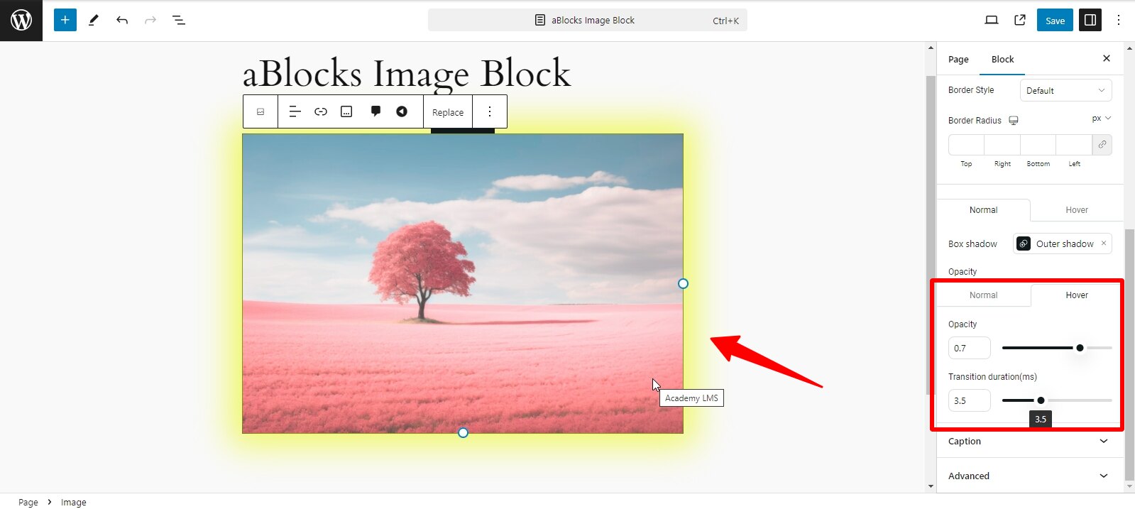
Hover
Hover: In this section, you can see the Opacity and Transition duration(ms) options.
Opacity: Opacity makes your image more or less transparent.
Transition duration(ms): Transition Duration (ms) determines how fast or slow the changes, like opacity, occur when triggered.
Both options give you control over how your images visually behave, helping you create more engaging and dynamic visuals on your website.