


Tables help present structured information clearly. The aBlocks Table Block lets you create and customize tables effortlessly for data organization, product features, or comparisons.
This guide covers adding and customizing tables using the aBlocks Table Block to display tabular data effectively.
How to Add aBlocks Table Block
Log in to your WordPress dashboard and navigate to the page or post where you want to add the table. You can also create a new page or post if needed.
Click the (+) icon to open the block options.

Now, you’ll see all the available blocks from aBlocks. Simply scroll through the list or use the search bar to find and select the aBlocks Table Block to add it to your page or post.
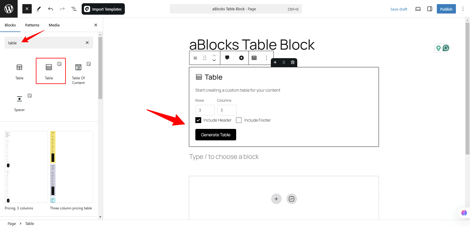
After selecting the aBlocks Table Block, customize your table by specifying the desired number of rows and columns. Once configured, click the Generate Table button to instantly create and display your table on the page.
Customizing aBlocks Table Block: Step by Step Guide
We will guide you through the usage and customization of the aBlocks Table Block with a detailed step-by-step approach.
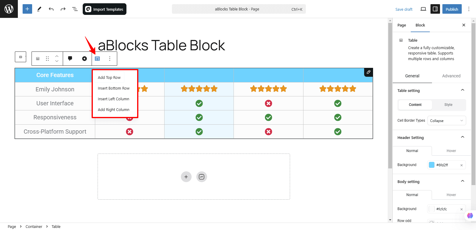
You can access the Toolbar and click on Edit Table Options to easily manage your table structure. Here’s what you can do:
- Add Top Row – Insert a new row at the top of the table.
- Insert Bottom Row – Add a new row at the bottom.
- Insert Left Column – Insert a column on the left side.
- Add Right Column – Add a column on the right side.
These options make it simple to adjust your table layout as needed.
Click the Add Top Row option to insert a new row at the top of the table. This allows you to expand your table while keeping the existing structure intact.
Click the Insert Bottom Row option to add a new row at the bottom of the table. This helps you extend your table without altering the existing content.
In the same way, click the Insert Left Column option to add a new column on the left side of the table. This helps you extend your table without altering the existing content.
Click the Add Right Column option to insert a new column on the right side of the table. In the same way, this helps you extend your table without altering the existing content.
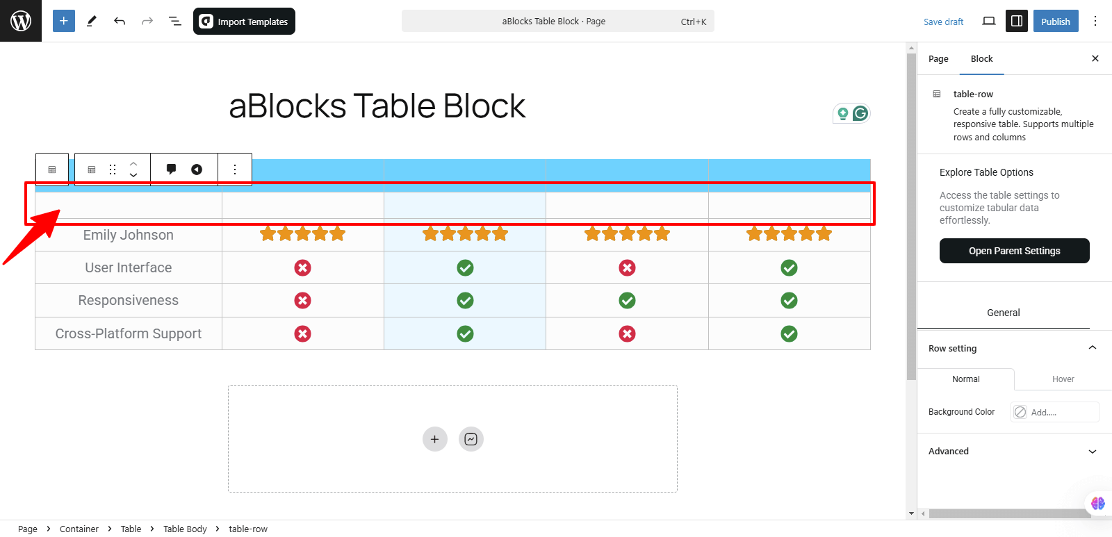
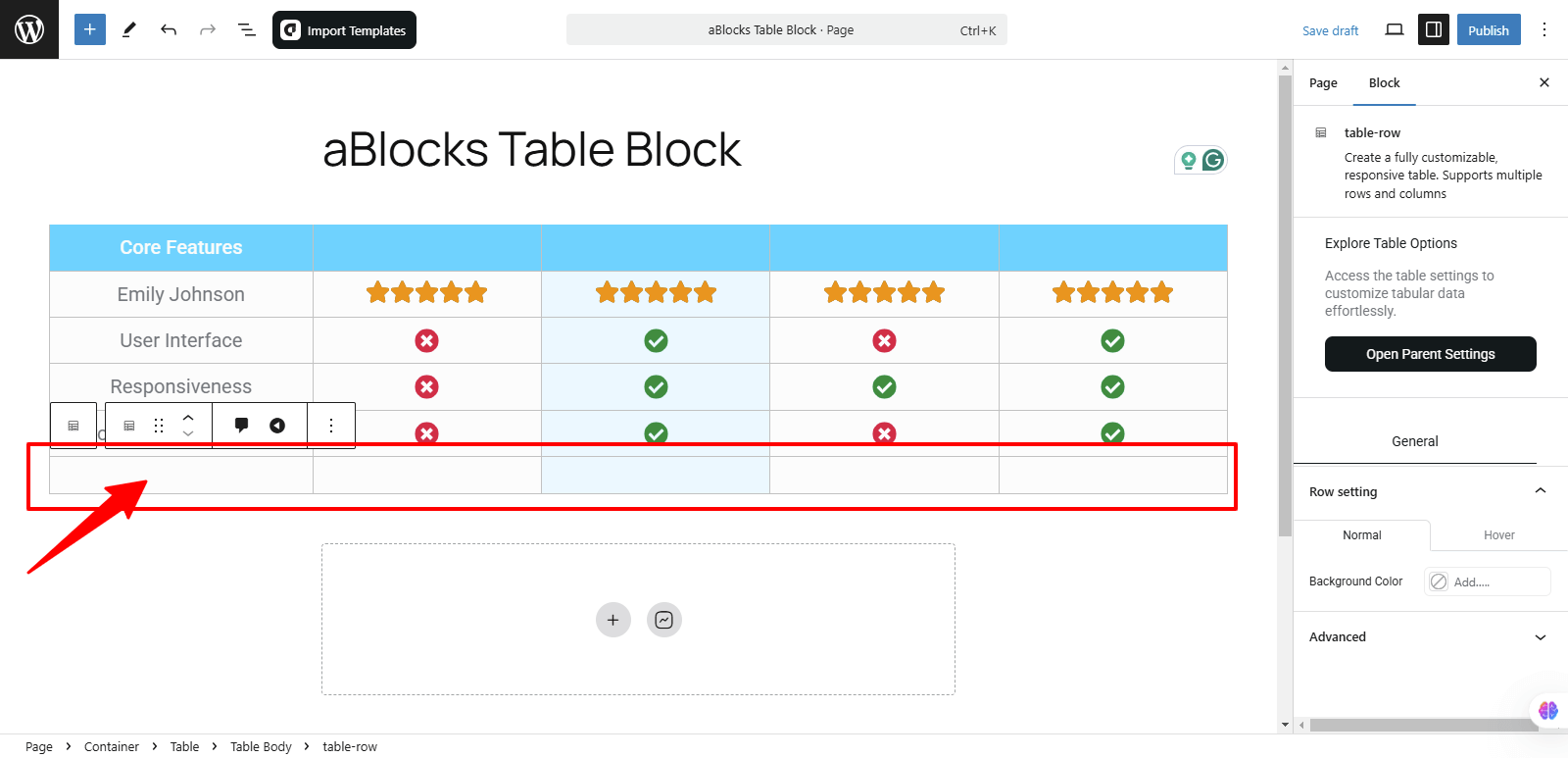
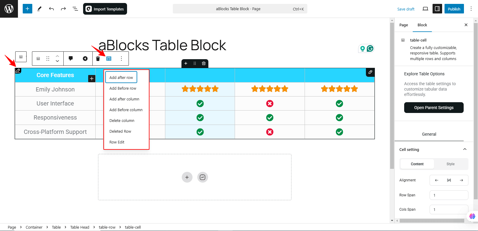
When you click the Row Edit option, then select the Table Edit option in the toolbar, a dropdown menu appears with several options to manage your table structure:
- Add After Row – Insert a new row below the selected row.
- Add Before Row – Insert a new row above the selected row.
- Add After Column – Insert a new column to the right of the selected column.
- Add Before Column – Insert a new column to the left of the selected column.
- Delete Row – Removes the selected row from the table.
- Delete Column – Removes the selected column from the table.
- Row Edit – Allows further customization of the selected row.
These options give you complete control over the table layout, making it easy to adjust rows and columns as needed.
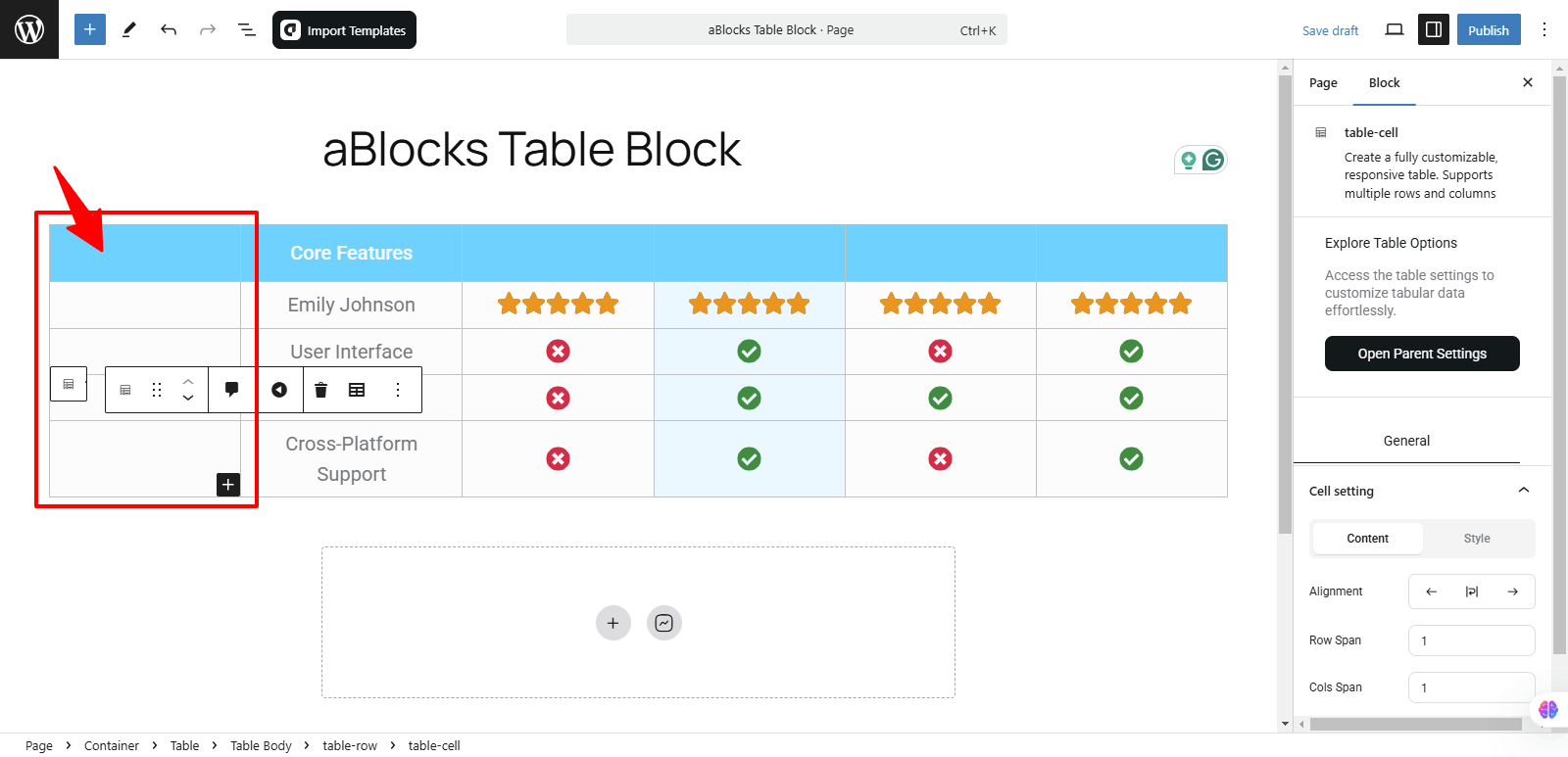
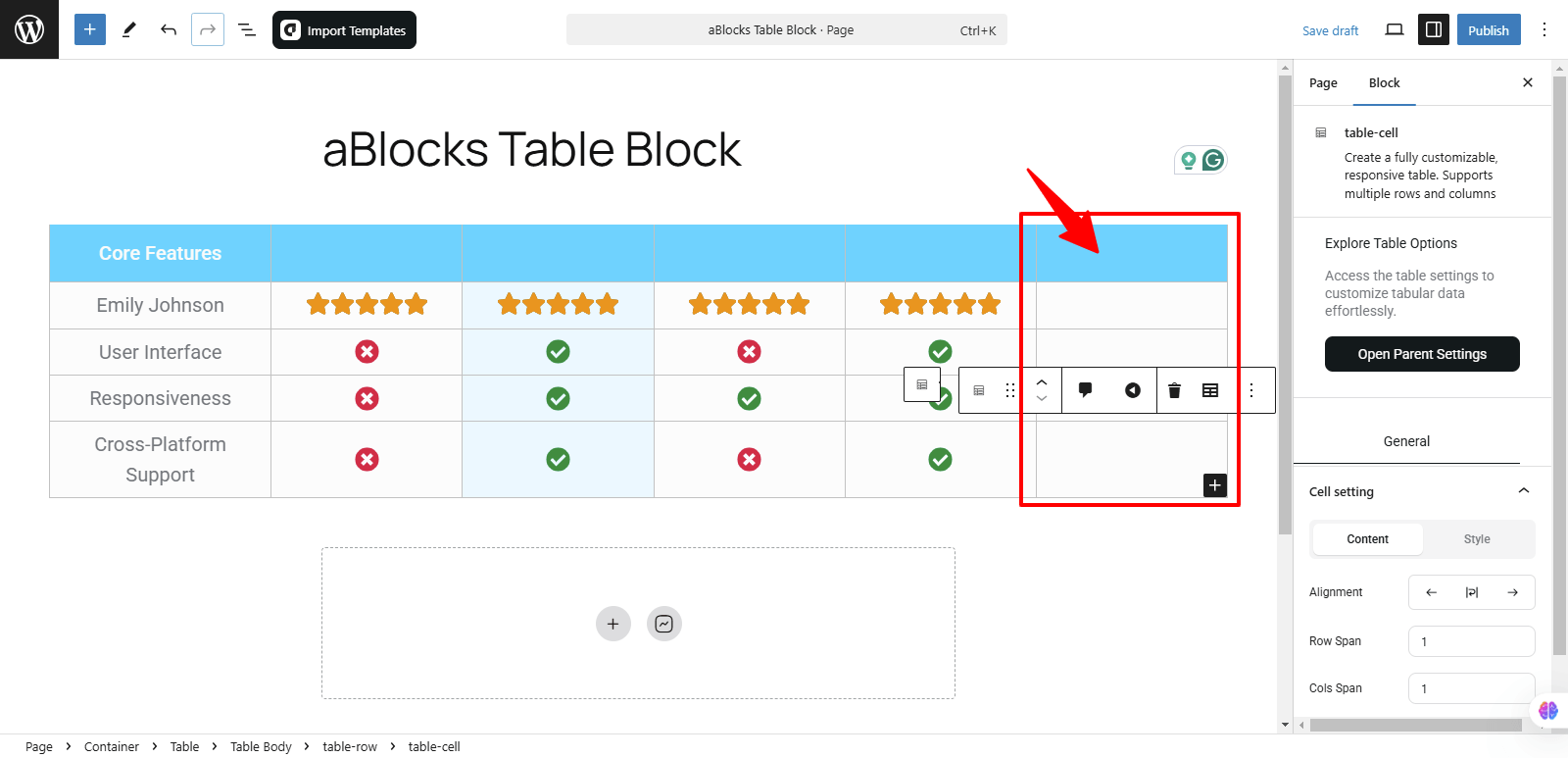
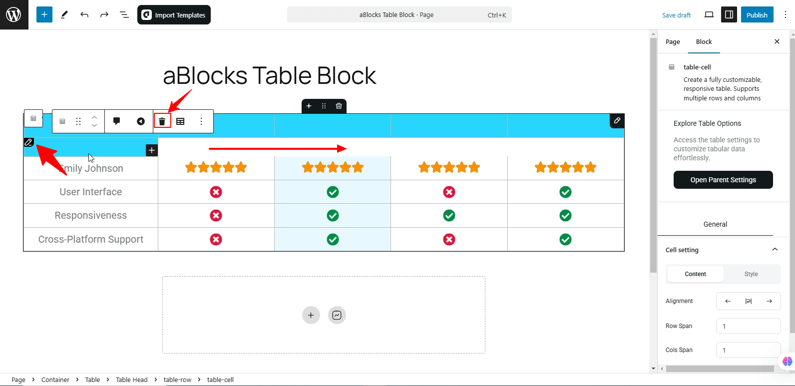
Every row and column of the table has an edit option. When you click on the edit icon, a toolbar appears, allowing you to modify the table. From this toolbar, you can find the Delete option, which enables you to remove rows or columns as needed. This feature gives you full control over your table structure, making customization simple and efficient.
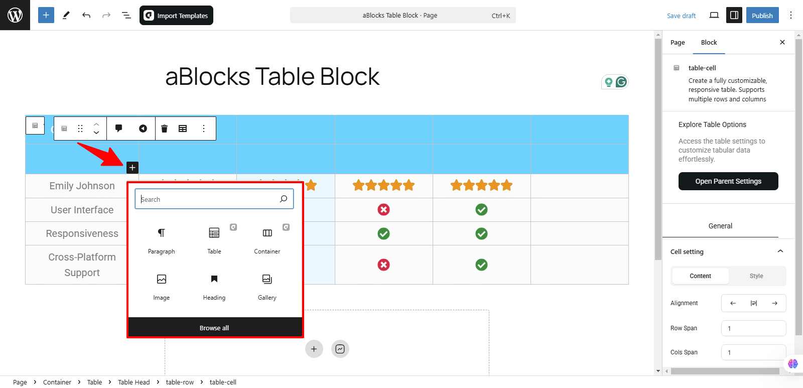
In every row and column of the table, you’ll see a (+) icon. Clicking this icon will open a menu where you can either view available blocks or use a search bar to find specific blocks. This allows you to quickly search for and add any block to your table’s rows and columns.
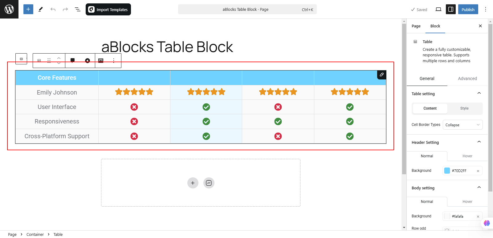
To customize the table, go to the right-side panel under Block > General. Here, you will find four customization options:
- Table Setting
- Header Setting
- Body Setting
- Advanced
Let’s go through each option in detail:
Table Setting
In the Table Setting section, you will find two tabs: Content and Style.
Content
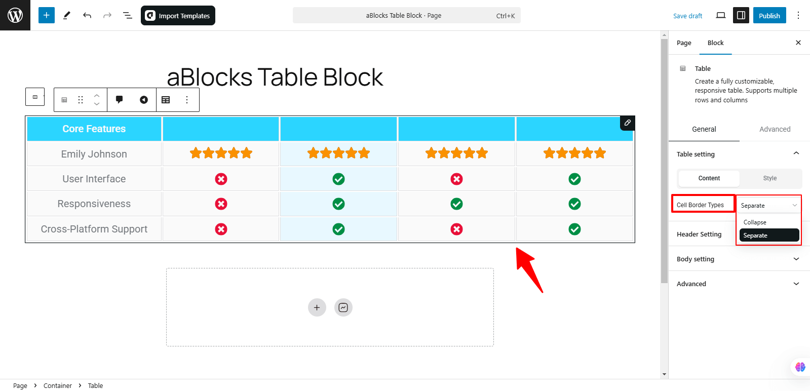
In the Content section, you will find the Cell Border Types option. This feature allows you to control the appearance of table cell borders. It includes two options:
- Collapsed – Merges the borders of adjacent cells into a single line, giving the table a more compact look.
- Separate – Each cell will have its own distinct border, creating visible gaps between cells.
These options help you customize the table’s border style based on your design preferences.
Style
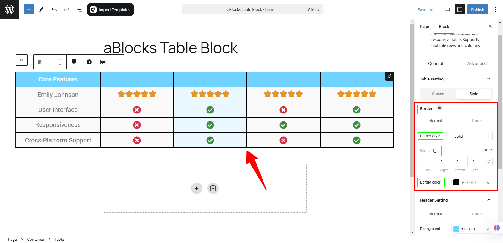
In the Style section, you will find four customization options:
- Border – Adjust the thickness of the table borders for both Normal and Hover states.
- Border Style – Choose from different styles like None, Double, Dotted, Dashed or Groove
- Width – Set the width of the table borders for a refined look.
- Border Color – Customize the color of the table borders to match your design.
These options allow you to fine-tune the table’s appearance for a polished and cohesive look.
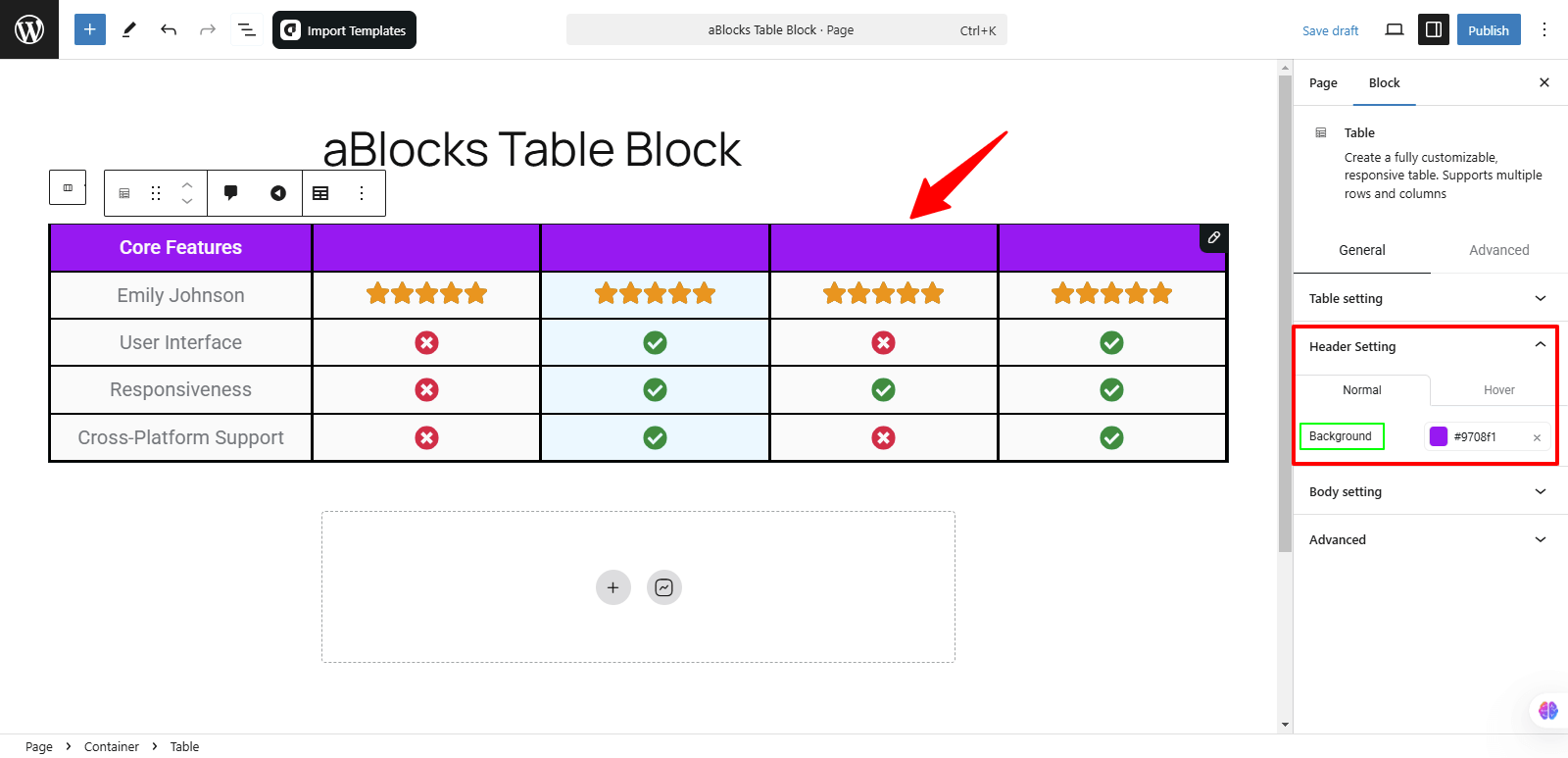
Header Setting
In the Header Setting section, you will find the Background option. This allows you to customize the background color of the table header with two settings:
- Normal – Set the default background color of the header.
- Hover – Choose a different background color that appears when users hover over the header.
These options help you enhance the visual appeal and interactivity of your table header.
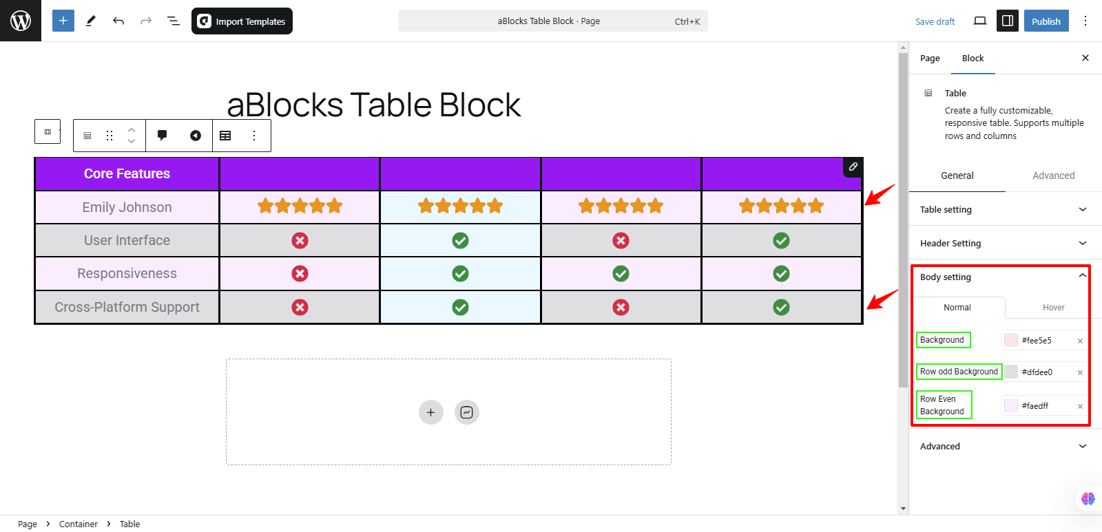
Body Setting
In the Border Setting section, you will find three background customization options:
- Background – Sets the overall background color of the table.
- Row Odd Background – Defines the background color for odd-numbered rows.
- Row Even Background – Defines the background color for even-numbered rows.
Each of these options includes two settings:
- Normal – Sets the default background color.
- Hover – Changes the background color when a user hovers over the table.
These settings help you create a visually structured and engaging table design.
The aBlocks Table Block makes creating stylish and functional tables effortless. With its user-friendly design and customization options, it enhances content presentation seamlessly. Need help? Our support team is always here for you!