


The aBlocks Counter Block allows you to display animated counters for statistics, achievements, or key metrics on your website. You can customize numbers, icons, colors, and layout to match your design, making it an engaging way to highlight important figures.
Showcase Dynamic Stats with Counter Block
Analyze course progress
Learners & Counting
Learners & Counting
Learners & Counting
Learners & Counting
In this documentation, I will guide you on how to add and customize a counter on your page or post using the aBlocks counter block.
Add Counter Block
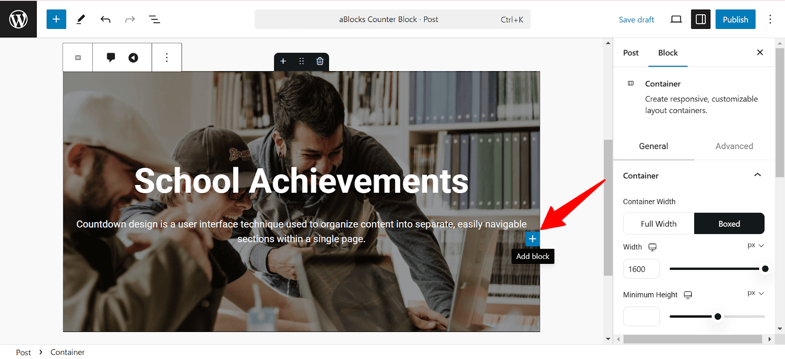
First, open your WordPress dashboard and click the edit page or post. Then navigate the section where you want to add the counter. Also, you can add the counter on a new page or post.
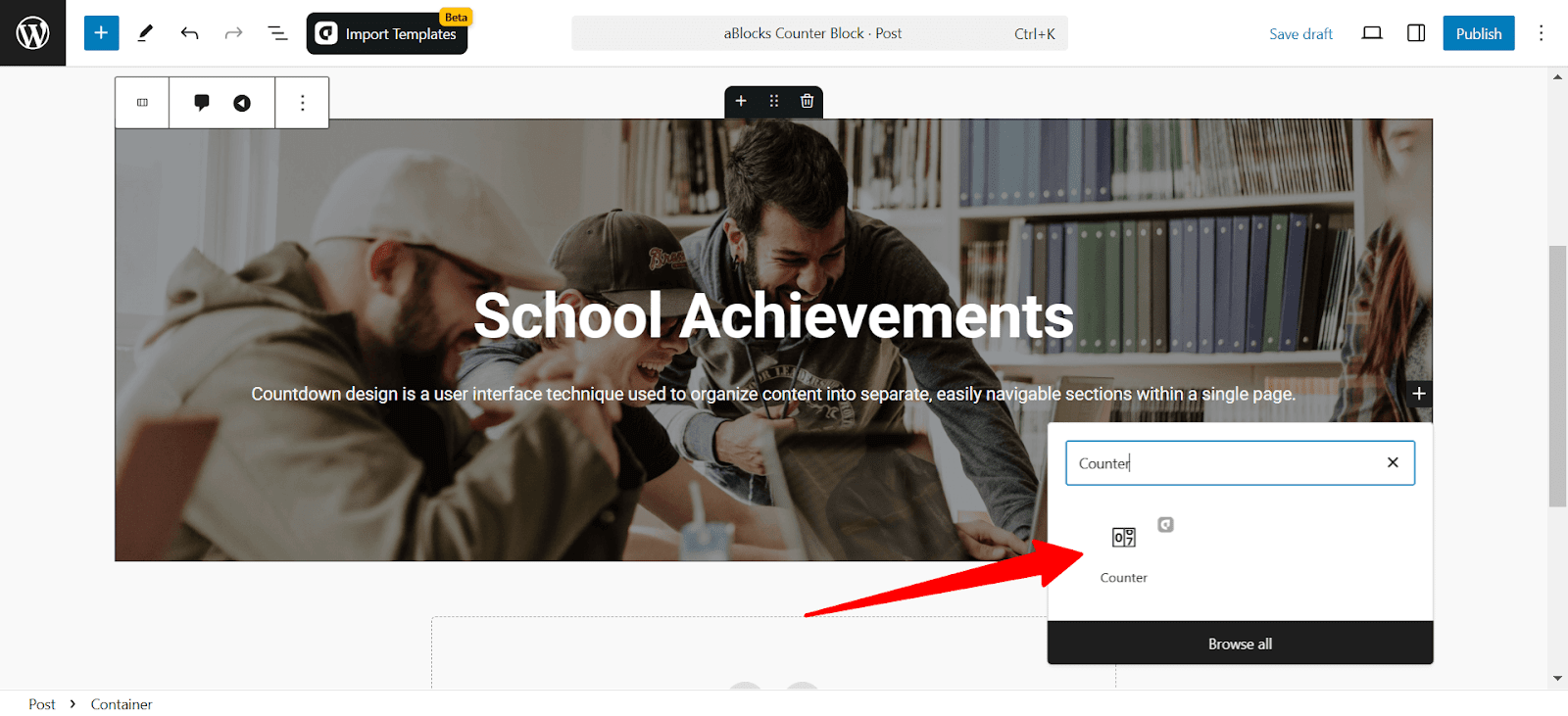
Click the plus (+) icon to add a new block.
Afterward, find the “Counter” from the search option. Simply just click on the aBlocks counter block.
To customize it, go to the right-side panel Block>General and explore the large library of aBlocks counter block customization options.
Let’s describe one by one.
Counter Block Customization
Counter
The Counter section lets you set the number, animation, and layout of the counter block. You can define the starting and ending values, adjust the speed, and control how the counter appears on your site.
- Alignment: Adjust the counter’s alignment. Choose between: Left, Center, and Right.
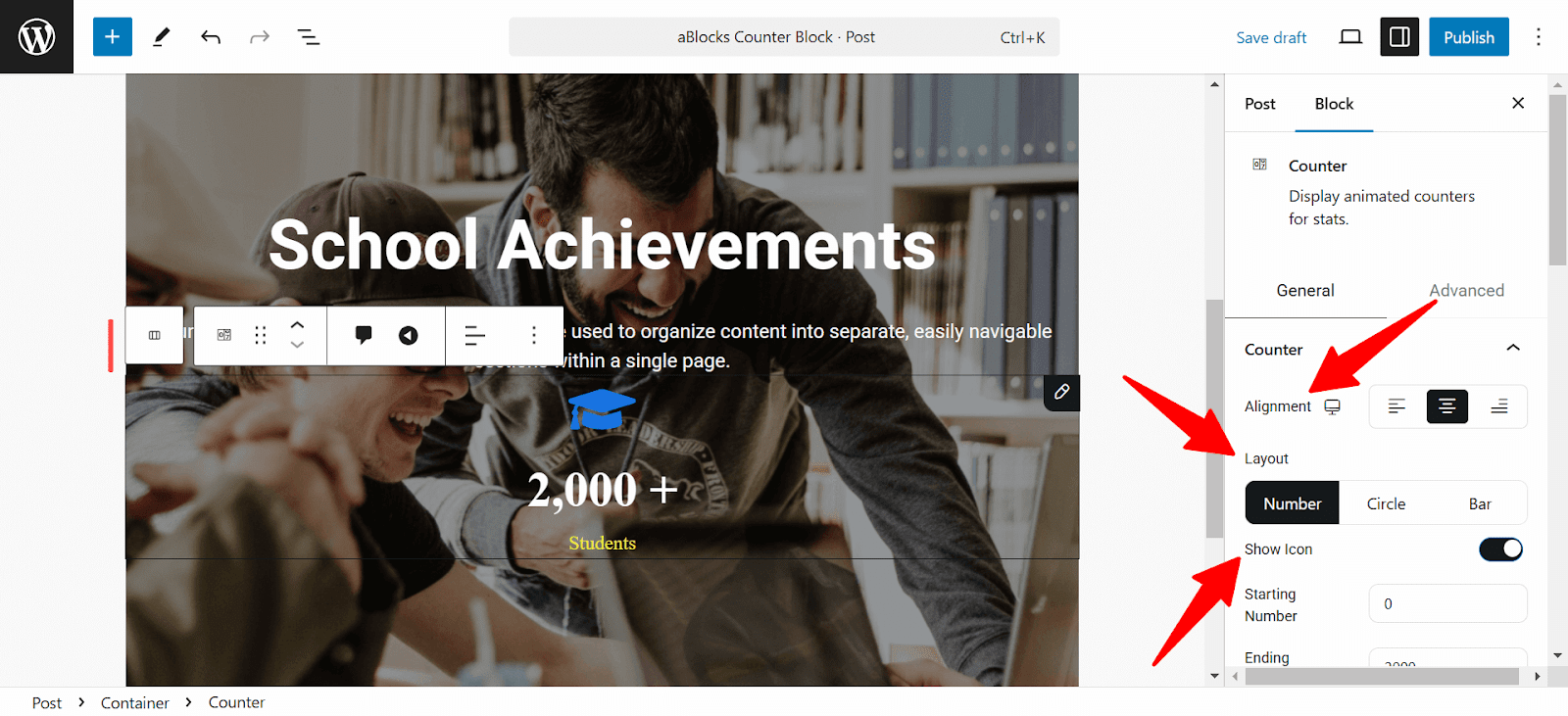
- Layout: Choose and select the counter layout as:
- Number: Displays the count as a numeric value.
- Circle: Wraps the count in a circular progress style.
- Bar: Displays the count in progress as a bar.
- Show Icon: Toggle to display or hide an icon with the counter.
- Starting Number: Set the starting number of your counter.
- Ending Number: Define the final value to which the counter will count.
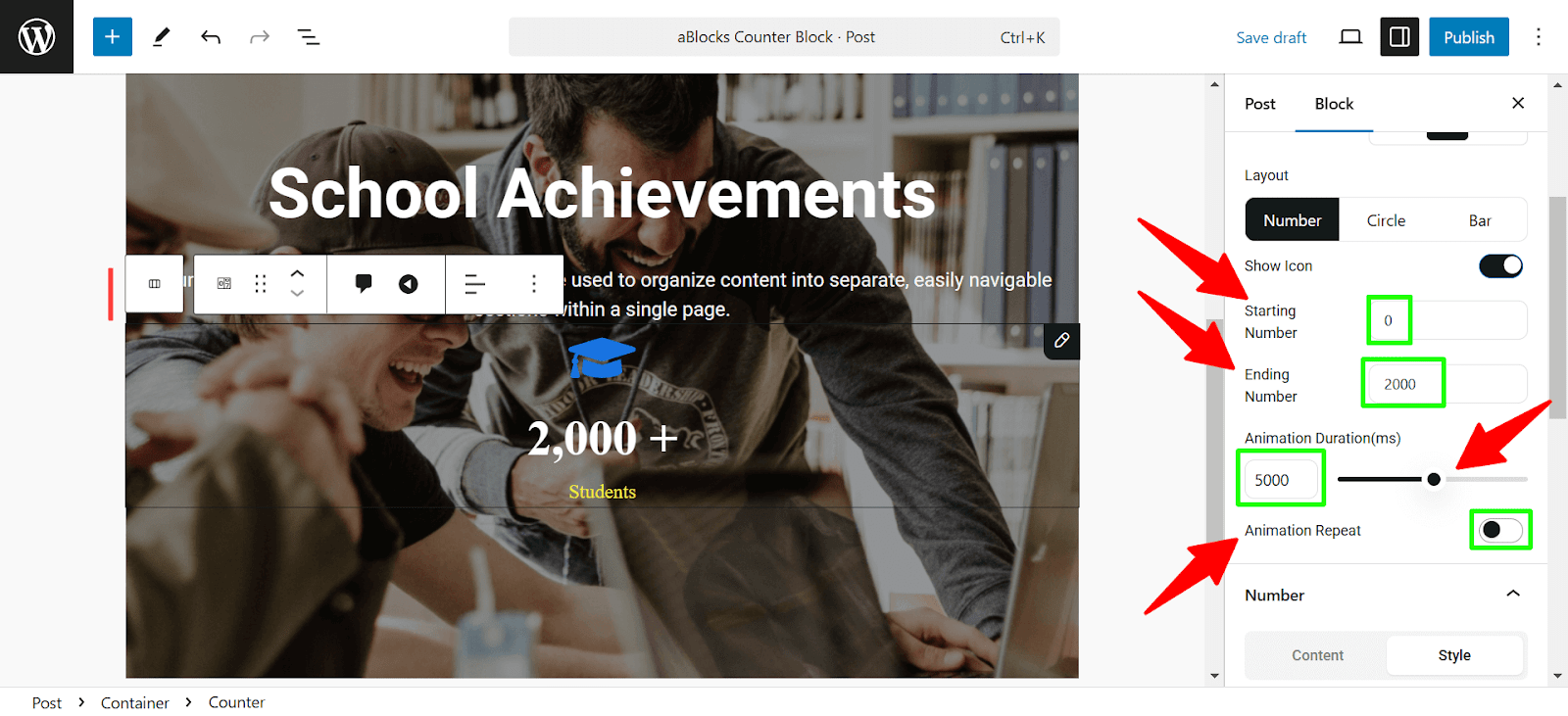
- Animation Duration (ms): Set how long the animation will take, in milliseconds. Use the slider or input a custom value.
- Animation Repeat: Toggle this option to repeat the counter animation continuously.
Number Settings
This section focuses on customizing the numerical content and formatting of the counter.
Content:
- Decimal Places: Set the number of decimal points to be displayed on the counter.
- Number Prefix: Add a prefix to the number.
- Number Suffix: Add a suffix to the number.
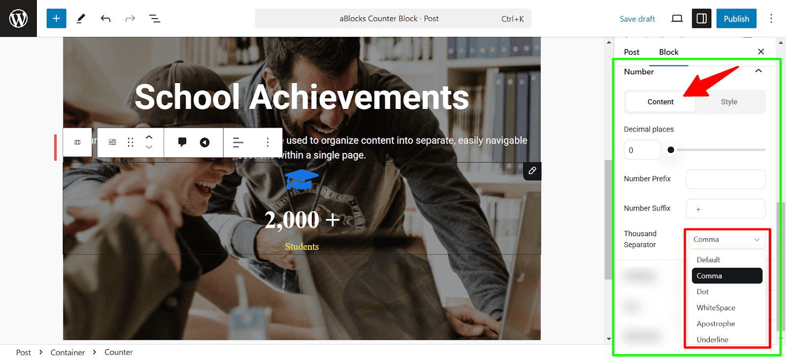
- Thousand Separator: Choose the format for thousands:
- Comma (e.g: 1,000)
- Period (e.g: 1.000)
- Space (e.g: 1 000)
- Default (no separator)
Style
This section allows you to style the number display:
- Color: Customize the number’s color by selecting or inputting a color code. To learn more, check out the aBlocks Advanced Color Settings documentation.
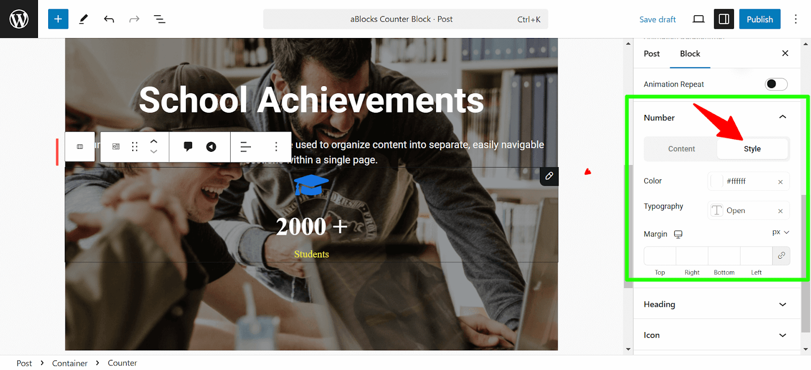
- Typography: Adjust the font family, size, weight, transform, style, decoration, line height, letter spacing, and word spacing. To learn more check out the aBlocks Typography Settings documentation.
- Margin: Use the input boxes on each side to modify the margin around the number. Click the link icon to avoid customizing parallelly and customize independently for each side.
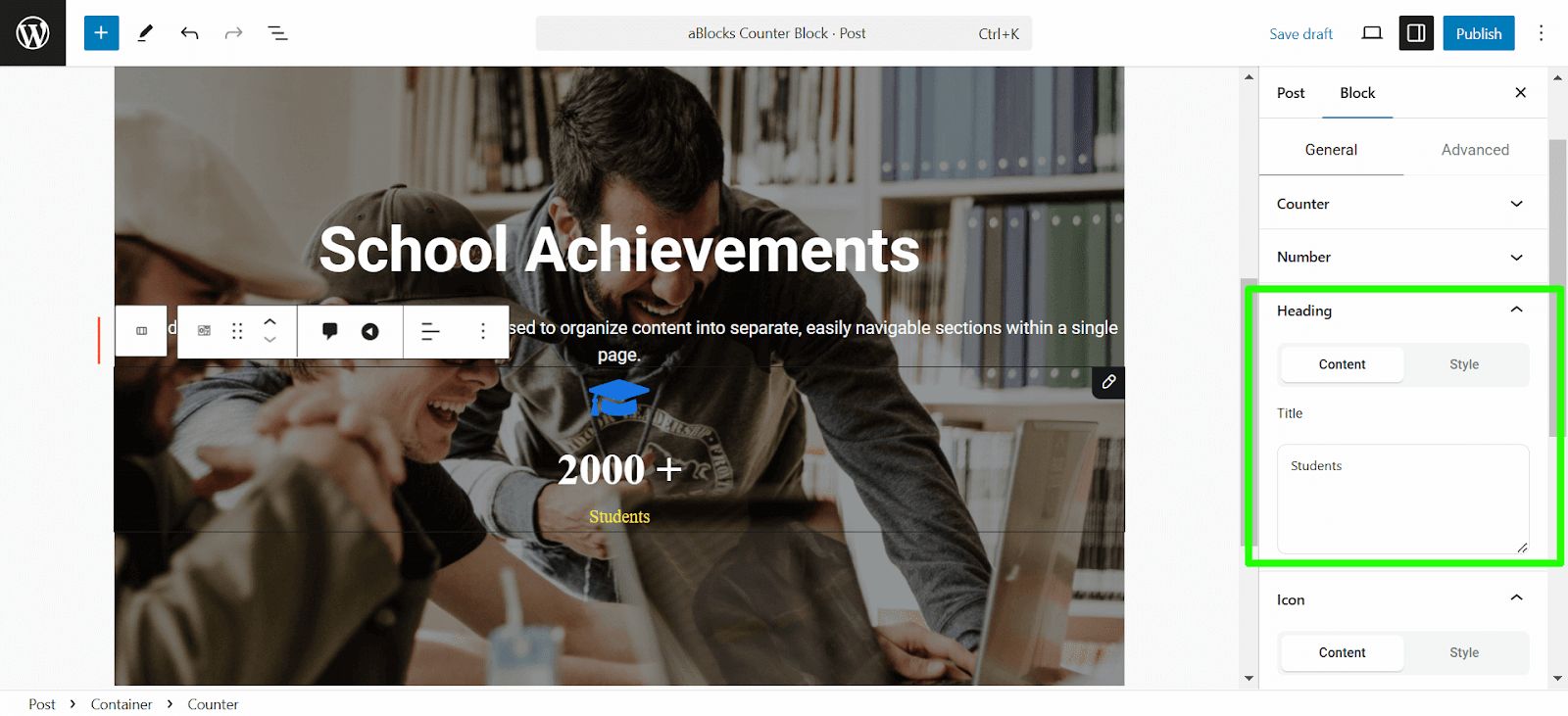
Heading Settings
The Heading settings allow you to control how the title appears in your Counter block.
Content:
- Title: Write the title on the title box that shows on your counter.
Style:
- Color: Choose a color for the heading text.
- Typography: Adjust the font family, size, weight, transform, style, decoration, line height, letter spacing, and word spacing.
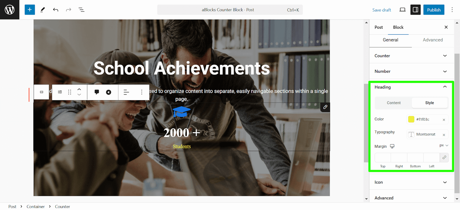
- Margin: Use the input boxes on each side to modify the margin around the heading. Click the link icon to avoid customizing parallelly and customize independently for each side.
Icon Settings
The Icon settings define the icon that appears in the Counter block.
Content
- Position: Options to choose where the icon is placed relative to the counter number:
- Top
- Bottom
- Left of Number
- Right of Number
- Icon: Choose from a library of icons to represent your counter, or upload your own image or custom icon.
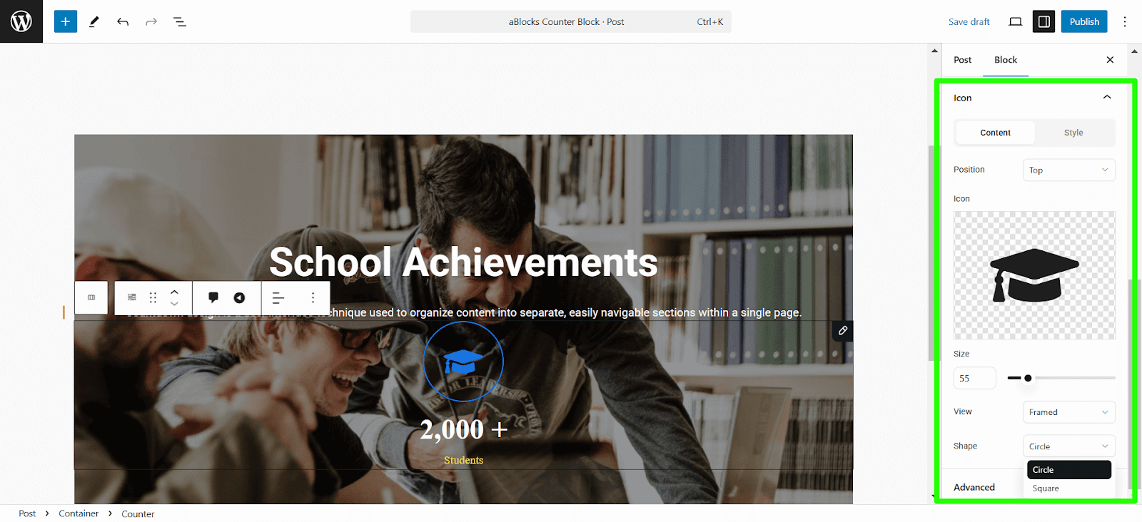
- Size: Set the size of the icon.
- View: Options for how the icon appears:
- Default: Regular icon without extra design.
- Stacked: Icon stacked with other elements.
- Framed: Icon with a frame.
- Shape: Select the shape of the icon:
- Circle
- Square
Style
- Primary Color: Select the main color for the icon. This will define the icon’s appearance.
- Background Color: Add a background color to the icon to enhance its visibility.
- Rotate: Adjust the rotation angle of the icon in degrees
- Padding: Define the space between the icon and its container. You can set different values for the Top, Right, Bottom, and Left.
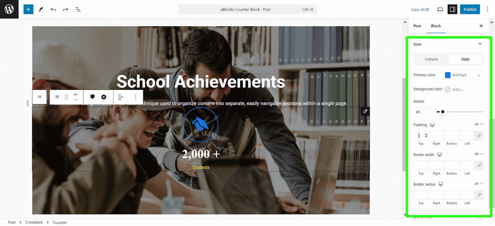
- Border Width: Set the thickness of the border around the icon. Separate values can be applied for: the Top, Right, Bottom, and Left.
- Border Radius: Control the roundness of the icon’s border. Separate values can be applied for: the Top, Right, Bottom, and Left
Similarly, you can add a Circle counter and a Bar counter. The circle counter and bar counter settings are similar to those of the number counter.