


The aBlocks Social Shares Block lets you add share buttons to your posts or pages, so visitors can easily share your content on platforms like Facebook, Twitter, LinkedIn, and more—no coding needed. This guide walks you through how to add and customize it step by step.
How to Add the Social Shares Block
Open your WordPress dashboard and select the page or post where you want to add social shares.
Click the ( + ) icon to open the block options.
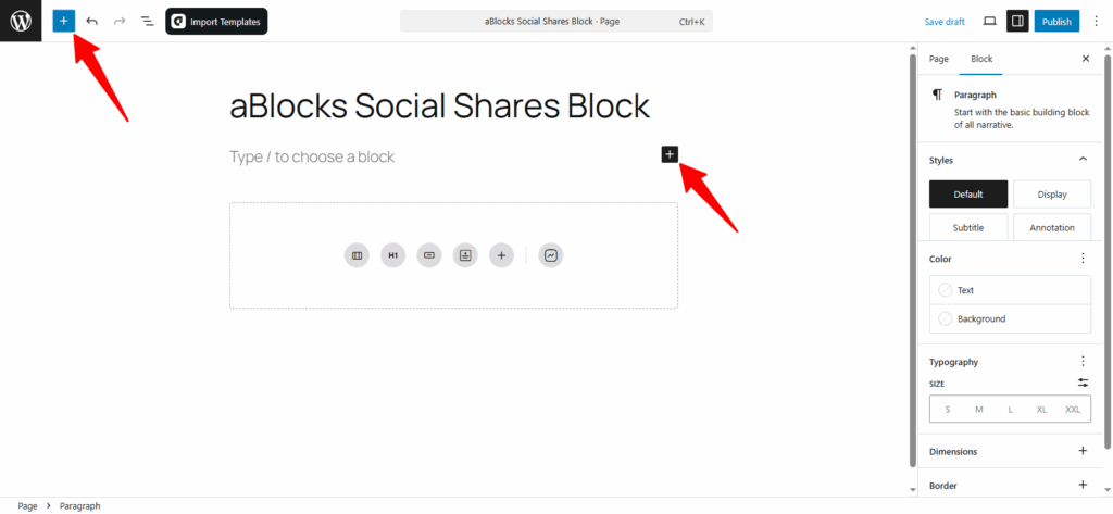
You’ll see all available aBlocks blocks. You can scroll to find the Social Shares Block or type Social Shares Block in the search bar for quick access.
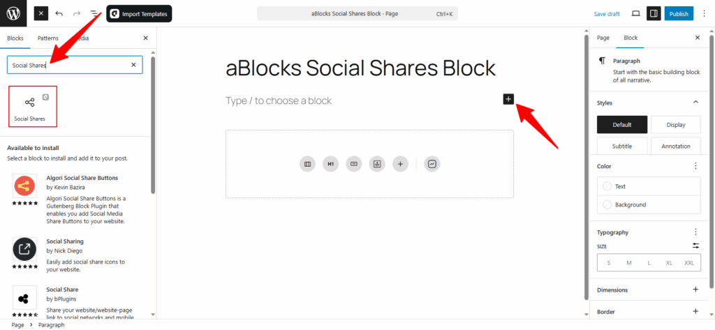
Now, select the aBlocks Social Shares Block and click to add it. Then customize it to match your site’s style.
Customize the aBlocks Social Shares Block
We’ll walk you through how to use and customize the aBlocks Social Shares Block step by step.
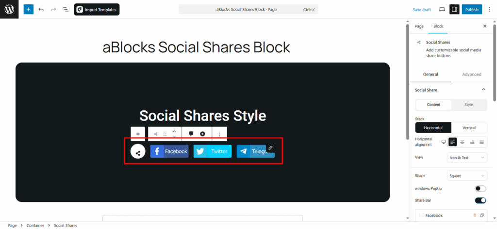
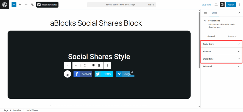
Go to the right panel, then Block > General. You’ll find three main sections:
- Social Share
- Share Bar
- Share Items
Let’s explore each option step by step.
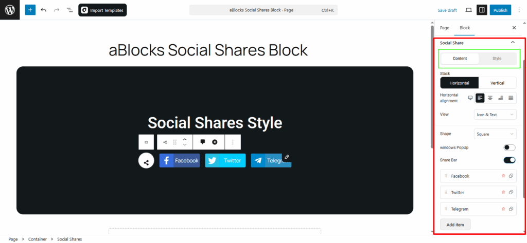
Social Share
This section has two parts: Content and Style.
Content
In the Content tab, you’ll find several settings to control how the share buttons appear. Each option lets you adjust the look and function of the buttons. Below, we’ll explain each setting one by one.
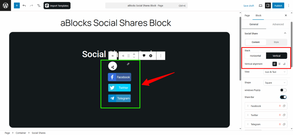
Stack: This option lets you choose how the buttons are arranged — Horizontal or Vertical.
- If you choose Horizontal, you’ll see a Horizontal Alignment option (Flex Start, Center, Flex End, Space Between).
- If you choose Vertical, you’ll get a Vertical Alignment option (Left, Center, Right).
Pick the one that fits your layout best.
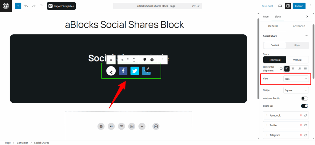
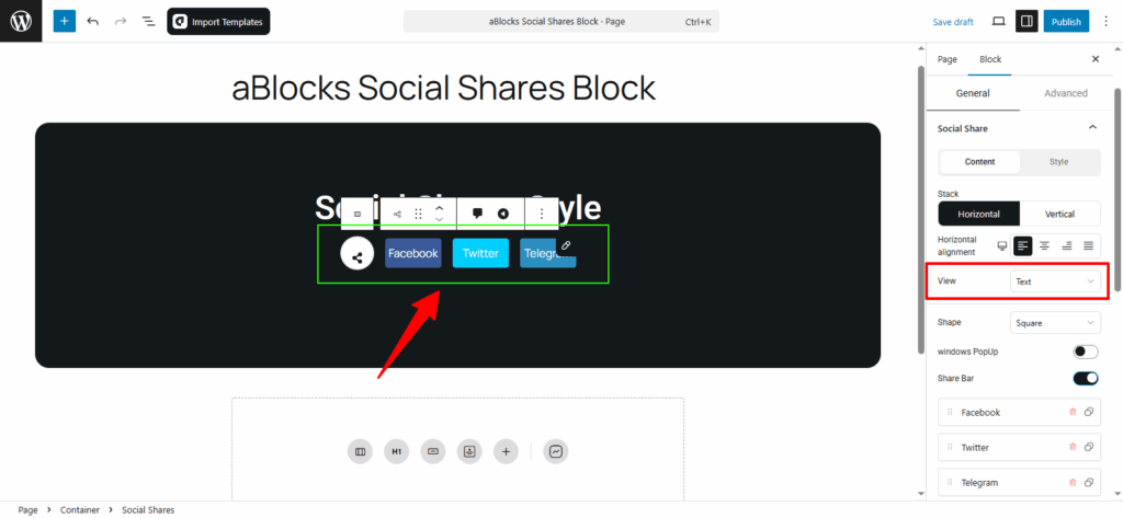
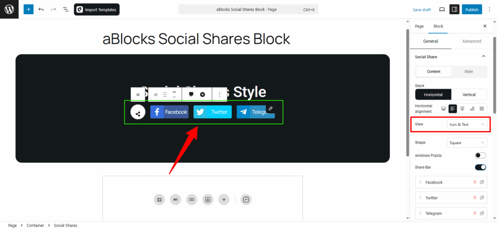
View: This option controls how the share buttons are shown. You have three choices:
- Icon: Shows only the social media icons.
- Text: Shows only the platform names (like Facebook, Twitter, Telegram).
- Icon & Text: Shows both icon and text together.
Choose the one that fits your design.
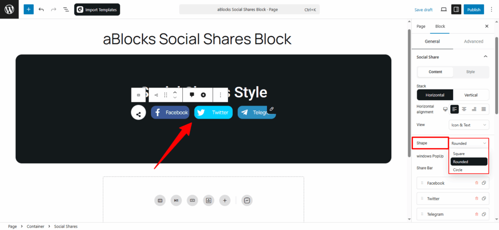
Shape: Choose the button shape (Square, Rounded, or Circle) based on your design preference.
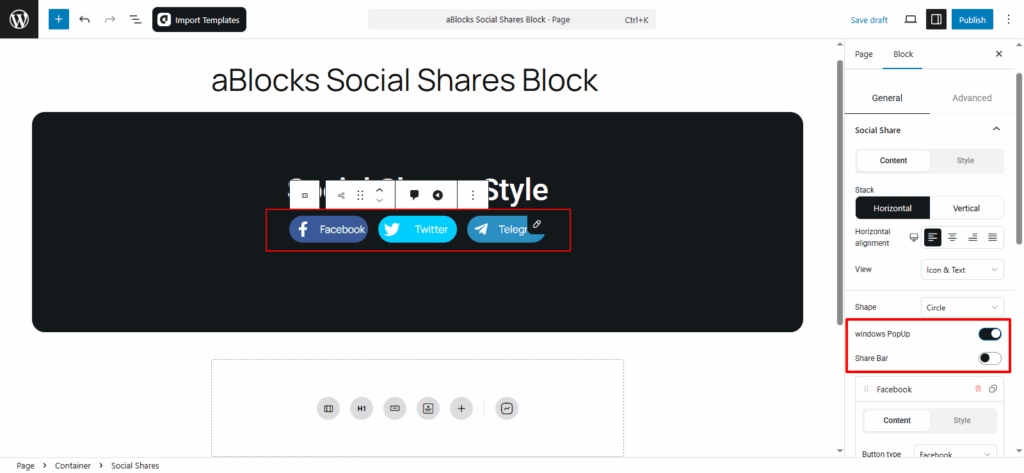
Windows PopUp: Turn this on to open a PopUp window when someone clicks a share button, making it easier to share the post.
Share Bar: Use the toggle to show or hide the entire share bar on your page.
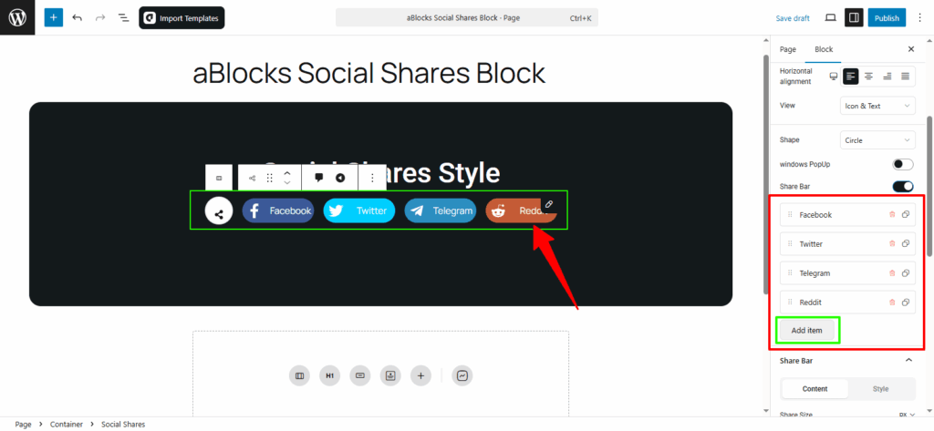
Under the Share Bar, you’ll see all your social share buttons.
You can click Add Item to add a new button or click Delete to remove any button you don’t need.
Now you can edit each social share button separately.
Click on any button, and you’ll see two tabs: Content and Style.
Content
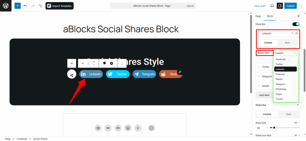
Button Type: In this option, you can choose from different button types. Pick the one that fits your needs.
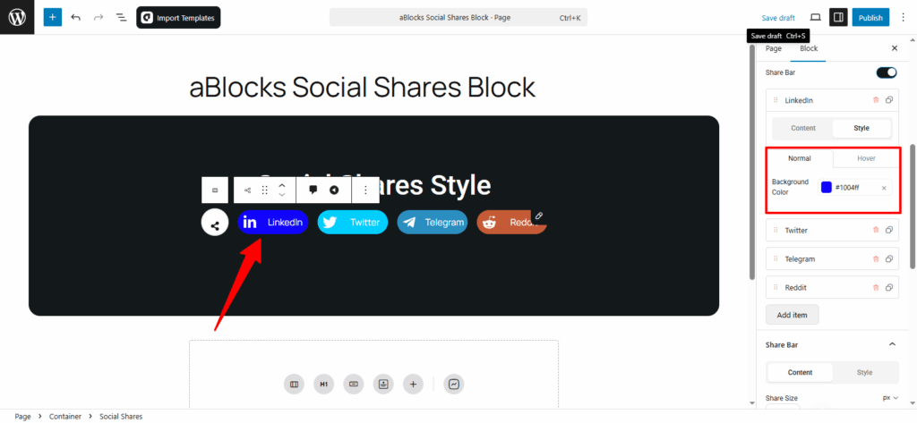
Style
In this option, you’ll find Normal and Hover settings. Each has a Background Color option, allowing you to customize the colors as needed.
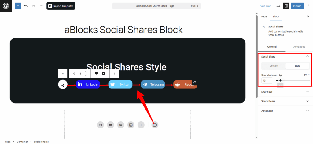
Style
Space between: Control the gap between social share buttons. Increase the value for more space, decrease it to bring buttons closer.
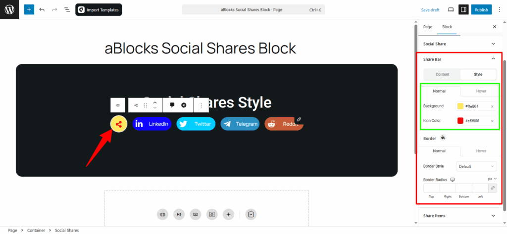
Share Bar
This section has two parts: Content and Style.
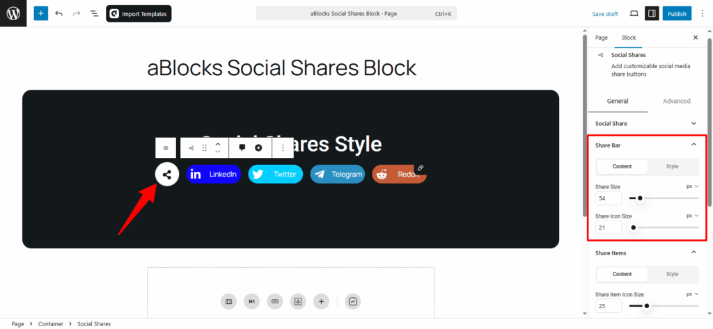
Content
In the Content tab, you’ll find two options:
Share Size: Adjust the overall size of the share bar.
Share Icon Size: Adjust the size of the share icons.
Style
In the Style tab, you’ll see Normal and Hover options. Both have similar customization settings.
- Normal: This is the default state of the share bar.
- Hover: This is the state when someone hovers over the button, and you can change its appearance.
Background: You can change the background color of your share bar.
Icon Color: You can change the color of the icons in the share bar.
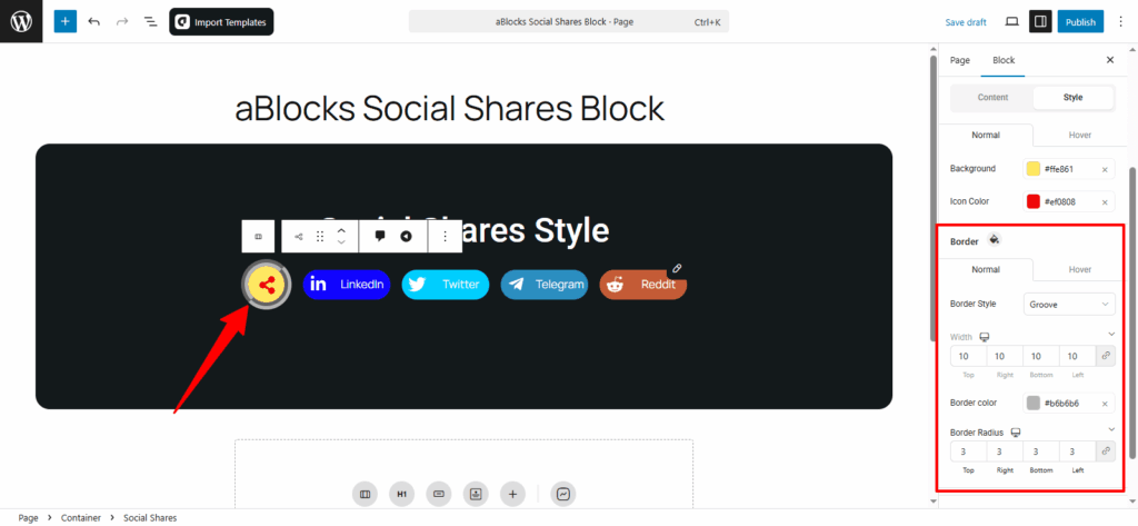
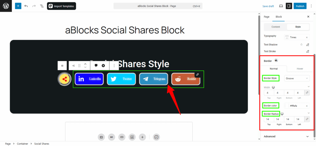
Share Bar Border Customization
You’ll see Normal and Hover options, just like before. Here’s what you can customize:
Border Style: Choose from several border styles like: None, Solid, Double, Dotted, Dashed and Groove. Easily change the border style of your share bar.
Width: Adjust the width of your share bar.
Border Color: Change the color of the border.
Border Radius: Adjust the border radius to make the edges more rounded or sharper.
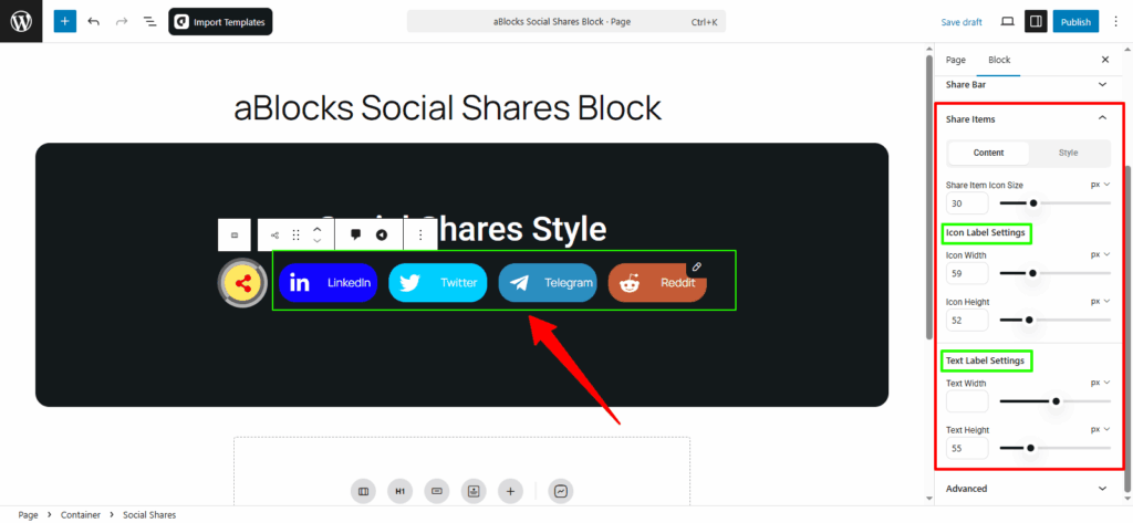
Share Items
In this section, you’ll find two main options: Content and Style. Each option has various customization settings. Let’s go over the Content options.
Content
Share Item Icon Size: You can adjust the size of the icons for each share item.
Icon Label Settings:
- Icon Width: Change the width of the icon.
- Icon Height: Adjust the height of the icon.
Text Label Settings:
- Text Width: Customize the width of the text label.
- Text Height: Adjust the height of the text label.
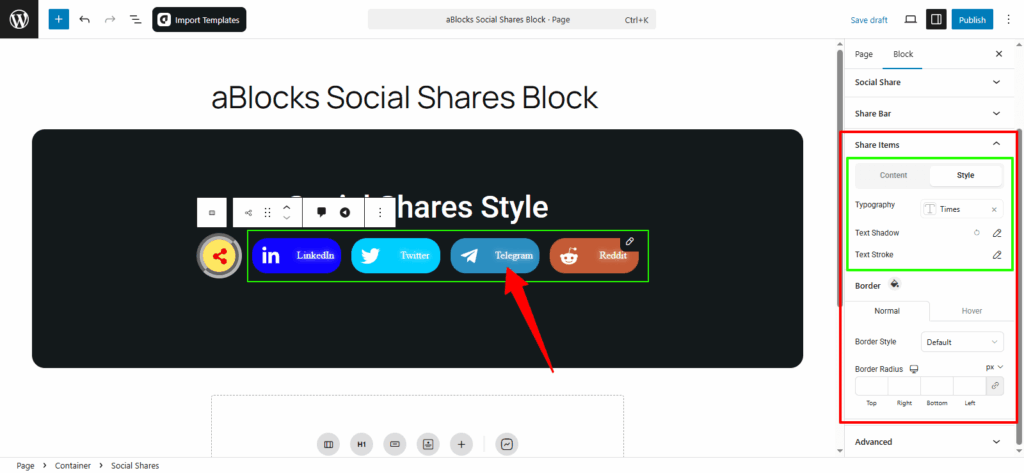
Style
Typography: In this section, you can easily customize the text style of your share items. For full details on each option, check the aBlocks Typography Settings documentation.
Text Shadow: This section includes four settings to style the text of your share items. For full guidance, see the aBlocks Text Stroke and Text Shadow documentation.
Text Stroke: You’ll find two options here to refine the text appearance of your share items. For complete instructions, visit the aBlocks Text Stroke and Text Shadow documentation.
Share Items Border Customization
You’ll see Normal and Hover options, just like before. Here’s what you can customize:
Border Style: Choose from styles like None, Solid, Double, Dotted, Dashed, and Groove. You can easily update the border style of your share items.
Width: Adjust the border width of your share items.
Border Color: Change the color of the border.
Border Radius: Control how rounded or sharp the corners appear.
Conclusion
The aBlocks Social Shares Block gives you full control over how your social sharing buttons look and function. From layout and style to icon size and borders—everything is easy to customize without any coding.
If you have any questions or need assistance, feel free to contact our support team. We’re here to help!