


Hello aBlocks Lovers. Welcome to aBlocks Border Settings documentation. The Border Settings in aBlocks let you easily control how borders look around your blocks. You can quickly adjust the borders’ width, style, and color to create clear divisions or bold outlines that make your layout stand out.
You can customize any block borders. For tutorial purposes, I have taken a container to show you the border settings.
Let’s dive deep into the Border Settings documentation
Navigate the Border Settings
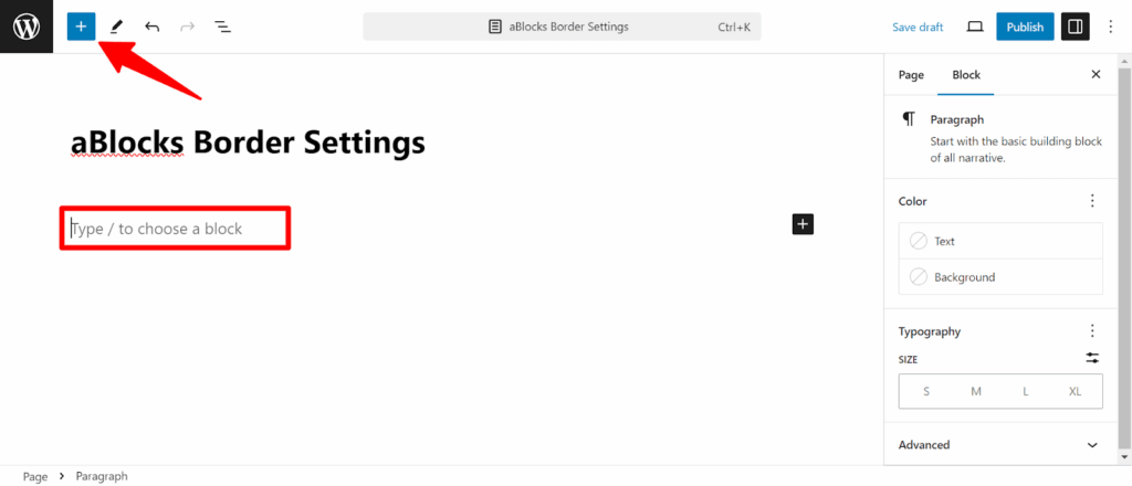
First of all, take a container by clicking the plus (+) icon from the top left of your page or post. After clicking you will see all the blocks of aBlocks.
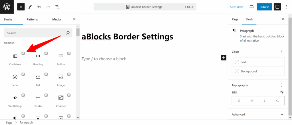
You can also find out the blocks by typing Slash ( / ) on the page. Now select the container block.
The container will appear on your page. To customize the border we need one more container in the previous container.
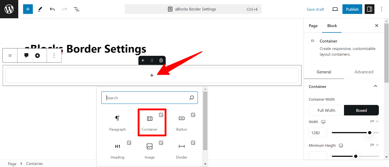
To take the new container click on the Plus ( + ) icon you will see a new popup, find the container block here and click on that.
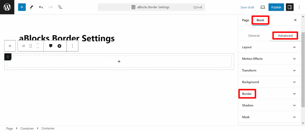
Now select the latest taken container by clicking on it. Now to customize the container make sure you are in the Block>Advanced section and navigate the Border settings. Now simply click on that.
You will see two different customization panels here. The first one is Normal and the second one is Hover. all the customization options here,
Normal
In the normal section, You will see so many customization options available. We’ll explore them one by one.
Border Style
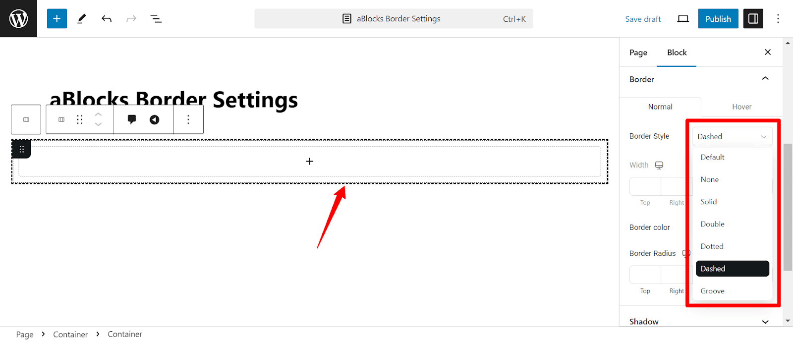
On the border style, you can change the style of your border. You can make it solid, Double, Dotted, Dashed, and Groove. If you want to customize the border style as your own there is the option to do that named Width.
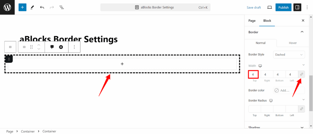
Width
In the Width, you can change the customize of your border. If you want to customize the border parallelly just change the value of any border in the width box. Additionally, if you want to customize it more specifically then deselect the Link Value Together. Then you can change the border to Top, Right, Bottom, and Left specifically.
You will see a monitor symbol beside the Width. You can see a preview of your style by clicking on it. You can see different devices pewview mobile, Tablet, and PC.
Now scroll down a bit, you will see the Border Color.
Border color
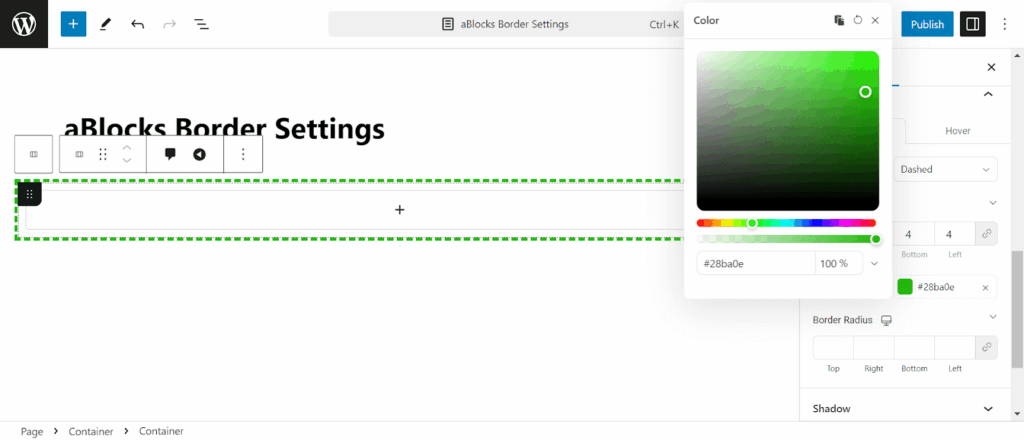
You can change the border color from here. Customize the color to align the border to your brands. To learn more about the color please follow our Advanced Color Settings documentation.
Border Radius
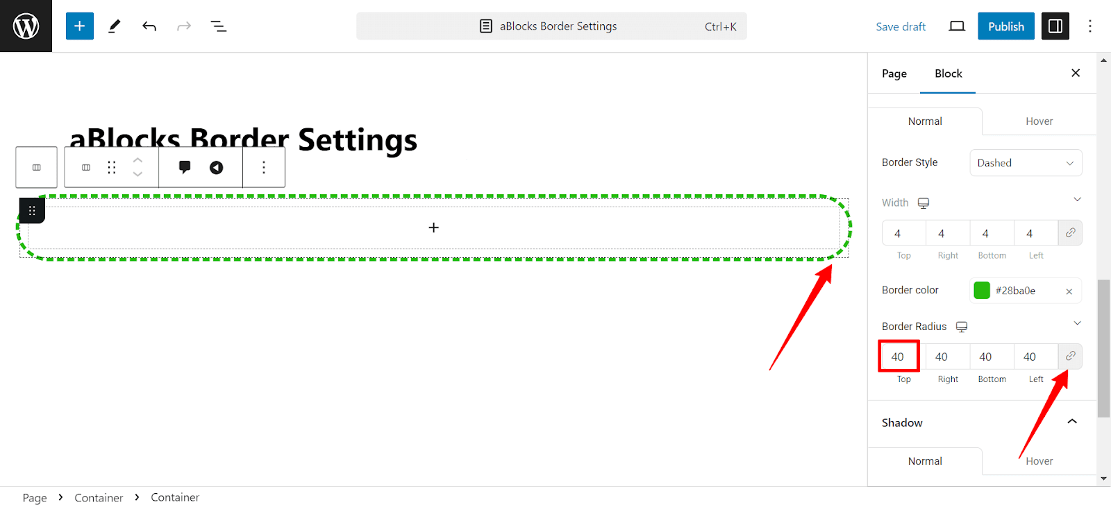
In the Border Radius, you can change the corner style of your border. If you want to customize the border corner parallelly just change the value of the border in the border radius box. Additionally, if you want to customize it more specifically then deselect the Link Value Together and change the border to Top, Right, Bottom, and Left specifically.
Here is all about the normal customization. Now Hover
Hover
The hover is the same as the normal section. People see the style of your hover by hovering over it. Also, an amazing option is available here which is Transition Duration. The transition Duration option manages the time duration of changing the normal border to hover border style. The duration is measured in seconds, you can change the time duration by dragging the pointer left or right, also you can do that by putting a value on the Transition Duration box.