


The aBlocks Image Hotspot block allows you to place clickable hotspots on any image—perfect for showcasing product features, highlighting details, or adding links and tooltips. This block makes your visuals interactive and helps visitors explore key elements directly from the image. In this documentation, we’ll guide you through how to add, edit, and customize the Image Hotspot block using the aBlocks plugin in the Gutenberg editor.
Open the WordPress Editor
Navigate to your WordPress dashboard.
Go to Pages or Posts and open an existing one or create a new page/post.
This will launch the Gutenberg editor.
Insert the aBlocks Image Hotspot Block
Click the + (Add Block) button in the editor where you want to place the hotspot image.
In the block search bar, type “Image Hotspot”.
Select the aBlocks Image Hotspot block.
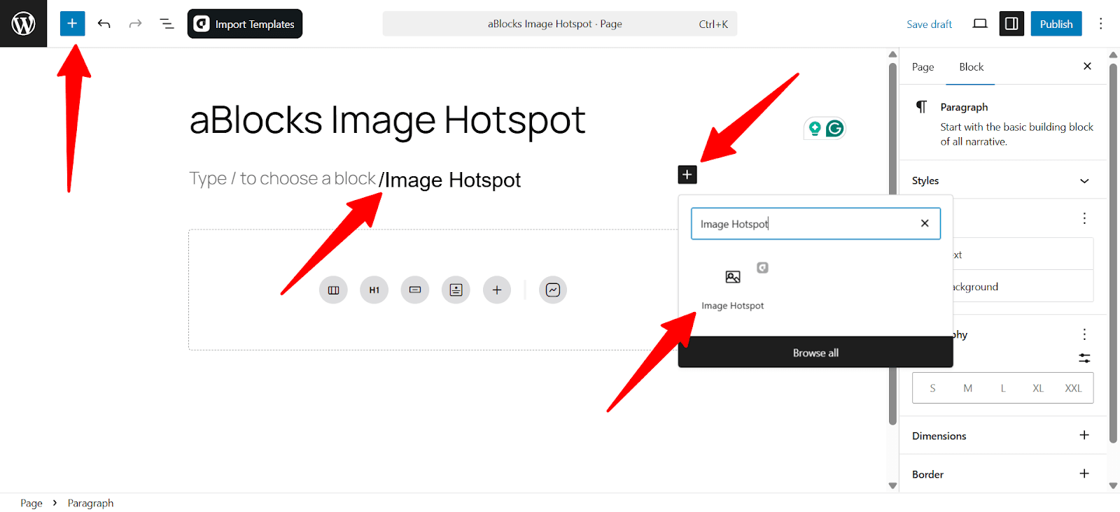
Tip: You can also type /image hotspot directly into a new block to insert it faster.
Once added, you’ll see a placeholder to upload or select your background image. You can now begin placing and configuring your hotspots.
General Settings
The General section lets you add your image, place hotspots, and set how they behave and look. Use the Content tab for setup and the Style tab for design.
Content
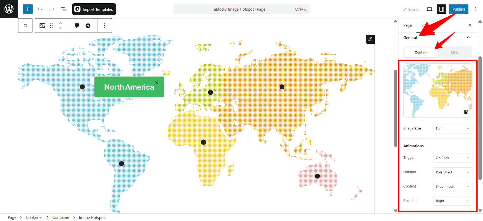
- Image: Upload the background image where you want to place hotspots.
- Image Size: Set the image display size. Choose from Full, Large, Medium, or Thumbnail.
- Animations
Trigger: Select how the tooltip appears. Options include:- On Hover: Tooltip appears when the user hovers over the hotspot.
- On Click: Tooltip shows only when clicked.
- Hotspot: Choose an animation effect for the hotspot itself. Examples include: Pulse Effect, Soft Beat, Glow, None.
- Content: Define how the tooltip content enters. Available options include:
- Slide In Left, Right, Top, Bottom, Fade In, and fade grow.
- Position: Set where the tooltip appears relative to the hotspot. Options: Top, Bottom, Left, Right.
Style
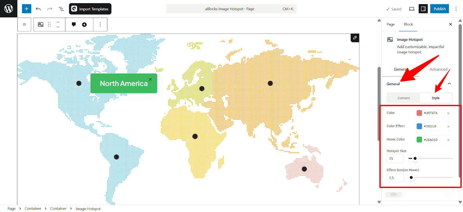
- Color: Set the base color of each hotspot.
- Color Effect: Choose a color that appears during animation.
- Hover Color: Pick a color that shows when someone hovers over a hotspot.
- Hotspot Size: Set the size of the hotspot dots.
- Effect Size (on Hover): Control how much the dot grows when hovered.
Hotspot Section
Control the appearance and position of the clickable marker. Adjust its icon, size, placement, and interaction settings to match your design needs.
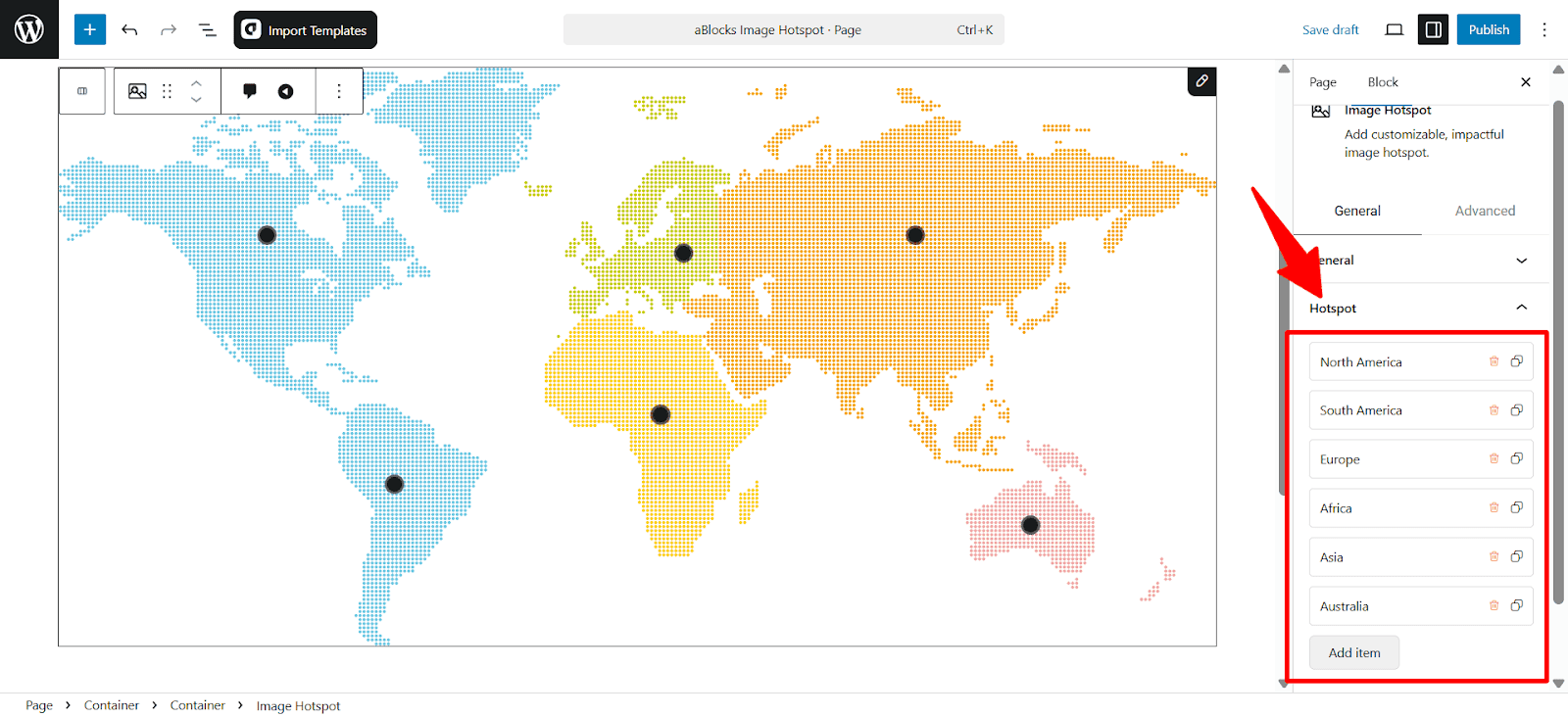
- List all hotspots by name.
- Edit or delete each one as needed.
- Add Item: Click this button to create a new hotspot on the image.
You will see the field content and style customization options when you click on any field.
Content
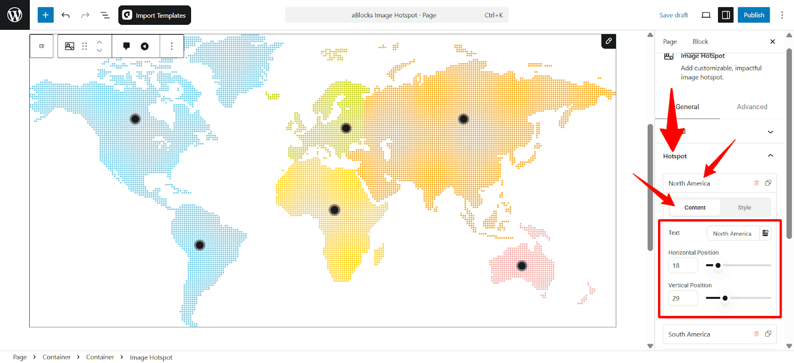
- Text: Enter the label for the hotspot (e.g., “North America”, “Asia”).
- Horizontal Position: Adjust the horizontal placement of the hotspot using the slider (0–100).
- Vertical Position: Set the vertical location using the slider (0–100).
Style
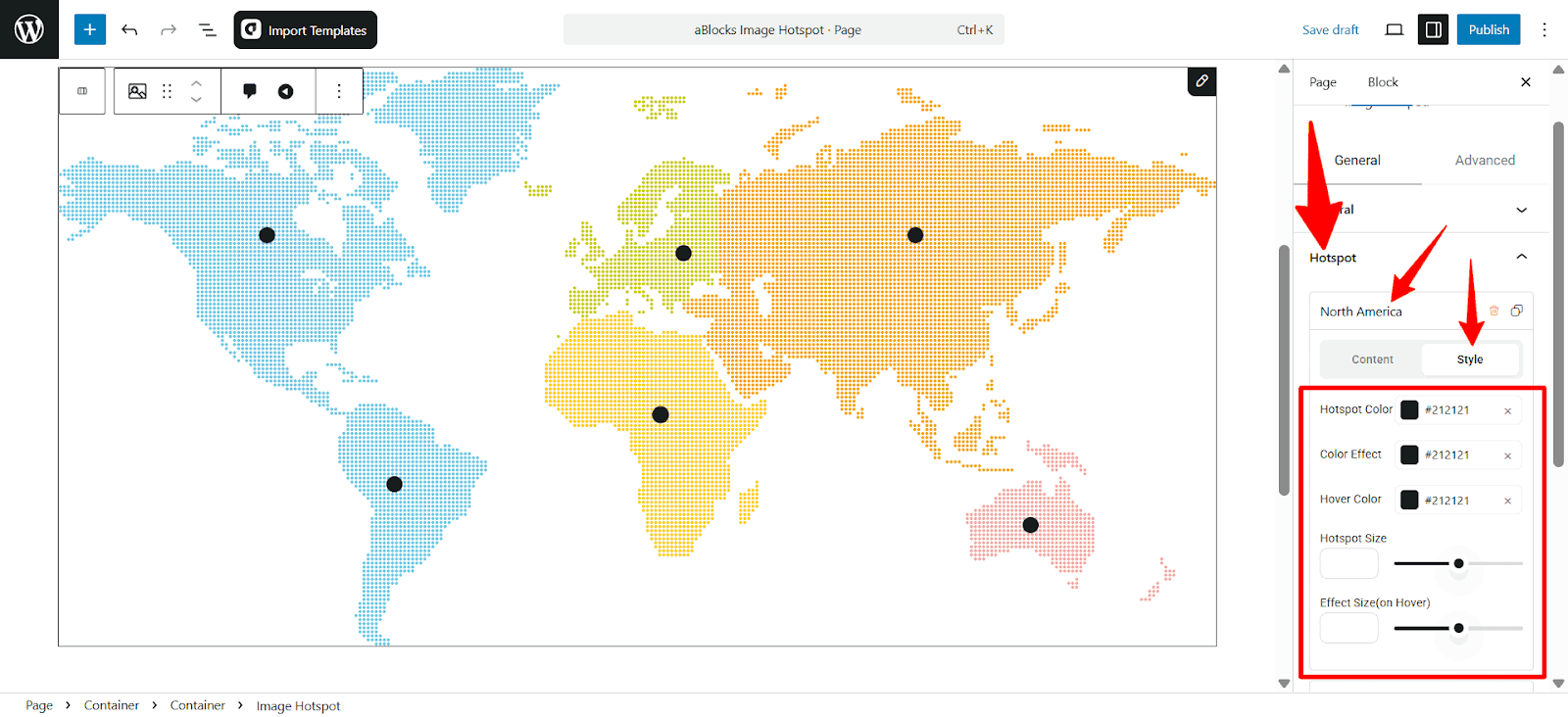
- Hotspot Color: Set the main color of the hotspot dot.
- Color Effect: Choose the color that appears as a glow or pulse effect.
- Hover Color: Set the color shown when hovering over the hotspot.
- Hotspot Size: Adjust the size of the hotspot dot using the slider.
- Effect Size (on Hover): Change the size the hotspot grows to when hovered.
Content
Set the tooltip width and background color.
Content
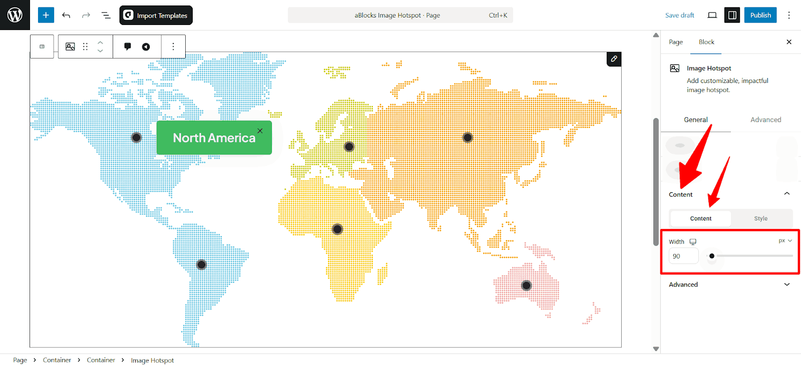
- Width: Set the maximum width of the tooltip content area in pixels. Use the slider or input box to control how wide the tooltip box should appear.
Style
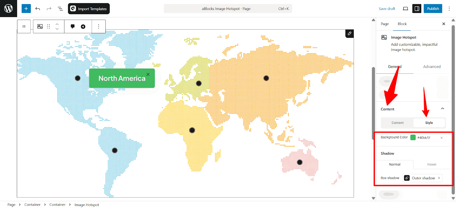
- Background Color: Choose the background color of the tooltip/content box.
- Box Shadow (Normal): Enable or disable shadow effect when content is static.
- Box Shadow (Hover): Enable or disable shadow effect when content is hovered.
Customize the Image Hotspot Child Block
The Image Hotspot Child block in aBlocks allows you to add and style individual hotspot elements on top of your image. Each hotspot can display text, icons, or interactive elements, making your images more engaging and informative.
To customize an Image Hotspot Child, follow these quick steps:
- Click on the Hotspot you want to edit directly on the image, or use the List View to select it under the “Image Hotspot” block.
- Once selected, the Block Settings will appear on the right panel.
Once selected, the Block Settings Panel will appear on the right side of the editor. This panel includes all customization options.

Each Image Hotspot Child block has a range of design settings located in the right-side block settings panel. Here’s a breakdown of each available option:
1. Width
- Controls the width of the hotspot element.
- You can set values in different units (px, %, em).
2. Background Color: Set a background color for the hotspot.
3. Padding: Adds space inside the hotspot between the content and the border. Adjustable for top, right, bottom, and left separately.
4. Border
- Includes both normal and hover state customization.
- Options include:
- Border Style: Solid, Dotted, Dashed, and more…
- Border Width: Individual control for each side.
- Border Color: Customizable for both default and hover states.
- Border Radius: To round the corners of the hotspot.
- Border Style: Solid, Dotted, Dashed, and more…
5. Transition (Animation Delay)
- Controls the speed of transitions like hover effects.
- Set in milliseconds (ms).
By using these options, you can fully control the appearance and behavior of each Image Hotspot Child
Conclusion
You now have full control over every part of the Image Hotspot block — from adding interactive points to the image hotspot child, how you want. Each setting is simple yet powerful, helping you build engaging visuals fast. Use these tools to guide users, highlight key areas, or tell a visual story without code.