


The aBlocks Accordion Block lets you create collapsible content sections, ideal for FAQs, product details, or any structured information. This guide will walk you through setting it up and customizing it.
Added an aBlocks Accordion Block
Open your WordPress dashboard and select the page or post where you want to add an accordion.
Click the (+) icon to access block options.
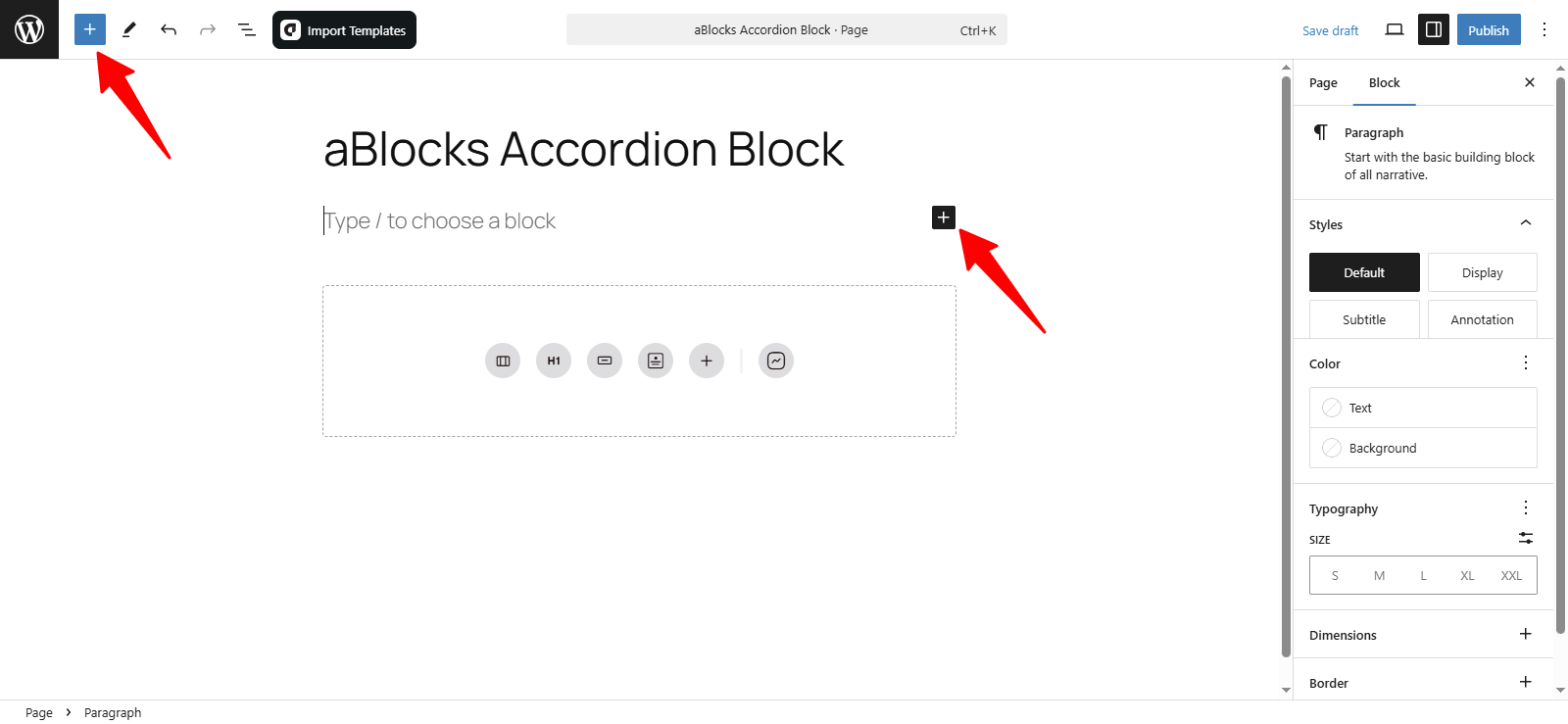
Click the (+) icon to view all available aBlocks. To add an Accordion Block, search for aBlocks Accordion Block in the search bar. Alternatively, click the (+) icon in the page editor and select the Accordion Block.
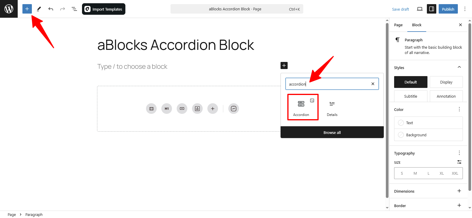
Now, select the aBlocks Accordion Block from the list. Click on it to add it to your page or post. Customize it as needed to match your website’s branding.
Customize the aBlocks Accordion Block
We’ll guide you through using and customizing the aBlocks Accordion Block with a detailed step-by-step tutorial.
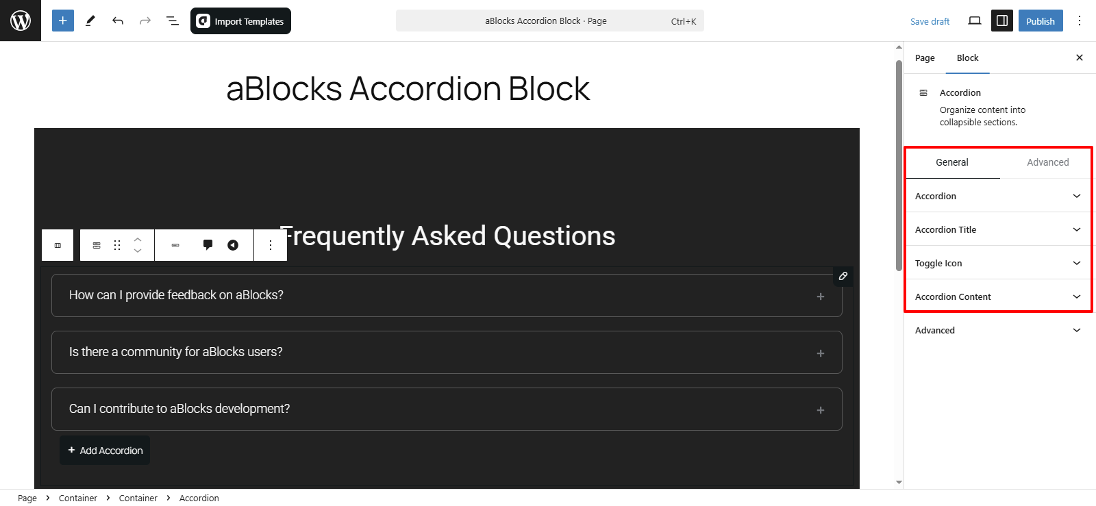
To customize the aBlocks Accordion Block, go to the right-side panel and navigate to Block > General. There, you’ll find four main customization options.
- Accordion
- Accordion Title
- Toggle Icon
- Accordion Content
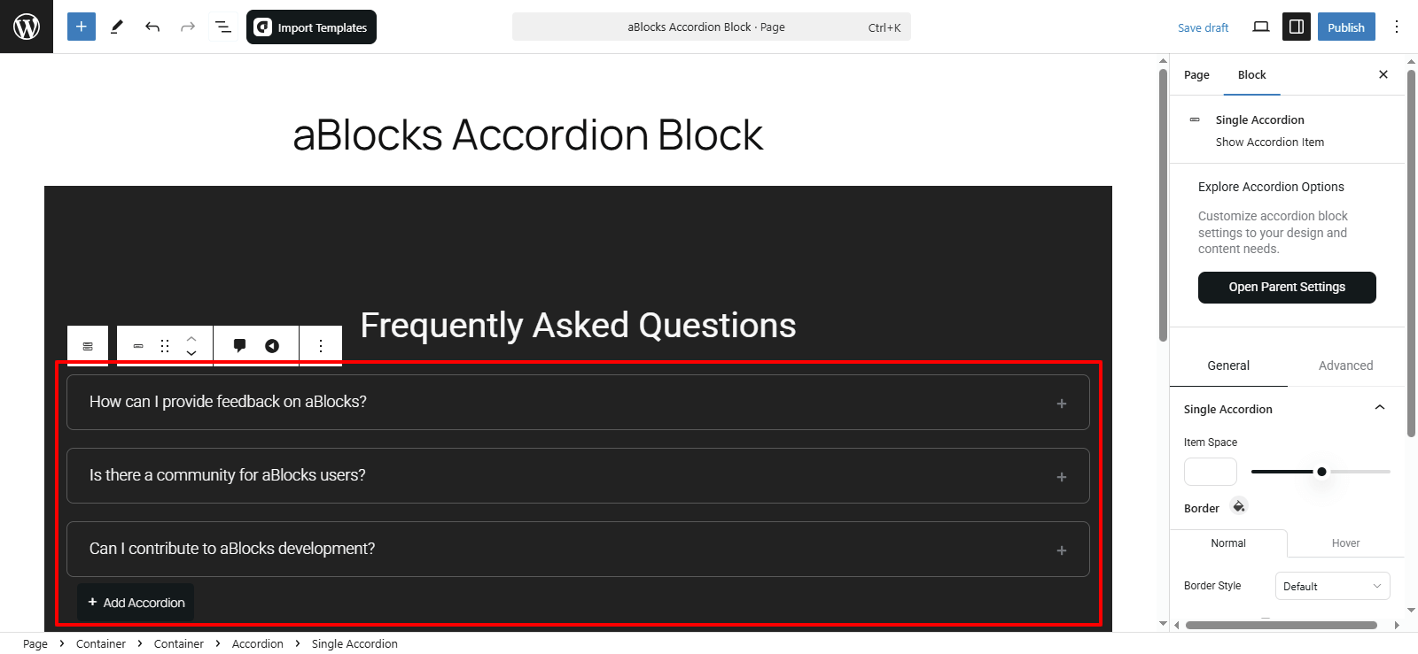
Now, I will show you how to customize a single accordion.
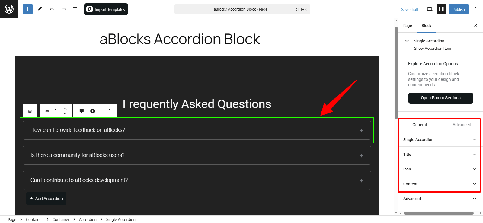
Select the single accordion, then go to the General section, where you’ll find four customization options. Let’s go through them one by one.
- Single Accordion
- Title
- Icon
- Content
Let’s go through them step by step:
Single Accordion
The aBlocks Accordion Block offers several customization options to enhance the appearance and functionality of your accordions. Here’s how to access and utilize these settings:
- Item Space: Modify the spacing between accordion items.
- Border Section: Within the border settings, you’ll find:
- Normal and Hover Options: Customize the border appearance for both the default state and when a user hovers over the accordion.
- Border Style: Select the type of border (solid, dashed, etc.) to match your design preferences.
- Border Radius: Adjust the curvature of the accordion’s corners to achieve the desired look.

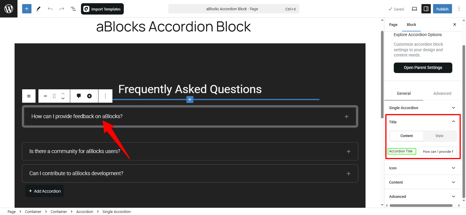
Title
In this section, you’ll find two primary customization options: Content and Style.
Content
In this section, you’ll find an option labeled Accordion Title. Modify the title text to align with your content.
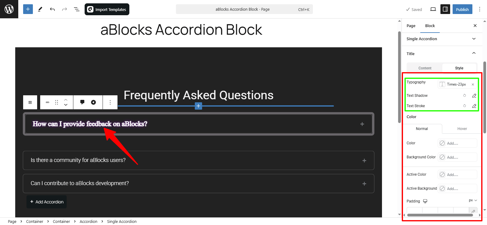
Style
In this section, you’ll find various customization options. Let’s discuss each one:
Typography
In this section, you have access to various customization options that allow you to easily modify the style of your accordion titles. For detailed information on each typography option, please refer to our aBlocks Typography Settings documentation.
Text Shadow
This section offers four customization options to style your accordion titles. For comprehensive details on each setting, consult our aBlocks Text Stroke and Text Shadow documentation.
Text Stroke
Here, you’ll find two customization options that enable you to adjust your title styles with ease. For in-depth information on each setting, please visit our aBlocks Text Stroke and Text Shadow documentation.
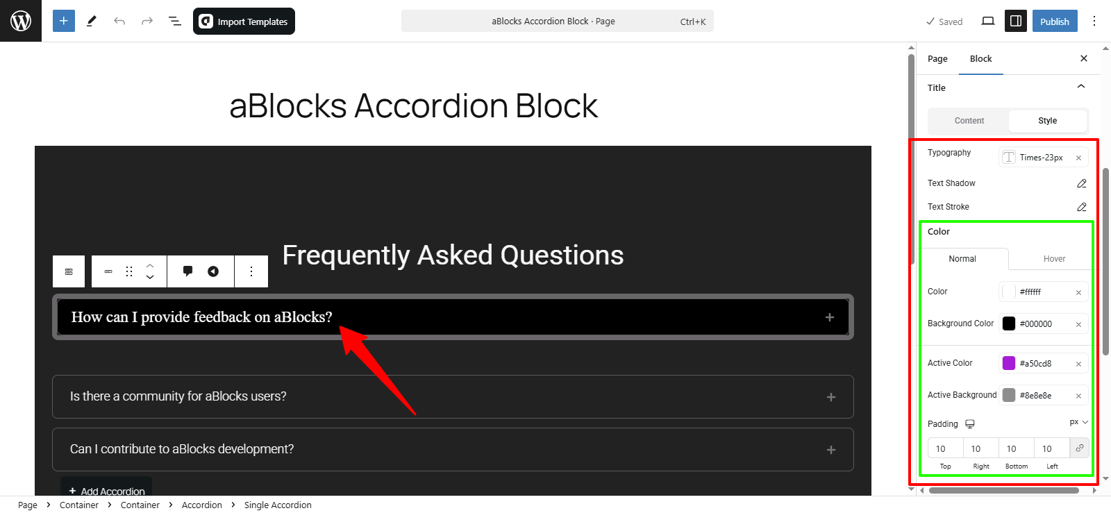
Color
Within the style section, you’ll find a dedicated Color section offering various customization options to enhance your accordion’s appearance. Here’s a breakdown of these options:
Normal and Hover Sections:
Normal: Customize the default appearance of your accordion.
Hover: Adjust the styling for when users hover over the accordion.
Customization Options:
Title Color: Modify the color of your accordion titles to match your site’s design.
Background Color: Set the background color of the accordion to complement your overall theme.
Active Color: Change the color of the title when the accordion is active or expanded.
Active Background: Adjust the background color for the active accordion section.
Padding: Increase or decrease the padding to control the spacing within the accordion.
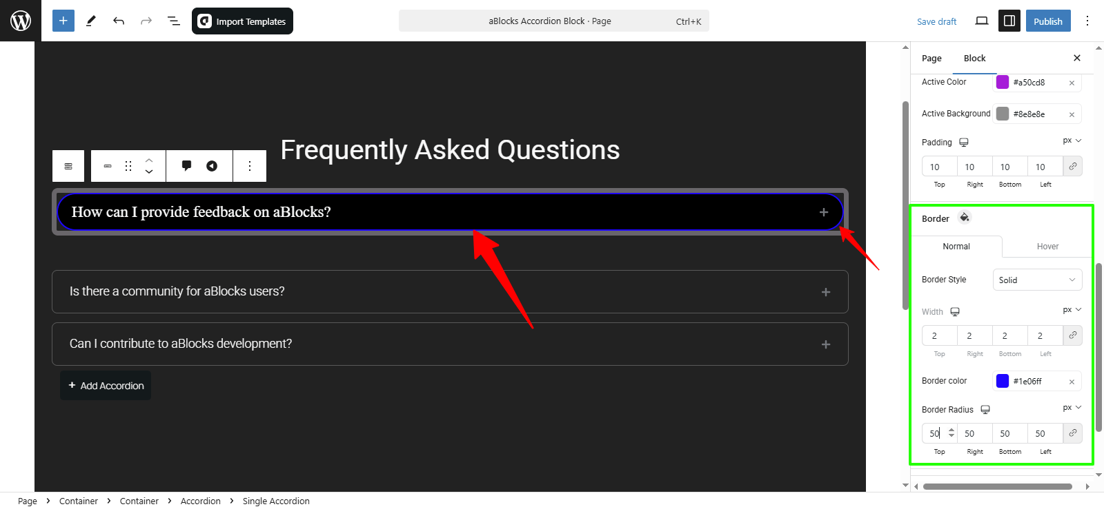
Border
In the Style section of the aBlocks Accordion Block, you have various options to adjust the borders of your accordion elements. Similar to the Color section, the Border settings are divided into Normal and Hover states, allowing you to define how borders appear by default and when a user hovers over them.
Customization Options:
Border Style: Select the type of border (e.g., solid, dashed, dotted).
Width: Adjust the border thickness.
Border Color: Pick a color that fits your site design.
Border Radius: Control the roundness of accordion edges.
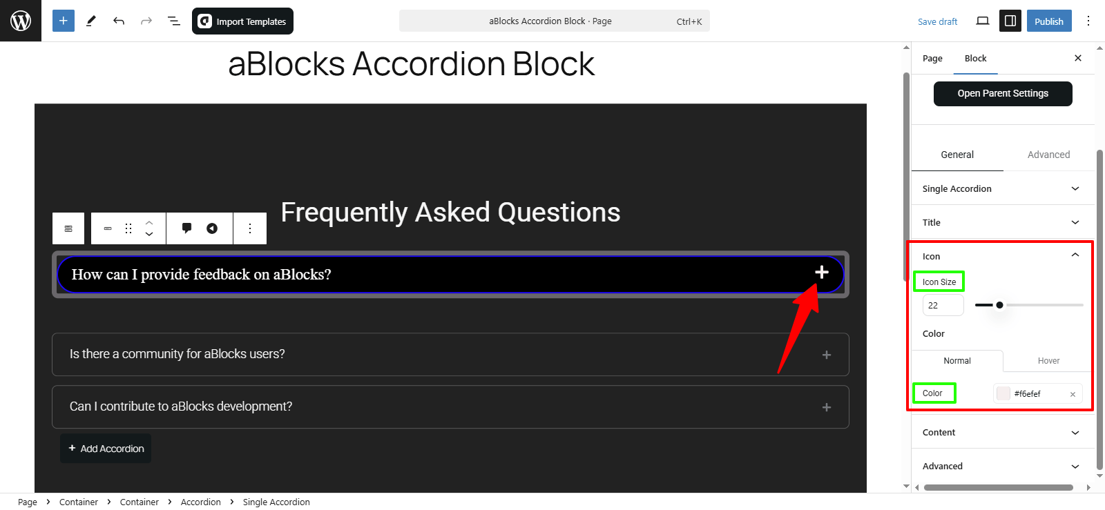
Icon
In the Icon section of the aBlocks Accordion Block’s style settings, you have two primary customization options:
- Icon Size: Resize the icon to match your design.
- Color: Customize the icon’s color for both Normal and Hover states.
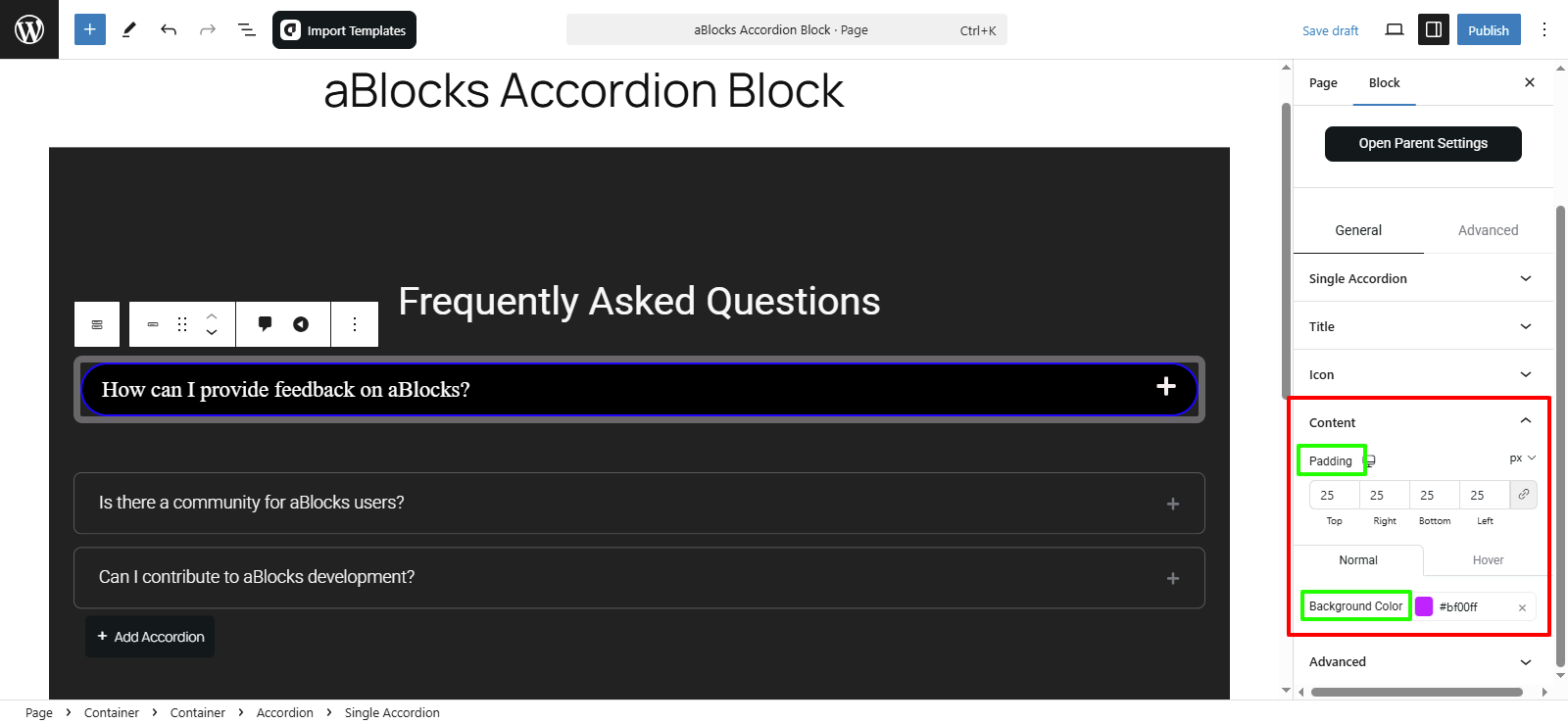
Content
In the Content section of the aBlocks Accordion Block, you have several options to tailor the appearance and behavior of your accordion items:
- Padding: Adjust the internal spacing for better readability.
- Background Color:
Normal: Set the default background color.
Hover: Define a different background color for hovered items.
These options allow you to create an engaging and visually appealing accordion layout.
Conclusion
The aBlocks Accordion Block makes content organization seamless. Follow these steps to customize it for an enhanced user experience. Need help? Contact our support team—we’re here for you!