


Notifications help grab user attention by displaying important messages such as alerts, success confirmations, warnings, or general updates. They enhance user experience by providing real-time information in a clear and engaging way.
The aBlocks Notification Block allows you to easily create and customize notifications on your website. This guide will walk you through its setup, features, and advanced customization options to help you make the most of it.
Add aBlocks Notification Block
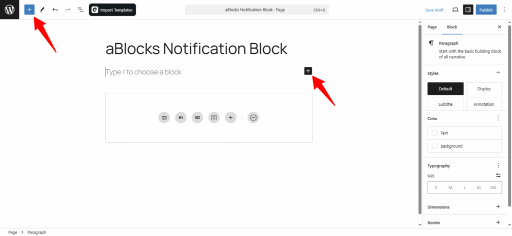
Open your WordPress editor and go to the desired page or post.
Click the (+) button to open the block menu.
Click the (+) plus icon to open the aBlocks list. Search for aBlocks Notification Block or scroll to find it. You can also select it directly from the page editor.
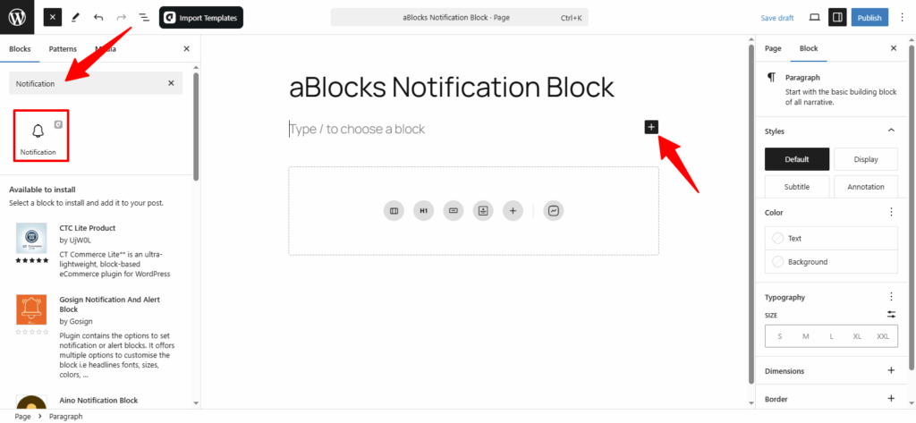
Now, select the aBlocks Notification Block from the list. Click on it to add it to your page or post. You can then customize it to match your website’s branding.
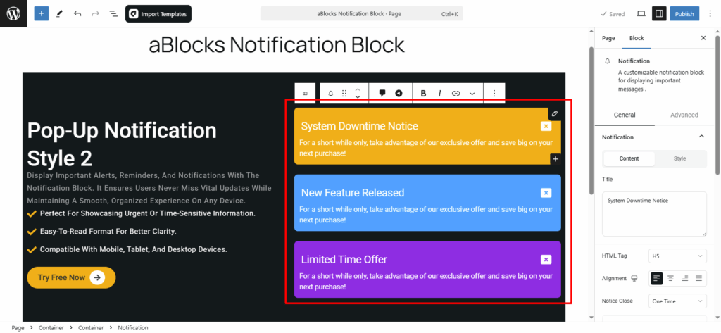
Customize aBlocks Notification Block
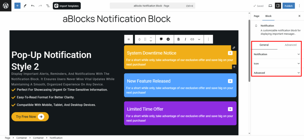
To customize the Notification Block, go to the right-side settings panel and navigate to Block > General for key customization options. Here, you’ll find two main customization options:
- Notification
- Icon
Let’s explore each of these in detail!
Notification
In the Notification Block, you’ll find two main customization options: Content and Style.
Let’s start by exploring the Content section.
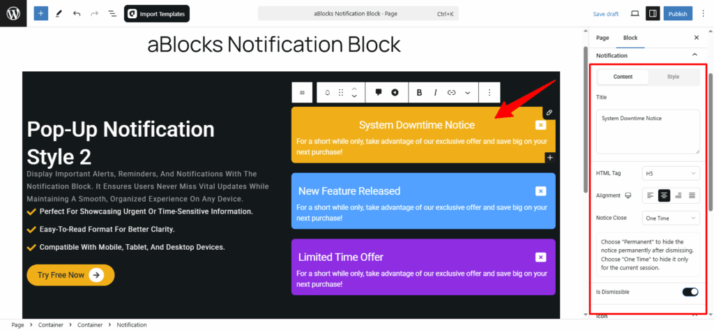
Content
In this section, you’ll find multiple customization options for your notification. Let’s go through them step by step:
Title: You’ll see a title box where you can add or edit the notification title as needed.
HTML Tag: Customize the title’s HTML tag (e.g., H1, H2, H6) to match your content structure.
Alignment: Adjust the title alignment to fit your design.
Notice Close: Choose whether the notice should be one-time or permanent.
Is Dismissible: Toggle this option to enable or disable the close icon for the notification.
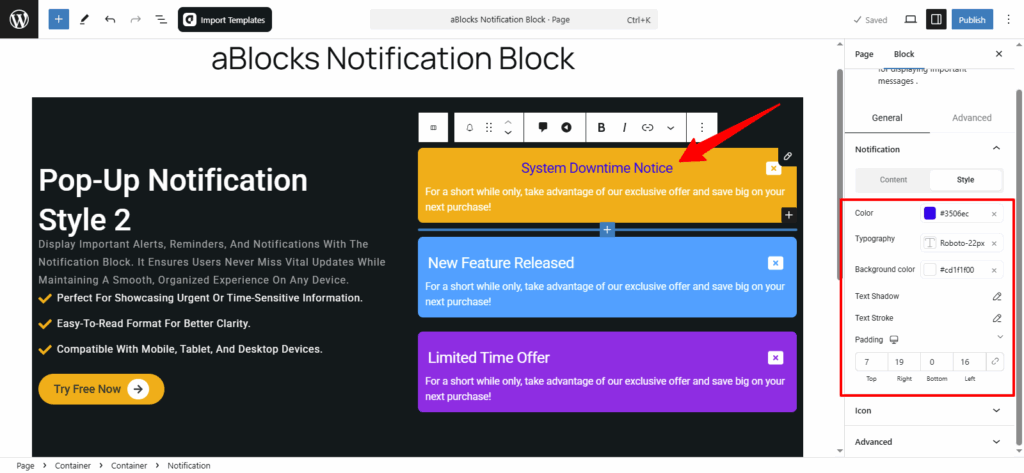
Style
In this section, you can explore various customization options. Let’s go through them step by step.
Color- You have complete flexibility to change colors as per your preference.
Typography- Fully customizable text styles. For more details, check out our aBlocks Typography Setting Documentation.
Text Shadow: Add and adjust shadow effects to enhance text visibility.
Text Stroke: Outline text with adjustable color and width for a distinct look.
For more details on Text Shadow and Text Stroke, refer to our aBlocks Text Shadow and Text Stroke documentation.
Padding: You can increase or decrease the padding as needed to adjust spacing.
Icon
In this section, you can see two main sections Content and Style. Now discuss step by step.
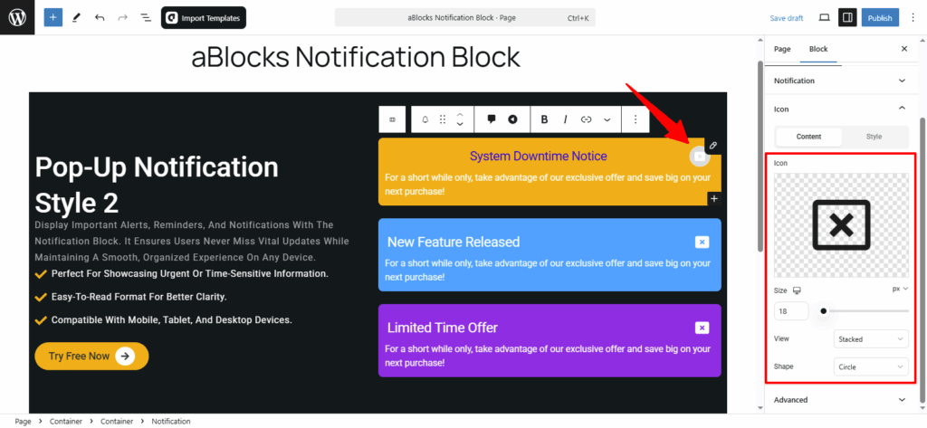
Content
In this section, you’ll find four customization options.
Icon: In this section, you can easily upload your icon. For more details, check out our aBlocks Icon Block documentation.
Size: You can easily change your icon size from here.
View: You can easily select your icon view Stacked or Framed.
Shape: Select your icon shape Circle or Square from here.
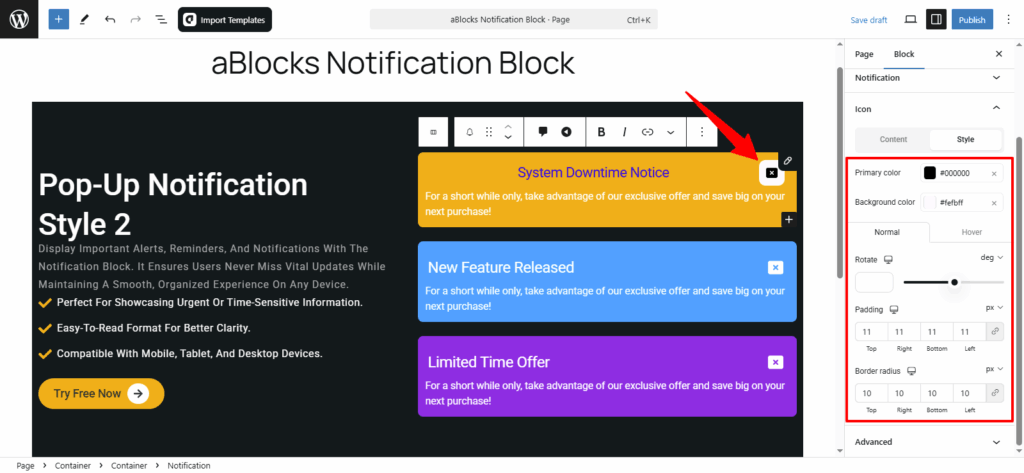
Style
In this section, you’ll find multiple customization options. Let’s go through them step by step:
Primary color: You can easily change your icon primary color from here.
Background color: Change your icon background color from here.
Now you can see the Normal and Hover options. Every option has many customization options.
Normal
Rotate: You can easily rotate your icon from here.
Padding: You can increase or decrease the padding as needed to adjust your icon Shape.
Border radius: You can increase or decrease the border radius as needed to adjust your icon Shape.
Hover: Applies the same settings when hovered over.
Conclusion
The aBlocks Notification Block makes it easy to display important messages on your website with full customization options. From content and styling to icon adjustments, you can create notifications that fit your brand and improve user engagement.
If you have any questions or need assistance, feel free to contact our support team. We’re here to help!