


The aBlocks Stripe Button Block allows you to seamlessly integrate Stripe payment functionality into your WordPress site. This block provides a simple yet powerful way to accept payments, ensuring a smooth and secure transaction process for both you and your customers. With various customization options—including button styles, icons, pricing settings, and advanced configurations—you can easily tailor the aBlocks Stripe button to match your website’s design and business needs.
Add Stripe Button
First, open your WordPress dashboard and click to edit a page or post. Then, navigate to the section where you want to add the Stripe button.
Click the plus (+) icon to add a new block.
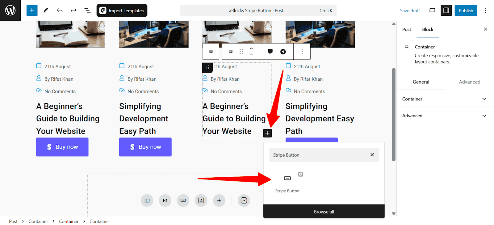
Afterward, search for the “Stripe Button” using the search option. Simply click on the aBlocks Stripe Button Block to add it.
To customize it, select the Stripe button and go to the right-side panel Block > General to explore the wide range of customization options available for the aBlocks Stripe Button Block.

Let’s go through the customization options one by one.
Customize Stripe Button Block
Stripe Button Customization allows users to personalize payment buttons by adjusting styles, sizes, and functionality to fit their website and branding, providing a smooth checkout experience.
Pricing and Payments
The Pricing & Payments section in the aBlocks Stripe Button Block lets you configure product details, pricing, currency, quantity, shipping costs, and tax settings for Stripe transactions.
- Stripe API: Enter your Stripe API key for payment processing.
- Item Name: Set the product or service name.
- Product Price: Define the product price.
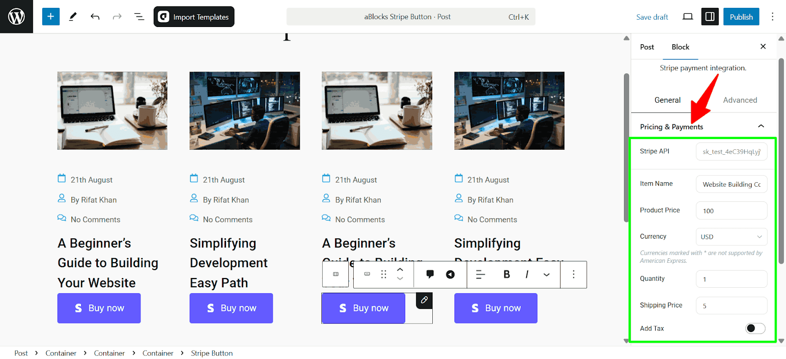
- Currency: Choose the transaction currency.
- Quantity: Set the default purchase quantity.
- Shipping Price: Add a shipping fee if applicable.
- Add Tax: Enable tax inclusion in pricing.
Button Section
The Button section in the aBlocks Stripe Button Block allows you to customize the button’s content and style to match your website’s design. The Content tab lets you configure the button’s text, size, position, and icons, while the Style tab enables design adjustments such as color, border, and typography.
Content
- Position: Choose the button’s alignment.
- Type: Select a button type (e.g., success, warning, primary).
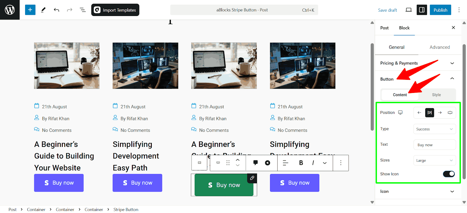
- Text: Customize the button label.
- Sizes: Adjust the button size.
- Show Icon: Toggle the display of an icon within the button.
Style
- Typography: Customize the font family, size, width, style, line height, and more. Check our aBlocks Typography Settings Documentation to learn more.
- Text Shadow: Add a shadow effect to the button text.
- Color: Normal and hover. Each state includes:
- Text Color: Set the button text color.
- Background Color: Choose a background color for the button.
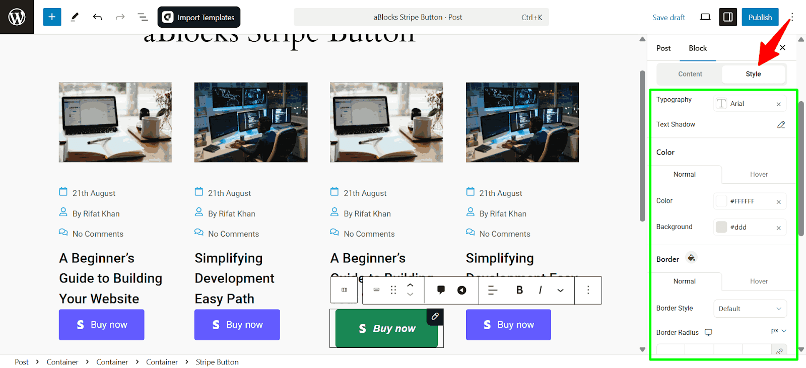
- Border: Two states normal and hover. Each state includes:
- Border Style: Select solid, dashed, or other styles.
- Border Radius: Adjust the roundness of button edges.
- Padding: Control spacing inside the button.
- Box Shadow: Box shadow has two states normal and hover. Each state includes.
- Box Shadow: This option allows you to add depth to the button by applying a shadow effect.
Icon
The Icon section allows you to modify the appearance and placement of icons in the Stripe Button. It is divided into two parts: Content and Style. The Content section focuses on selecting and positioning the icon, while the Style section controls the visual aspects like color and effects.
Content
- Icon: Choose an icon from the library or upload a custom one.
- Size: Adjust the icon size for better visibility.
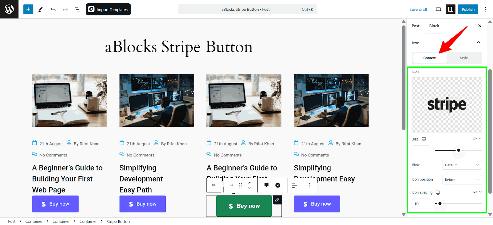
- View: Change the display mode of the icon (e.g., default, outlined, filled).
- Icon Position: Set whether the icon appears before or after the text.
- Icon Spacing: Define the space between the icon and the button text.
Style
- Primary Color: Defines the main color of the icon.
- Background Color: Sets the background color behind the icon.
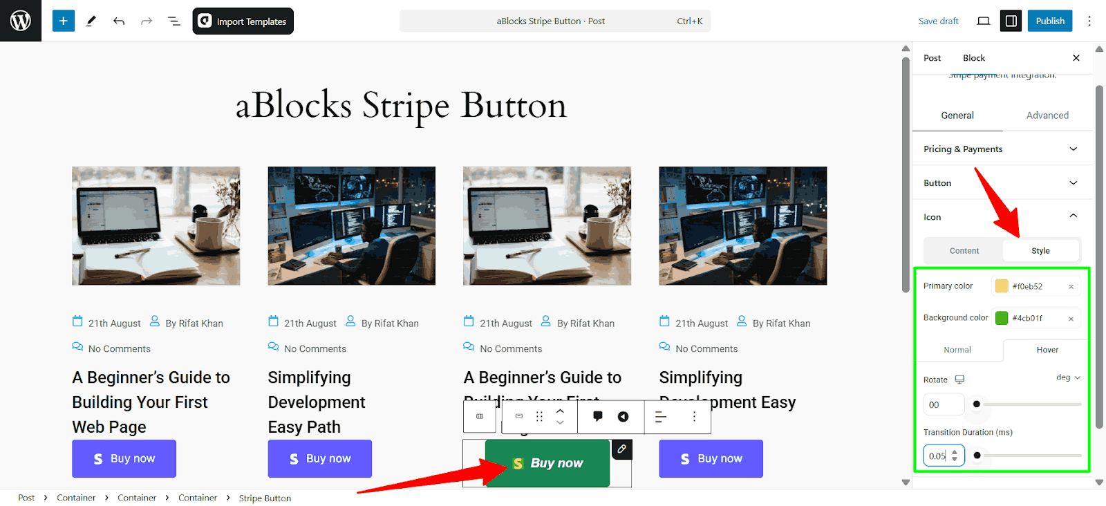
- Normal & Hover States: Customize how the icon looks in its default state and when hovered over.
- Rotate: Adjust the icon’s rotation in degrees.
- Transition Duration: Control how smoothly the icon transitions when changes occur.
Additional Options
The Additional Options section lets you customize the behavior of the Stripe Button after a payment is completed.
- Redirection After Payment: Enter a URL where users will be redirected after a successful transaction.
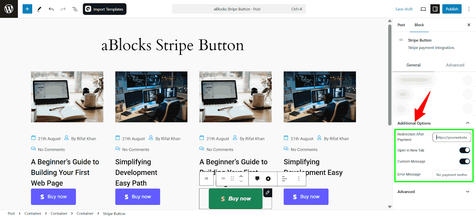
- Open in New Tab: Enable this option to open the redirection URL in a new browser tab.
- Custom Message: Activate this to display a personalized message to users after payment.
- Error Message: Define a custom error message in case the payment fails or an issue occurs.
Consultation
The aBlocks Stripe Button Block offers a simple yet powerful way to accept payments directly on your WordPress site. Designed for ease of use and flexibility, this block allows you to customize button styles, labels, icons, and redirection settings, as well as configure advanced options for recurring payments or custom checkout flows. With these features, you can create a branded, seamless checkout experience that’s both secure and intuitive, helping you convert more visitors into paying customers.