


The Gutenberg Divider Block by aBlocks helps you add clear separations between different sections of your content. This improves the structure and readability of your layout. Here’s a step-by-step guide on how to use and customize the Divider Block to improve your layout flow.
Add aBlocks Divider Block
Go to your website’s admin area and add a new page or post.
After that, press the (+) icon to display the block choices.
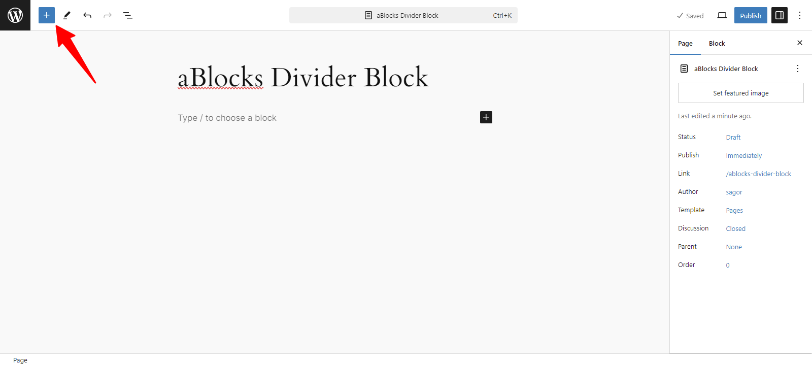
Now, all the blocks from aBlocks are visible to you. Select the aBlocks Divider Block from the available choices.
Customizing aBlocks Divider Block
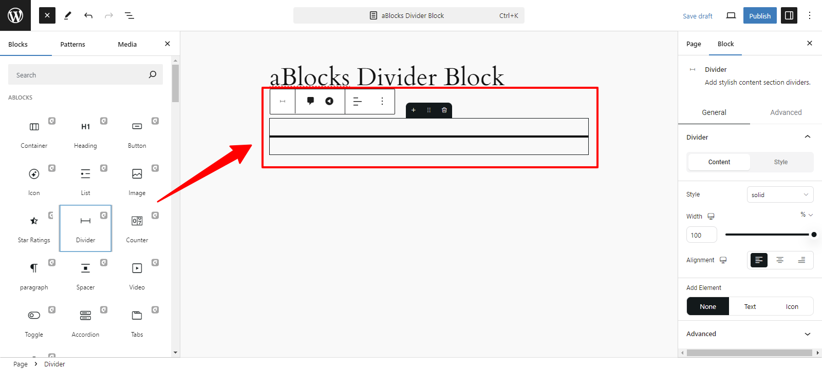
We will explore the comprehensive usage and customization features of the aBlocks Divider Block, step by step.
General & Advanced
After selecting the aBlocks Divider block, you will see the General and Advanced sections on the right side, making it easy to customize your images, text, and more.
General
This section is divided into two categories:
- Content
- Style
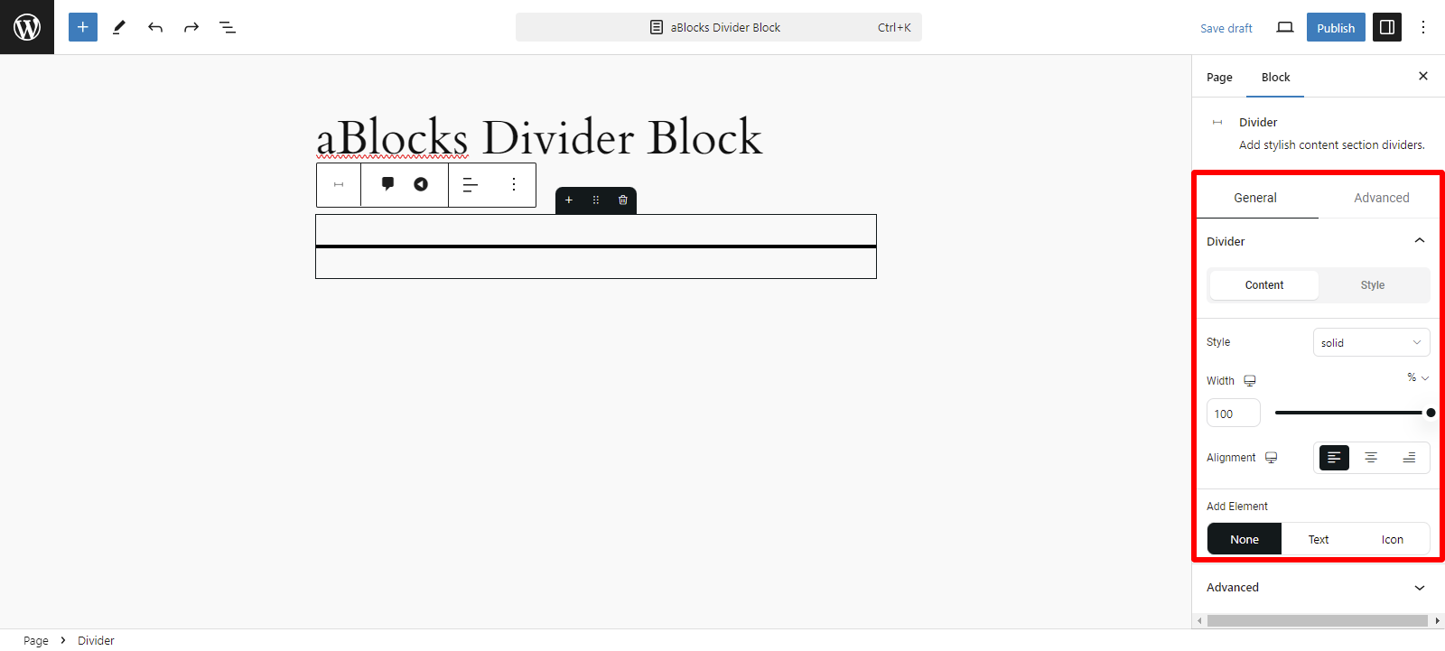
Content
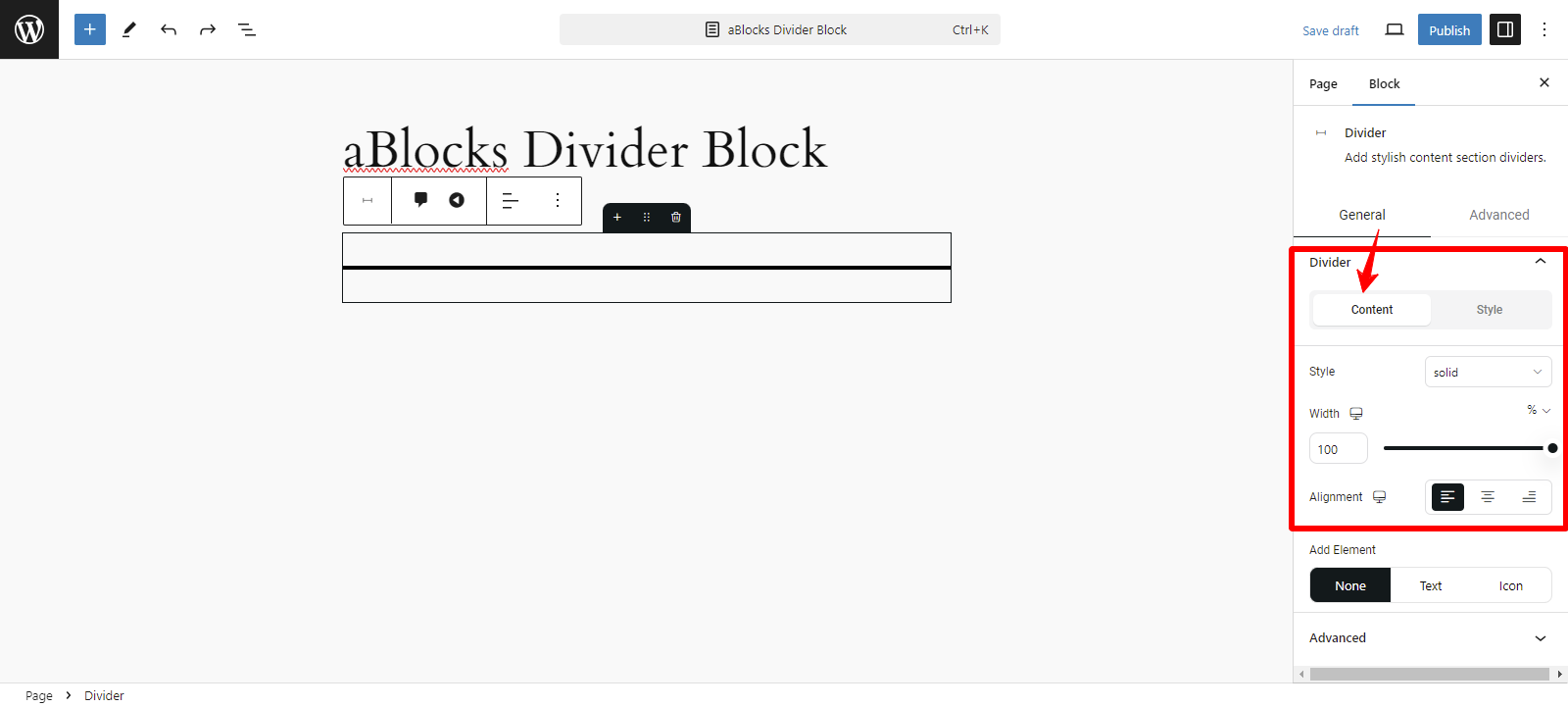
There are several customizable settings in the Content section.
Style: In the Style section, you’ll find several default options that are simple to use and adjust.
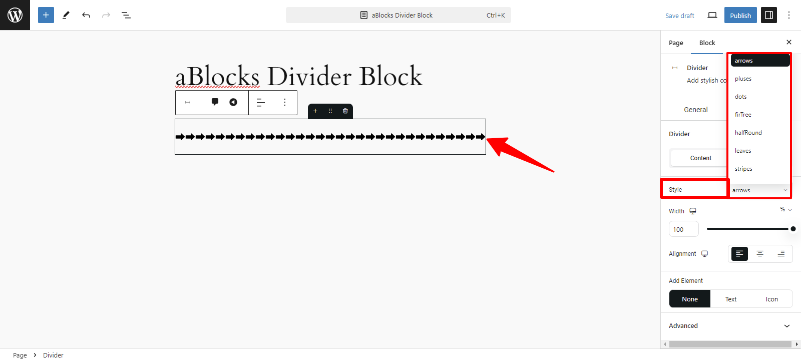
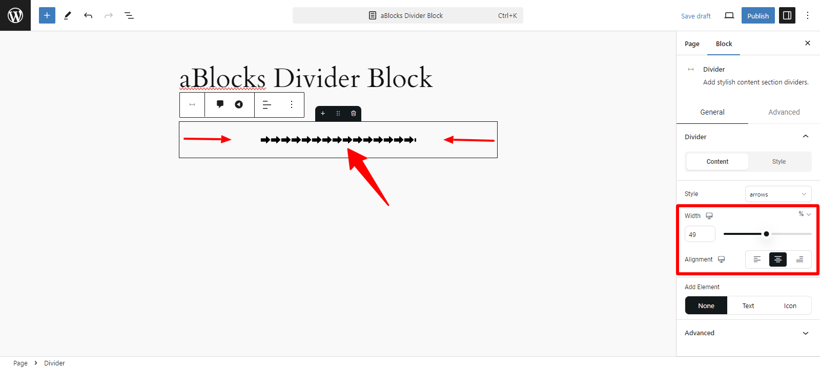
Width: This setting allows you to adjust how wide the divider appears on the page. You can make it span the entire content area or just a portion, depending on your design needs.
Alignment: You can align the divider to the left, right, or center of the page. This helps in positioning the divider to match the layout and flow of your content.
Add Element: The Divider section includes Add Element options to further customize your divider. These options allow you to Text or Icons alongside the divider line.
Text: When you Text option selection you can see the Divider Text option. The Divider Text section has two options, like
- Content
- Style
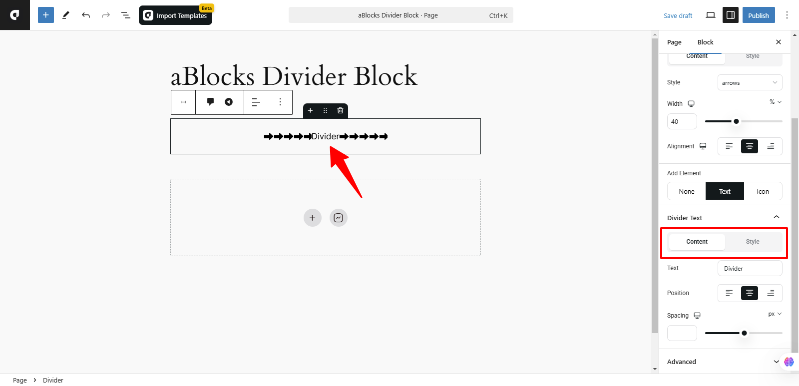
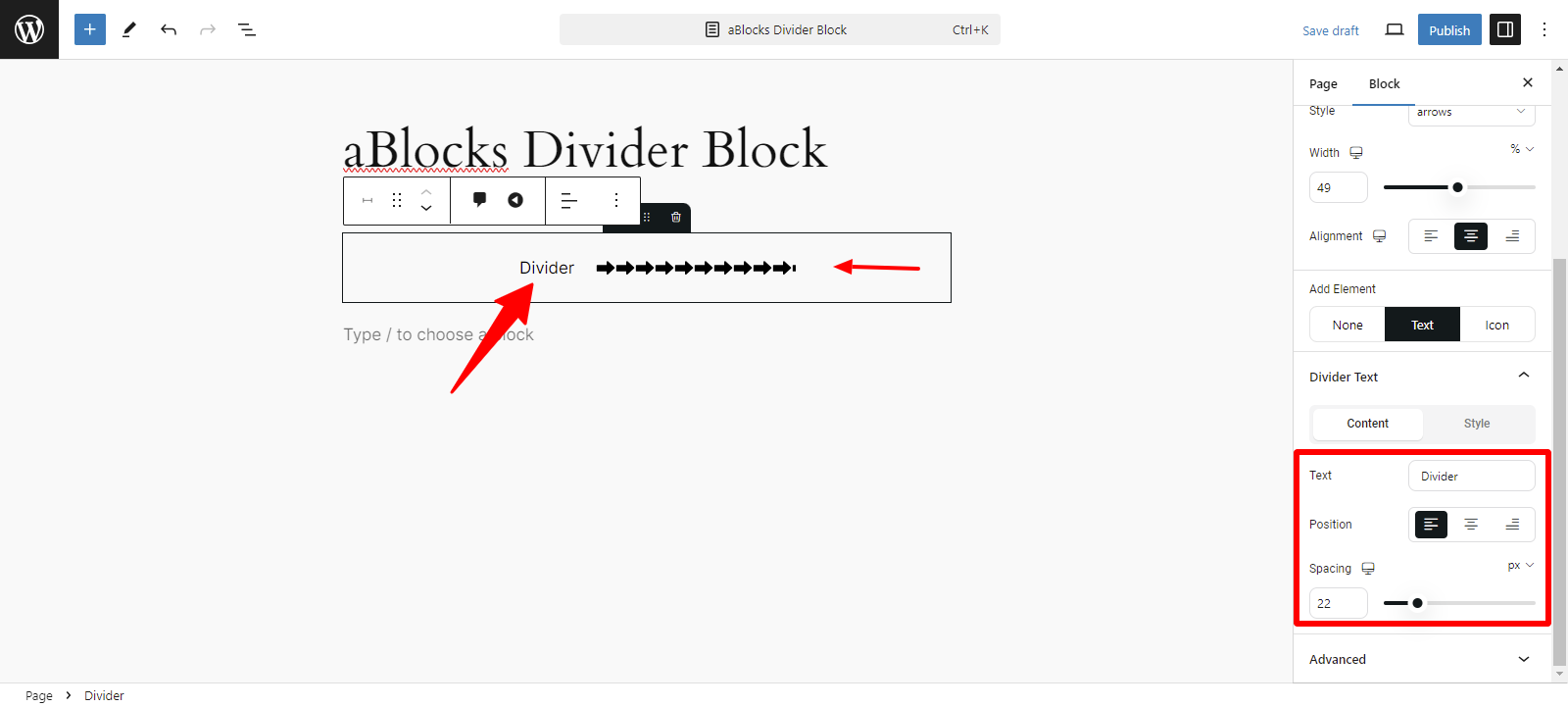
Content: In the Divider Text section, the Content area offers three options:
- Text: You can add custom text to display on the divider.
- Position: Choose where the text appears—Left, Center, or Right.
- Spacing: Adjust the space between the text and the divider line for better alignment.
Style: In the Divider Text section, the Style area provides three customization options:
- Color
- Typography
- Text Stroke
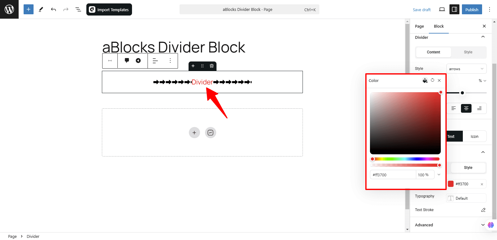
Color: Select the color of the text to match your design.
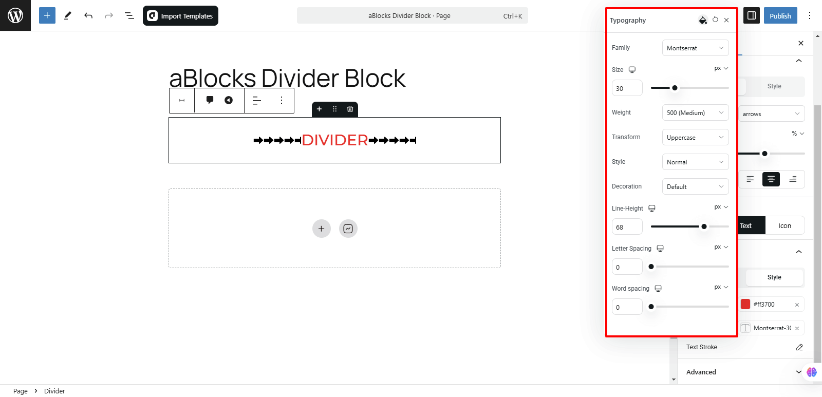
Typography: There are several customization options available in this section. For detailed explanations, refer to the aBlock Typography Setting documentation.
Text Stroke: In the Text Stroke section, you’ll find two options:
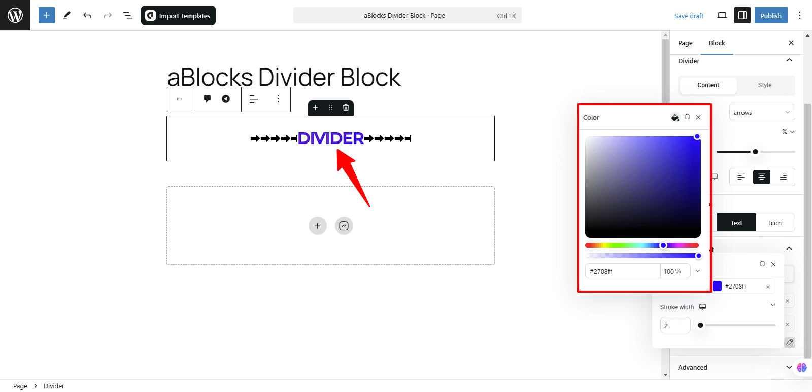
Stroke Color: Stroke Color allows you to select the color of the stroke or outline around the text, enhancing its visibility and design.
Stroke Width: Stroke Width lets you adjust the thickness of the stroke or outline around the text, giving you control over how bold or subtle the effect appears.
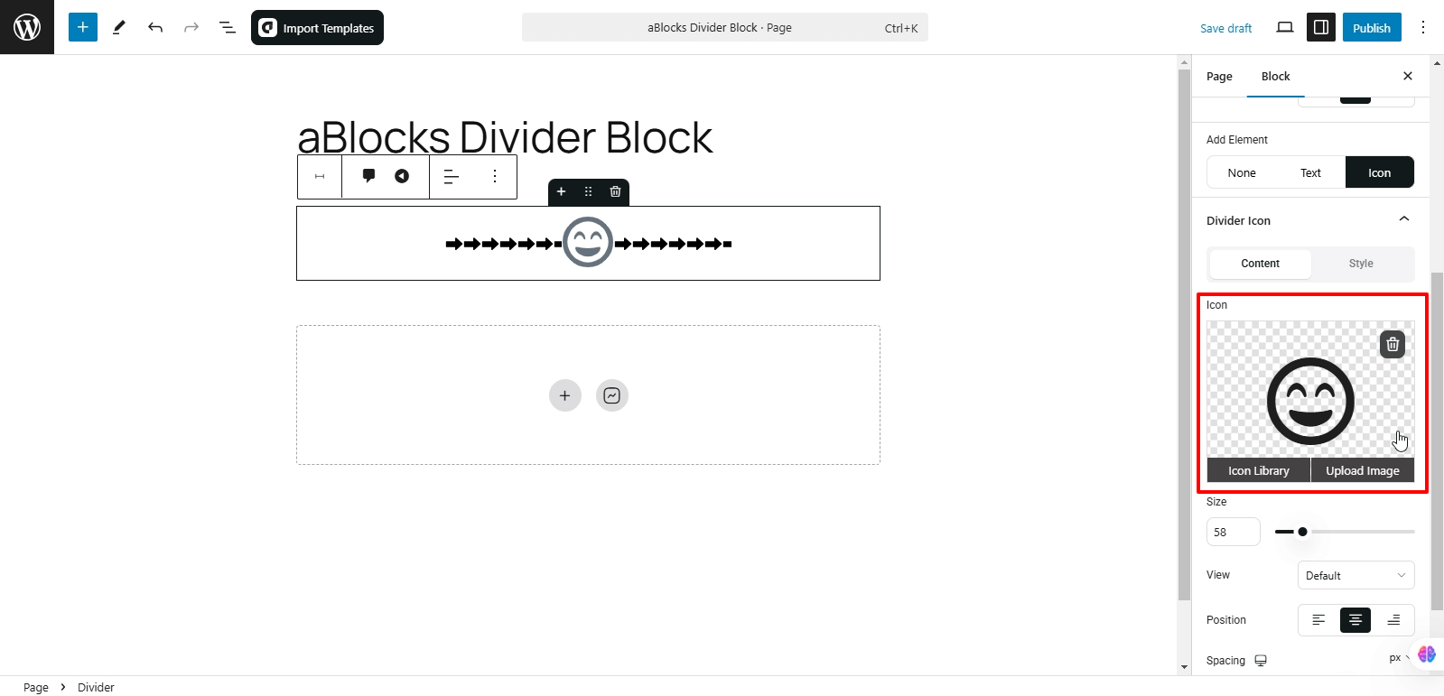
Icons: After accessing the Add Element section, click on Icons to explore various customizable features. The first thing you’ll notice is the Divider Icon section, which has two options.
- Content
- Style
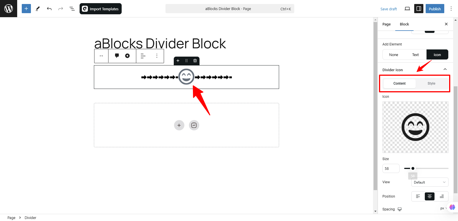
Content: The Content area offers various customization options.
Icon: In the Icon option you can see the Icon box, then you can upload your icon image using two methods:
- Icon Library
- Upload Image
Icon Library: The aBlocks Icon Library provides a vast selection of icons for direct use in your designs. Click on Icon Library to view all available icons. You can choose your icon from the following categories:
- ALL: View all available icons in the library.
- Solid: Here, you’ll find only solid icons.
- Brands: This option shows all brand icons.
Also, utilize the Search Icons box at the top to quickly find a specific icon. Type relevant keywords, and the library will display matching icons.
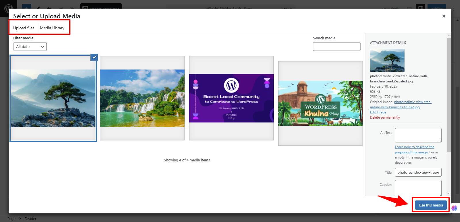
Upload Image: You can upload your image using two options:
- Upload Files: Directly upload images from your device.
- Media Library: Choose an existing image from your website’s media library.
Now, select your icon image and click the Use This Media button to apply it to the button.
After clicking the Use This Media button, your icon image will appear on the button.
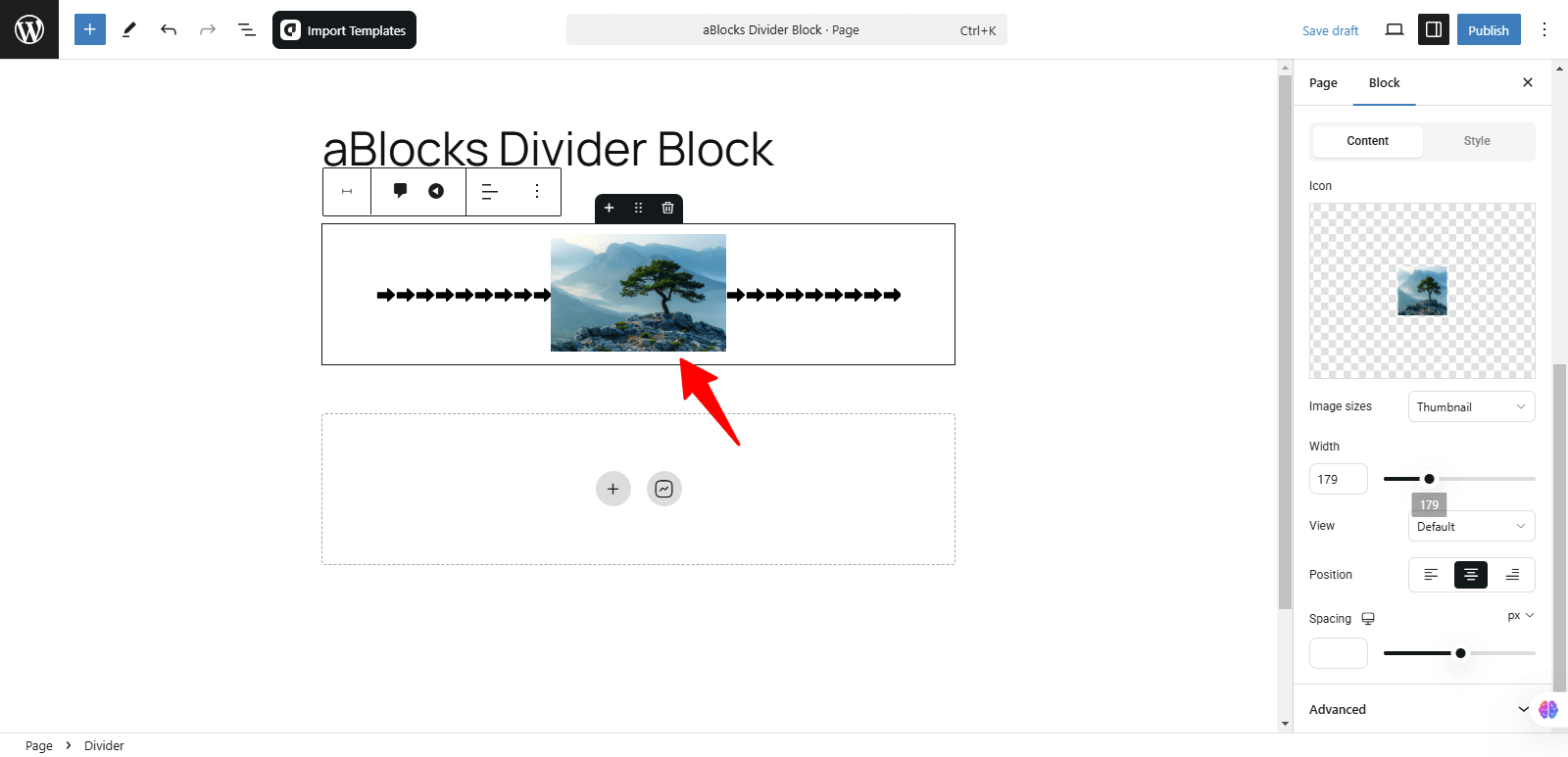
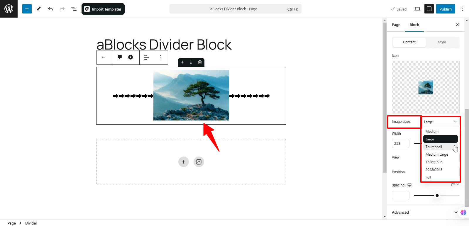
Image Sizes: You can adjust your icon’s size by selecting from the following options:
- Medium: A balanced size for most uses.
- Large: A bigger icon for more prominence.
- Thumbnail: A smaller, compact version of the icon.
- Medium Large: A slightly larger option than Medium.
- Full: Displays the icon in its original size without cropping.
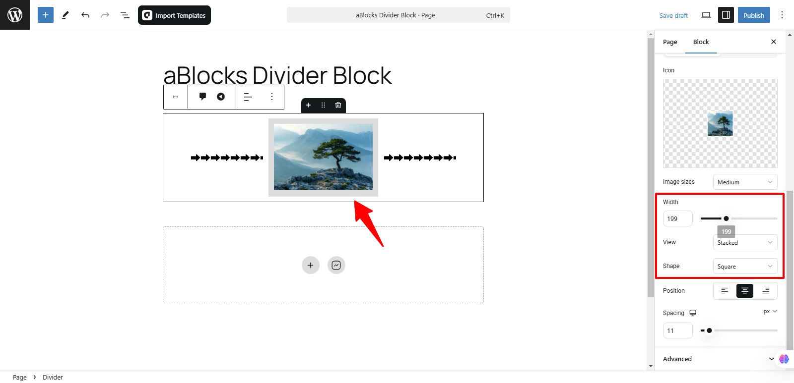
Width: Modify the icon’s width to fit your design preferences.
View: You can display your image using two options:
- Stacked: The icon is aligned above the text.
- Framed: The icon is enclosed within a border or frame.
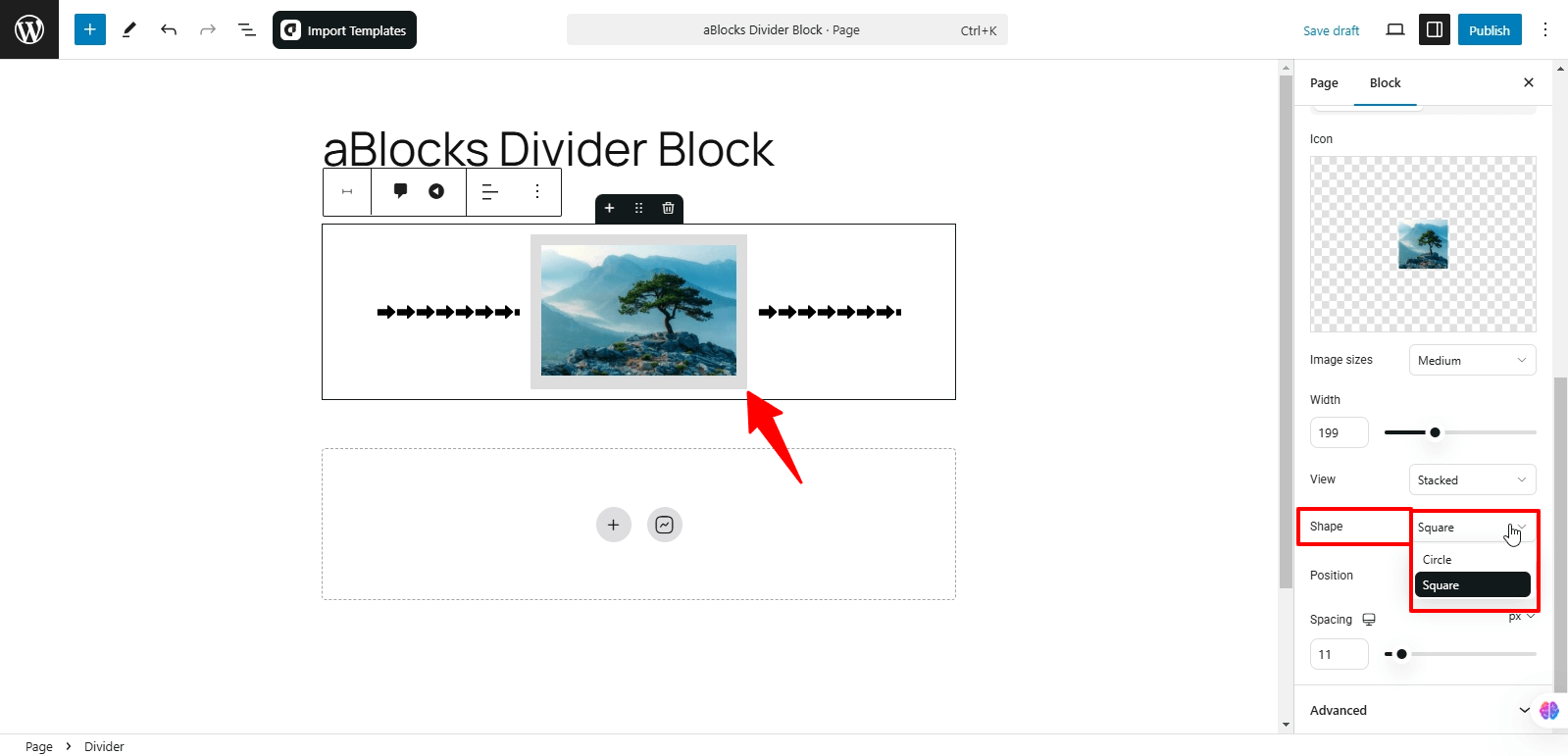
Shape: You can set the shape of your image with these two options:
- Circle: Displays the image with rounded edges in a circular form.
- Square: Displays the image with straight edges in a square form.
Position: You can easily adjust the position of your icon using these options:
- Left: Align the icon to the left.
- Center: Place the icon in the center.
- Right: Align the icon to the right.
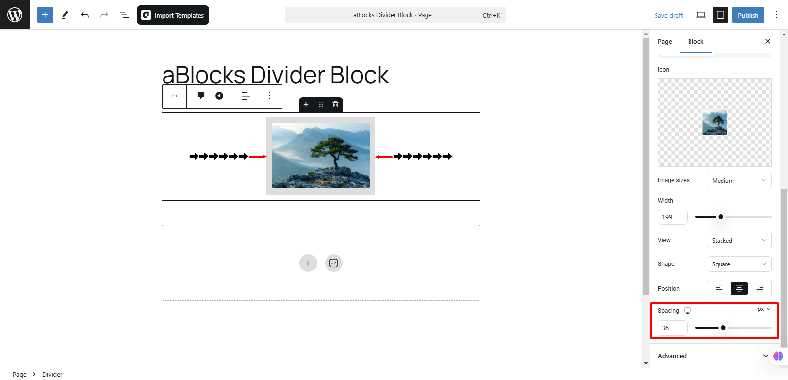
Spacing: You can easily adjust the spacing by increasing or decreasing it according to your preference.
Style: In the Divider Icon section, the Style option offers various customization choices, like
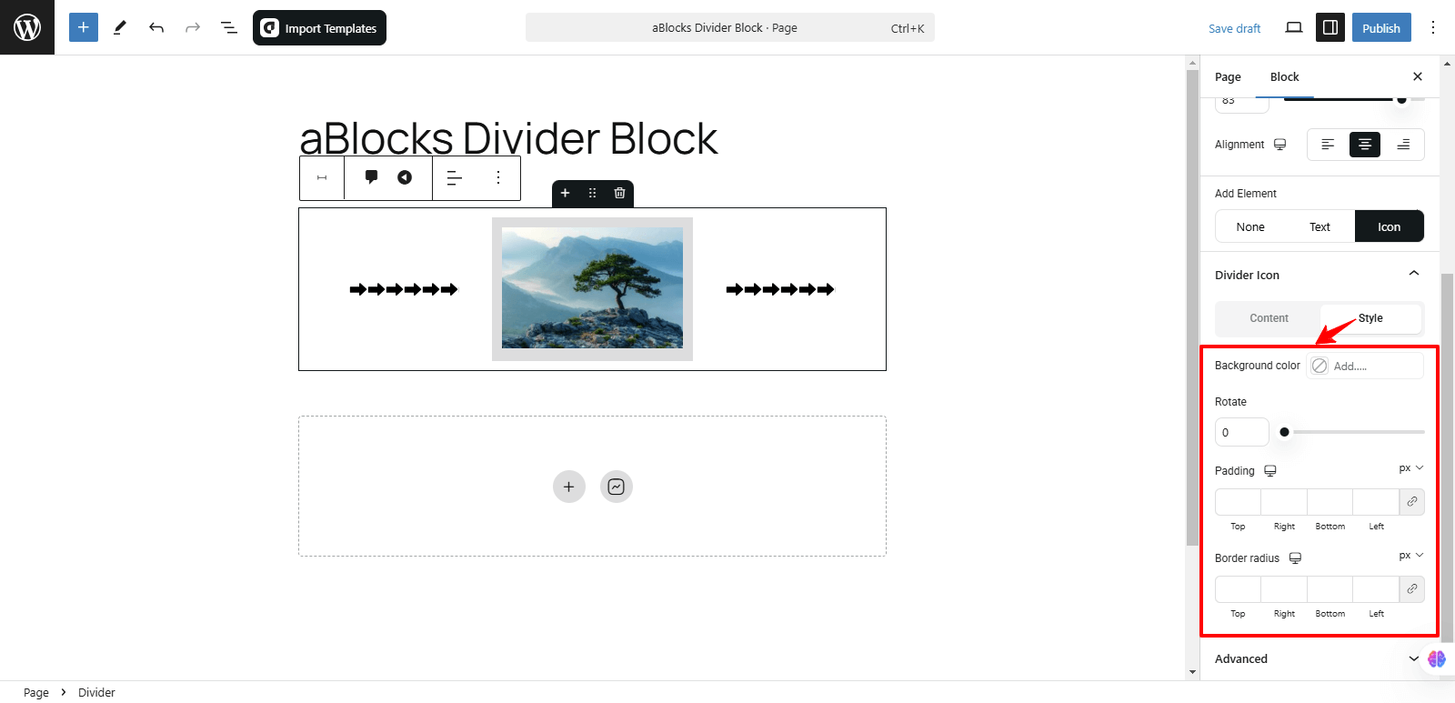
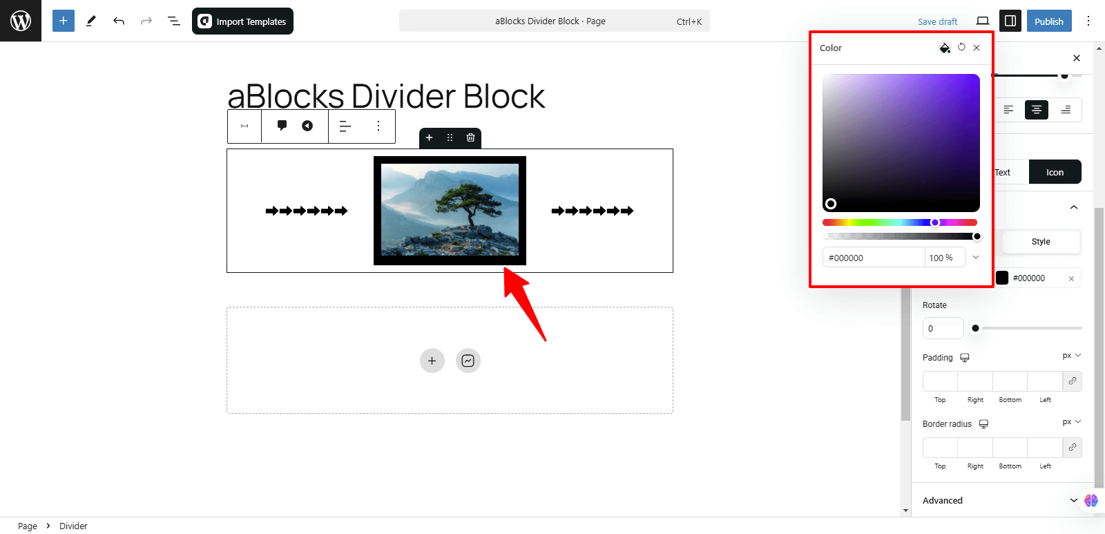
Background Color: You can change the background color of your icon to any color of your choice from this option.
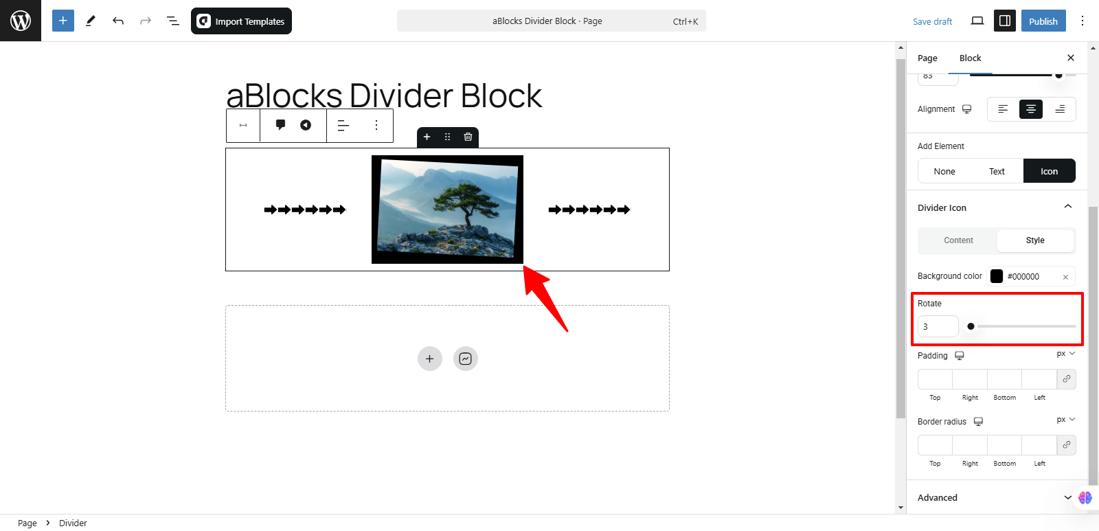
Rotate: You can easily rotate your icon image to the desired angle using this option.
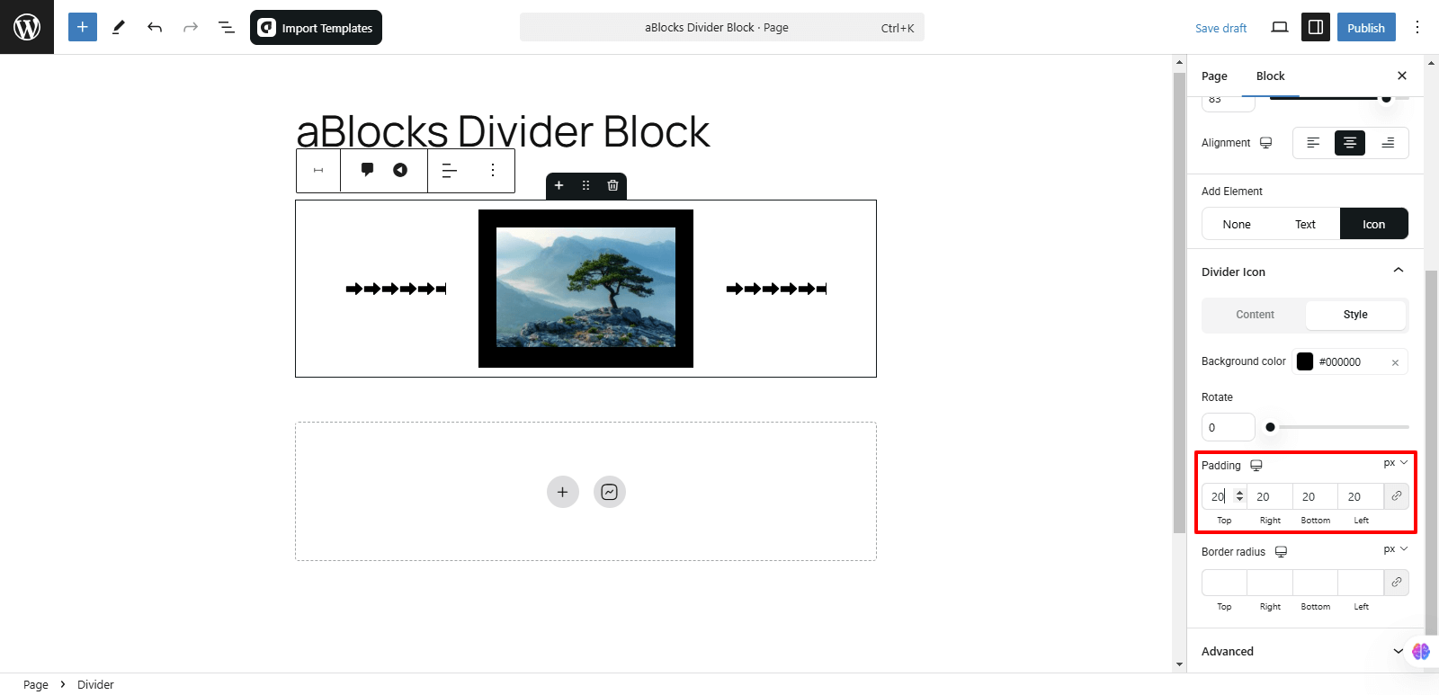
Padding: You can adjust the padding around your icon to control the space between the icon and its surrounding elements. This allows for more precise spacing and layout customization.
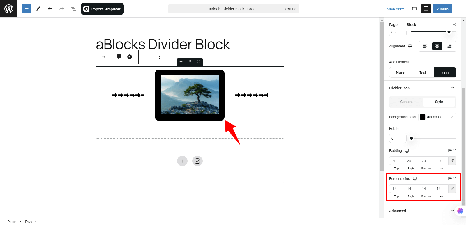
Border Radius: This option allows you to control how rounded the corners of your icon’s border are. Increasing the radius will make the corners more curved while reducing it will keep them sharper or square.
Style
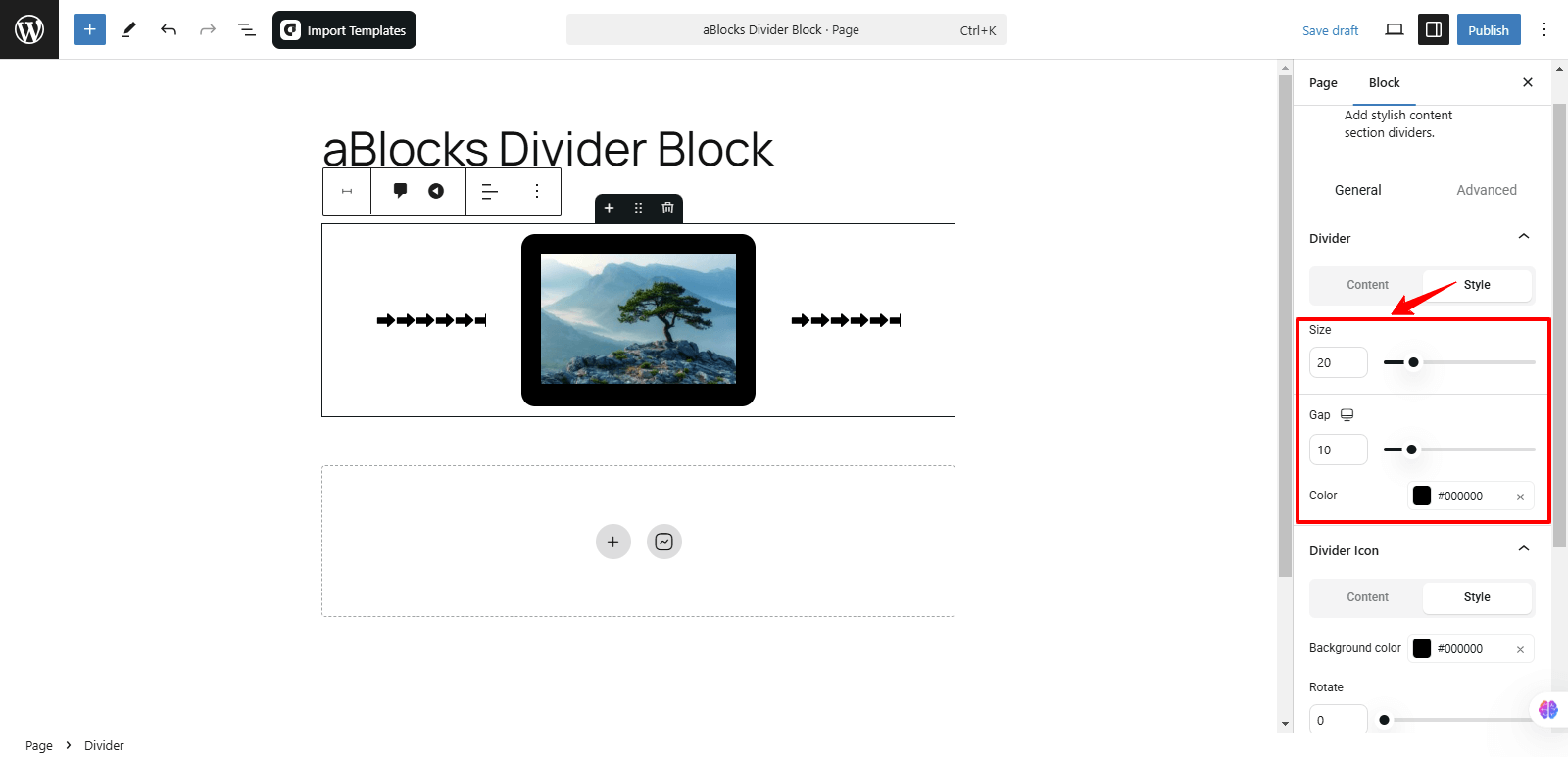
In the General section, the second option is Style, which offers three customizable settings, like
- Size
- Gap
- Color
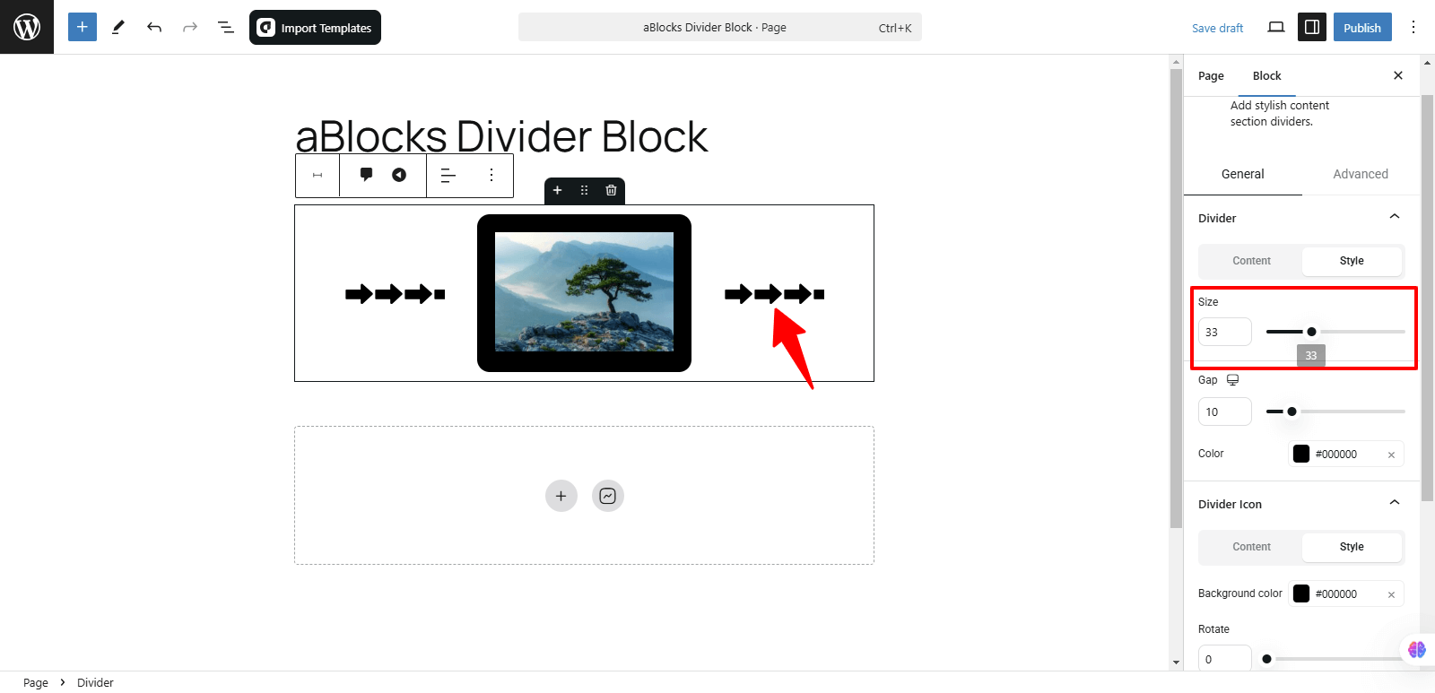
Size: You can easily adjust the size by increasing or decreasing it to fit your design preferences.
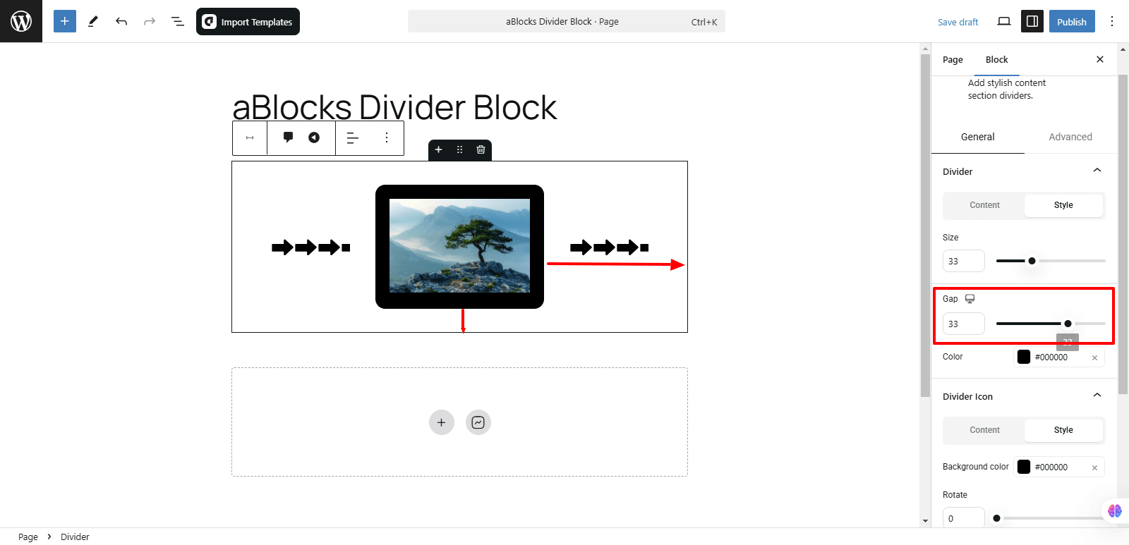
Gap: This option allows you to adjust the space between elements, such as the text and icon, or between multiple buttons. You can increase or decrease the gap to improve layout and alignment based on your design needs.
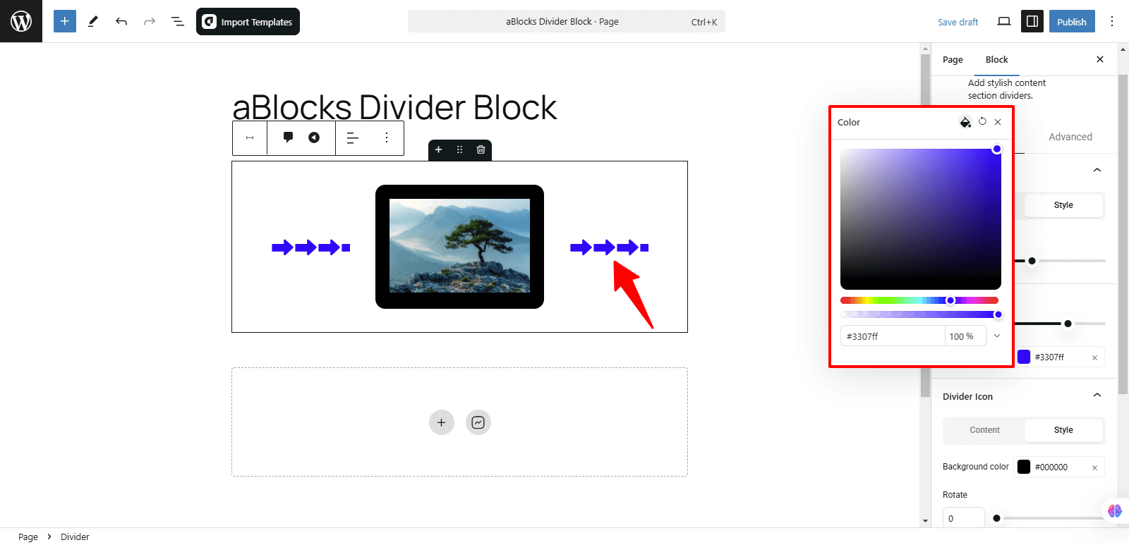
Color: You can easily change the color to your preference from this option.
Conclusion
The aBlocks Divider Block helps you create clear section breaks with customizable styles, text, and icons. With options for alignment, width, typography, and spacing, you can tailor it to fit your design perfectly. If you need any assistance, feel free to reach out to our support team anytime.