


The Dual Button block lets you place two buttons side-by-side. It’s useful for adding primary and secondary actions together. Follow these steps to add and customize it using the aBlocks plugin.
Add aBlocks Dual Button Block
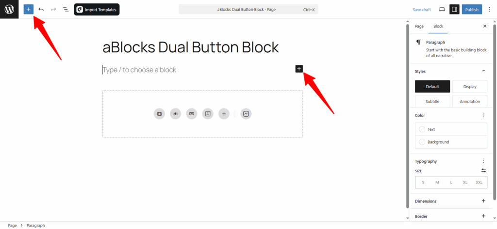
Open your WordPress dashboard and select the page or post where you want to add Dual Button.
Click the (+) icon to access block options.
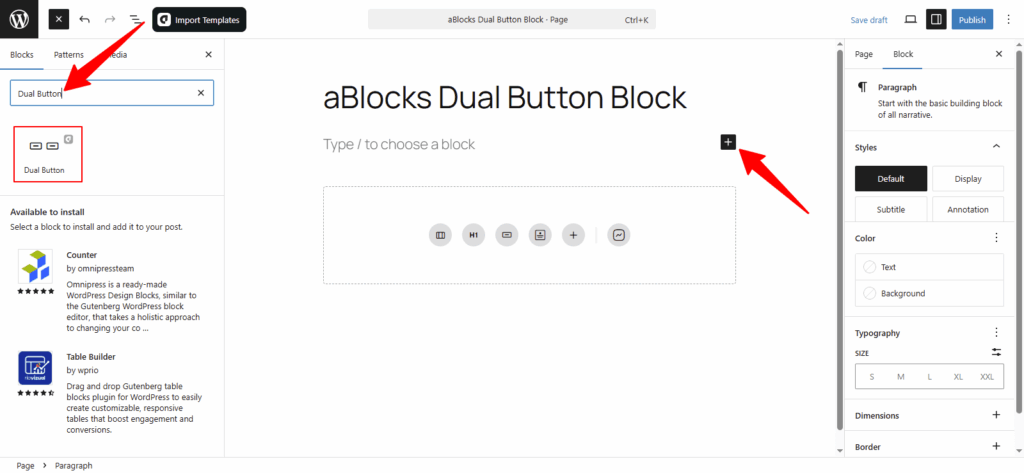
From the block inserter, scroll through the aBlocks section or use the search bar to find Dual Button. Click on it to add the block to your page or post.
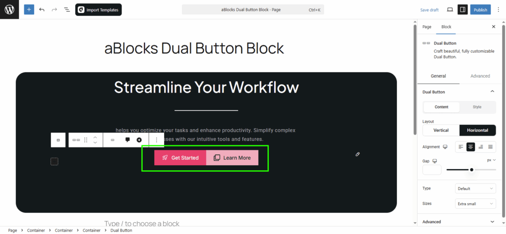
Now, select the aBlocks Dual Button Block and click to add it. Then customize it to match your site’s style.
Customize aBlocks Dual Button Block
This guide shows you how to use and customize the aBlocks Dual Button Block with clear steps.
First, select the Dual Button Block and open the settings panel on the right.
Then go to Block > General.
Here, you’ll find one main option to control the layout and behavior:
- Dual Button
Let’s explore this option step by step.
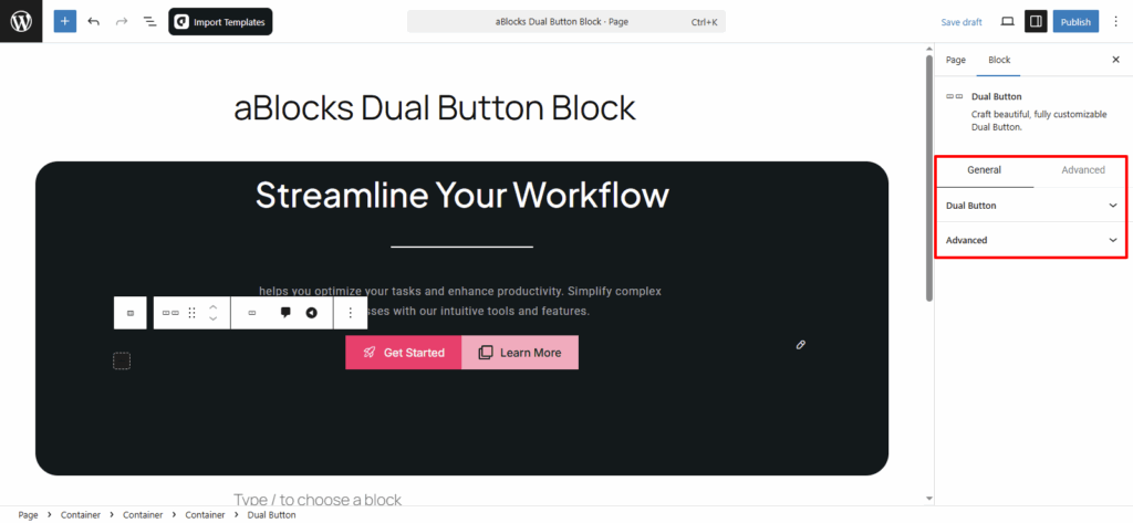
Dual Button
This section has two main parts—Content and Style.
Each part gives you different settings to control how your Dual Button looks and works.
Let’s start with the Content options.
Content
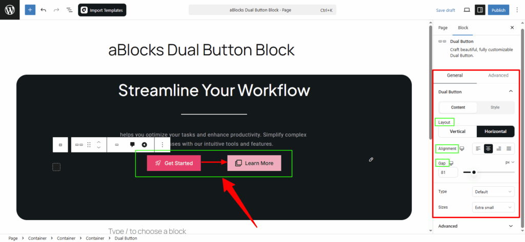
Layout: You can set the Dual Button layout in two ways:
- Horizontal – buttons appear side by side.
- Vertical – buttons stack one above the other.
Alignment: Set how the buttons are aligned—choose from Flex Start, Center, Flex End, or Space Between.
Gap: Adjust the space between the two buttons as needed.
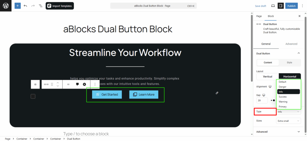
Type: You can set each button to a different style type like Primary, Success, Info, Warning, or Danger to match the action or message.
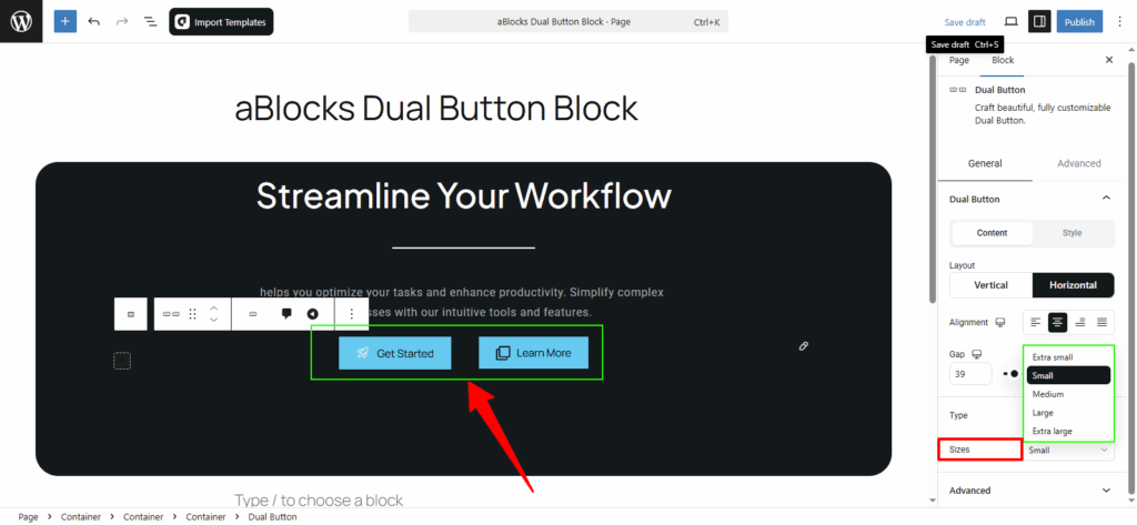
Sizes: You can change the size of your Dual Buttons to fit your design. Available options are: Extra Small, Small, Medium, Large, and Extra Large.
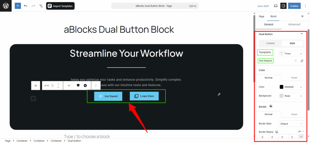
Style
In this section, you’ll find several options to customize the appearance of each button. Let’s go through them step by step.
Typography: Change the font, size, weight, and spacing of your Dual Button text. For details, check the aBlocks Typography Settings documentation.
Text Shadow: Add shadow effects to your button text using four simple controls. Learn more in the aBlocks Text Stroke and Text Shadow documentation.
Text Stroke: Apply stroke effects to your text with two easy settings. See the aBlocks Text Stroke and Text Shadow documentation for full help.
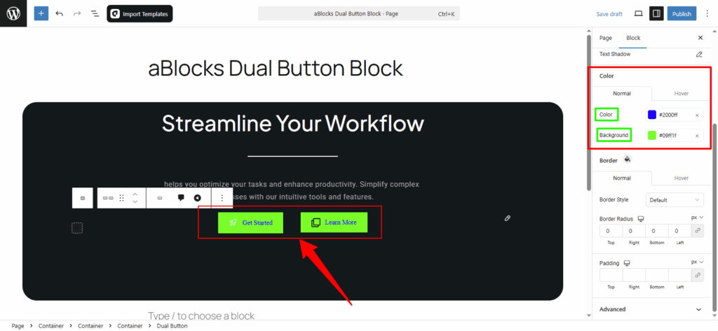
Dual Button Color Customization
This section has two parts: Normal and Hover. Both offer the same settings.
- Normal styles apply by default.
- Hover styles show when users place the cursor over the button.
Text Color: Change the button text color.
Background Color: Change the button background color.
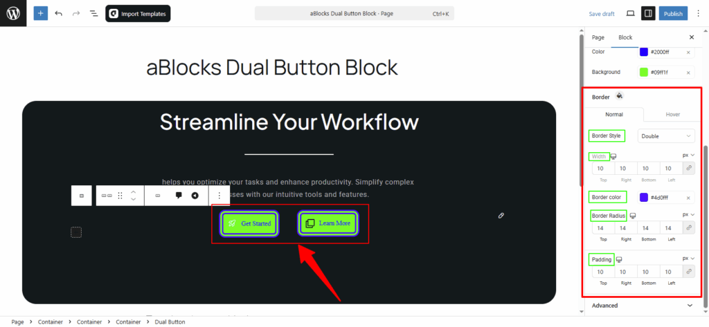
Dual Button Border Customization
You’ll see Normal and Hover options, just like before. Here’s what you can control for each button:
Border Style: Choose from options like None, Solid, Double, Dotted, Dashed, or Groove.
Width: Set how thick or thin the button borders should be.
Border Color: Pick a color for the border.
Border Radius: Adjust how round or sharp the button corners look.
Conclusion
The aBlocks Dual Button Block is a simple way to place two buttons side-by-side and style them to fit your site’s design. From layout to color, size, and border—you have full control over how each button looks and behaves.
If you need help, the support team is always ready to assist.