


The aBlocks Countdown block is a powerful and customizable block that allows you to display a countdown to any event, promotion, or deadline on your WordPress site. It helps create urgency and engagement for your audience by visually tracking time until a specific moment.
Add Countdown Block
Open your WordPress dashboard and click to edit the page or post. Navigate to the section where you want to add the countdown block. You can also add it to a new page or post and the top of your website as a notification.
Click the plus (+) icon to add a new block.
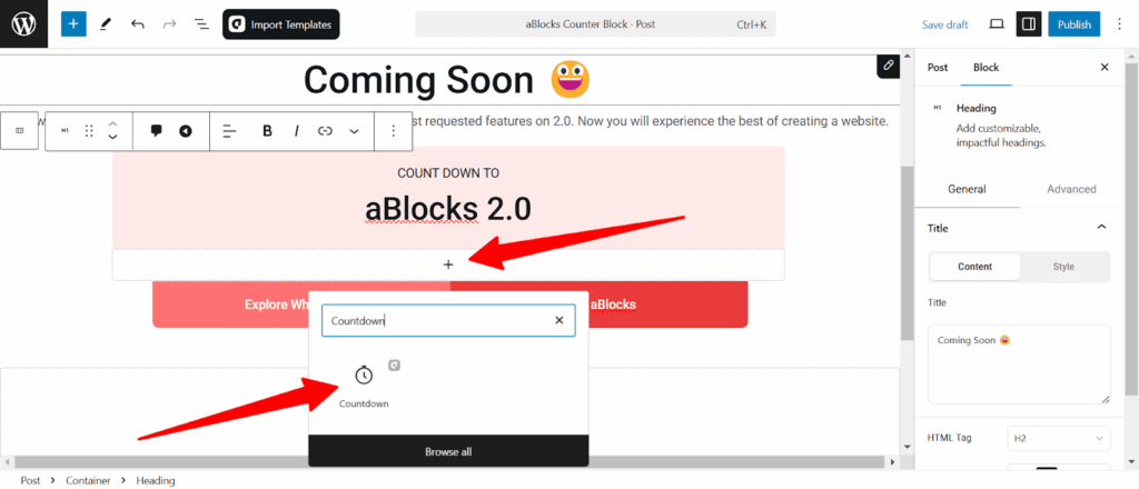
Search for “Countdown” in the search option and select the aBlocks Countdown block. The countdown timer will appear on your page.
Customize Countdown Block
Once the Countdown block appears on your page, you can customize it using the right-side panel under Block > General. Here, you will find multiple options to configure your countdown timer according to your needs.
- Countdown
- Label
- Number
- Separator
- Advanced

Let’s describe one by one.
Countdown
The Countdown Customization Options let you adjust alignment, spacing, layout, and set the target date for a seamless countdown display.
Countdown content
- Direction: Choose the layout direction of the countdown items:
- Horizontal (→) – Displays the countdown in a single row.
- Vertical (↓) – Stacks the countdown elements in a column.
- Justify: Adjust the positioning of the countdown items along the main axis. Options include start, center, end, space-between, space-around, and space evenly.
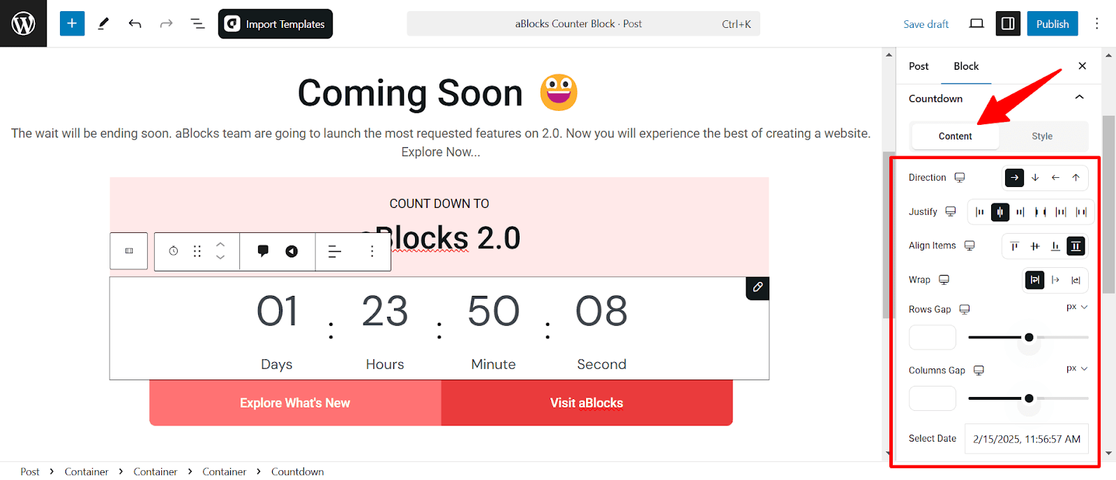
- Align Items: Controls the vertical alignment of the countdown elements. Choose from start-aligned, centered, end-aligned or .stretch
- Wrap: Enables wrapping of countdown elements when the screen width is limited.
- Rows Gap: Adjusts the spacing between rows in a vertical layout.
- Columns Gap: Modifies the spacing between countdown elements in a horizontal layout.
- Select Date: Set the target date and time for the countdown to reach zero. The countdown automatically calculates and updates the remaining time in days, hours, minutes, and seconds.

- Show Day, Hour, Minute, Second: Toggle visibility for each countdown unit.
- Show Separator: Enable or disable separators between countdown units.
- Show Labels: Display or hide labels beneath the countdown numbers.
Countdown Style
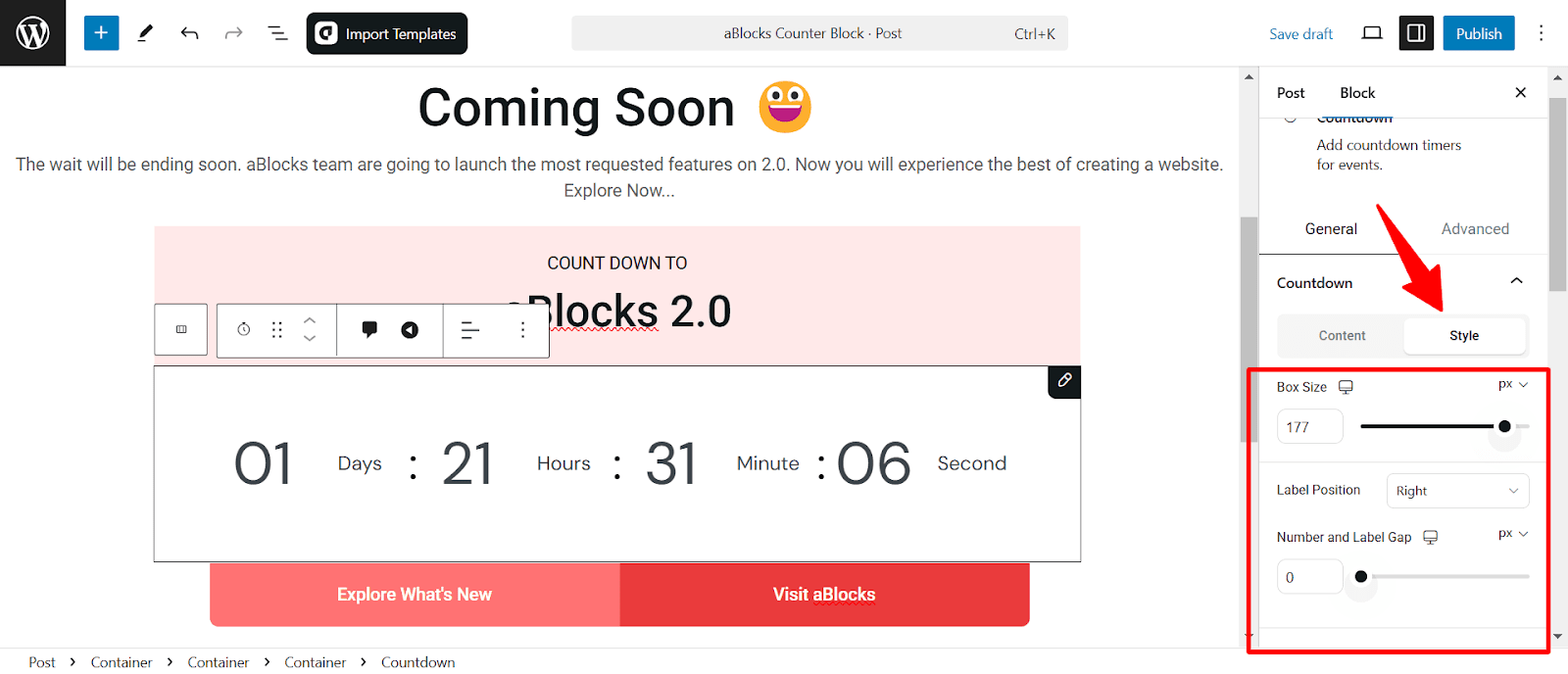
Box Size: Adjust the overall size of each countdown unit.
Label Position: Set the placement of labels (Days, Hours, etc.) relative to the numbers. Options include left, right, top, or bottom.
Number and Label Gap: Control the spacing between numbers and their corresponding labels for better readability.
Scroll a little bit down you will see the option
Border
- Border Style: Choose from solid, dashed, or dotted styles to match your design aesthetics.
- Width: Adjust the border thickness to define the structure of the countdown timer.
- Border Color: Select a custom color to complement your theme.
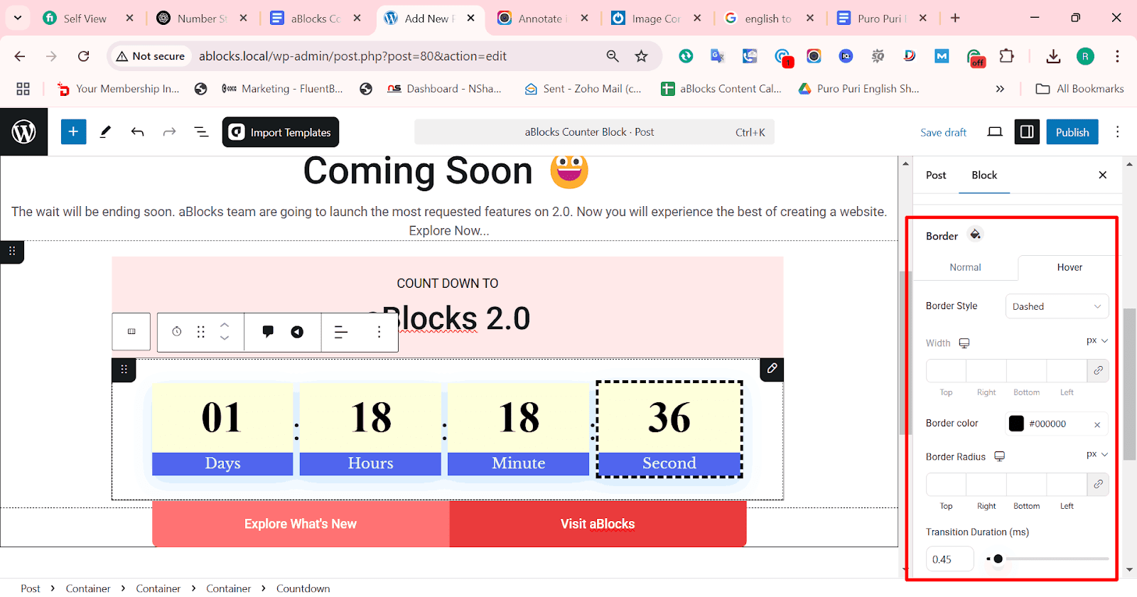
- Border Radius: Modify the corner roundness to create sharp or smooth edges.
- Transition Duration: Set the animation speed for border changes when interacting with the element.
- Background Color: Choose a background color to enhance visibility and blend seamlessly with your design.
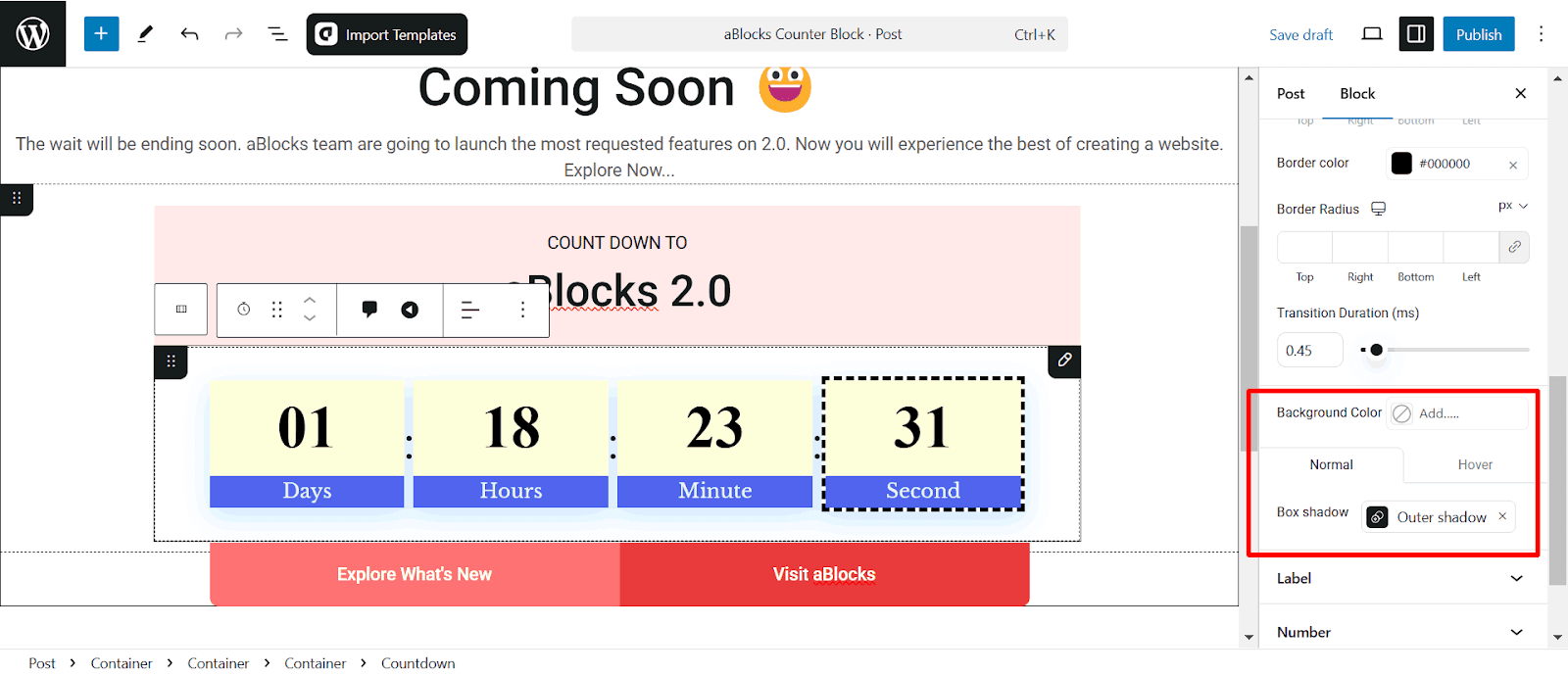
- Box Shadow: Add an outer shadow effect to create depth and make the countdown stand out.
Also, you can set Hover Effects. Customize how the background and shadow behave when users interact with the countdown.
Label
The Label section allows you to customize the text displayed under each countdown unit. You can modify the labels for Days, Hours, Minutes, and Seconds to match your design needs or language preferences.
Label Content
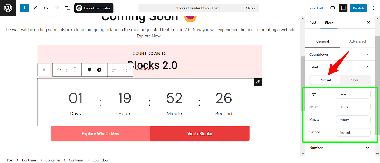
Days, Hours, Minutes, Seconds: Customize the text labels displayed beneath each countdown unit. You can modify these to fit your preferred language or style.
Label Style
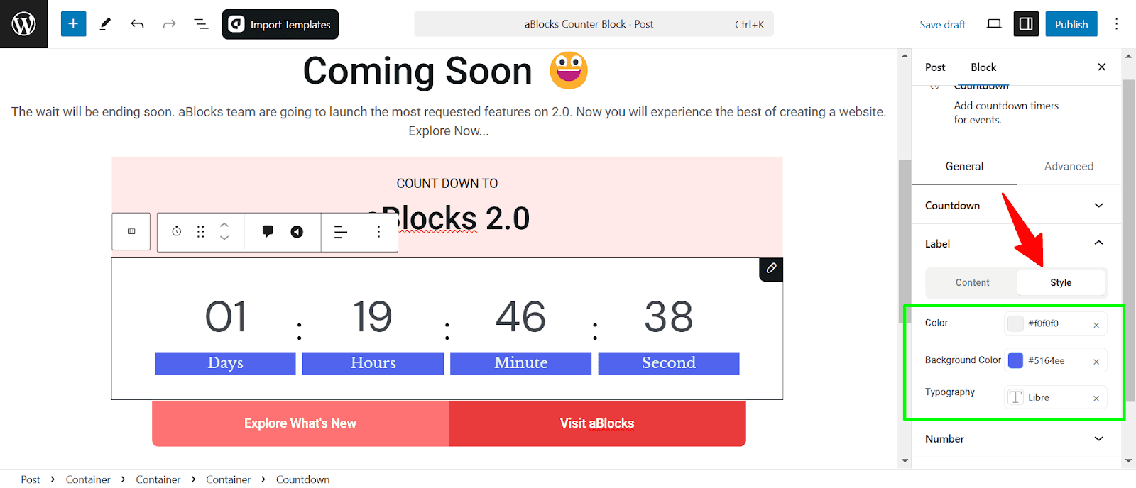
- Color: Adjust the text color of the labels to match your design preferences.
- Background Color: Set a background color for the labels, helping them stand out or blend with the countdown’s overall design.
- Typography: Customize the font style, size, weight, and other typographic settings to ensure the labels are visually appealing and readable.
Number
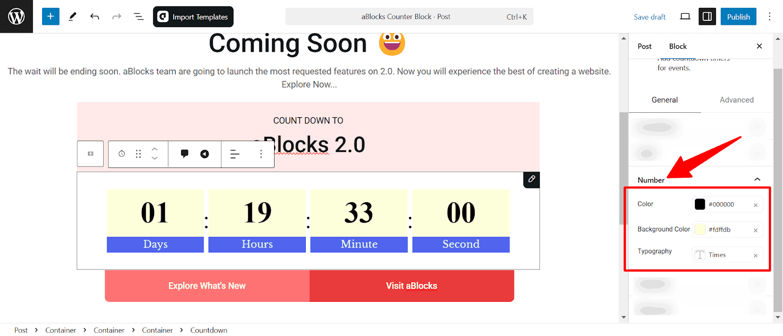
Color: Customize the text color of the numbers to seamlessly match your design.
Background Color: Set a background color for the numbers to make them pop or integrate smoothly with the countdown’s aesthetic.
Typography: Personalize the font style, size, weight, and other typographic elements to ensure the numbers are clear, stylish, and easy to read.
Separator
The Separator section in the aBlocks Countdown Block lets users customize the divider between countdown units for better readability and design consistency.
Separator Content
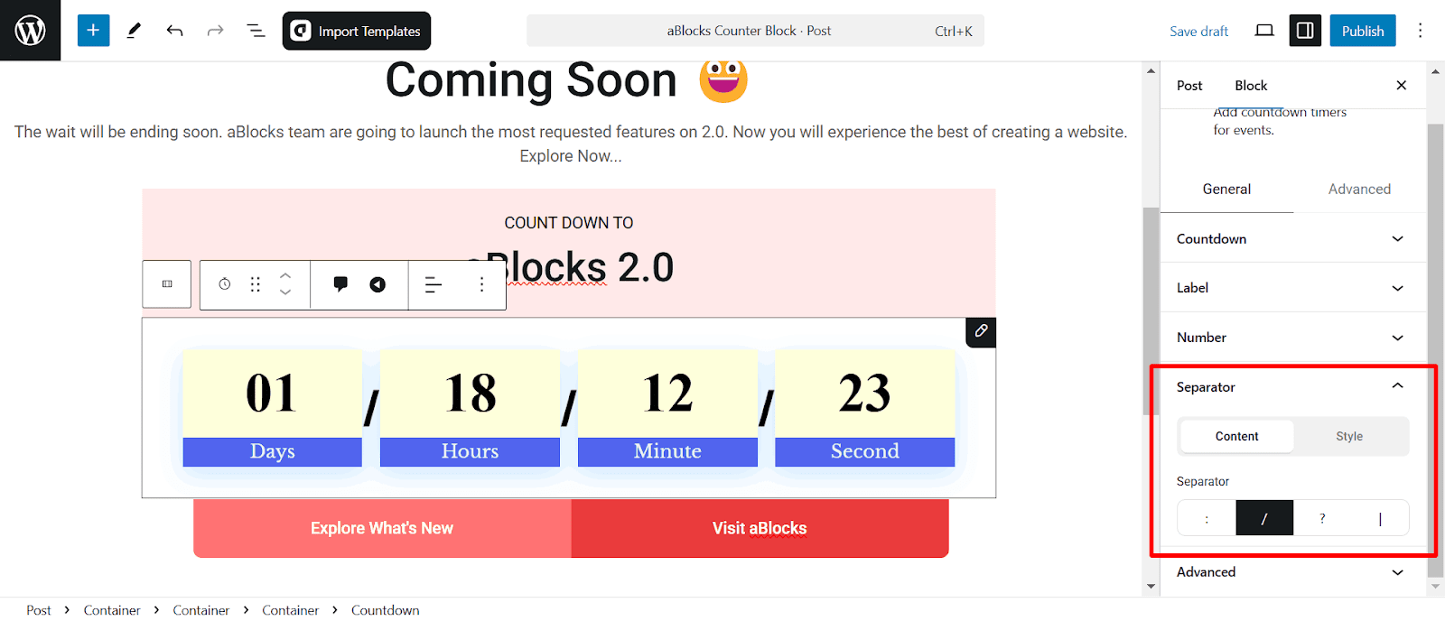
- Separator Type: Choose the character or symbol between countdown units:
- : (Colon)
- / (Slash)
- ? (Question Mark)
- | (Vertical Bar)
Separator Style
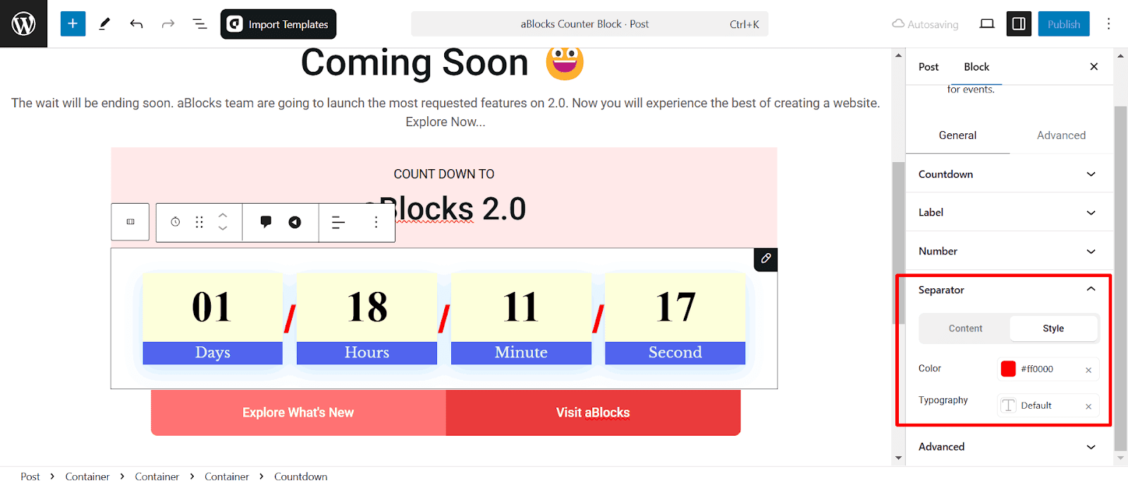
- Color: Select the separator color to match the overall design of your countdown block.
- Typography: Customize the font style and size for the separator to ensure it blends seamlessly with your design.
Conclusion
This guide covers everything you need to customize the aBlocks Countdown Block. If you need any help, just create a support ticket, our dedicated support team is always ready to assist you!