


The Logout Block by aBlocks helps you add a simple logout button to your WordPress pages. It’s perfect for sites with user accounts, memberships, or eLearning platforms. Here’s how you can use it:
Add the aBlocks Logout Block
Go to the page or post where you want to place the logout button.
Click the ( + ) icon to open the block options.
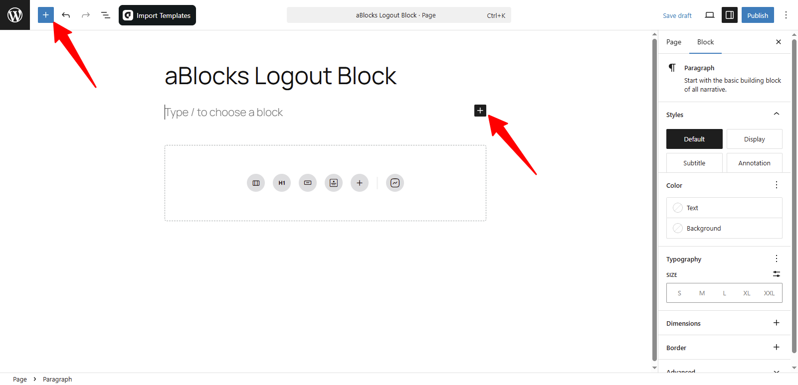
You’ll see all the aBlocks blocks. Scroll to find the Logout Block or type Logout in the search bar to find it quickly.

Select the aBlocks Logout Block and click to add it. After that, you can change the text, color, size, and spacing to match your site’s design.

Customize the aBlocks Logout Block
We’ll guide you step-by-step on how to use and customize the aBlocks Logout Block.
Open the right sidebar panel and go to Block > General. There, you’ll see two main sections:
- Logout
- Avatar
Let’s explore each option step by step.
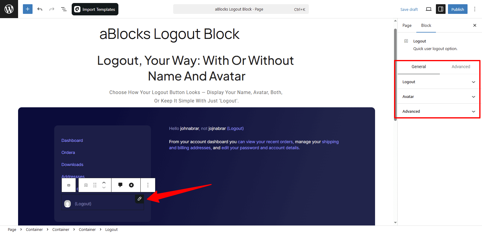
Logout
This section is divided into two parts: Content and Style. Each part offers several customization options. Let’s start by looking at the Content settings.
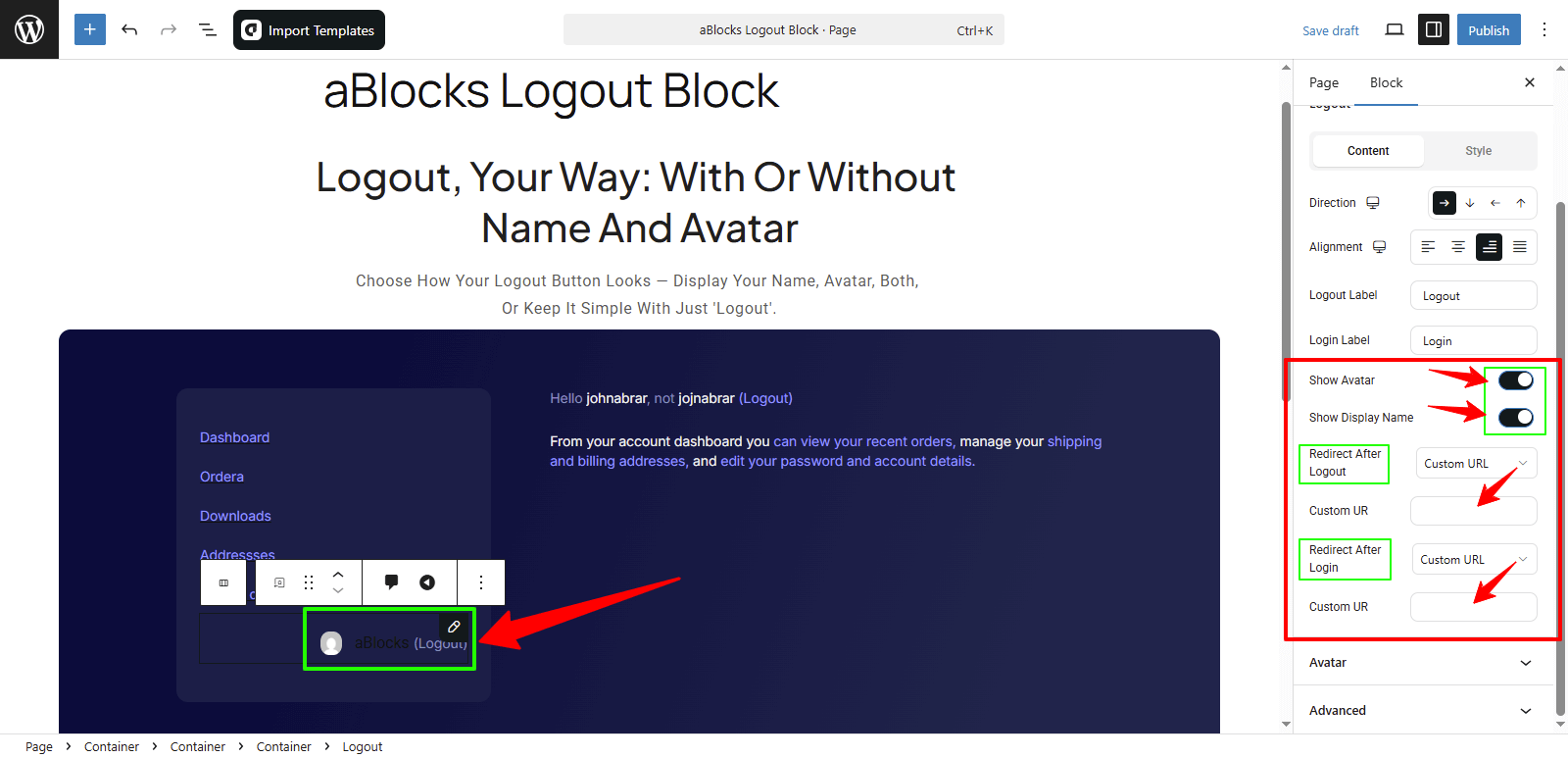
Content
Direction: Choose how the logout elements are arranged. You can set it to Row, Column, Row Reverse, or Column Reverse.
Alignment: Control the alignment of the logout block. Options include Flex Start, Center, Flex End, and Space Between.
Logout Label: You’ll see a text box where you can type your own logout label. Example: Sign Out or Logout Now.
Login Label: Just like the logout label, you can set a custom label for the login text. Example: Sign In or Login.

Show Avatar: Use the toggle switch to show or hide your avatar next to the logout button.
Show Display Name: Turn this toggle on or off to show or hide the user’s display name.
Redirect After Logout: Choose where users go after logging out. You’ll get two options:
- Current URL: Users stay on the same page.
- Custom URL: Select this to show a URL input box. Enter the link where you want users to go after logout.
Redirect After Login: This works the same way as the logout redirect. You can add a custom URL where users will be taken after they log in.
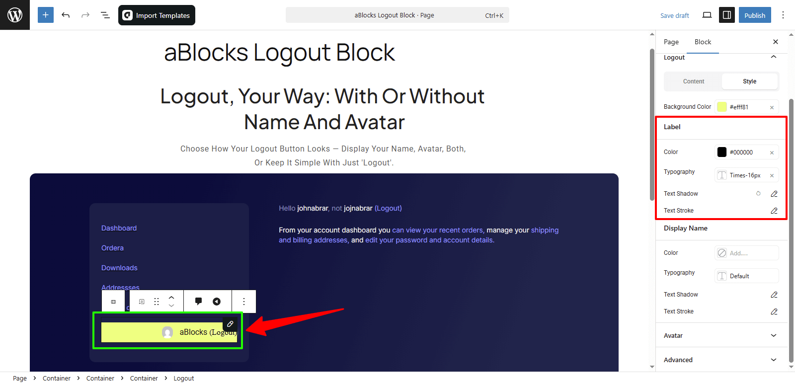
Style
In this section, you’ll find several customization options to control the appearance of the logout block. Let’s go through them one by one.
Background Color: You can change the background color of the entire logout section to match your site’s design.

Customize the Label Section
Color: You can change the label text color to fit your design.
Typography: Easily control the font size, weight, line height, and more for your labels. For full details on each option, check the aBlocks Typography Settings documentation.
Text Shadow: This section includes four settings to add shadow effects to your label text. For full guidance, see the aBlocks Text Stroke and Text Shadow documentation.
Text Stroke: You’ll get two options to fine-tune the text outline for your label. For complete instructions, visit the aBlocks Text Stroke and Text Shadow documentation.
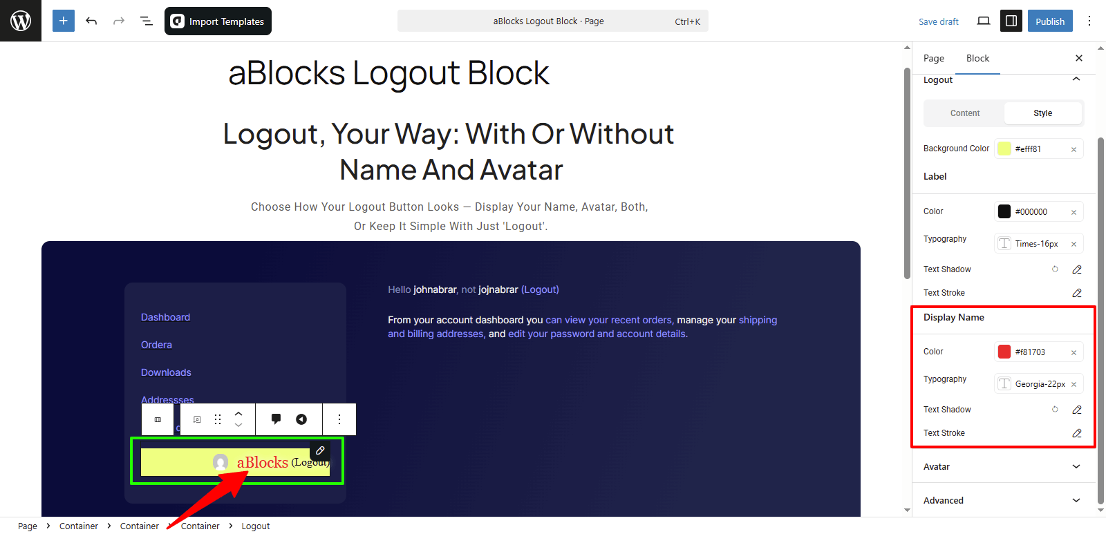
Customize the Display Name
Color: You can change the color of the display name text to match your design.
Typography: Adjust the font size, weight, spacing, and more to style the display name text. For full details on each option, check the aBlocks Typography Settings documentation.
Text Shadow: Add shadow effects to the display name text using four available settings. For full guidance, see the aBlocks Text Stroke and Text Shadow documentation.
Text Stroke: Use two options to outline the display name text and make it stand out. For full guidance, see the aBlocks Text Stroke and Text Shadow documentation.
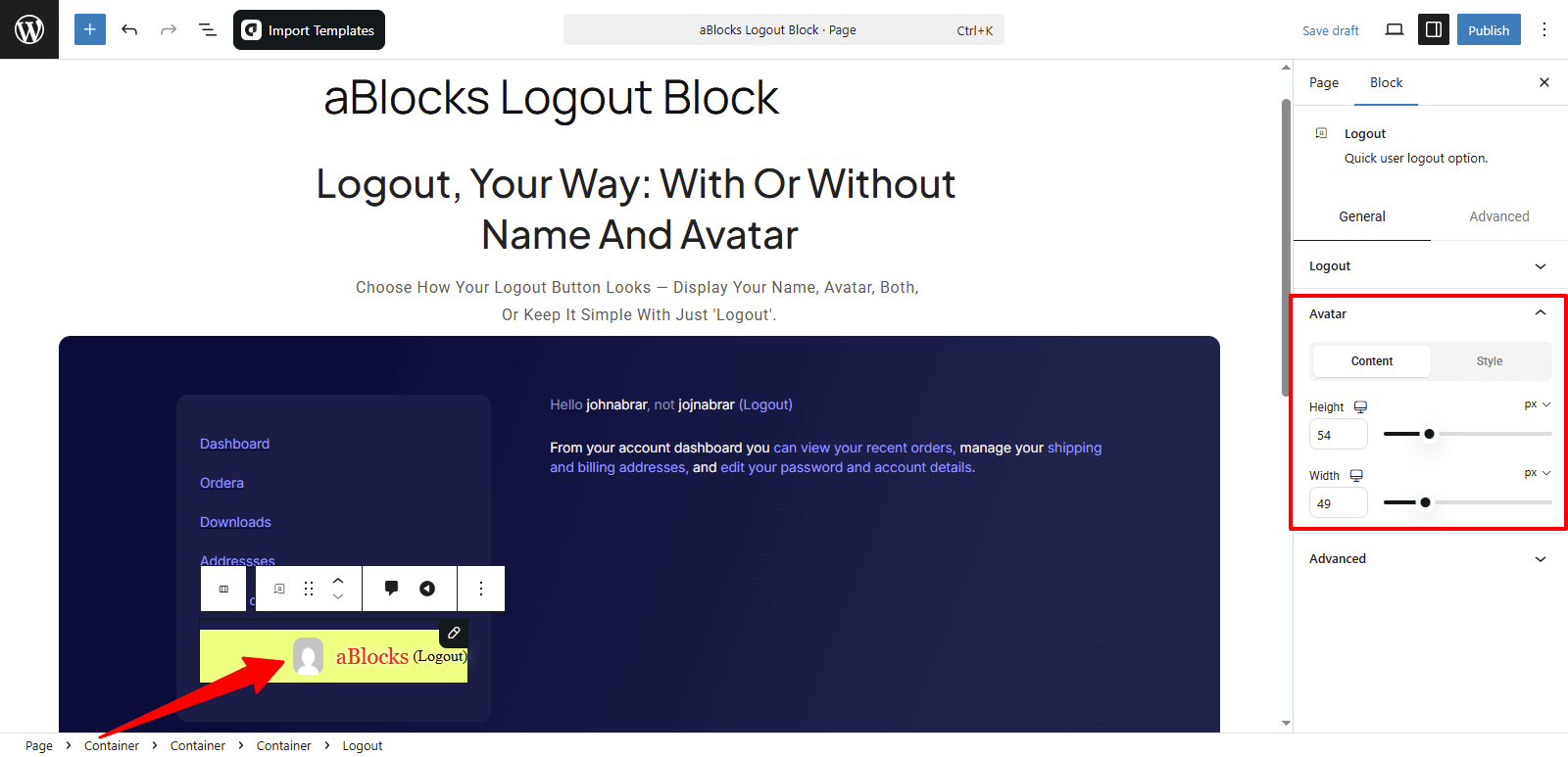
Avatar
This section has two parts: Content and Style. Let’s go over the Content options first.
Content
Height: You can increase or decrease the height of the avatar as needed.
Width: You can adjust the width of the avatar to fit your design.
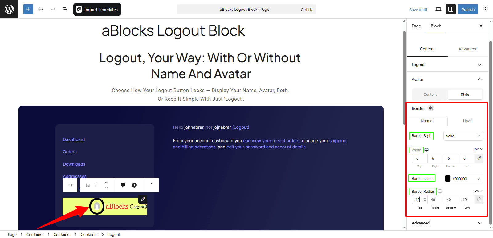
Style
In this section, you’ll find border customization options. You’ll see two tabs: Normal and Hover, just like before. Here’s what you can adjust:
Border Style: Choose from options like None, Solid, Double, Dotted, Dashed, and Groove to style the avatar border.
Width: Change the thickness of the border.
Border Color: Pick a color for the border to match your design.
Border Radius: Adjust the corner roundness. Make it fully rounded or keep it sharp—your choice.
Conclusion
The aBlocks Logout Block lets you easily add and style a logout button on your site. With full control over layout, labels, avatar, and redirects, you can create a smooth logout experience in minutes.
If you have any questions or need assistance, feel free to contact our support team. We’re here to help!