


aBlocks modal popup is the most smooth and easiest solution to add a modal popup on your wordpress website. You don’t need to face any extra hassle like install extra plugin. aBlocks modal and popup builder gives you the seamless flexibility to create and design a modal popup with just some clicks to fulfill your needs.
Add aBlocks modal popup
Open your wordpress dashboard and go to the page or post where you want to add the modal popup. Navigate the section where you want to add the modal popup.
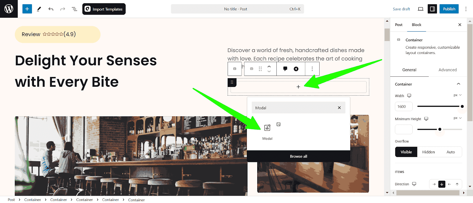
Click the plus icon (+) to add a new container or directly search for “modal or popup” then select the aBlocks modal popup and click on it.
The modal popup will appear on your page.
Customize aBlocks modal popup builder
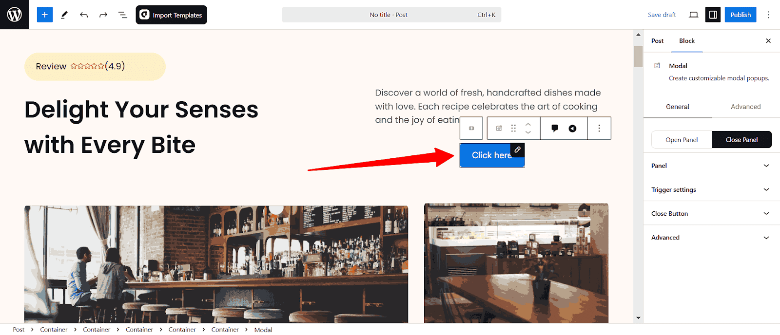
To customize select the modal popup and go to block>general, Here you will see all the customization options.
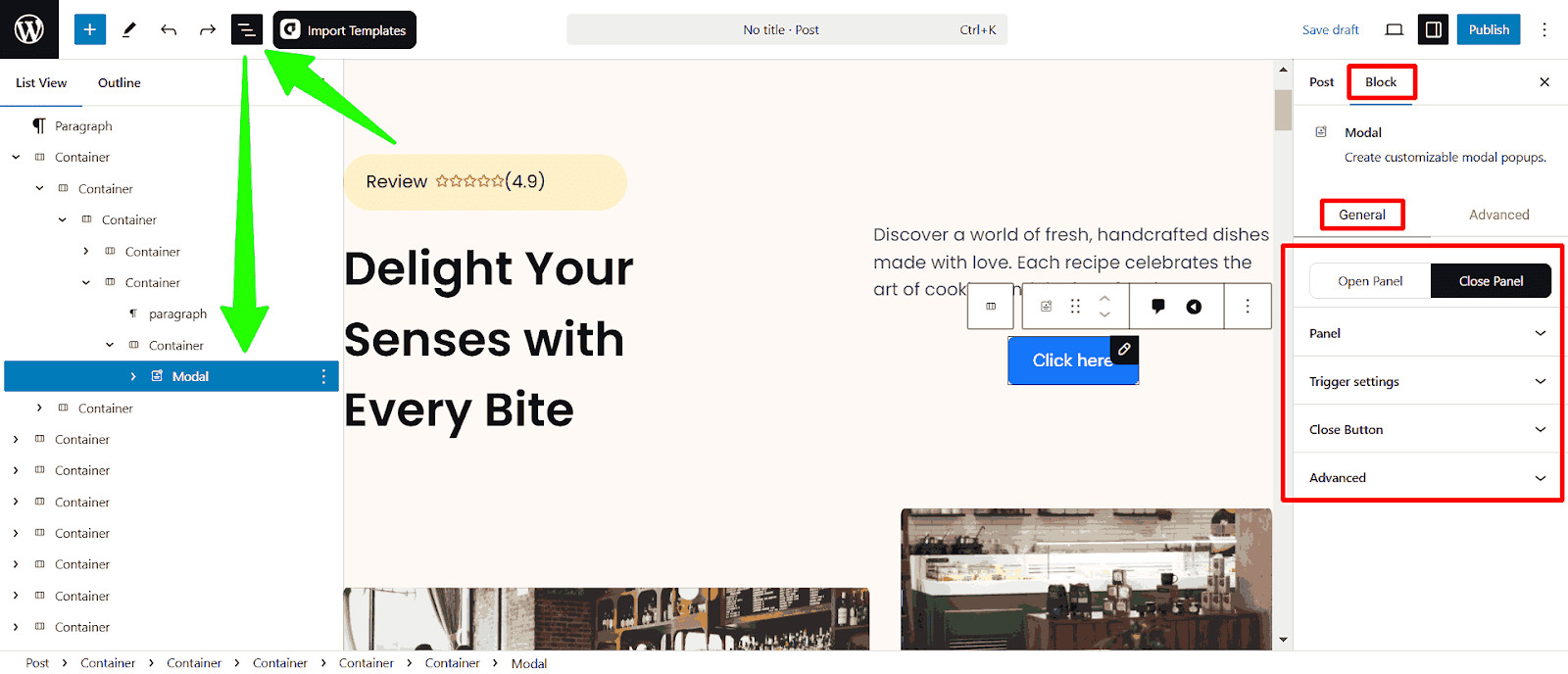
Also, you can open the Document Overview to navigate all the sections and customize them easily.
Modal popup customization options available:
- Open Panel
- Close Panel
- Panel
- Trigger Settings
- Close Button
Let’s describe one by one:
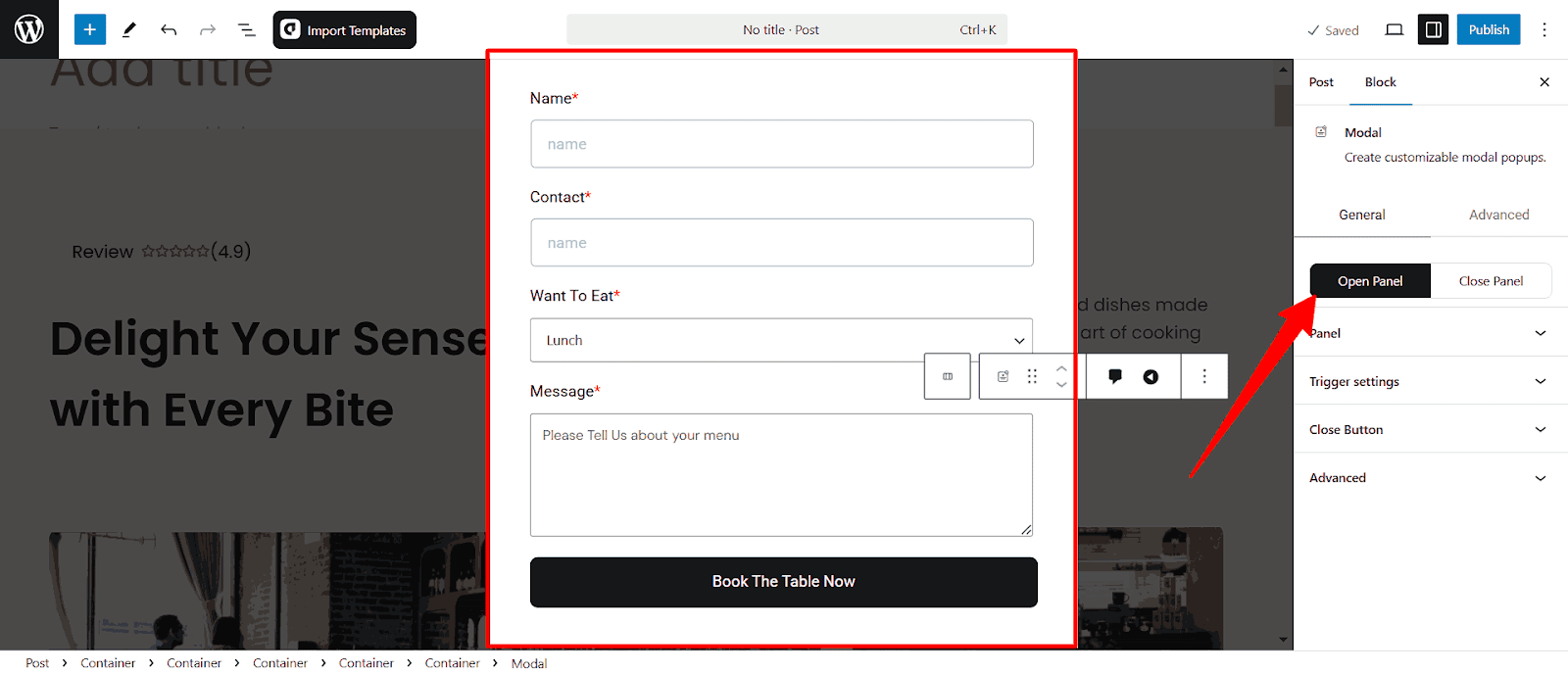
Customize Open Panel
The Open Panel allows you to activate and customize the modal popup preview whenever someone clicks the button. Add the elements you want to display when the button is clicked.
Add Open Panel Elements
Click the Open Panel, you will see the new page to add the elements. Simply type slash (/) to add blocks.
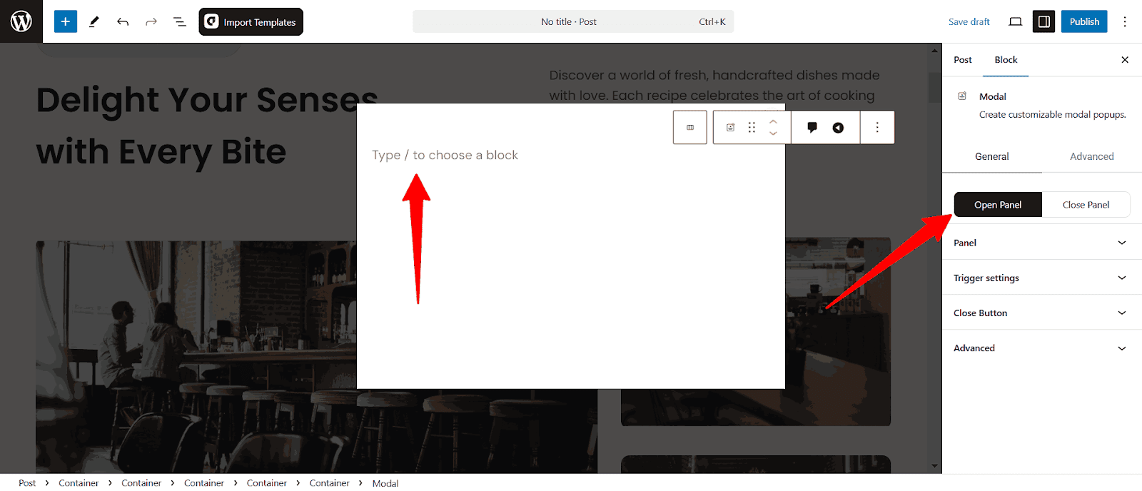
Also, you can click the page and then click the plus icon to add new blocks.
I have added a booking form here.
Customize Close Panel
The Close Panel section lets you customize the close button and dismissal behavior of your modal popup. Adjust settings to control the button’s visibility, position, style, and advanced interactions for a tailored user experience.
Panel
The Panel section contains the main customization options for the modal. You can adjust its content, style, width, height, and positioning for a perfect layout.
Close Panel Content
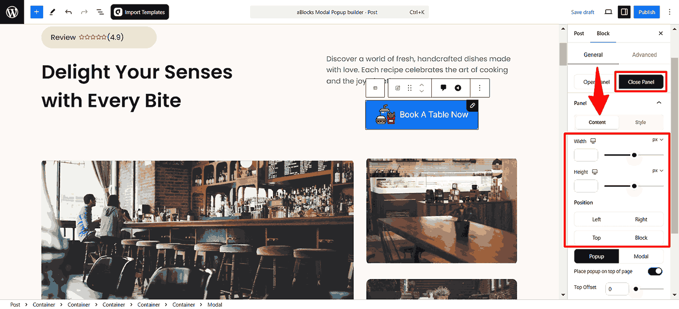
- Width: Adjust the width of the modal in pixels (px) to define its size.
- Height: Set the modal’s height in pixels (px) for a structured layout.
- Position: Choose whether the modal aligns to the left, right, top, or block of the screen.
Modal and Popup Customization
The aBlocks Modal Block allows you to switch between two display modes: Popup and Modal. Each mode provides different ways to present your content dynamically.
Popup Mode
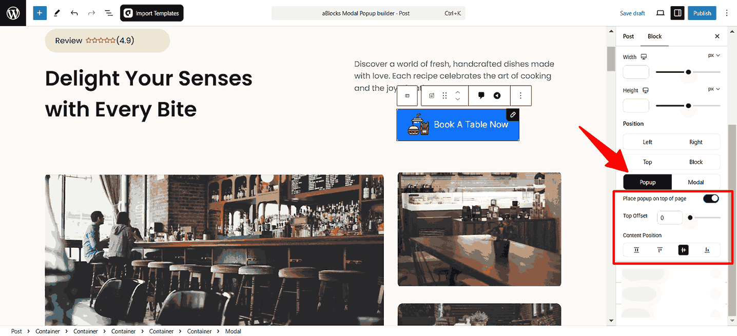
- Place popup on top of page: Enable this toggle to make the popup appear above all elements on the page.
- Top Offset: Adjust the vertical spacing between the popup and the top of the page.
- Content Position: Align content inside the popup (Stretch, Top, Center, Bottom).
Modal Mode
When switching to Modal Mode, the popup behaves as a traditional modal window, appearing at the center of the screen and overlaying the content below.
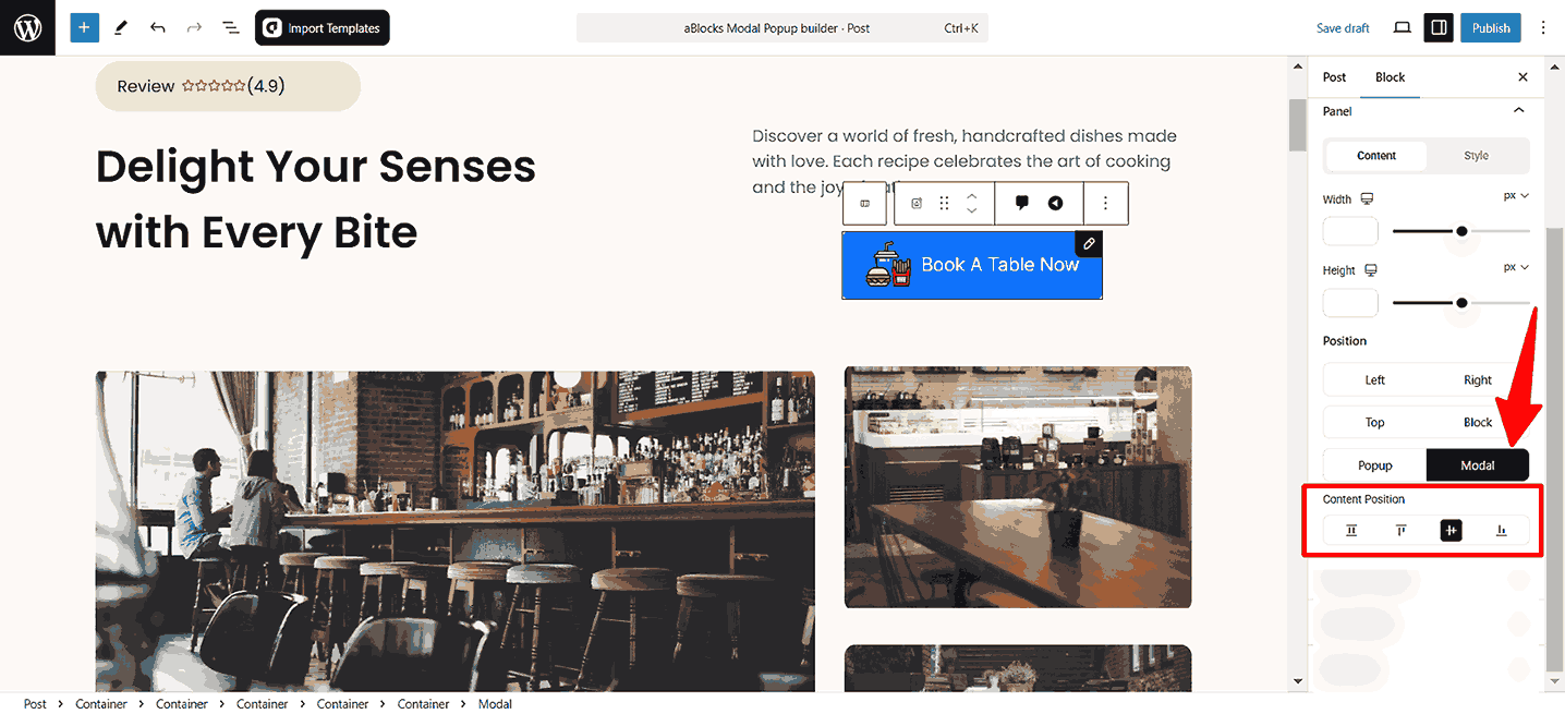
- Content Position: Align content inside the popup (Stretch, Top, Center, Bottom).
Close Panel Style
- Backdrop BG: Sets the background color of the overlay behind the popup. Uses a color picker to choose or input a custom hex code.
- Padding: Adjusts the inner spacing of the panel. Provides controls for top, right, bottom, and left padding individually.
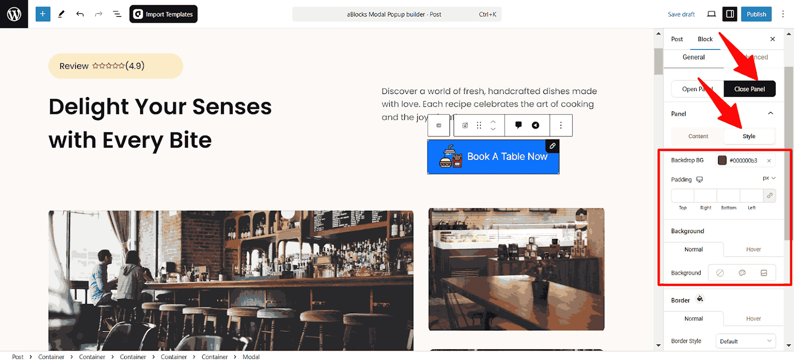
Background
Configure background settings for both Normal and hover states.
- Background Options: Choose from solid color, gradient, or image.
Border
- Border Style: Choose the type of border none, solid, double, dotted, dashed, or groove.
- Border Radius: Adjusts the corner roundness for top, right, bottom, and left individually.
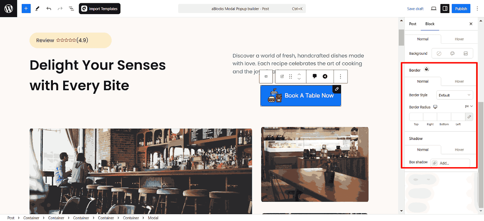
Shadow
Set different shadow styles for normal and hover states.
- Box Shadow: Add a shadow effect to the modal for a more elevated look.
- Transition Duration: Adjust the time it takes for the shadow effect to transition when the popup appears or changes state.
Trigger Settings
The Trigger Settings section controls how and when the popup appears. You can choose between manual and automatic triggers to engage visitors effectively.
- Use hover trigger instead of click: Enable this to open the popup when users hover over the trigger element instead of clicking it.
- Enable Auto Trigger Timer (s): Automatically display the popup after a set number of seconds. Adjust the timer to control the delay.
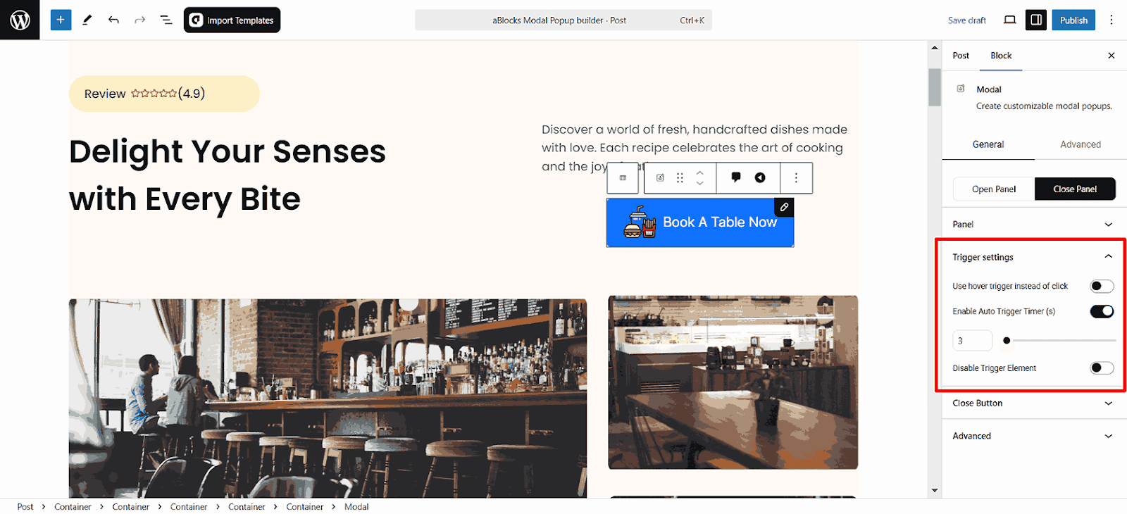
When Auto Trigger Timer is enabled, extra settings appear to help control when and how the popup appears:
- Trigger After (Seconds): Set a delay (in seconds) before the popup shows automatically.
- Disable Trigger Element: When activated, the assigned trigger (such as a button or link) is disabled, ensuring the popup opens only through the timer.
Close Button
The Close Button section provides options to control the popup’s closing functionality
- Disable Button: If enabled, the close button will be removed, preventing users from manually closing the popup.
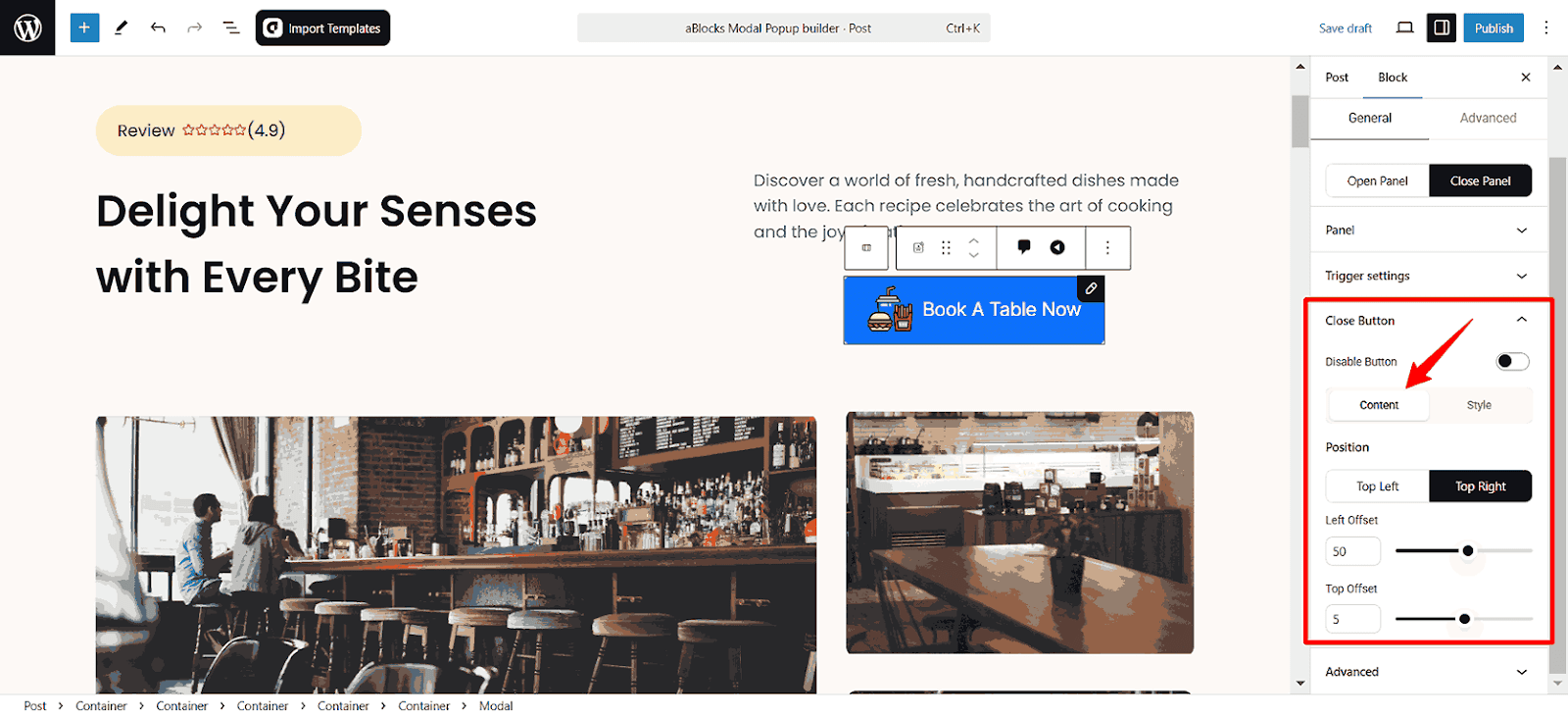
Close Button Content
Close Button Position: The position section allows you to control the close popup option. You can set it to the Top Left or Top Right.
- Left Offset: Adjust how far the popup moves from the left edge.
- Top Offset: Control the vertical distance from the top of the page.
Close Button Style
The section allows you to customize the close button style. This ensures the modal aligns with your website’s design and branding.
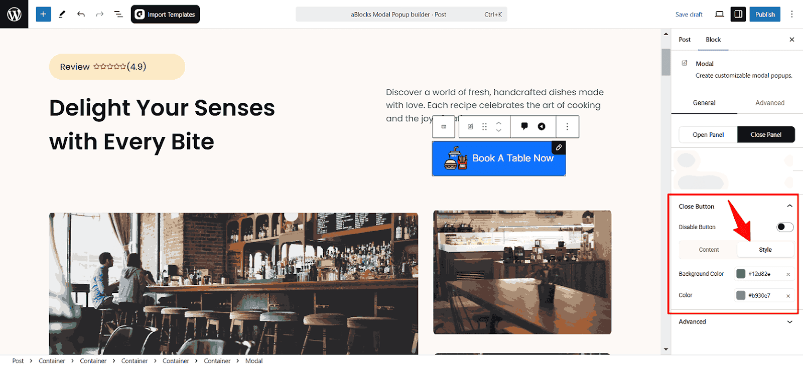
- Background Color: Choose the background color for the close button.
- Color: Set the text or icon color for the close button.
Conclusion
This documentation covers all features of the aBlocks Modal Popup Builder. If you need further refinements, feel free to create a support ticket—our team is always ready to assist!