


Icons can enhance your WordPress site by making it more visually appealing and easier to navigate. With aBlocks, adding and customizing icons is straightforward. Here’s a step-by-step guide to using the aBlocks Icon Block.
A Complete Guide to Using and Personalizing the Gutenberg Icon Block with aBlocks
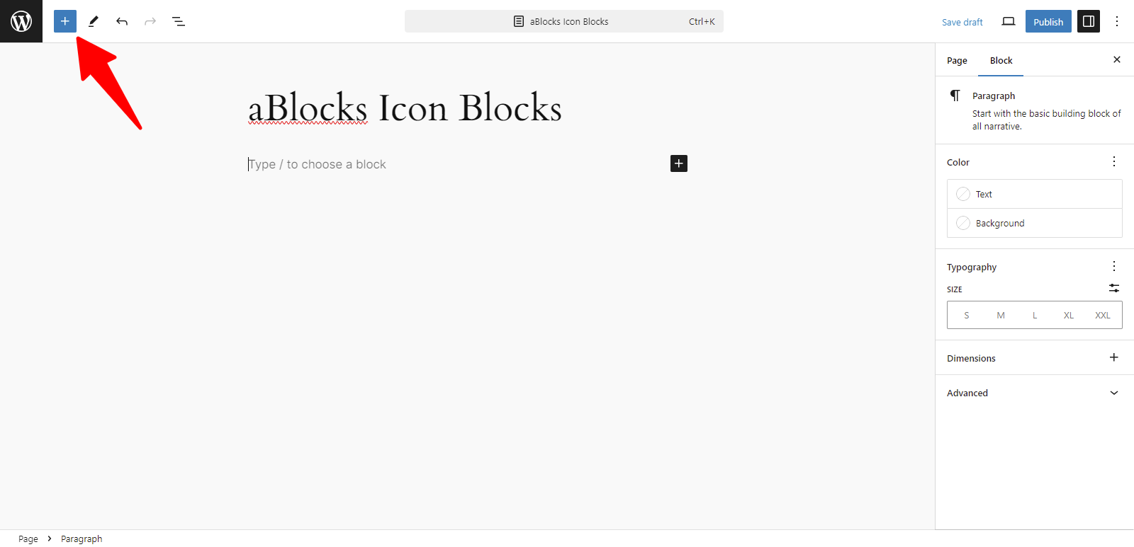
Enter your website’s dashboard and add a new page.
Click the (+) icon to access the block options.
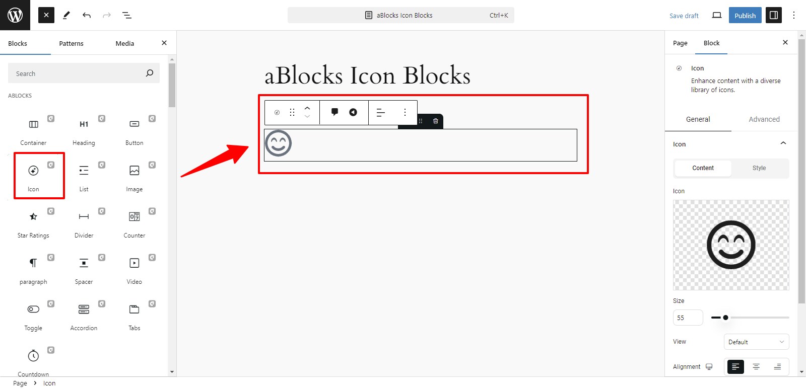
Now, all the blocks from aBlocks are visible to you. Select the aBlocks Icon Block from the available choices.
Customizing the aBlocks Icon Block for Enhanced Functionality
We will examine the complete usage and customization options of the aBlocks Icon Block, step by step.
General & Advanced
After selecting the aBlocks Icon Block, you will find the General and Advanced sections on the right side, allowing you to easily customize your icon.
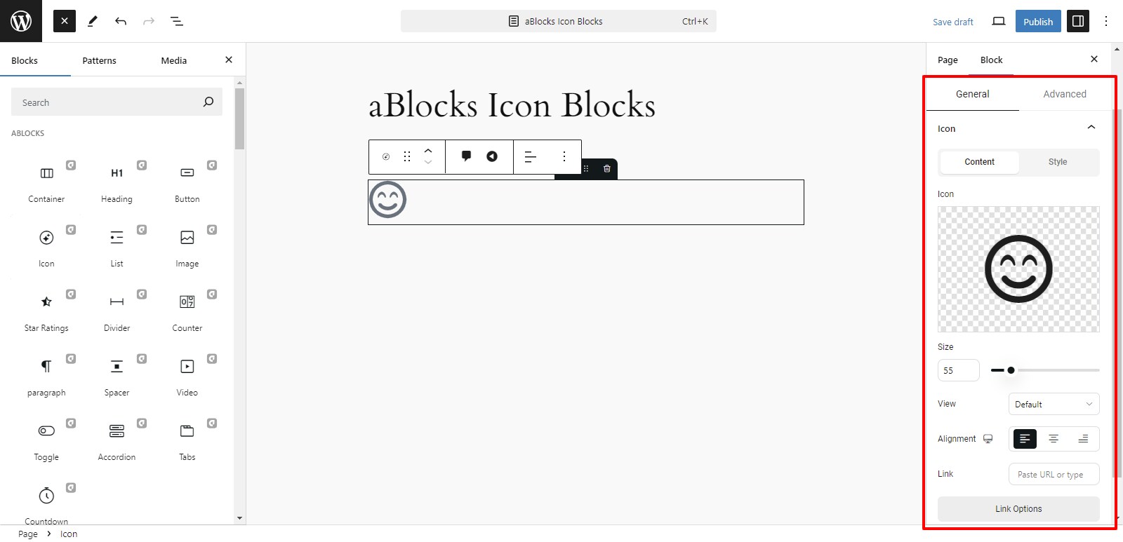
General
This section is divided into two parts:
- Content
- Style
Content
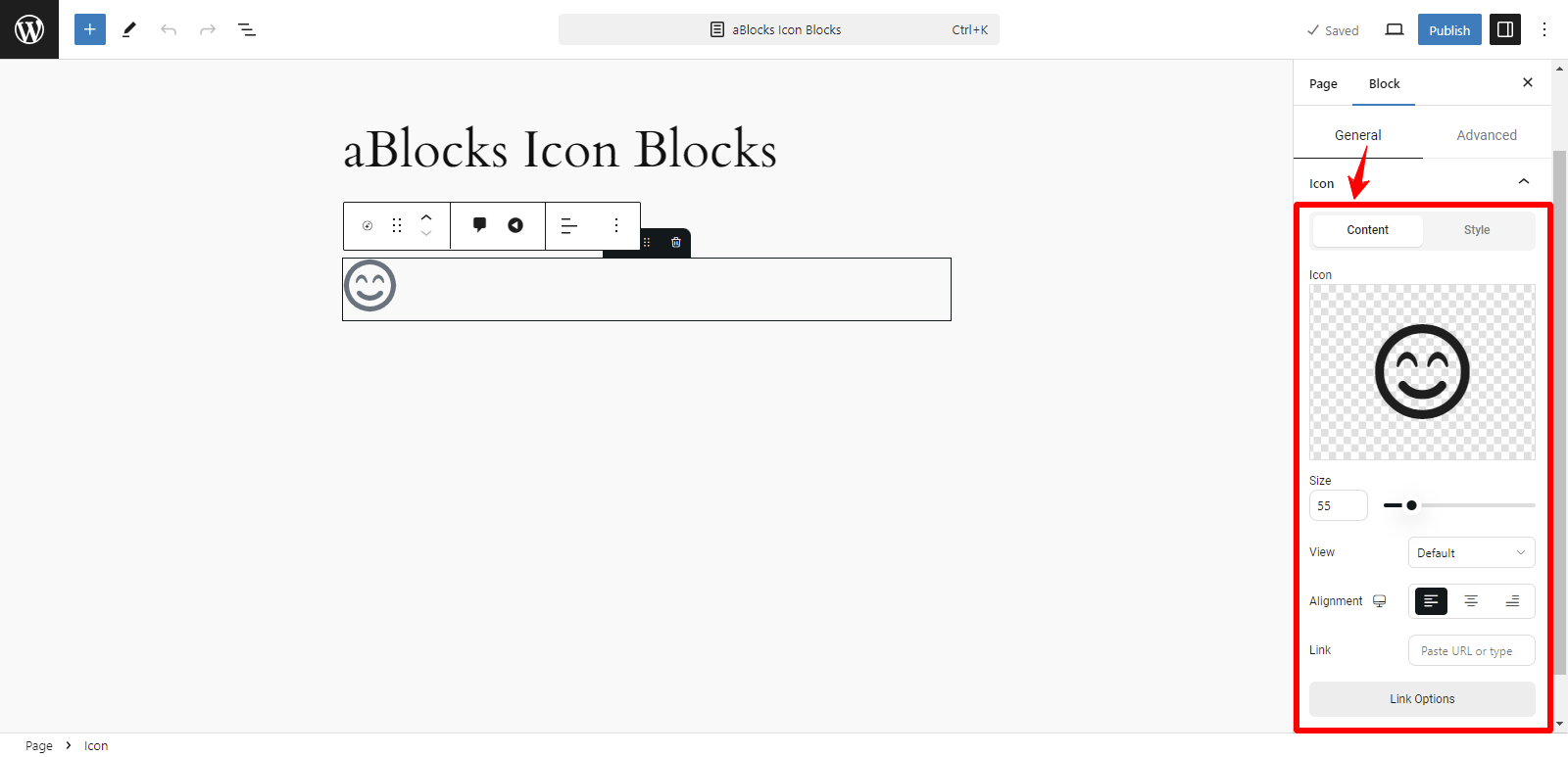
The content section has many customized options.
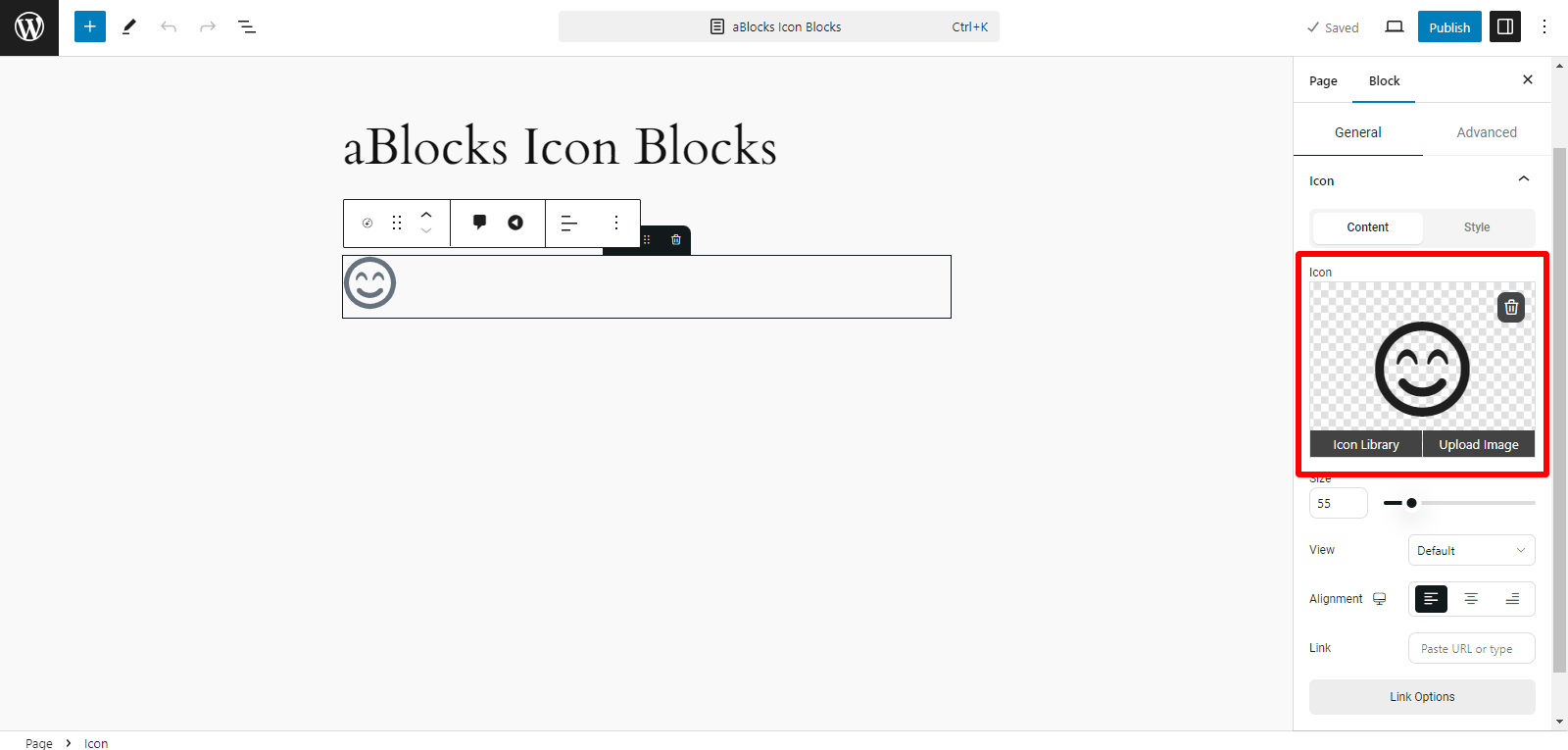
Icon: In the Icon option you can see the Icon box, then you can upload your icon image using two methods:
- Icon Library
- Upload Image
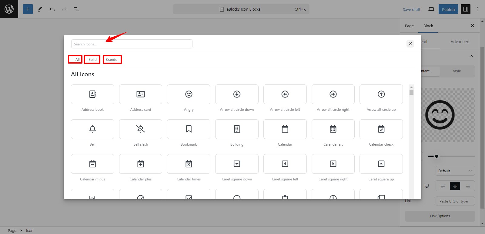
Icon Library: The aBlocks Icon Library provides a vast selection of icons for direct use in your designs. Click on Icon Library to view all available icons. You can choose your icon from the following categories:
- ALL: View all available icons in the library.
- Solid: Here, you’ll find only solid icons.
- Brands: This option shows all brand icons.
Also, utilize the Search Icons box at the top to quickly find a specific icon. Type relevant keywords, and the library will display matching icons.
Upload Image: You can upload your image using two options:
- Upload Files: Directly upload images from your device.
- Media Library: Choose an existing image from your website’s media library.
Now, select your icon image and click the Use This Media button to apply it to the button.
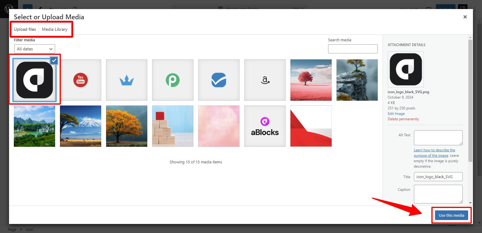
After clicking the Use This Media button, your icon image will appear on the button.
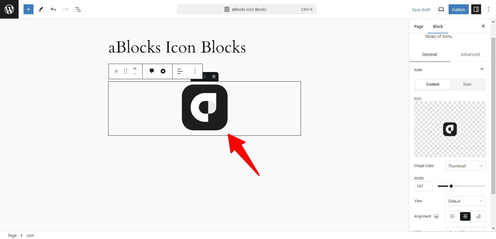
Image Sizes: You can adjust your icon’s size by selecting from the following options:
- Thumbnail: A smaller, compact version of the icon.
- Full: Displays the icon in its original size without cropping.
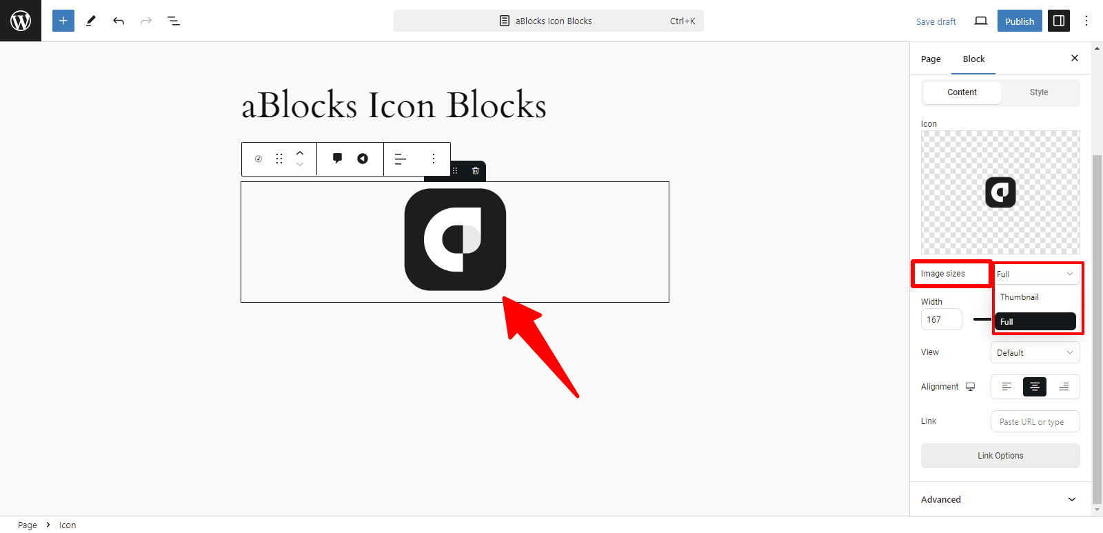
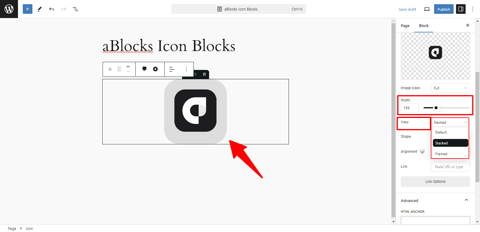
Width: Modify the icon’s width to fit your design preferences.
View: You can display your image using two options:
- Stacked: The icon is aligned above the text.
- Framed: The icon is enclosed within a border or frame.
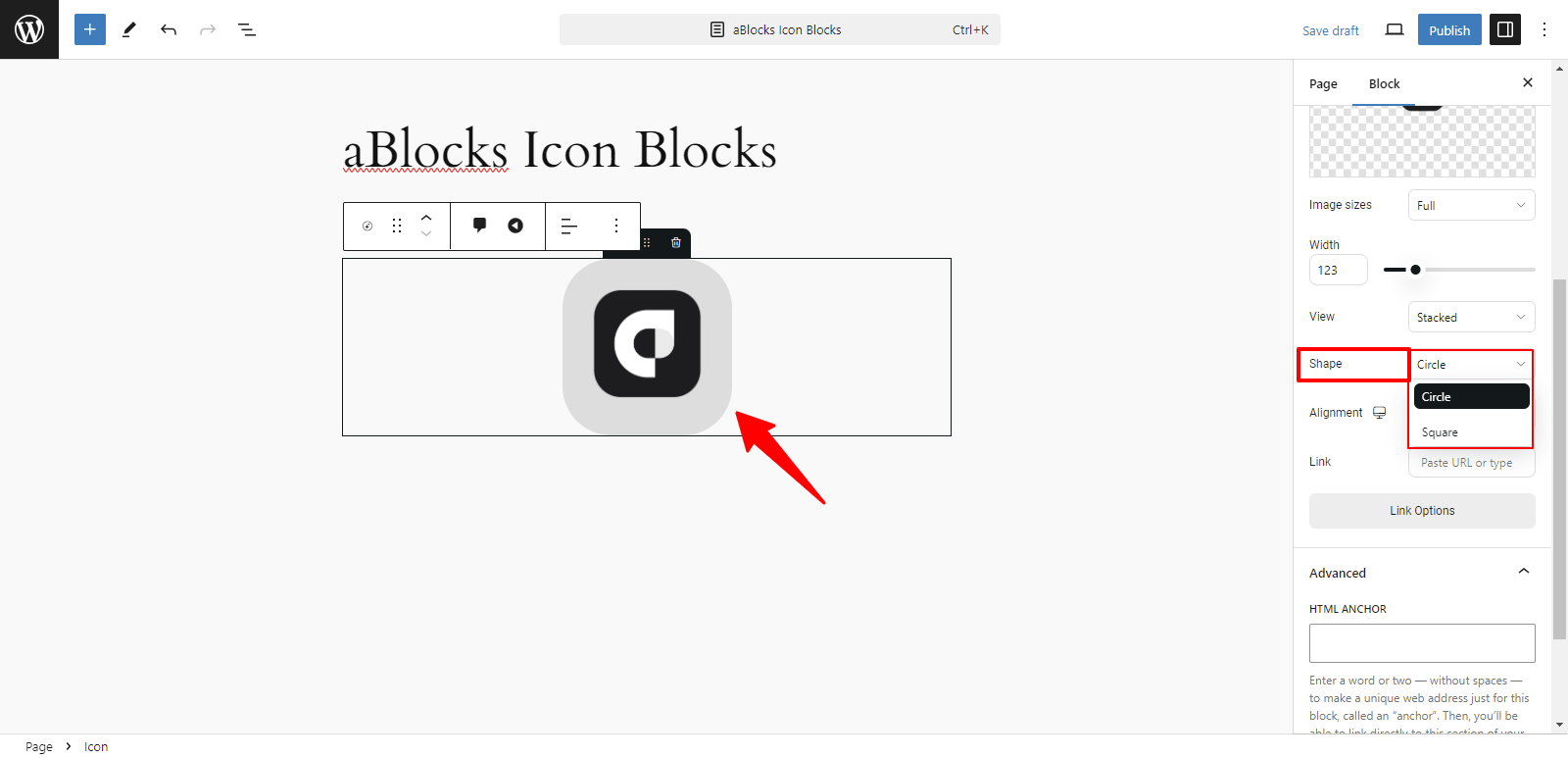
Shape: You can set the shape of your image with these two options:
- Circle: Displays the image with rounded edges in a circular form.
- Square: Displays the image with straight edges in a square form.
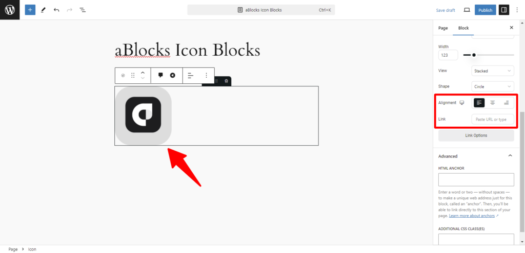
Alignment: You can easily adjust the alignment of your icon using these options:
- Left: Align the icon to the left.
- Center: Place the icon in the center.
- Right: Align the icon to the right.
Link: This option allows you to add a URL link to the icon. You can link the icon to any page or resource by entering the desired URL.
Style
In the General section, the second option is Style. The Style option offers various customization choices, like
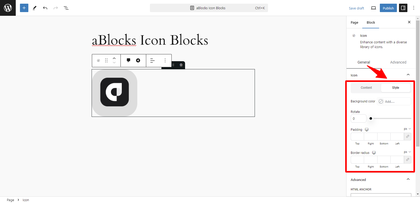
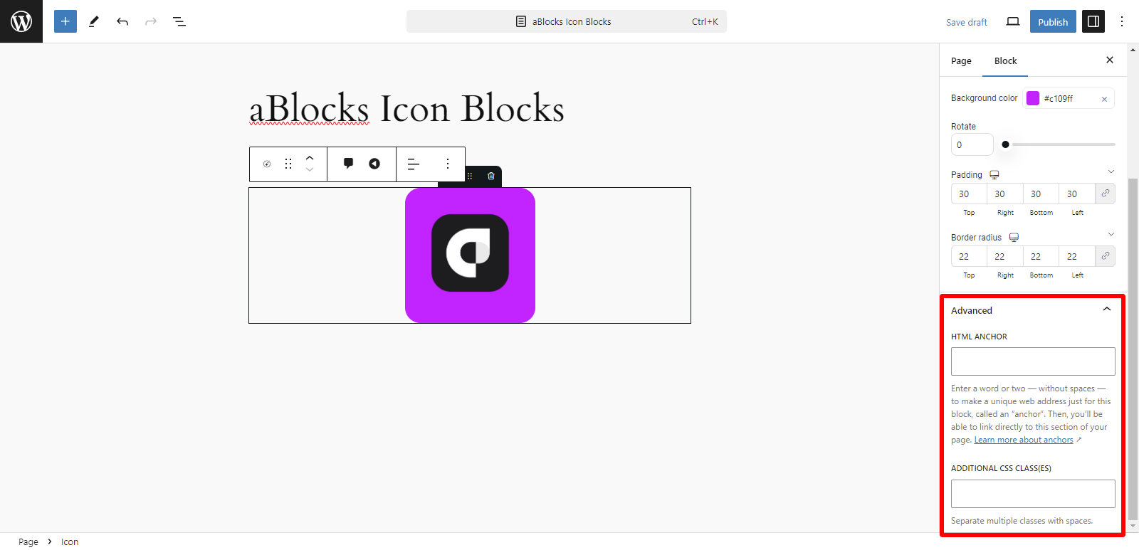
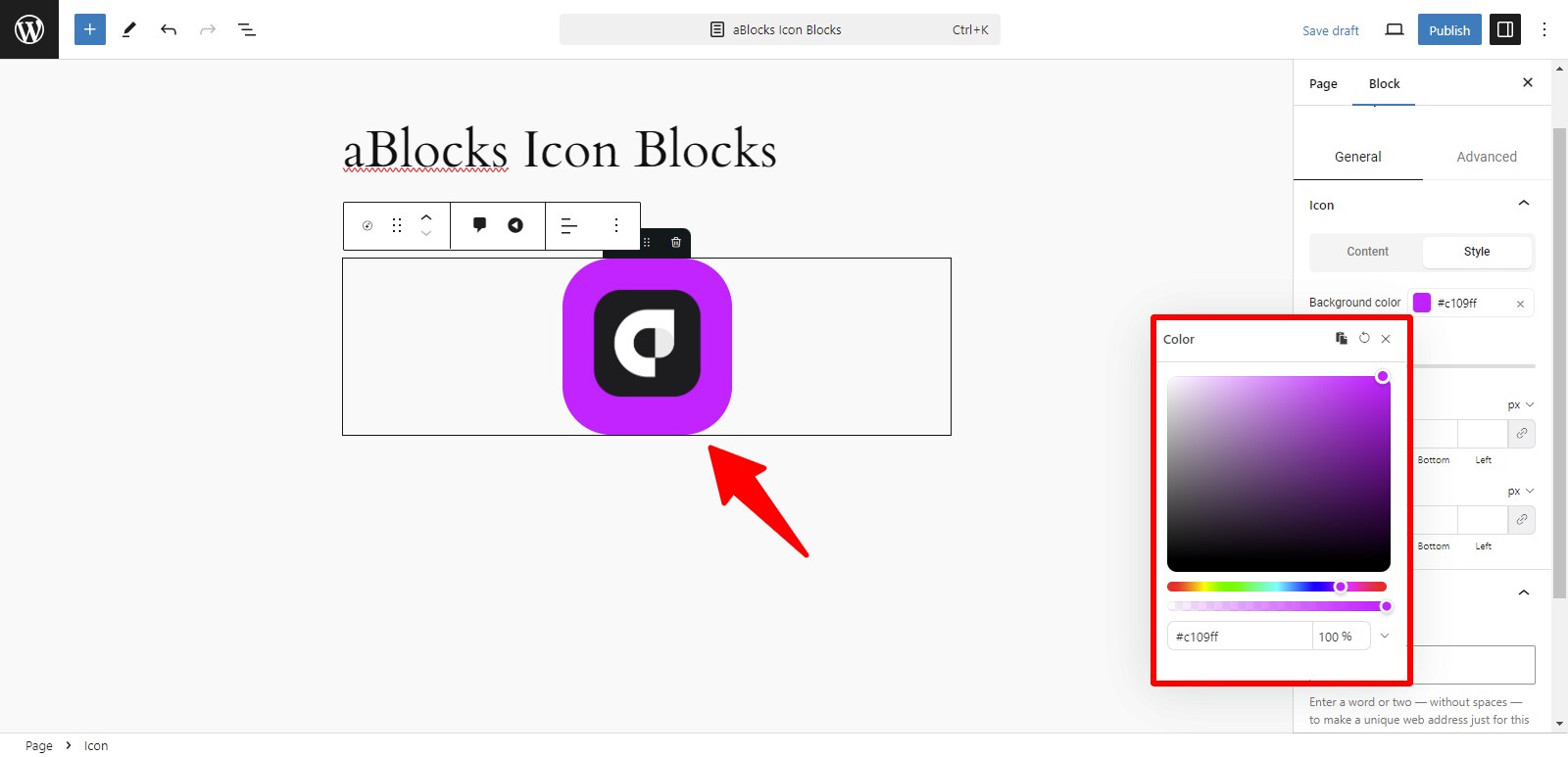
Background Color: You can change the background color of your icon to any color of your choice from this option. Please show and explain the aBlocks Advanced Color Settings document to me.
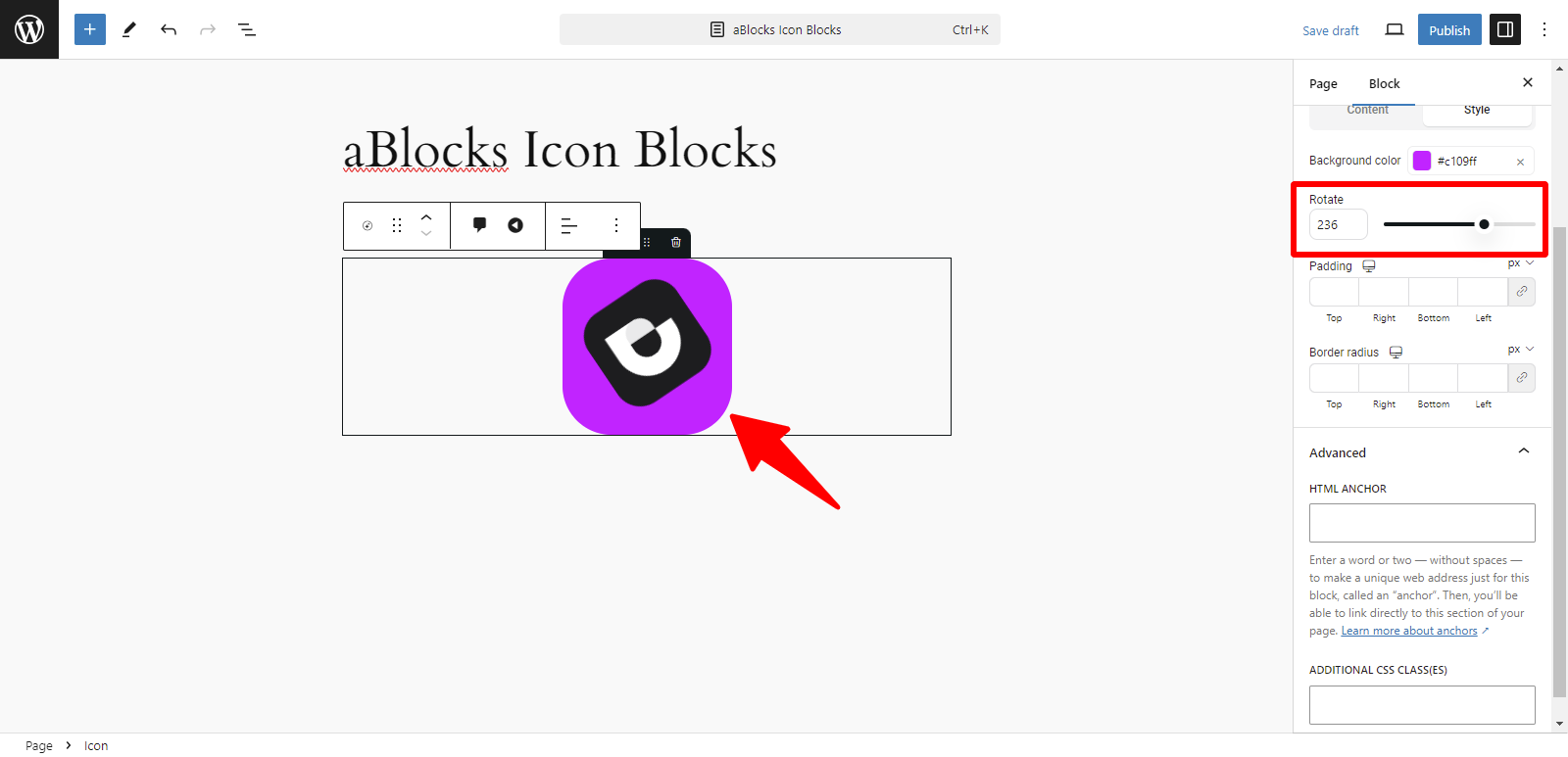
Rotate: You can easily rotate your icon image to the desired angle using this option.
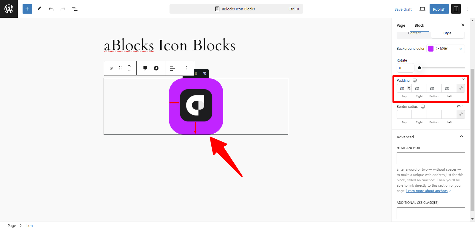
Padding: You can adjust the padding around your icon to control the space between the icon and its surrounding elements. This allows for more precise spacing and layout customization.
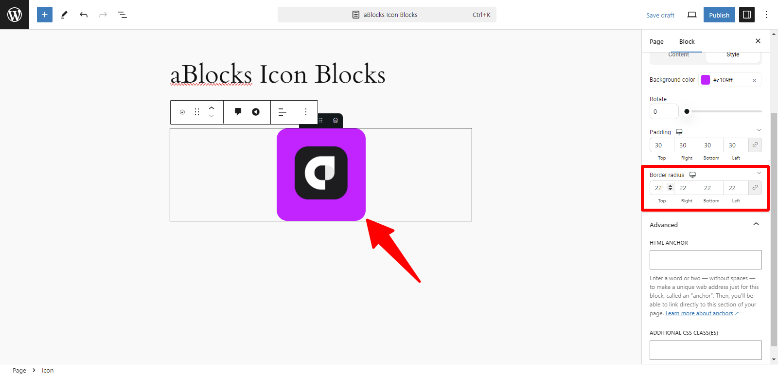
Border width: This option allows you to adjust the thickness of the border around your icon. You can increase or decrease the width to suit your design preferences.
Advanced: In the Advanced section, you have two options:
- HTML Anchor: This allows you to create a unique identifier (anchor) for the block. You can link directly to this section of the page by using the anchor in a URL.
- Additional CSS Class(es): Here, you can add custom CSS classes to apply specific styles to the block. Enter your class names, and the block will apply any styles associated with them.