


The tabs block lets you split your content into clickable sections. Visitors can easily switch between tabs to view different parts without scrolling too much. It’s a smart way to keep your page clean and make related content easier to read.
This guide shows how to add the aBlocks Tabs Block, update the content, style the design, and use advanced settings—step by step.
Add aBlocks Tabs Block
Open your WordPress editor and go to the desired page or post.
Click the (+) button to open the block menu.
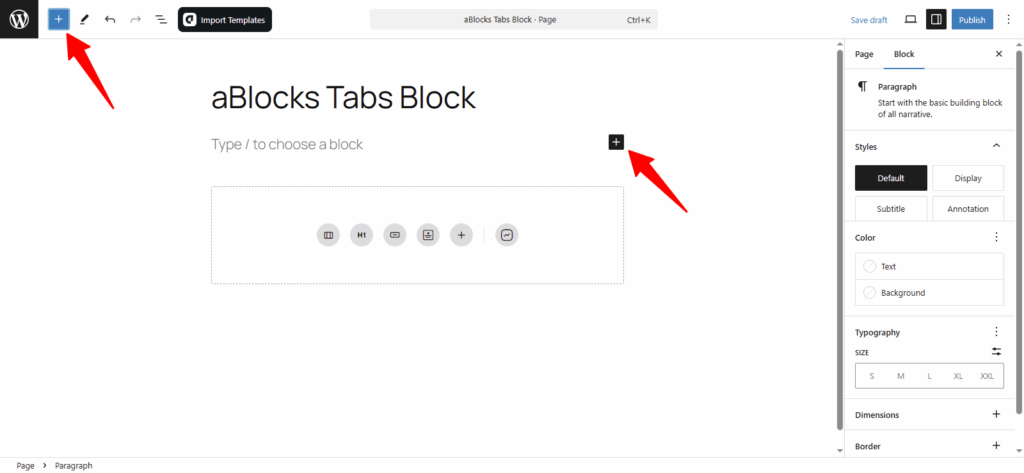
All aBlocks blocks will now appear in the block library. Scroll or use the search bar to find the Tabs block under the aBlocks section. Once you spot it, click on it to add it to your page.
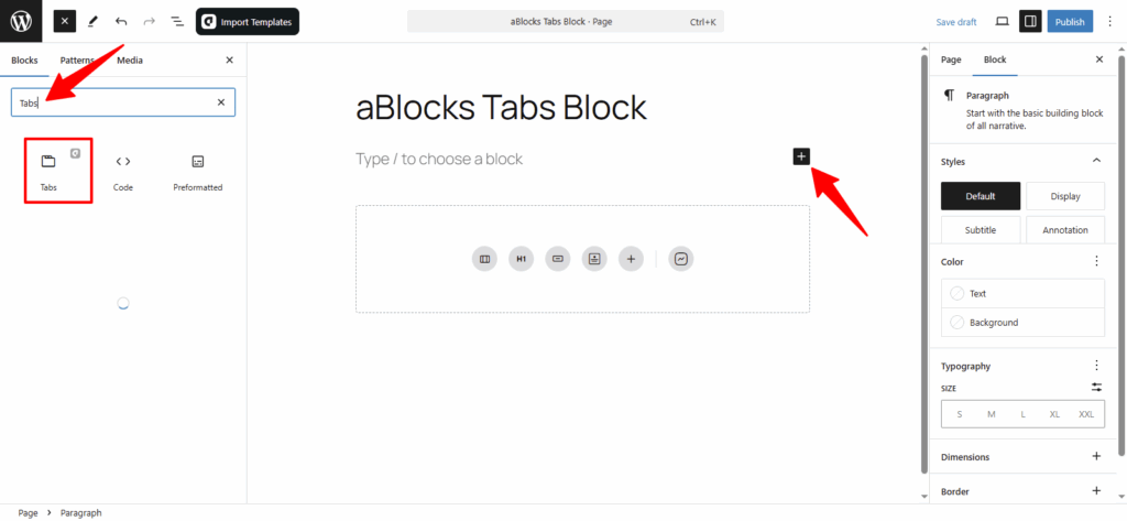
Just click the Tabs Block, and it’ll be added to your page or post. After that, you can adjust its settings to fit your content and layout style.
Customize aBlocks Tabs Block
This guide will help you use and customize the aBlocks Tabs Block with clear, step-by-step instructions.
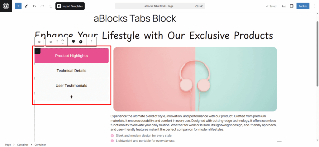
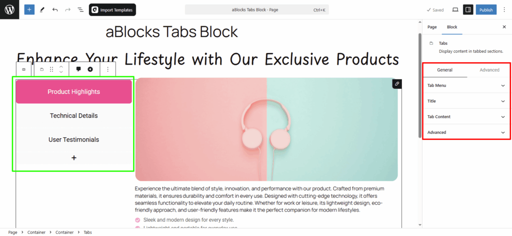
To start, click on the Tabs Block and look at the right-side settings panel.
Then go to Block > General.
Here, you’ll find three main options to control the layout and behavior:
- Tab Menu
- Title
- Tab Content
Let’s explore each option step by step.
Tab Menu
This section has two main parts—Content and Style.
Each section offers different customization settings to control the look and behavior of your tabs.
Let’s begin with the Content options.
Menu Position: Set the tabs menu to Top, Bottom, Left, or Right as needed.
Menu Alignment: Align the tabs to Start, Center, End, or Stretch based on your layout.
Menu Content Alignment: Set tab content alignment to Start, Center, or End as needed.
Initial Open: Choose which tab should be open by default when the page loads.
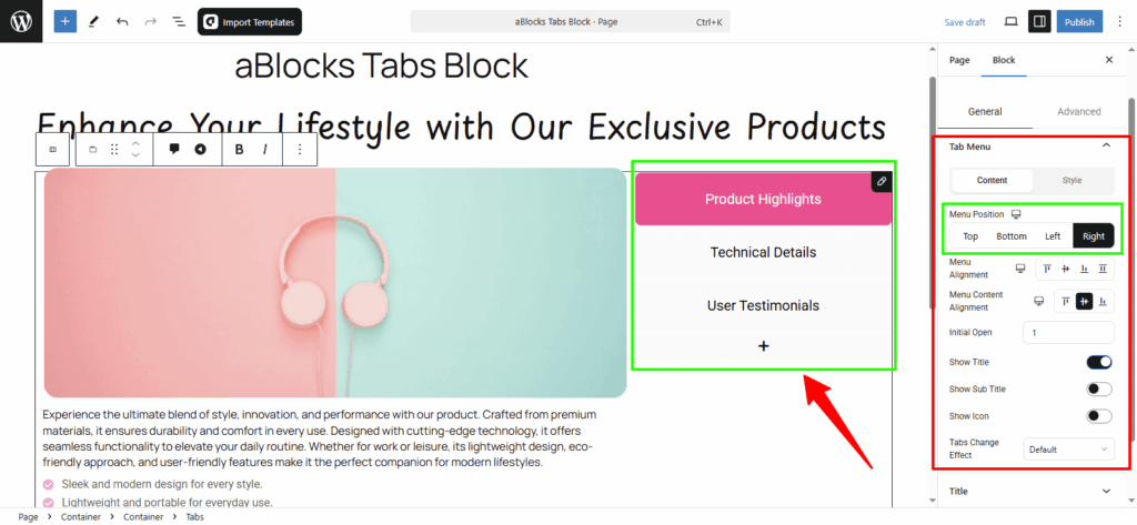
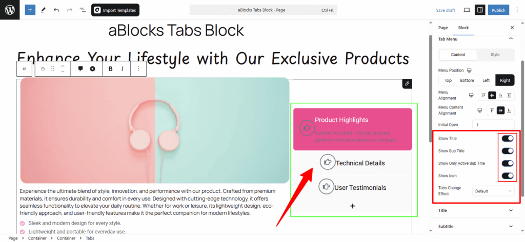
Show Title: Turn the toggle on to show the tab titles. Turn it off to hide them.
Show Sub Title: Enable the toggle to display sub titles under each tab. Disable it to hide them.
Show Only Active Sub Title: Use this toggle to show the sub title for the active tab only.
Show Icon: Toggle this on to display icons next to tab titles. Turn it off to hide them.
Once enabled, you’ll see an extra Icon option where you can easily change or upload a new icon for each tab.
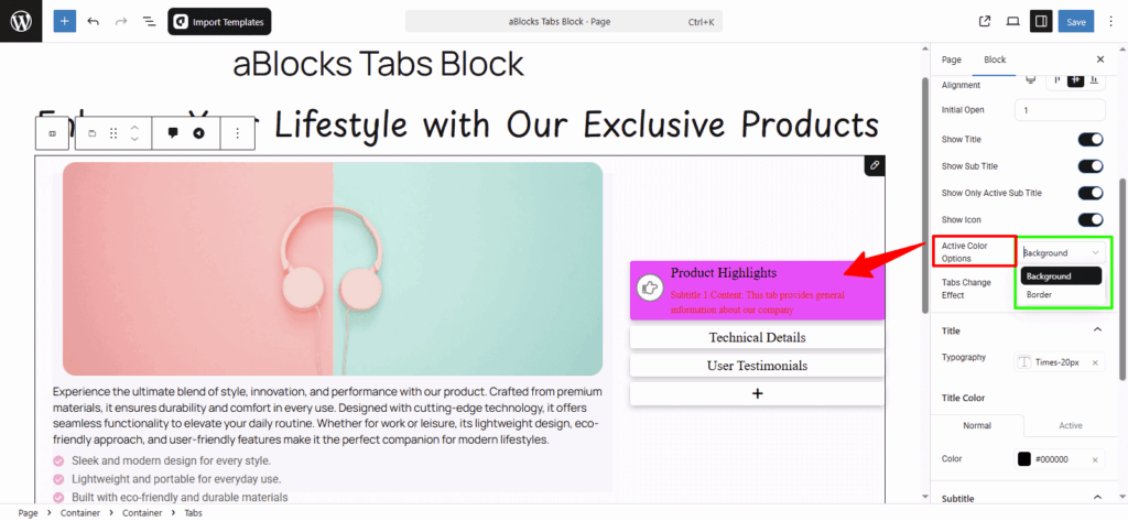
Active Color Options: In the Active Color section, you will see two options: Background and Border.
- If you choose the Background option, the color will apply to the active tab’s background only. It gives one kind of visual style.
- If you select the Border option and also set a border style (like solid, dashed, etc.), the color will apply to the border of the active tab, showing a different style.
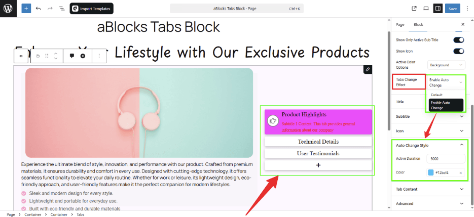
Tabs Change Effect:
In this option, you’ll find two settings: Default System and Enable Auto Change.
- If you select Default System, tabs will only switch when someone clicks on them.
- If you choose Enable Auto Change, the tabs will switch automatically after a few seconds.
Once you enable auto change, you can preview how the tabs rotate on their own inside the editor.
At the same time, a new section called Auto Change System will appear with two extra settings:
- Active Duration: Set how long each tab will stay visible before switching. You can choose the duration based on your needs.
- Color: Pick a color for the auto-active tab from here.
Style
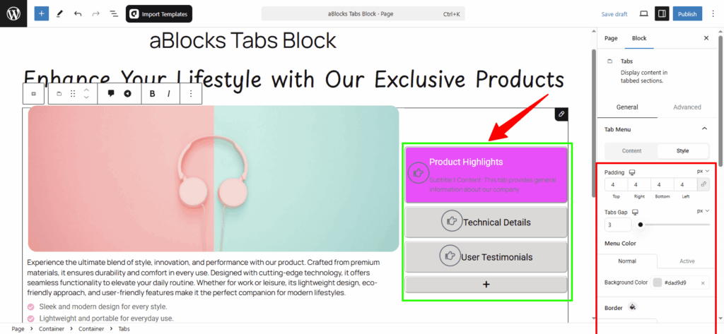
Padding: Add space inside the tab content area.
Tabs Gap: Set the spacing between each tab.
Menu Color: Change the text color of tab titles.
Background Color:
- Normal: Set background color for inactive tabs.
- Active: Set background color for the active tab.
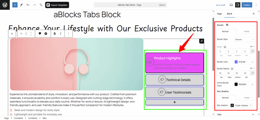
Border: Customize the border for tabs:
- Normal / Hover: Choose different border styles for regular and hover states.
- Width: Set the thickness of the border.
- Border Color: Pick a border color.
- Active Border Color: Set a specific color for the active tab’s border.
- Border Radius: Round the corners of your tabs.
Box Shadow: Add a shadow effect to the tabs for extra depth.
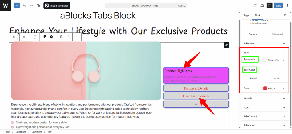
Title
Typography: This section gives you several options to style the tab titles—like font size, weight, line height, and more.
For full details, check the aBlock Typography Setting documentation.
Title Color: You can easily set different colors for both Normal and Active tab titles using the Color options.
Subtitle
Typography: This section lets you style the tab subtitles with options like font size, weight, line height, and more.
For full details, check the aBlock Typography Setting documentation.
Subtitle Color: Set different colors for Normal and Active subtitles using the Color options provided.

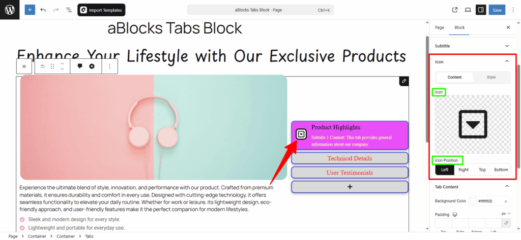
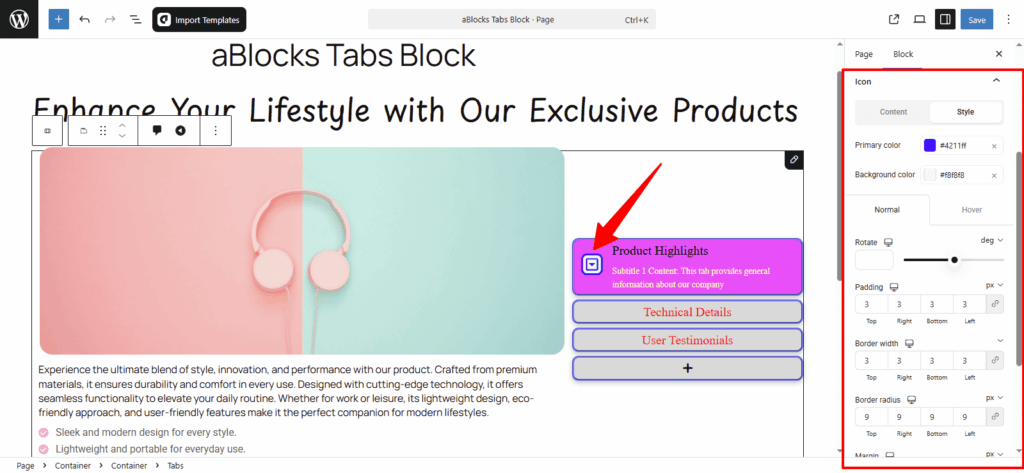
Icon
This section includes two parts — Content and Style. Here’s a step-by-step look:
Content
Icon: You can delete the default icon or upload a new one as needed.
Icon Position: Set the icon position to Left, Right, Top, or Bottom based on your layout.
Style
In this section, you’ll find several options to control how the icon looks. Here’s a step-by-step breakdown:
Primary color: Change the color of the icon.
Background Color: Set a background color behind the icon.
You’ll also see Normal and Hover tabs.
- Under Normal, you can adjust the default appearance.
- Under Hover, you’ll see those same settings—but only when you hover over the icon.
Normal
Rotate: Rotate the icon to any angle.
Padding: Add or reduce space inside the icon box.
Border Width: Control how thick the icon border is.
Border Radius: Round the icon corners as needed.
Margin: Adjust the space around the icon.
Spacing: Set the space between icon and title.
For more details about icon settings, you can check the aBlocks Icon Block documentation.
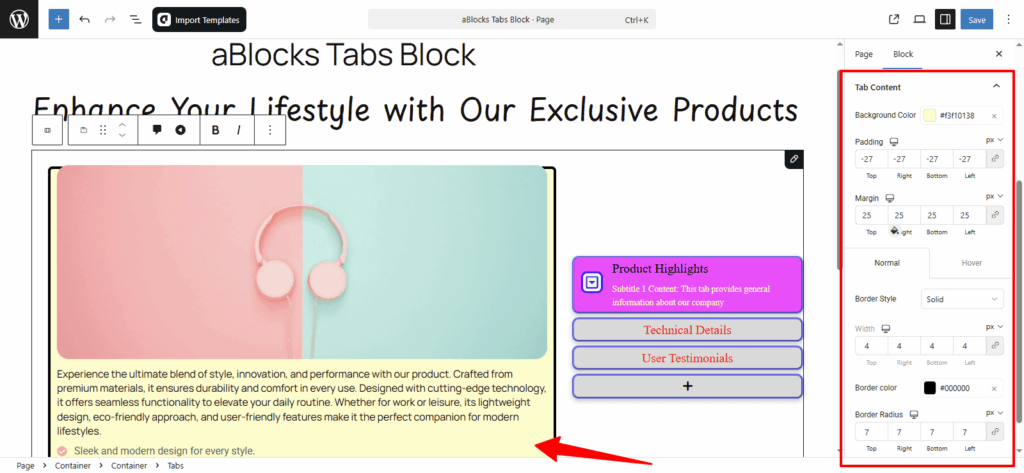
Tab Content
Background Color: Set the background color for the tab content area.
Padding: Add space inside the content area.
Margin: Add space outside the content box.
You’ll also find Normal and Hover options for styling the border:
Border Style: Choose the border type (solid, dashed, etc.).
Width: Set how thick the border should be.
Border Color: Pick the border color.
Border Radius: Round the corners of the content box.
Conclusion
The aBlocks Tabs Block is a simple way to organize your content into clickable sections. With its easy layout options and style controls, you can match it to any design in just a few steps. From tab positions to icons, borders, and effects—everything is adjustable without needing any coding skills.
If you face any issues or have questions while using the Tabs Block, feel free to reach out to our support team. We’re here to help!