


Creating an eye-catching and effective Call-to-Action (CTA) is simple with the Gutenberg Button Block and aBlocks. Here’s how to design your CTA button step-by-step:
How to Add aBlocks Button Block
Log into your website’s dashboard and add a new page.
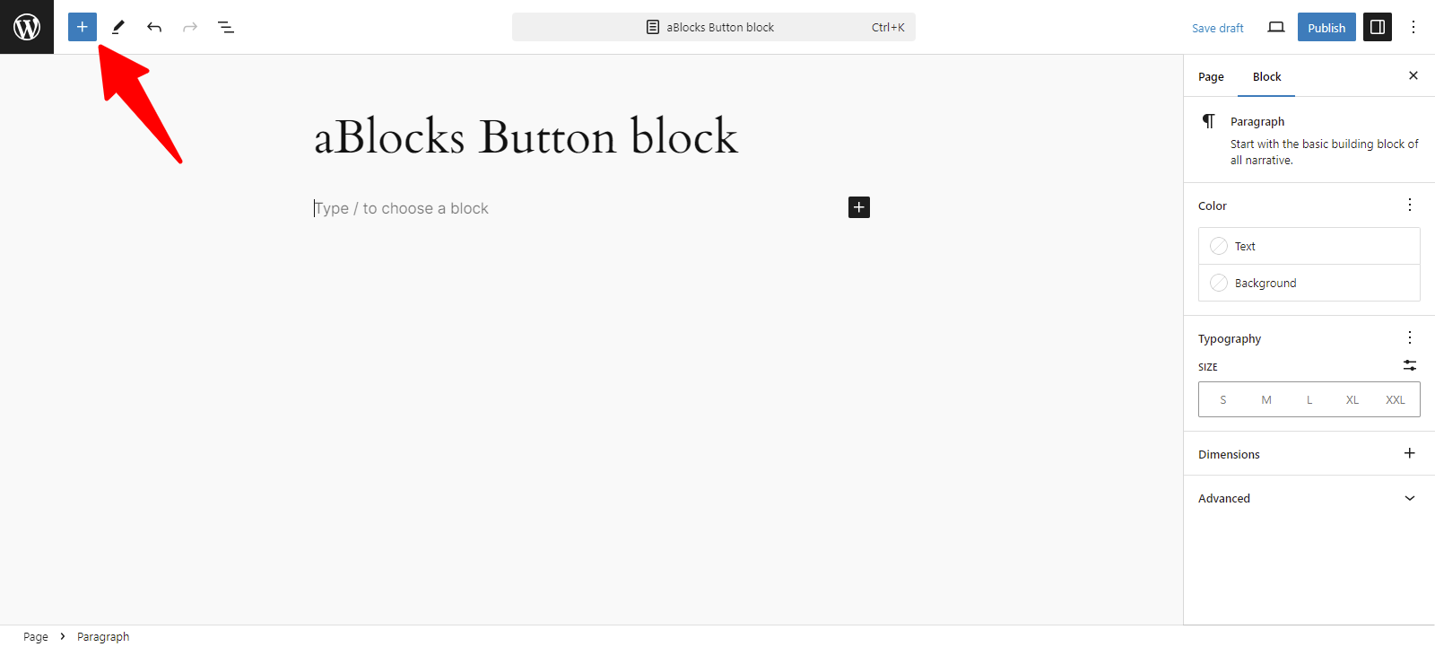
Now, click the (+) icon to open the block options.
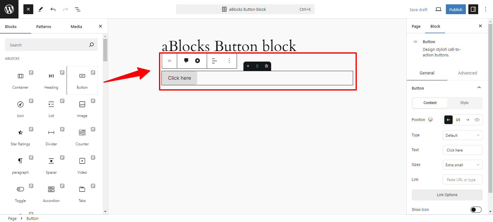
Now you can see all the blocks of aBlocks. Select the aBlocks Button Block from the list.
Customizing aBlocks Button Block: Step by Step Guide
Let’s explore the full usage and editing options of the aBlocks Button Block step by step.
General and Advanced
After selecting the aBlocks Button block, two options will appear on the right: General and Advanced, allowing you to easily customize the button as you like.

General
This section is divided into two parts:
- Content
- Style
Content
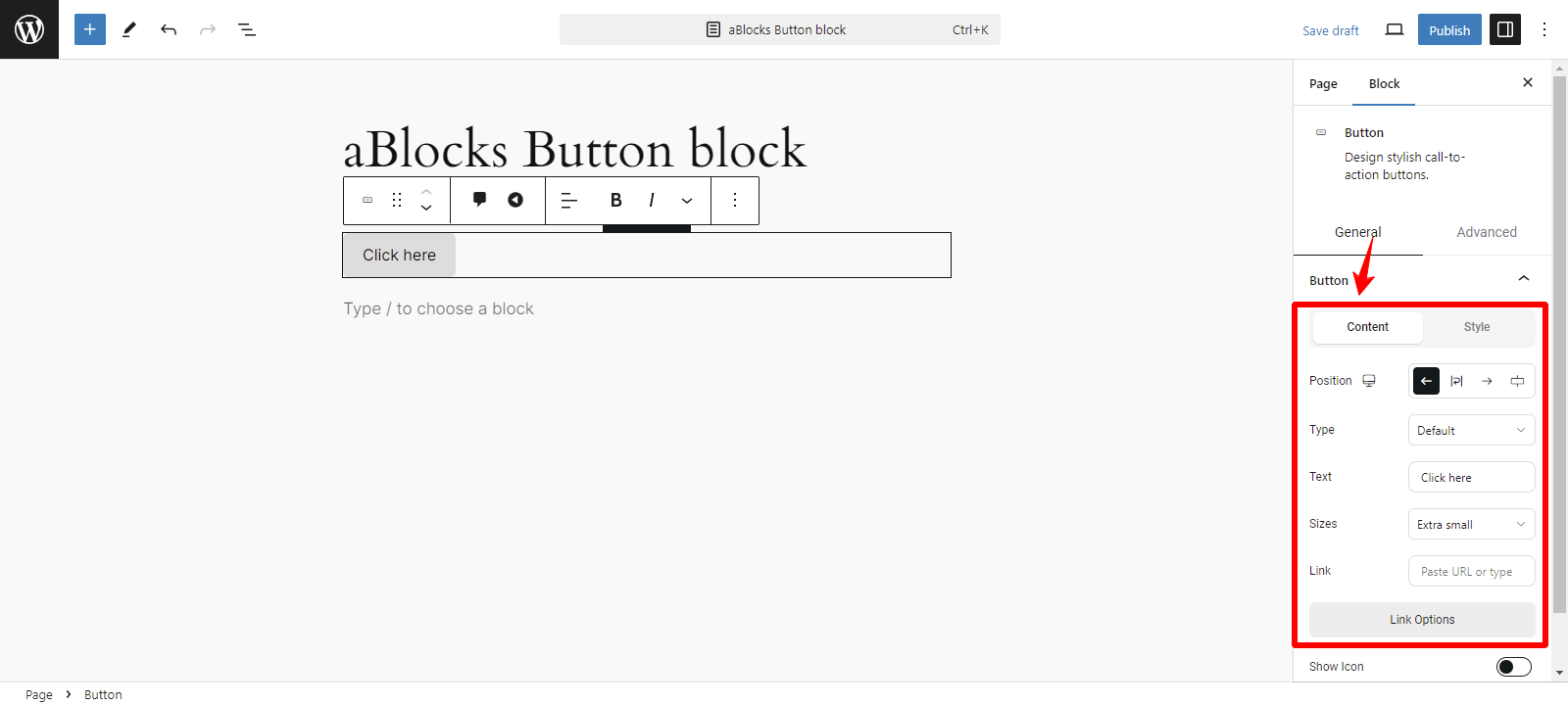
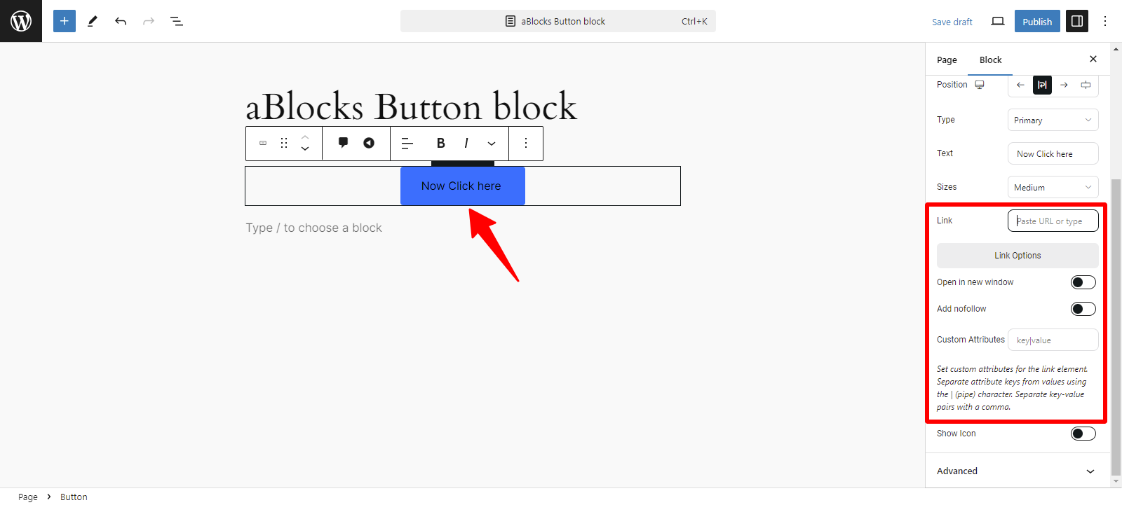
The content section offers several customization options, like
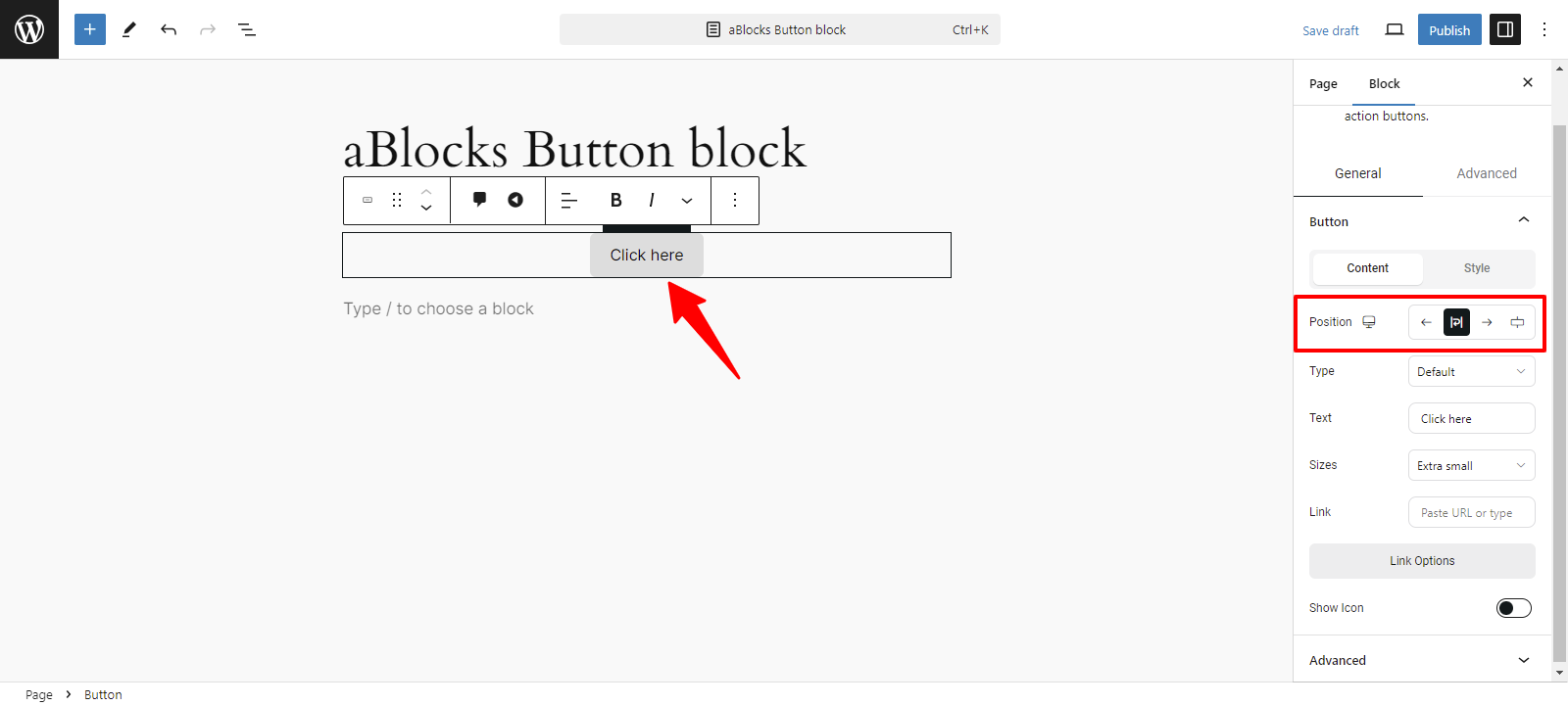
- Position
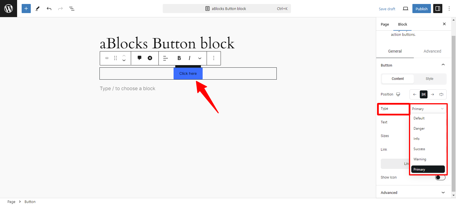
- Type
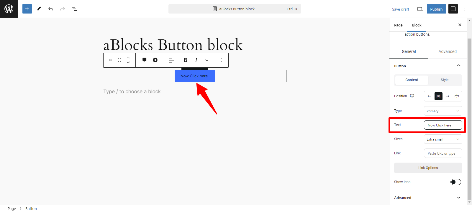
- Text
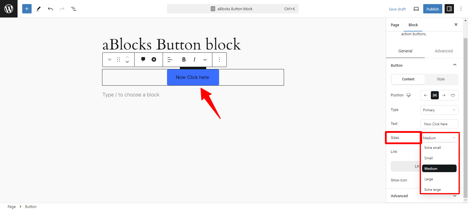
- Sizes
- Link
- Show Icon

Position: You can easily change your Position from here, like
- Left: Align the button to the left side of the block.
- Center: Place the button in the center of the block.
- Right: Align the button to the right side of the block.
- Stretch: Expand the button to fill the entire width of the block.
Type: You can easily change the Type from the following options:
- Danger: Indicates a critical action or alert, usually in red.
- Info: Provides information, typically in blue.
- Success: This signifies a successful operation, often shown in green.
- Warning: Alerts users about potential issues, usually in yellow.
- Primary: Represents the main action, often styled prominently.
Text: In this section, there is a text box where you can customize your text as desired, which will be displayed on your page.
Sizes: You can easily change the Sizes from these options:
- Extra Small: A compact button size for minimal space.
- Small: A slightly larger size that remains unobtrusive.
- Medium: A balanced size, suitable for most contexts.
- Large: A prominent size that draws attention.
- Extra Large: The biggest option, ideal for high visibility.
Link: The Link section allows you to configure how the button directs users. Here are the key options available:
- URL: Enter the destination link where users will go when they click the button. This can be either an internal page or an external website.
- Open in New Tab: Toggle this option to allow the link to open in a new browser tab. This is useful for keeping users on your site while they access additional content.
- Add Nofollow: This option allows you to add attributes like nofollow, which tells search engines not to follow this link, or other custom attributes for tracking purposes.
- Custom Attributes: Specify any actions that should occur when the button is clicked, such as submitting a form or triggering a specific event.
By customizing these options, you can ensure that the button effectively fulfills its intended purpose and enhances the user experience.
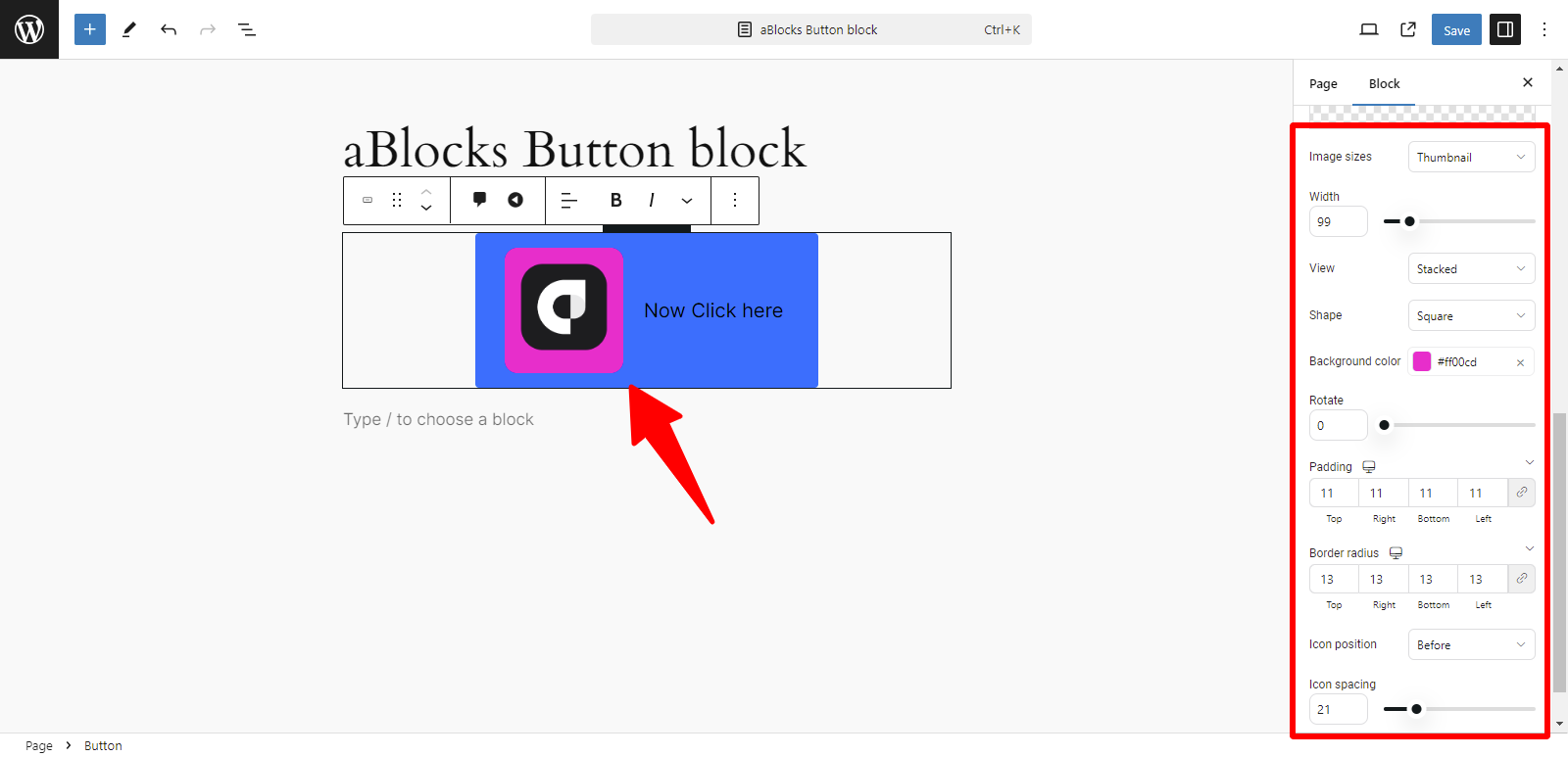
Show Icon: You can enable the Icon section by clicking the toggle button. Once activated, you can easily upload your icon image.

Icon Section: Customization Options
Icon: You can upload your image using two options: the system “Icon Library” or the “Upload Image“(by uploading your own image).
The aBlocks Icon section provides several customization options to enhance your icons effectively. Here’s a brief overview of each option:
- Image Sizes: Adjust the size of your icons to fit your design needs. Choose from predefined sizes or set a custom size.
- Width: Control the width of the icon to ensure it aligns well with other elements on your page.
- View: Select different view styles for your icons, allowing for various presentations (e.g., filled, outlined).
- Shape: Customize the shape of your icons, such as circular, square, or custom shapes, to match your design.
- Background Color: Set a background color for your icons to make them stand out and complement your overall color scheme.
- Rotate: Use the rotate option to adjust the angle of your icons for creative effects.
- Padding: Modify the padding around your icons to create space and improve the layout.
- Border Width: Set the thickness of the border around your icons for added definition.
- Icon Position: Adjust the positioning of your icons within their containers for optimal alignment.
- Icon Spacing: Control the spacing between multiple icons to ensure a balanced and visually appealing layout.
These customization options allow you to tailor your icons to fit the specific style and layout of your website.
For detailed instructions on using the icon section, refer to the aBlocks Icon Block documentation. Click here to view aBlocks Icon Block.
Style
In the General section, the second option is Style. The Style option offers various customization choices, like
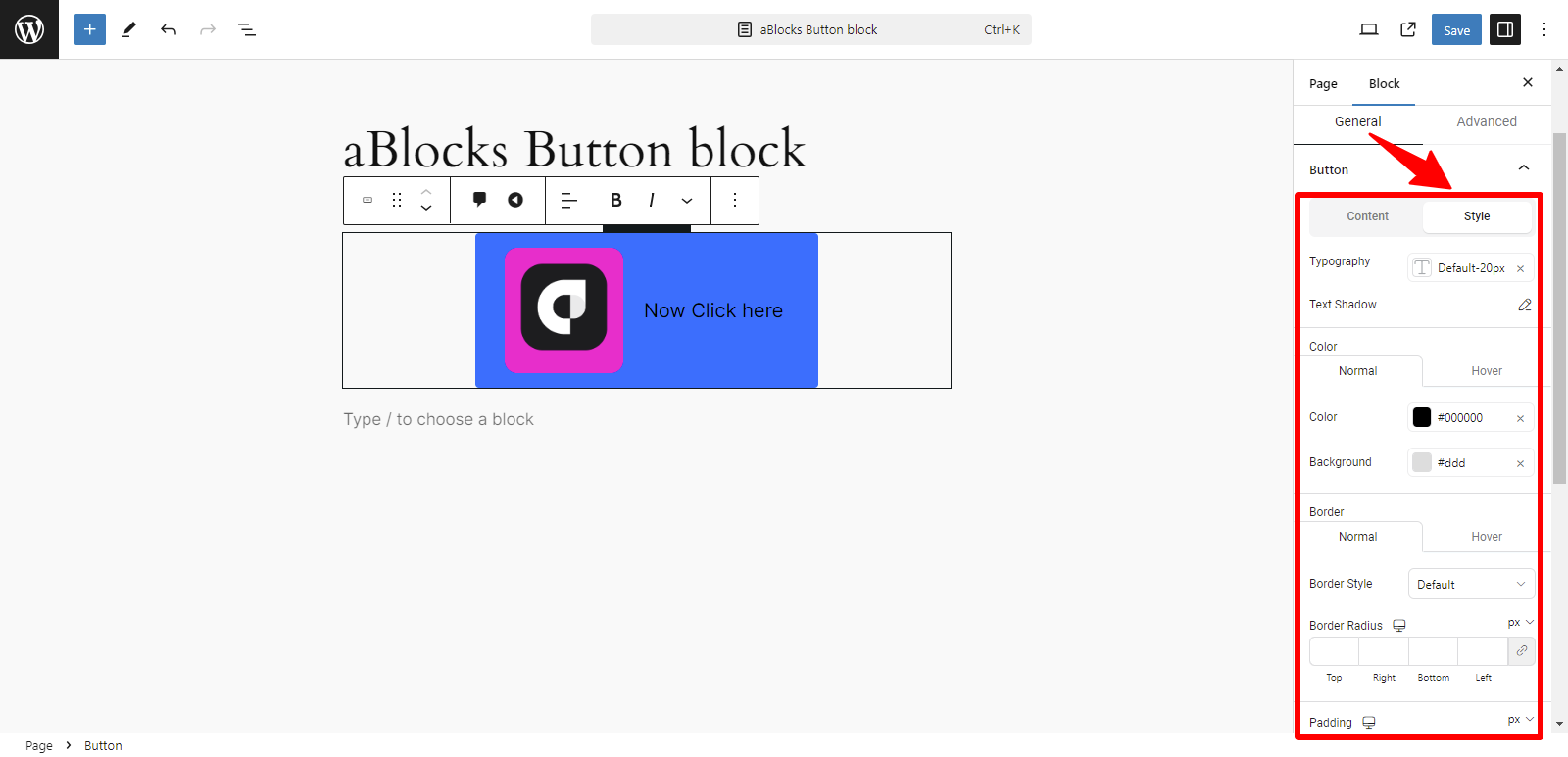
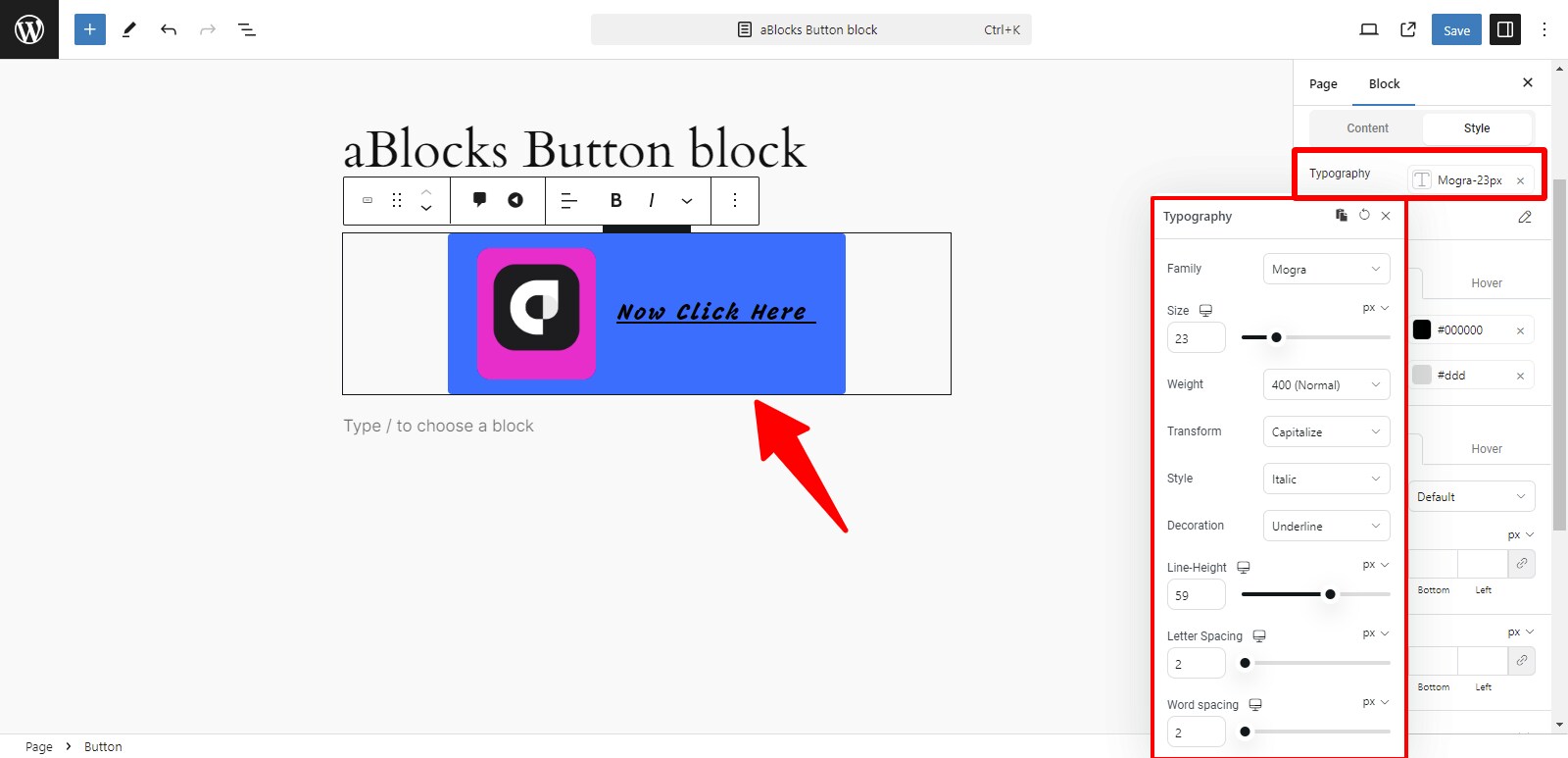
Typography: The Typography section offers many customization options. For detailed information about each option, refer to the aBlocks Typography Block documentation. Click here to view aBlocks Typography Block.
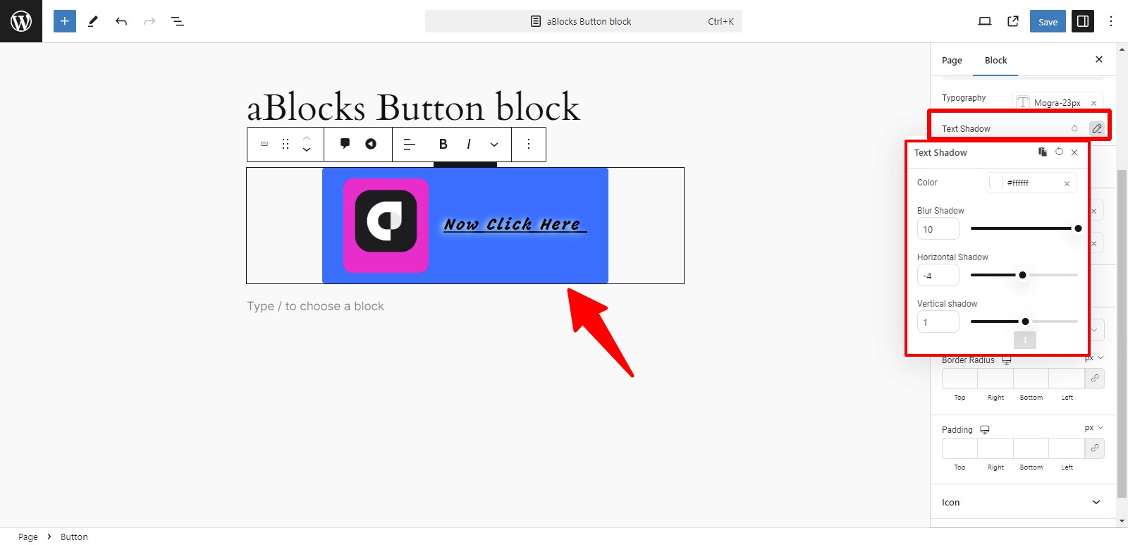
Text Shadow: The Text Shadow section offers various customization options. For detailed information about each option, refer to the aBlocks Text Stroke and Text Shadow documentation. You can explore settings to enhance your text’s appearance. This section allows you to create unique text styles. Click here to view aBlocks Text Stroke and Text Shadow documentation.
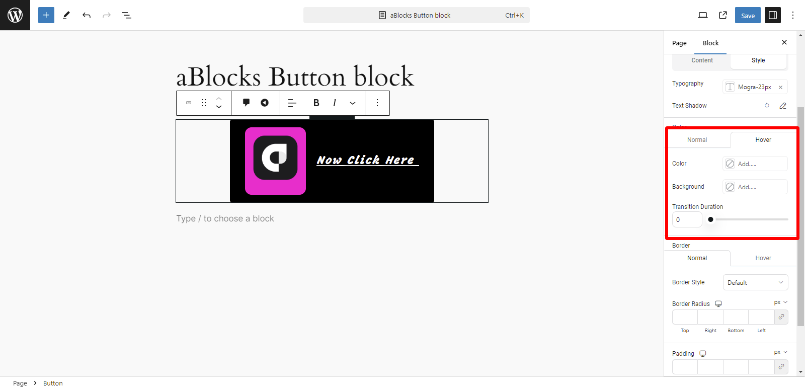
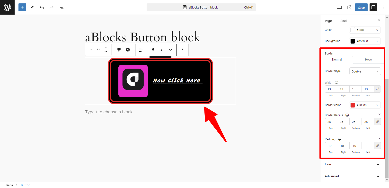
Color: In the Color section, you can manage the color settings for two states:
- Normal
- Hover
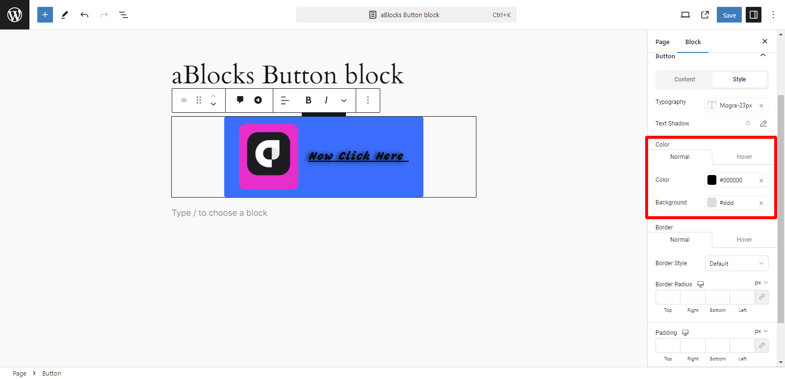
In the Normal option, you can customize two aspects:
- Color
- Background
Color: You can easily change the color of text or elements overlaid on the image from here.
Background: This option lets you set or change the background color from here.
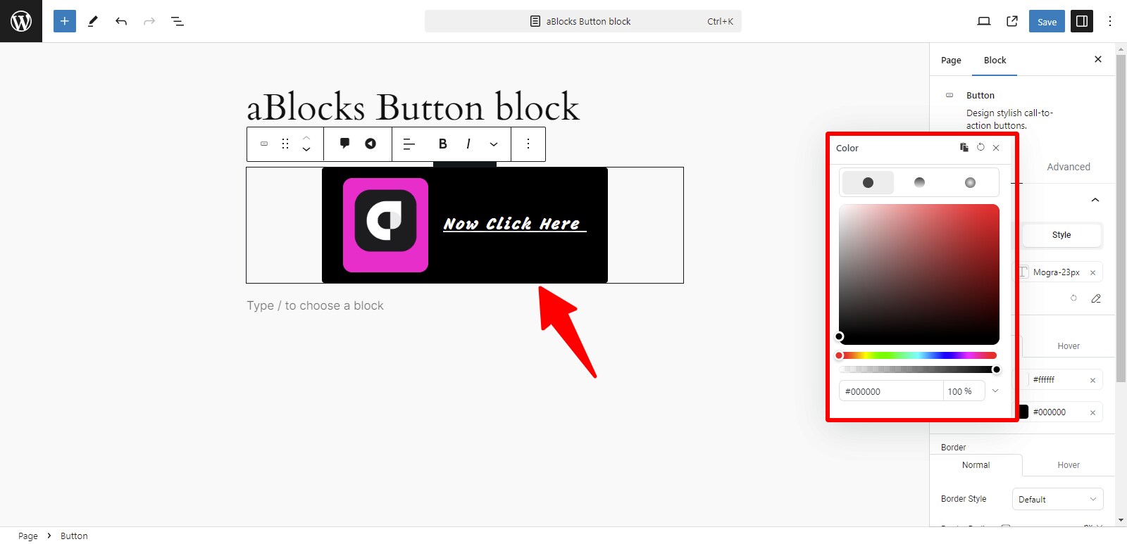
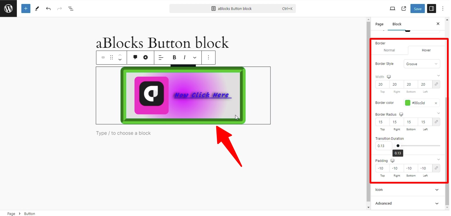
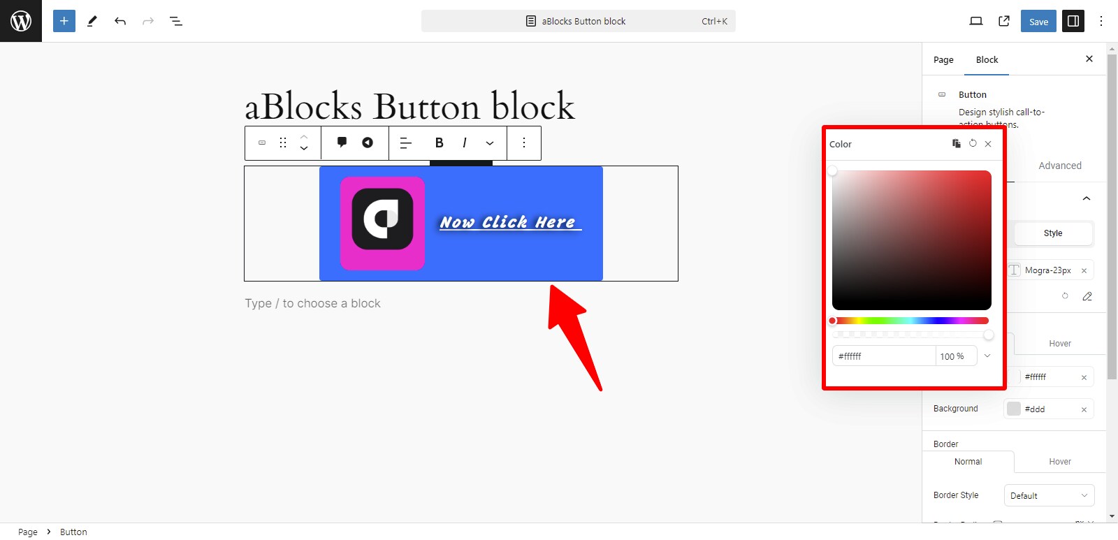
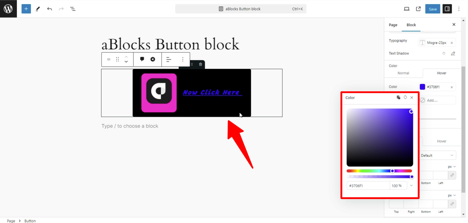
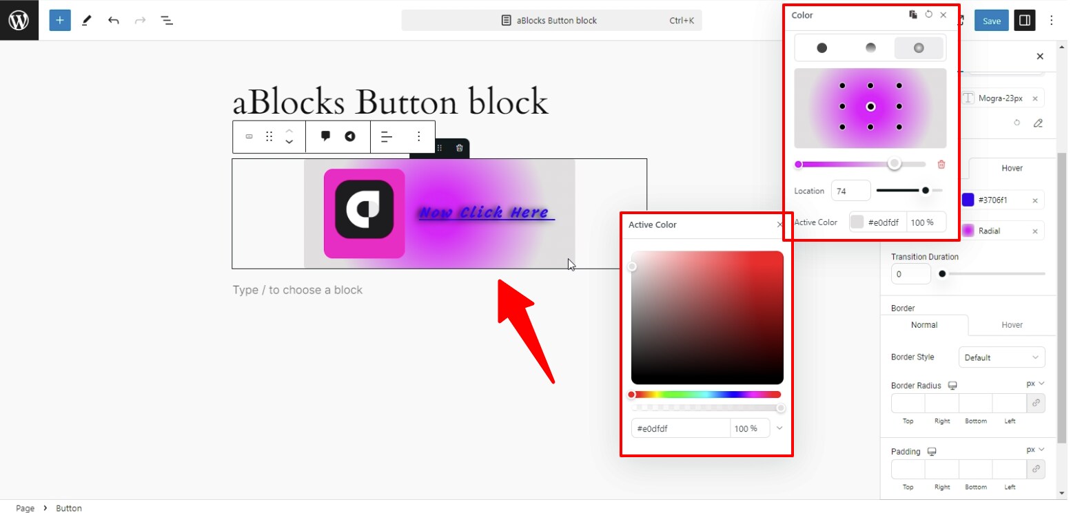
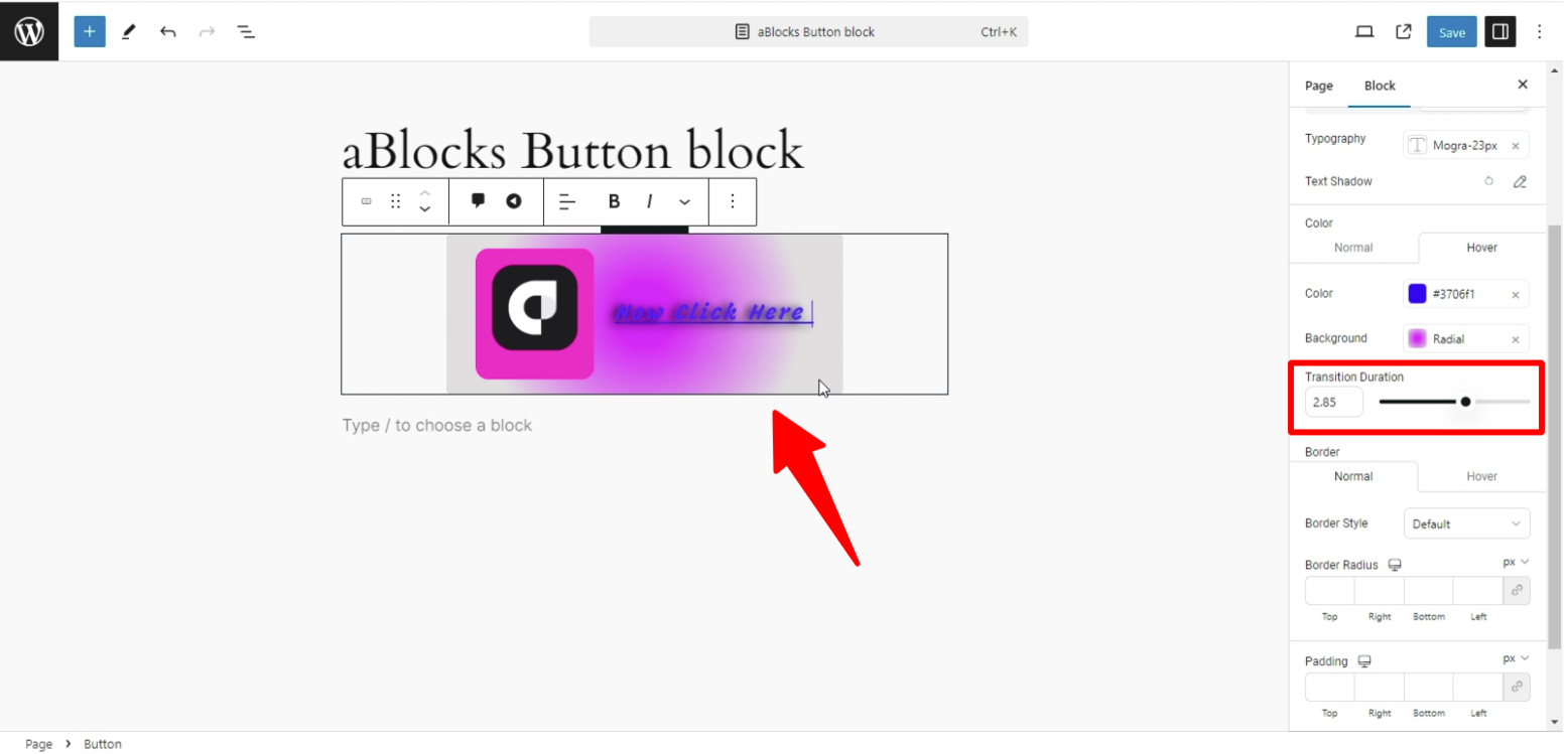
Hover: In the Hover option, you can customize three aspects:
- Color
- Background
- Transition Duration
Color: In the Hover option, the Color setting lets you change the color of text or elements overlaid on the image when a user hovers over it. This makes the hover effect more visually engaging by highlighting the text or elements.
Background: In the Hover option, the Background setting allows you to change the background color of the image block when the user hovers over it. This provides a dynamic effect, enhancing the visual interaction with the image.
Transition Duration: In the Hover option, the Transition Duration setting allows you to control how quickly the color and background changes happen when a user hovers over the image. You can set the duration in milliseconds to create smooth transitions between the normal and hover states.
Normal
Hover