


The aBlocks Search Block lets you add a search bar to your WordPress site for easy content discovery. This guide covers adding and customizing the block to enhance search functionality on your page or post.
Adding the aBlocks Search Block
Navigate to your WordPress dashboard. Go to the page or post where you want to add the search function. If needed, create a new page or post.
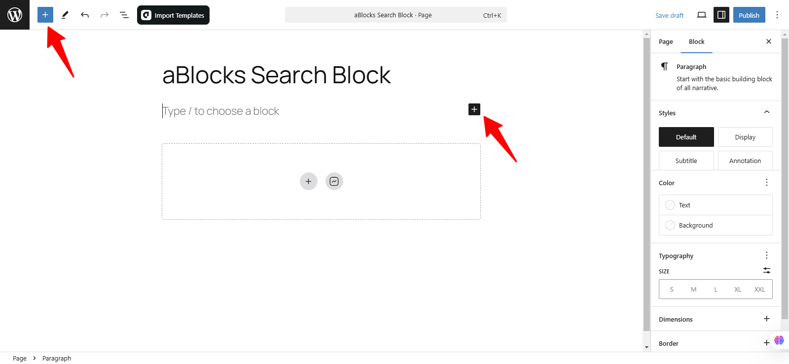
Click the ( + ) icon to open the block options.
Now, you’ll see all the available blocks from aBlocks. You can either scroll through the list or use the search bar to find the aBlocks Search Block. For a quicker approach, simply type “Search Block” in the search bar, and it will appear instantly. Once you locate it, click on it to add it to your page or post.
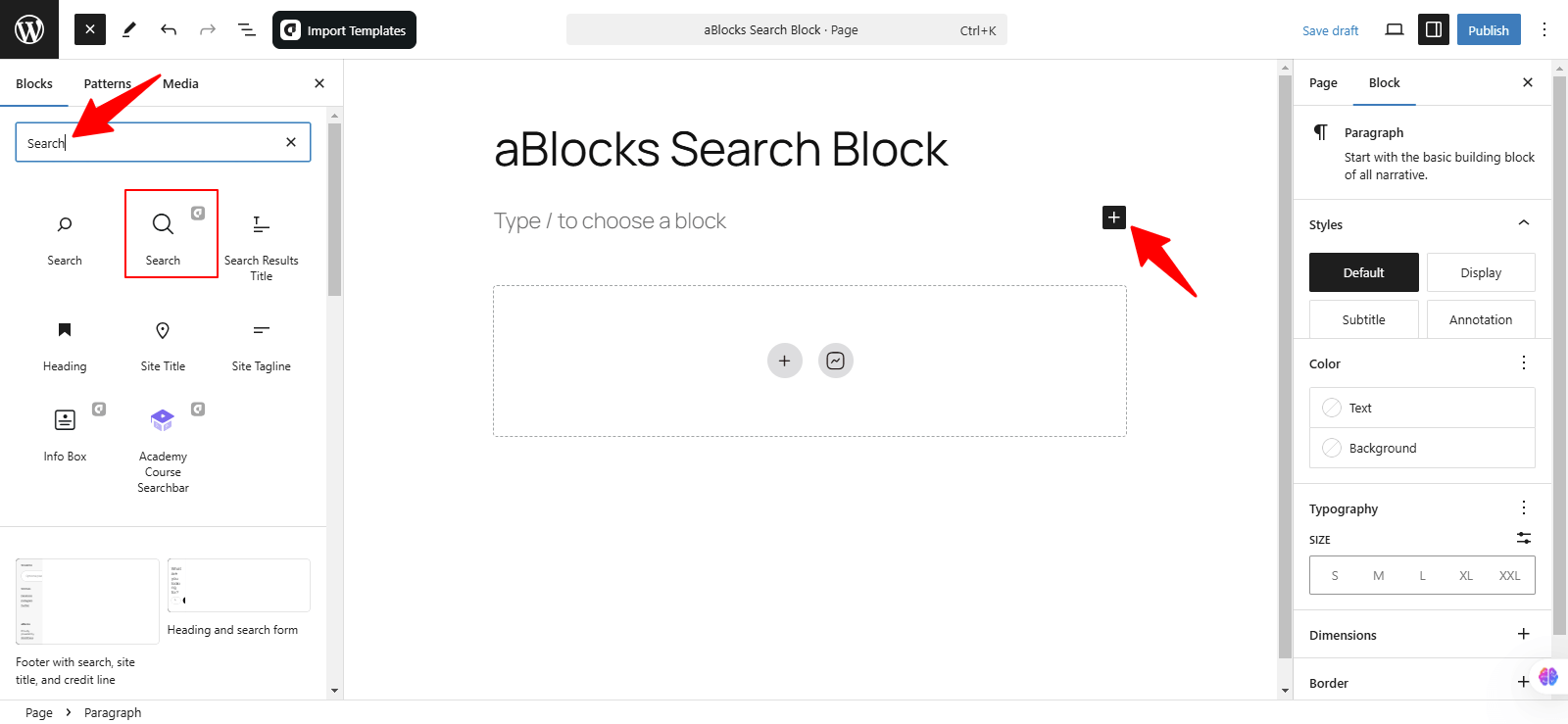
Now, can you find the aBlocks Search Block in the list? Simply click on it, and it will be added to your page or post. Once added, you can customize its settings to match your design and functionality needs.
Customize the aBlocks Search Block
This guide will help you understand how to use and customize the aBlocks Search Block with simple, step-by-step instructions.
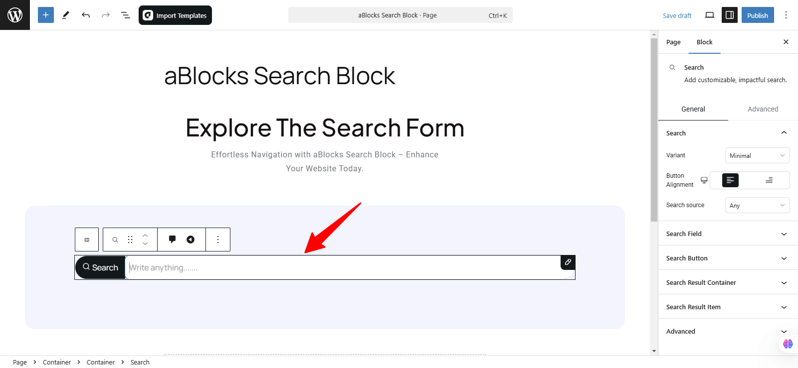
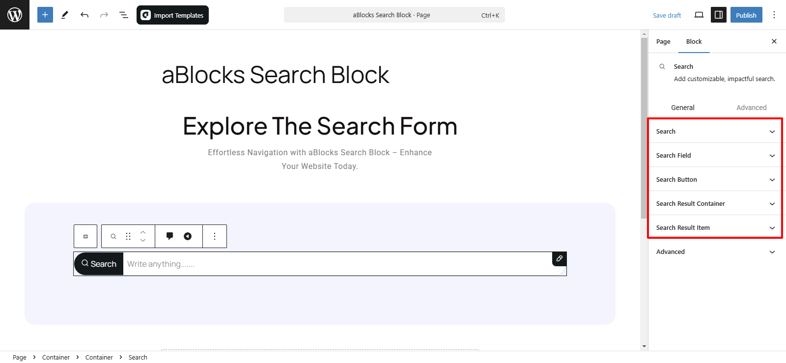
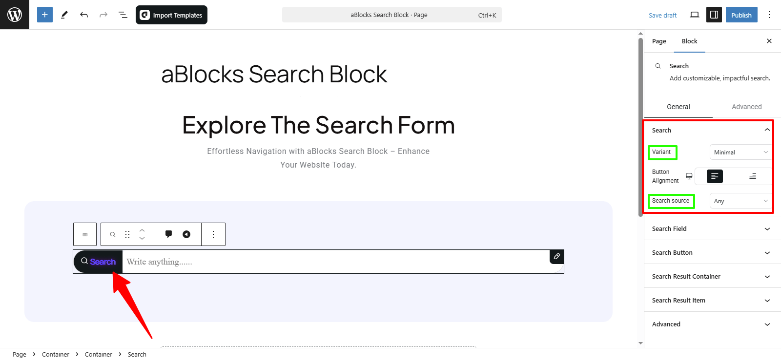
To modify the aBlocks Search Block, navigate to the right-side panel and go to Block > General. Here, you’ll find five key options to customize its design and behavior.
- Search
- Search Field
- Search Button
- Search Result Container
- Search Result Item
Let’s explore each option step by step.
Search
In this section, you’ll find two customization options:
- Variant – Choose a search bar style:
- Classic – Button on the left with a Gap setting.
- Minimal – Adjust Button Alignment (left/right).
- Search Source – Select search result source: Any, Post, Product, or Page.
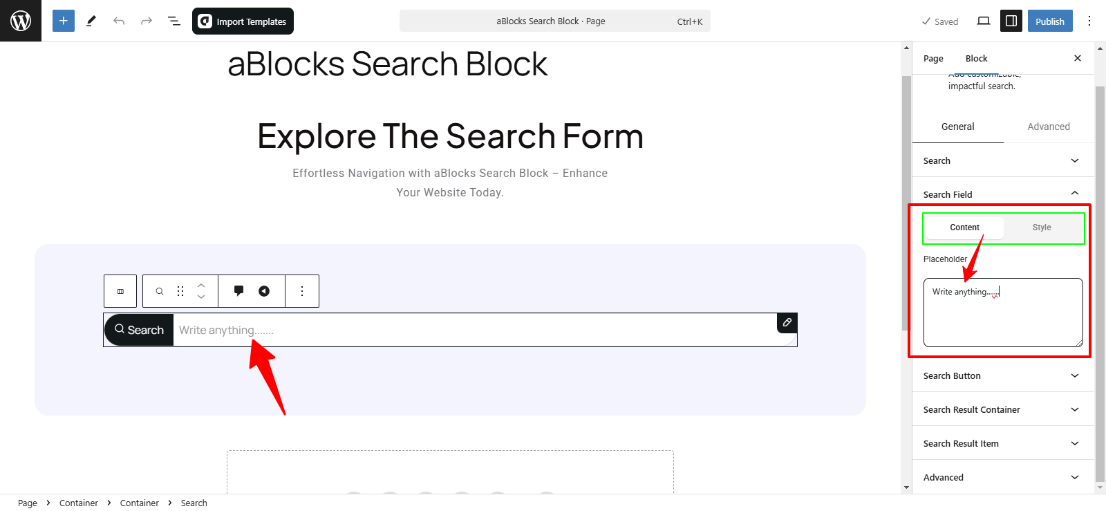
Search Field
The Search Field section has two main parts:
- Content
- Style
Content
In this section, you will find the Placeholder box. Customize the placeholder text (e.g., “Search for products…”) and adjust its style and behavior to fit your design.
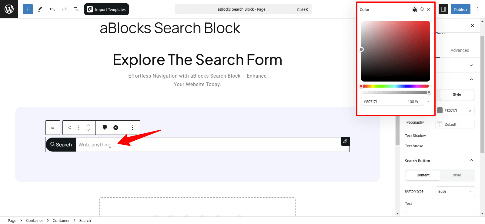
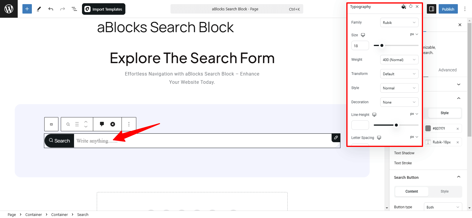
Style
In this section, you will find four customization options:
- Color
- Typography
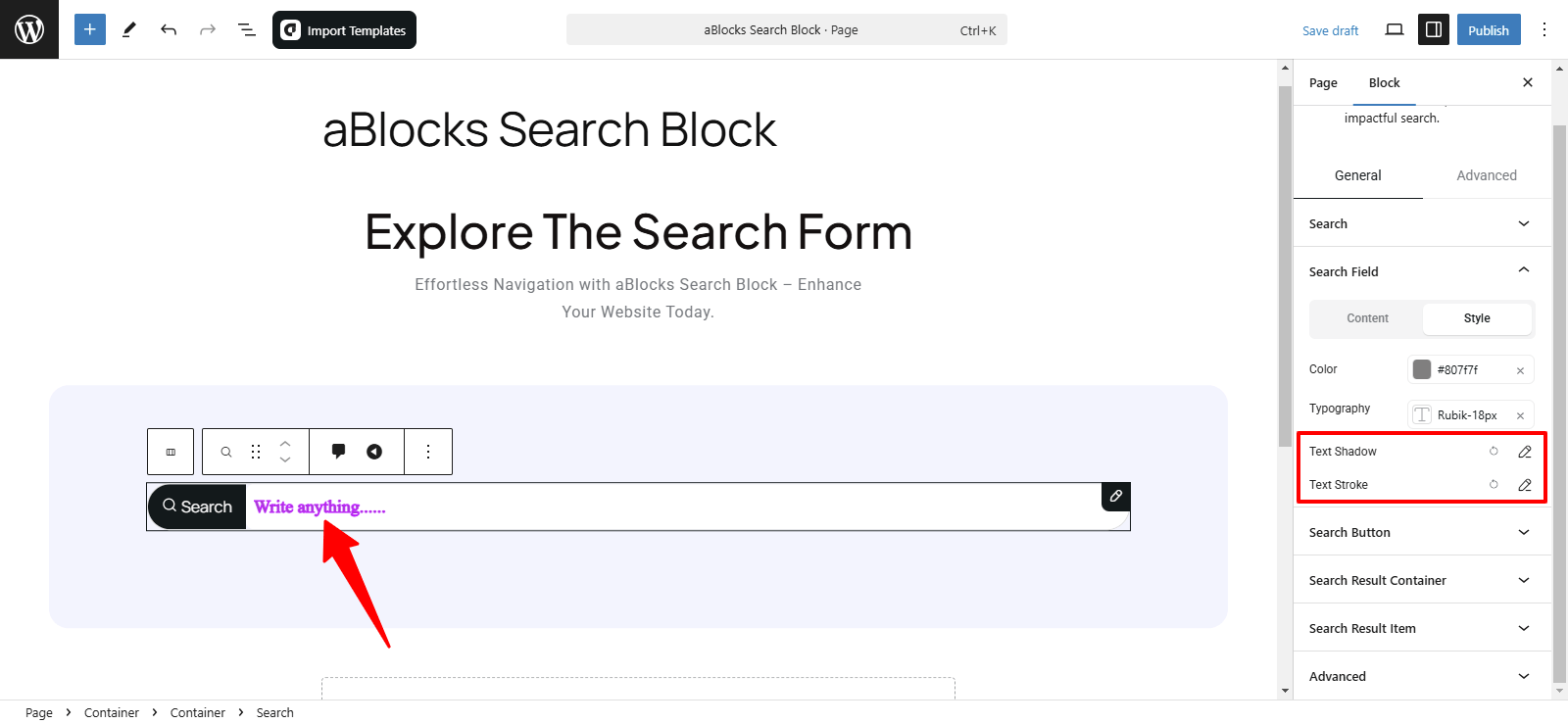
- Text Shadow
- Text Stroke
Let’s go deeper into how each of these options works!
Color: Change the text color inside the search field to match your design.
Typography: Fully customized text style. For more details, check out our aBlocks Typography Setting Documentation.
Text Shadow: Add and adjust shadow effects for better visibility.
Text Stroke: Outline text with adjustable color and width.
For more details on Text Shadow and Text Stroke, you can refer to our aBlocks Text Shadow and Text Stroke documentation.
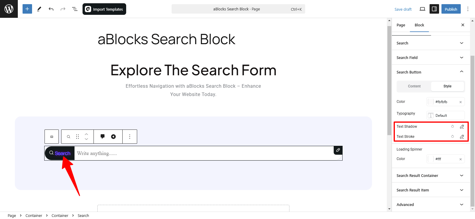
Search Button
This section includes two main options: Content and Style.
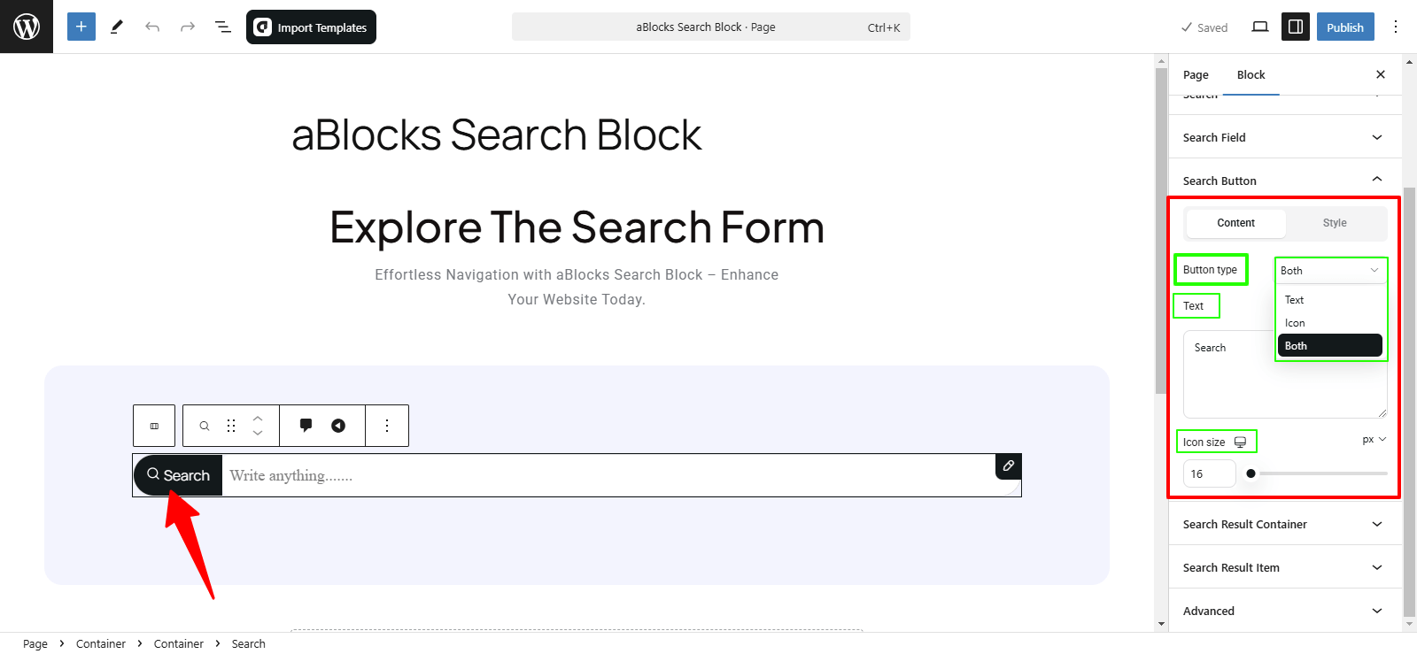
Content
In this section, you will find the Button Type option, which allows you to choose how the search button appears. There are three available options:
- Text –Customize button text.
- Icon – Adjust icon size.
- Both – Use text and icon with full customization.
Style
In this section, you will find four customization options to style the search button:
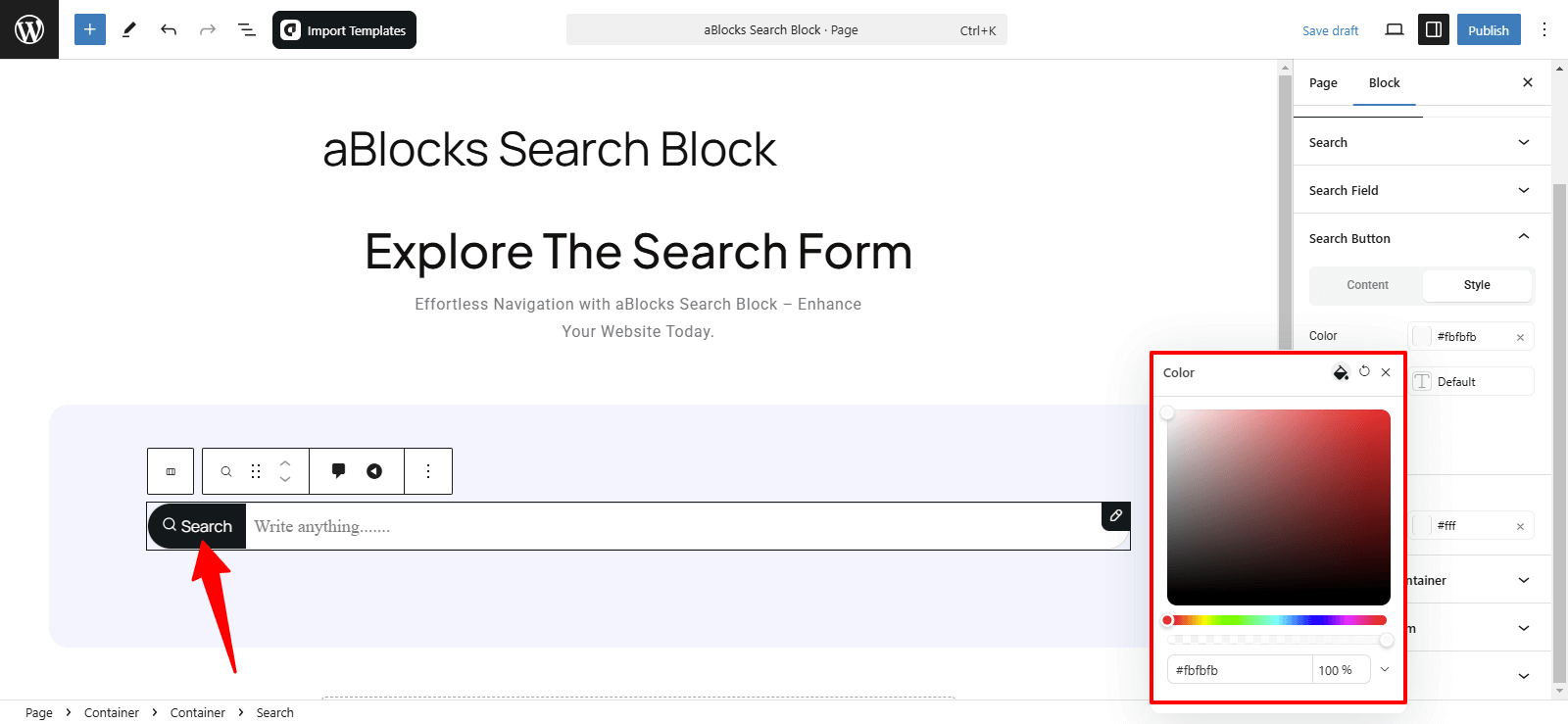
- Color
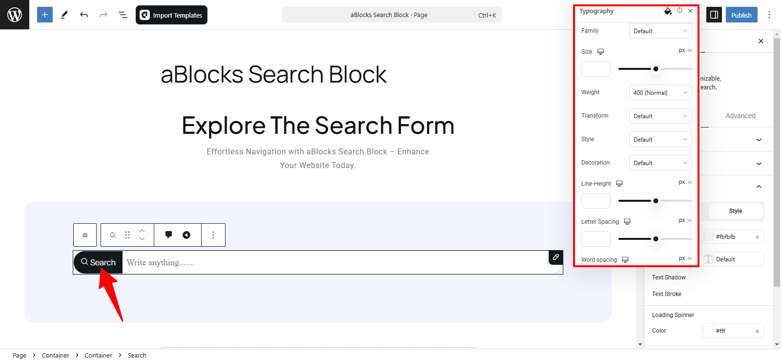
- Typography
- Text Shadow
- Text Stroke
Let’s explore each option in detail!
Color: Customize button text color to match your design.
Typography: Fully adjustable settings. See aBlocks Typography Setting Documentation.
Text Shadow: Add and adjust shadow effects for better visibility.
Text Stroke: Outline text with adjustable color and width.
For more details on Text Shadow and Text Stroke, you can refer to our aBlocks Text Shadow and Text Stroke documentation.
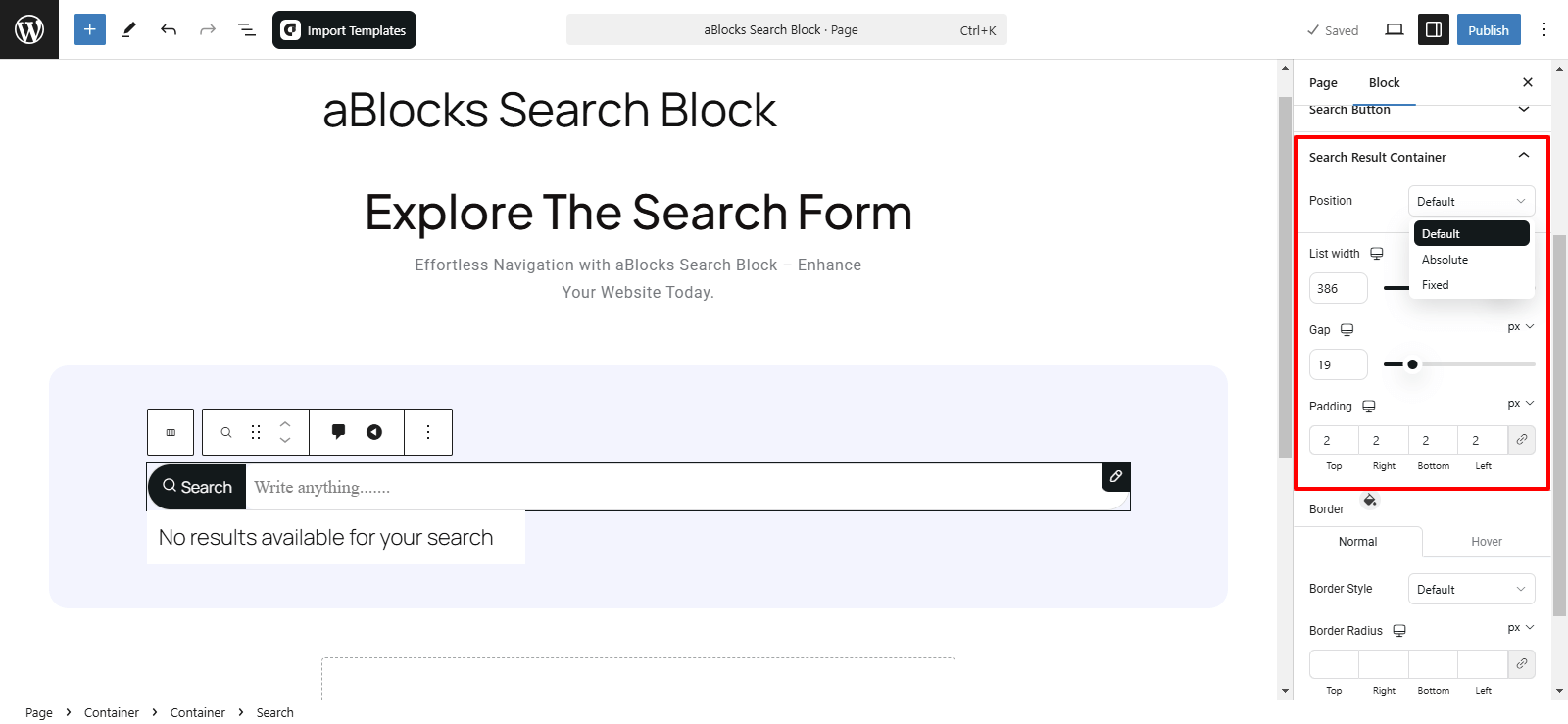
Search Result Container
The Search Result Container section offers several customization options to help you fine-tune the appearance and behavior of the search results.
Position: Choose Absolute (relative placement) or Fixed (stays on screen).
List Width: Adjust the search result width to fit your layout.
Gap: Control spacing between search results for better readability.
Padding: Customize inner spacing (Top, Right, Bottom, Left) for a structured look.
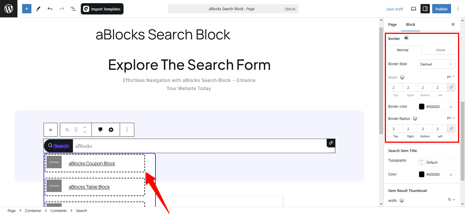
Border Customization
- Normal – Adjust default border settings:
- Border Style – Choose from Default, Solid, Dotted, Dashed, etc.
- Width – Set thickness for each side (Top, Right, Bottom, Left).
- Hover – Applies the same settings when hovered over.
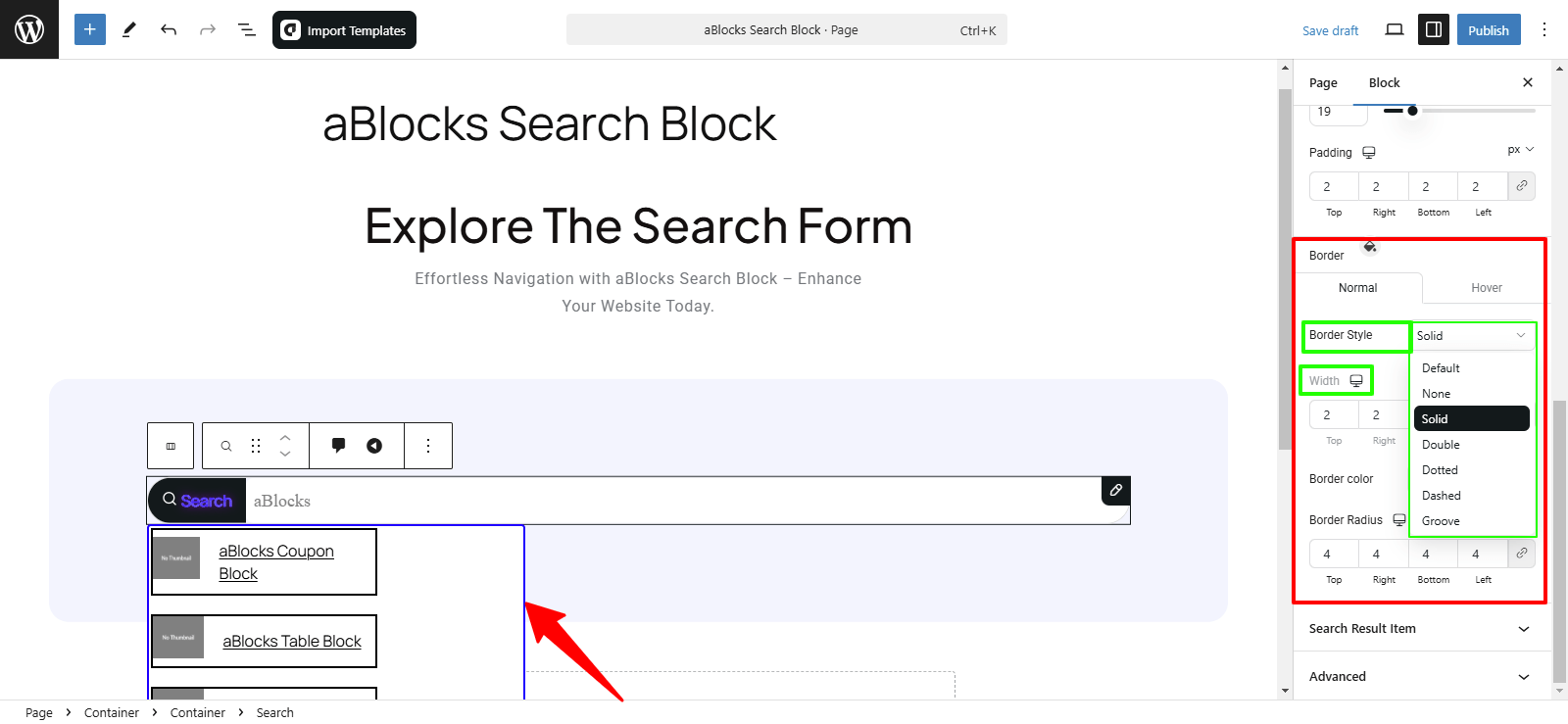
Border Color: Set a color to match or contrast with your theme.
Border Radius: Adjust corner roundness (Top Left, Top Right, Bottom Left, Bottom Right) for a smooth or sharp look.

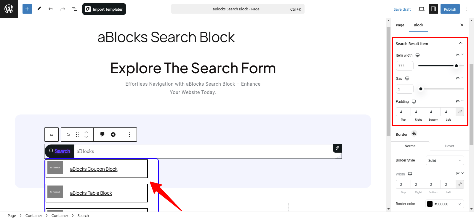
Search Result Item
In the Search Result Item section, you will find four main subsections:
- Search Result Item Layout: Adjust structure and spacing.
- Item Width: Set a fixed or responsive width for balance.
- Gap: Control spacing between items for a refined layout.
- Padding: Adjust the spacing inside the input fields (top, right, bottom, left).
Search Result Item Border Customization
- Normal Mode – Always visible border settings.
- Hover Mode – Changes applied when hovered over.
Customization Options:
- Border Style – Choose from Solid, Dashed, Dotted, Double, or Groove.
- Border Width – Adjust thickness for each side (Top, Right, Bottom, Left).
- Border Color – Match your theme or highlight search results.
- Border Radius – Customize corner roundness for a smooth or sharp look.
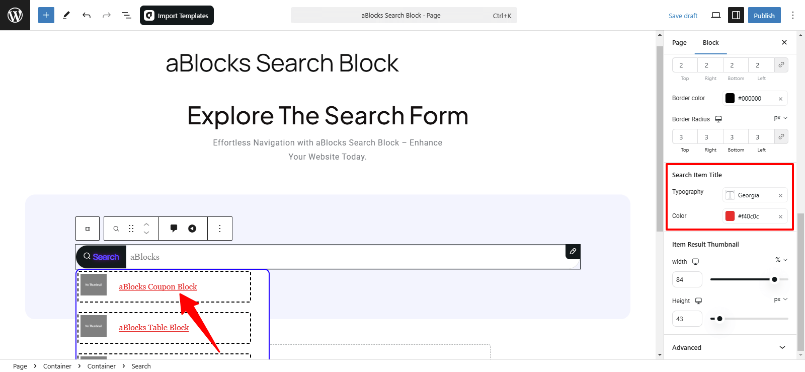
Search Item Title Customization
- Typography – Adjust font, size, weight, transform, style, and spacing for better readability. See aBlocks Typography Setting Documentation.
- Color – Customize text color to match your theme or enhance visibility.
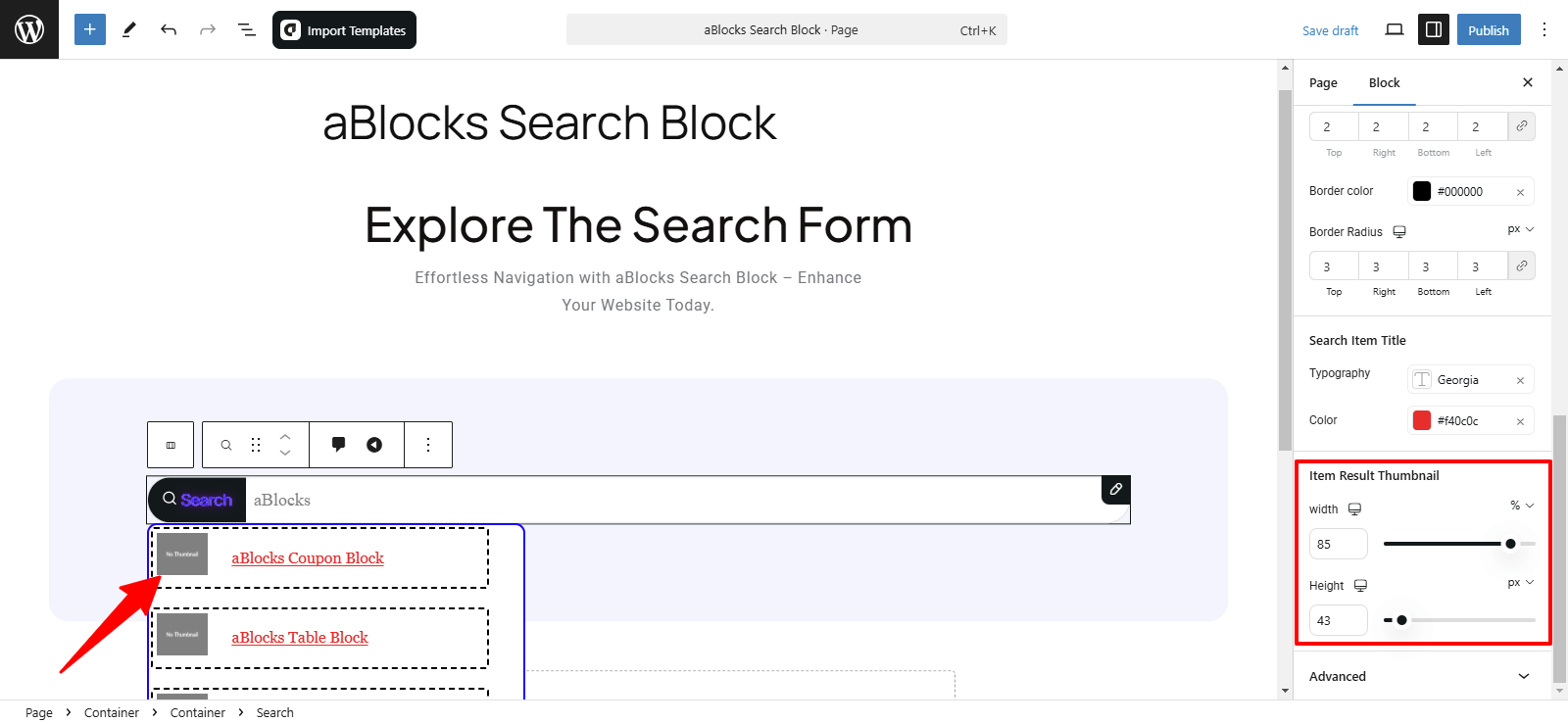
Item Result Thumbnail Customization
- Width – Adjust thumbnail size to fit your design.
- Height – Set proportions for visual balance.
Conclusion
The aBlocks Search Block offers a fully customizable search feature to enhance navigation and user experience. With flexible layout and styling options, it seamlessly integrates into your site. For assistance, contact our support team anytime!