


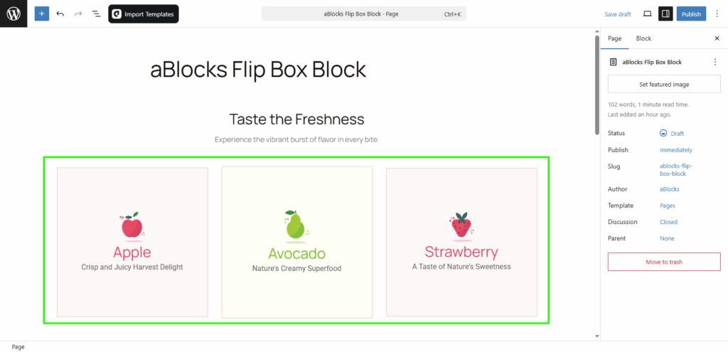
The Flip Box Block by aBlocks lets you display two-sided content that flips on hover. Use it to highlight services, team members, features, or deals with engaging effects. This guide walks you through how to add and customize it step by step.
How to Add the Flip Box Block
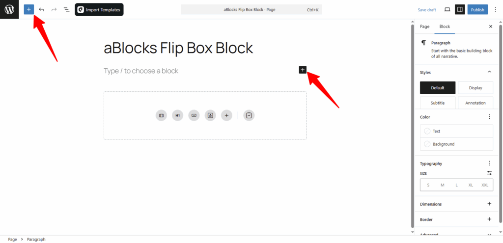
Open your WordPress dashboard and edit the page or post where you want to add the Flip Box.
Click the ( + ) icon to open the block options.
You’ll see all available aBlocks blocks. Scroll to find the Flip Box Block or type “Flip Box Block” in the search bar to locate it quickly.
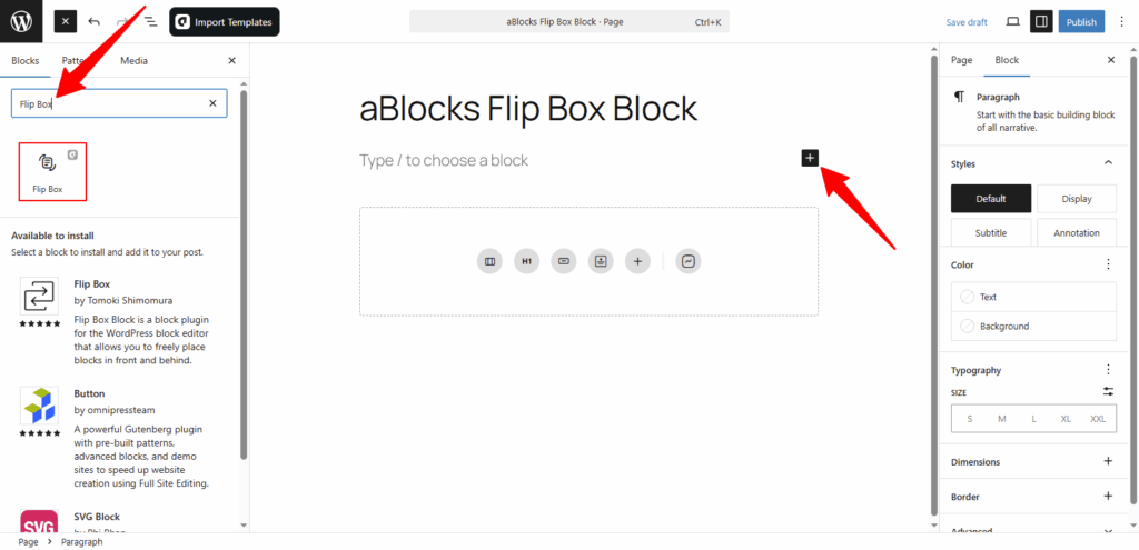
Select the aBlocks Flip Box Block and click to add it to your page. Then, customize the content and style to match your site’s design.
Customize the aBlocks Flip Box Block
This guide shows you how to use and customize the aBlocks Flip Box Block with simple steps.
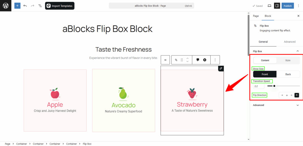
First, select the Flip Box Block and open the settings panel on the right. Then go to Block > General.
Here, you’ll find the main setting that controls the layout and flip direction:
- Flip Box
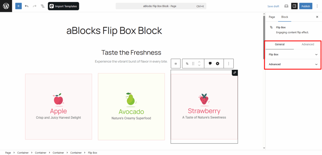
Flip Box
In the Flip Box section, you’ll find two tabs: Content and Style.
Each tab includes options to help you control how the flip box looks and works.
Let’s start with the Content tab:
Content
Show Side: Choose which side of the flip box you want to edit – Front or Back.
- Front: This lets you edit the front side of your flip box.
- Back: This lets you edit the back side of your flip box.
Transition Speed: You can adjust how fast the flip animation happens. Use lower values for faster speed and higher values for slower animation.
Flip Direction: Choose the direction of the flip – Right, Bottom, Left, or Top.
👉 You can see a live preview of all these changes directly in the editor as you make them.
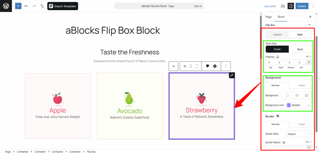
Style
Under the Style tab, you’ll see the Show Side option again.
Here, choose Front or Back to apply styles to each side of the flip box.
Both sides have similar style settings. Now, let’s look at the Front side style options.
Padding: Control the space inside the flip box. You can increase or decrease the padding as needed.
Background (Front Side Style)
In the Background section, you’ll see two tabs: Normal and Hover.
You can set different styles for each state.
- Background Type: Choose from None, Color, or Image as the background of your flip box.
- Background Color: Pick a color to set as the background. This will apply only if you select “Color” as the background type.
You can also switch to the Hover tab to set a different background when users hover over the flip box.
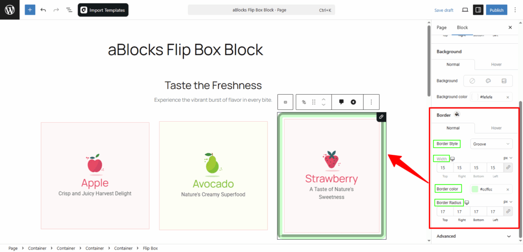
Border (Front Side Style)
In the Border section, you’ll see two tabs: Normal and Hover.
This lets you set different border styles for regular and hover states.
- Border Style: Choose from options like Default, None, Solid, Double, Dotted, Dashed, or Groove.
- Width: Control the thickness of the border. You can increase or decrease it as needed.
- Border Color: Pick a color for your border.
- Border Radius: Adjust the roundness of the corners by changing the radius.
Conclusion
The aBlocks Flip Box Block helps you create interactive content that looks modern and engaging. With simple controls for layout, animation, and style—customizing each side is easy and flexible.
If you need help, the aBlocks support team is always ready to assist.